What Colors Make White? Paint vs Light Color Mixing Explained

If you’ve ever wondered “what colors make white,” you’re not alone. It’s a classic color theory puzzle that trips up many artists, home decorators, and web designers because the rules change completely depending on what you’re mixing.
The direct answer is simple: in digital art and light, combining red, green, and blue light creates pure white, whereas in physical paint, you cannot create white by mixing other colors—you must buy it as a pure base pigment.
Why is there such a massive contradiction? The reason is simple: light works by adding wavelengths together to create brightness, while physical paint works by subtracting light away. Understanding this split is the key to mastering color behavior across different mediums. In this guide, you’ll learn the color science behind both systems, how to make various off-white paint shades, and how to control white perfectly in your physical and digital projects.
Main Takeaway:
Primary Red Light + Primary Green Light + Primary Blue Light = Pure White Light (while in physical paint, no mixture of colors can yield white due to pigment absorption).
What Two Colors Make White?
When dealing with physical paint pigments, you cannot mix two colors together to get white. In fact, if you try to mix any two paint colors in an attempt to make white, you’ll always end up with a darker, muddier shade.
This happens because paint relies on subtractive color mixing. Every pigment you add to your palette absorbs more light wavelengths, reflecting less light back to your eyes. If you mix two complementary pigments, like ultramarine blue and cadmium orange, they cancel each other out and leave you with a dark gray or brown, not white.
Imagine you’re painting a coastal scene. If you run out of titanium white paint, trying to blend yellow and blue, or orange and blue, will never save your canvas. You simply have to buy a dedicated tube of white paint.
What Three Colors Make White?
In the physical world of paints and inks, mixing three colors together will also fail to produce white. However, when you step into the world of light projection, the rules flip entirely.
The reason is simple: light operates under [additive mixing]. Instead of absorbing light waves, projecting red, green, and blue light beams onto a single spot adds their wavelengths together. When these three primary wavelengths of light are combined at full intensity, they reflect the entire visible spectrum back to your eyes, which your brain perceives as pure white.
Think of a theater stage. If the lighting director turns on a red spotlight, a green spotlight, and a blue spotlight, aiming them all at the exact same spot on the stage floor, the overlapping intersection will shine a brilliant, clean white.
Shades of White and How to Make Them
Even though you cannot mix a pure white paint from scratch, you can easily create custom shades of off-white by tinting a pure white base paint with tiny pinpoints of other colors.
This happens because pure white paint is incredibly sensitive to external pigments. Adding even a microscopic dot of another paint color shifts the entire character of the white, allowing you to create cozy, warm tones or sleek, cool highlights.
Here’s a good example: if you take a large cup of titanium white paint and add a pinpoint of raw umber, you’ll pull the starkness out of the white and turn it into a soft, creamy linen shade. If you instead add a pinpoint of phthalo blue, the white transitions into a crisp, icy, cool tone.
The Theory of White: Light vs. Pigment
To master this color, you have to separate your understanding of physical matter from light energy. It’s the ultimate fork in color theory.
The reason is simple: physical pigments are matter, meaning they reflect only certain light rays and swallow up the rest. Light beams, on the other hand, are pure energy. Adding more light always equals more brightness, while adding more physical pigments always equals more darkness.
Another thing worth knowing is that this fundamental split is why digital artists often struggle to transition to traditional painting, and vice versa. They are working with two entirely opposite physical systems of color creation.
White in Light: The RGB Additive Model
The additive color model describes how light waves combine to create the colors we see on screens and in nature.
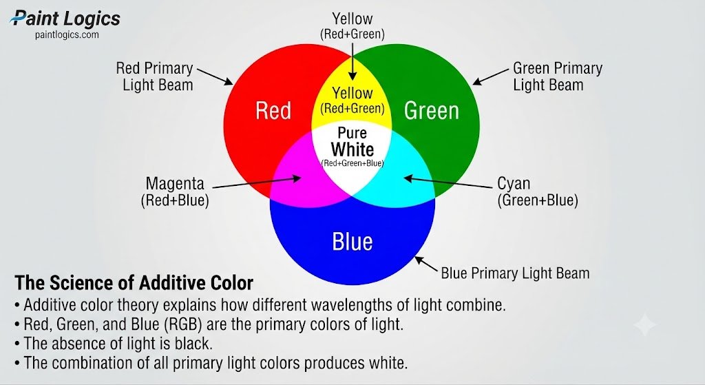
This happens because our eyes contain color-sensitive cells called cones, which respond to red, green, and blue light. When a digital display projects red, green, and blue light at maximum power, it stimulates all three types of cones in your eyes simultaneously. This uniform stimulation tricks your brain into seeing pure white light.
Imagine looking closely at a television screen with a magnifying glass. When the screen displays a bright white sky, you won’t actually see any white pixels. Instead, you’ll see tiny red, green, and blue sub-pixels glowing side-by-side at maximum brightness.
Two-Color White in Light
You don’t always need three distinct wavelengths of light to make white; you can actually achieve a white light sensation using only two colors.
Why does this happen? The reason is simple: you can use complementary light colors. If you combine a primary light wavelength with its exact secondary complement, you will still stimulate all three of your eye’s color receptors.
Here’s a good example: if you mix a pure blue light beam with a pure yellow light beam, the overlapping spot will shine white. This is because yellow light already stimulates your red and green receptors, and adding blue light rounds out the trio.
White Without Light: The Subtractive Model
In subtractive color systems, white is defined as the absolute absence of color or pigment.
This happens because physical surfaces require an external light source to show color. When you look at a blank sheet of paper, it appears white because the paper’s fibers are naturally designed to reflect all ambient light waves back to your eye without absorbing any of them. If you paint over that paper with any pigment, you are reducing its reflective power.
Artists often utilize this concept by leaving the bare canvas untouched where they want the brightest highlights to shine. This is especially true in watercolor painting, where the white of the paper serves as your absolute brightest value.
White in Printing: The CMYK Model
In commercial printing, white behaves very differently because printers use transparent inks that rely on the paper base beneath them.
The reason is simple: the CMYK (Cyan, Magenta, Yellow, Key/Black) ink system cannot mix a white ink to print over dark paper. Instead, a standard home inkjet or commercial printing press treats white as “empty space.” The printer simply leaves those specific areas of the paper blank, letting the natural white of the page shine through.
Think of printing a photo of a snowy mountain peak on a standard white printer paper. The printer doesn’t spray any ink onto the areas representing the brightest snow patches. It only sprays ink on the shadow areas around the snow to define its shape.
Common Mistake: If you try to print a colorful design onto dark black cardstock using a standard home printer, the design will look practically invisible. This happens because the printer relies on the white paper background to reflect light through its transparent inks. To print on dark paper, you need a specialized printer that uses a heavy, opaque white toner cartridge.
Digital White: RGB, Hex, and Brightness
In the digital world, white is represented by precise mathematical values that tell your screen’s sub-pixels to fire at their absolute maximum capacity.
Why does this happen? The reason is simple: digital systems use binary code to control light output. To get pure white, you must tell the red, green, and blue channels to run at full power, which is represented by the value 255 in an 8-bit color scale.
Now compare that with how we write these colors in design files:
| Color System | Red Channel | Green Channel | Blue Channel | Value / Code |
| RGB | 255 | 255 | 255 | rgb(255, 255, 255) |
| HEX | FF | FF | FF | #FFFFFF |
| CMYK | 0% | 0% | 0% | 0, 0, 0, 0 (No ink applied) |
Off-Whites and White Tints in Paint
Because pure titanium white can look cold and sterile in physical spaces, designers and artists frequently mix custom off-white tints to bring character to a surface.
This happens because a pure white base acts as a blank canvas for warmth or coolness. By folding in microscopic traces of earthy pigments, you can shift the visual temperature of the paint to fit any design goal.
Let’s look at how adding tiny drops of color to a white base shifts the final tone:
- Warm Off-White (Cream/Alabaster): Add a tiny pinhead of Yellow Ochre or Raw Sienna to your white base. It creates a cozy, inviting environment.
- Cool Off-White (Chalk/Ice): Add a tiny pinpoint of Cobalt Blue or Emerald Green to your white base. It feels modern, crisp, and clean.
- Neutral Off-White (Stone/Gray-White): Add a tiny drop of Raw Umber or Burnt Umber to your white base to cut the harshness without shifting the temperature too far warm or cool.
Human Perception and White Balance
The way your brain perceives white depends heavily on the ambient light reflecting around the room or canvas.
The reason is simple: our eyes naturally adapt to the light source of our environment, a process known as chromatic adaptation. If you look at a white piece of paper under a warm incandescent light bulb, the paper is actually reflecting yellow light, but your brain automatically corrects the image so you still perceive the paper as white.
Imagine taking a photo with your phone. If you move from a warm living room into a bright, blue-toned outdoor shadow, your camera’s sensor has to adjust its “white balance” settings so the snow or white shirts don’t look overly yellow or icy blue in the final image.
Common Myths About White
There are several persistent misconceptions about this light-reflective color that confuse beginners in both digital and physical design.
Myth 1: You can make white paint by mixing all colors together.
This is the most common color mixing mistake. Mixing all your physical paint colors together will yield a dark, muddy brown or near-black, not white. This mixing myth is often confused with light mixing, where combining all colors of light does indeed make white.
Myth 2: White paint is always pure and neutral.
In reality, different brands and types of white paint have distinct undertones. For example, Zinc White is very transparent and cool, while Titanium White is highly opaque and slightly warmer.
Myth 3: White is not a real color.
While physicists define white as a combination of all light wavelengths rather than a single color wave, visually and psychologically, white functions as a highly active, powerful color that heavily influences how we perceive neighboring shades.
Quick Reference Table: How White Is Made in Different Mediums
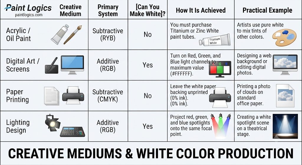
To help you keep these rules straight for your projects, use this quick-reference table showing how white is handled across different creative fields:
| Creative Medium | Primary System | [Can You Make White]? | How It Is Achieved | Practical Example |
| Acrylic / Oil Paint | Subtractive (RYB) | No | You must purchase Titanium or Zinc White paint tubes. | Artists use pure white to mix tints of other colors. |
| Digital Art / Screens | Additive (RGB) | Yes | Turn on Red, Green, and Blue light channels to maximum value (#FFFFFF). | Designing a web background or editing digital photos. |
| Paper Printing | Subtractive (CMYK) | No | Leave the white paper backing unprinted (0% ink). | Printing a photo of clouds on standard office paper. |
| Lighting Design | Additive (RGB) | Yes | Project red, green, and blue spotlights onto the same focal point. | Creating a white spotlight scene on a theatrical stage. |
Applying The Knowledge Of White Color in Art and Design
Understanding the nature of white helps you make smarter decisions whether you are working on a digital canvas or painting a physical wall.
Why White Matters
In physical spaces, pure white paint reflects up to 85% of ambient light, making a cramped room feel twice as large and airy. In digital interface design, using generous white space between blocks of text allows the reader’s eyes to rest, dramatically improving their reading comprehension and keeping them on your website longer.
In Art and Painting
Fine artists use different white paints for specific tasks.
Pro Tip: Use Titanium White when you need strong, opaque coverage to block out background layers, and use Zinc White when you want to mix delicate, semi-transparent color glazes that let the underlying sketch lines show through.
Conclusion
To bring it all home, what colors make white depends entirely on whether you are working with light or paint. In digital design and lighting, combining red, green, and blue light at full intensity creates a brilliant pure white. In contrast, when you are working with physical paint, you cannot mix other colors to create white; instead, you must rely on pure, raw mineral pigments like Titanium White as your base.
The secret to mastering this color lies in separating additive light systems from subtractive pigment systems, letting the white of your paper shine in printing, and using tiny, controlled pinpoints of color to tint your physical white bases into cozy creams or crisp, modern grays. Whether you are illuminating a theatrical stage, decorating a new home, or designing a clean brand logo, understanding the unique behavior of white gives you complete control over the light, depth, and contrast of your entire creative space.
You Might Also Like:
- Red and Orange Make What Color? Complete Mixing Guide
- What Color Do Brown and Blue Make? Paint Mixing Guide
FAQs
Which two colors make white?
In the additive light system, combining complementary color lights like blue and yellow, or cyan and red, will create white light. In physical paints, you cannot mix any two colors to make white.
What three colors make white?
In digital screens and lighting design, mixing the three primary colors of light—red, green, and blue—creates pure white light.
Can blue, green, and red make white?
Yes, but only if you are mixing light beams (such as digital pixels or stage spotlights). If you mix blue, green, and red paint pigments together, you will get a dark, muddy charcoal or brown.
How is white made in printing?
In standard color printing on white paper, white is not made with ink. The printer simply leaves those sections of the paper blank, letting the white page show through.
Can you mix all colors to get white?
You can only mix all colors to get white when working with light beams. If you mix all the colors of your physical paint palette together, they will absorb all light and create a dark, muddy black.
What RGB values make white?
Pure white is represented by the RGB value 255, 255, 255 (and the hexadecimal code #FFFFFF), which tells the screen to fire its red, green, and blue channels at maximum brightness.
What is the best white paint for artists?
Titanium White is the most popular choice for artists because it is highly opaque, bright, and has excellent covering power. Zinc White is another great choice when you need a cooler, more transparent white for subtle color mixing.