Green and Gray Make What Color? Complete Color Mixing Guide
If you’ve ever wondered “green and gray make what color,” you’re not alone. It’s a question shared by landscape painters trying to capture the soft haze of a misty morning, homeowners picking a relaxing shade for a master bedroom, and designers building organic, modern brand palettes.
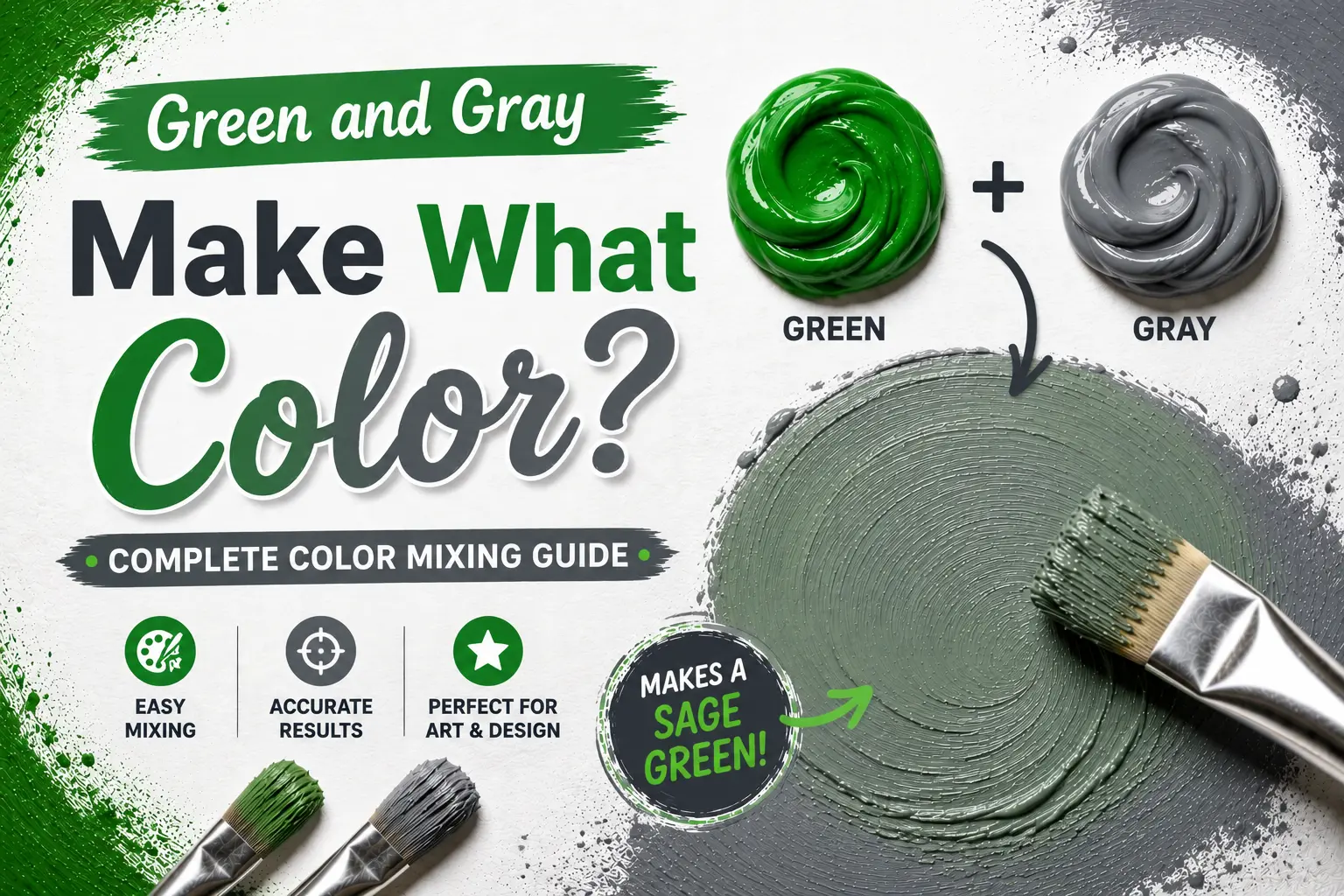
The direct answer is simple: mixing green and gray together creates a muted, desaturated green-gray tone, often producing calm, natural shades like sage, eucalyptus, or a smoky forest green.
However, the final result isn’t always identical every single time you mix them. The exact color you get depends heavily on whether your base green is warm or cool, the type of gray you introduce (warm, cool, or neutral), and the medium you are working with. Understanding these subtle shifts gives you complete control over these soft, highly sophisticated neutrals. In this guide, you’ll learn the color science behind this blend, how different paint pigments behave, and how to mix a flawless sage or dusty green for your next creative project.
Main Takeaway:
Vibrant Green + Neutral Gray = Muted Green-Gray / Sage (varying in lightness, warmth, and depth depending on your starting pigment ratios and base undertones).
How Green and Gray Mix: The Basics
When you mix a vibrant primary or secondary color with gray, you are carrying out a classic art technique known as toning. This process is the secret to taking bright, aggressive colors and turning them into sophisticated, livable shades.
Green and Gray in Paint (RYB Model)
In the traditional RYB (Red, Yellow, Blue) model used by painters, mixing green and gray is a physical subtractive process.
Why does this happen? The reason is simple: gray paint (which is a mixture of light-reflecting white and light-absorbing black) acts as a visual dampener. When mixed into green, the gray pigment swallows up the bright, saturated wavelengths of the green. This pulls the color’s overall intensity down into a quiet, organic gray-green.
Imagine you are mixing paint for a canvas. If you take a vivid Kelly green and slowly fold in a cool neutral gray, you’ll see the bright grassy tone soften immediately. It transforms into a serene, earthy green-gray that looks much more like foliage you’d see in the real world.
The RGB Model (Digital Light)
Now compare that with digital screens, which operate on the additive RGB (Red, Green, Blue) model. On a screen, colors are projected using light rather than physical pigments.
This happens because digital gray is created by running Red, Green, and Blue sub-pixels at identical, moderate intensity values. When you blend a green value with a gray value in digital design software, you are balancing these light emissions. The software lowers the pure green light output while increasing the red and blue light channels. This digital transition yields a clean, elegant sage or dusty green screen color.
The CMYK Model (Printing)
The CMYK (Cyan, Magenta, Yellow, Key/Black) system governs physical printing. Because printing inks are transparent, building a gray-green on paper requires laying down tiny, overlapping halftone dots of Cyan and Yellow (to make green) mixed with Cyan, Magenta, Yellow, and Black (to make gray).
Another thing worth knowing is that printing gray-greens can be incredibly tricky. If your printer’s alignment or ink flow is off by even a tiny fraction, the delicate balance shifts. Your clean, smoky green can easily print out looking like a dull, muddy brown or an overly bright, unnatural mint.
Core Results: What Color Does Green and Gray Make?
The exact proportions and temperatures of your starting colors determine the specific neutral shade you will create.
Let’s look at how the starting mix changes your final color output:
Sage Green
If you start with a warm, slightly yellow-green (like a soft leaf green) and add a light, neutral gray, you’ll create a classic sage green. This shade is highly prized for its soft, silvery-warm undertone that feels peaceful and organic.
Seafoam Green
What if you start with a cool, blue-green like mint or teal? Mixing this cool green with a crisp, light gray results in a breezy, refreshing seafoam green. This tone has a distinct watery, coastal feel that looks clean and bright.
Dusty Green / Muted Green
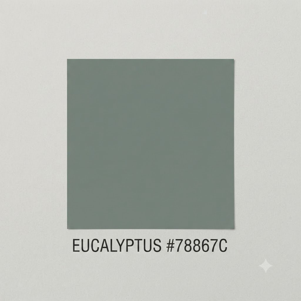
If you blend a balanced, rich green with a medium, neutral gray, you get a beautiful dusty green (sometimes called eucalyptus). It’s a balanced, mid-tone neutral that sits perfectly between warm and cool, making it incredibly versatile.
Green-Gray / Gray-Green
When your mixing ratio tilts heavily toward the gray side—think 70% gray and 30% green—you create a subtle, stony green-gray. This color looks like a natural slate or river rock, revealing its soft green personality only when compared directly to a pure gray.
Tints and Shades of Green and Gray
Adjusting the value and temperature of your mixture allows you to customize the color’s overall mood and presence.
Lightening the Mix (Adding White or Yellow)
If your green-gray mix looks a bit too dark or heavy, you can easily open it back up. Adding a touch of titanium white lifts the value, turning a dense sage into a airy, pastel chalk-green. If you want to make the mix feel cozier and more sunlit, fold in a tiny drop of warm yellow paint instead of white.
Darkening the Mix (Adding More Black or Gray)
To pull your mixture down into the shadows, you can introduce a darker gray or a pinpoint of black.
Pro Tip: Adding pure black can sometimes flatten your mix and make it look lifeless. To avoid this, try darkening your green-gray with a deep, cool gray mixed with a tiny touch of raw umber to keep the shadow looking rich and organic.
Practical Mixing Chart: HEX & RGB Reference
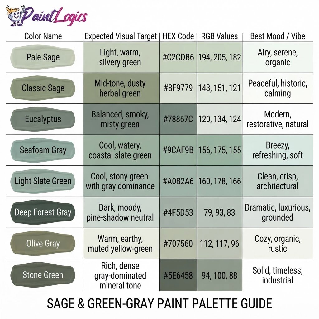
To make planning your physical crafts, home renovations, or digital canvas lines easier, use this quick-reference palette display showing how these shades line up:
| Color Name | Expected Visual Target | HEX Code | RGB Values | Best Mood / Vibe |
| Pale Sage | Light, warm, silvery green | #C2CDB6 | 194, 205, 182 | Airy, serene, organic |
| Classic Sage | Mid-tone, dusty herbal green | #8F9779 | 143, 151, 121 | Peaceful, historic, calming |
| Eucalyptus | Balanced, smoky, misty green | #78867C | 120, 134, 124 | Modern, restorative, natural |
| Seafoam Gray | Cool, watery, coastal slate green | #9CAF9B | 156, 175, 155 | Breezy, refreshing, soft |
| Light Slate Green | Cool, stony green with gray dominance | #A0B2A6 | 160, 178, 166 | Clean, crisp, architectural |
| Deep Forest Gray | Dark, moody, pine-shadow neutral | #4F5D53 | 79, 93, 83 | Dramatic, luxurious, grounded |
| Olive Gray | Warm, earthy, muted yellow-green | #707560 | 112, 117, 96 | Cozy, organic, rustic |
| Stone Green | Rich, dense gray-dominated mineral tone | #5E6458 | 94, 100, 88 | Solid, timeless, industrial |
Digital Design Pro Tip: When building an interface, using a very light tint of Pale Sage (#F1F4EE) as a soft background coupled with Deep Forest Gray (#4F5D53) for your body text creates an incredibly accessible, low-strain reading environment that feels much more organic than standard black-and-white.
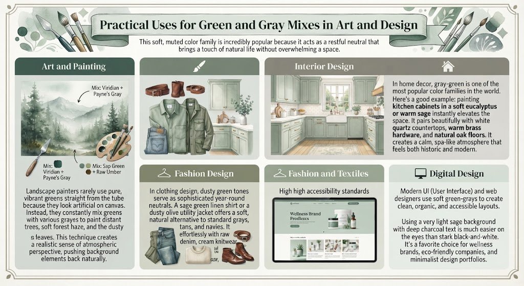
Practical Uses for Green and Gray Mixes in Art and Design
This soft, muted color family is incredibly popular because it acts as a restful neutral that brings a touch of natural life without overwhelming a space.
Art and Painting
Landscape painters rarely use pure, vibrant greens straight from the tube because they look artificial on canvas. Instead, they constantly mix greens with various grays to paint distant trees, soft forest haze, and the dusty surfaces of leaves. This technique creates a realistic sense of atmospheric perspective, pushing background elements back naturally.
Interior Design
In home decor, gray-green is one of the most popular color families in the world.
Here’s a good example: painting kitchen cabinets in a soft eucalyptus or warm sage instantly elevates the space. It pairs beautifully with white quartz countertops, warm brass hardware, and natural oak floors. It creates a calm, spa-like atmosphere that feels both historic and modern.
Fashion and Textiles
In clothing design, dusty green tones serve as sophisticated year-round neutrals. A sage green linen shirt or a dusty olive utility jacket offers a soft, natural alternative to standard grays, tans, and navies. It pairs effortlessly with raw denim, cream knitwear, and rich leather accessories.
Digital Design
Modern UI (User Interface) and web designers use soft green-grays to create clean, organic, and accessible layouts. Using a very light sage background with deep charcoal text is much easier on the eyes than stark black-and-white. It’s a favorite choice for wellness brands, eco-friendly companies, and minimalist design portfolios.
Real-World Examples of Green and Gray Mixing
Think of the soft, powdery surface of a fresh eucalyptus leaf or a bundle of dried sage. That characteristic dusty, silvery appearance is nature’s perfect version of a green and gray mix.
Another great example is the color of a mountain range fading into the distance. The layers of air and moisture in the atmosphere act like a natural gray filter, turning the vibrant green forests of the mountains into a soft, hazy blue-gray-green by the time the light reaches your eyes.
Conclusion
To bring it all home, green and gray make a muted green-gray when mixed. By blending these two colors, you desaturate the vibrant green to produce stunning, organic shades like sage, eucalyptus, and dusty green.
The secret to mastering this mix lies in starting with your green paint as your main base, introducing your gray slowly in small steps, and choosing the right color temperature for your project. Whether you are painting a misty landscape, picking a calming paint color for your bedroom, or designing a clean website interface, this sophisticated neutral family brings a sense of natural peace, balance, and elegance to your work.
You Might Also Like:
- Black and White Make What Color? Gray Mixing Guide
- What Color Does Yellow and Gray Make When Mixed? Complete Guide
FAQs
What color do you get when you mix green and gray?
You get a desaturated, muted shade of green, which is commonly referred to as a gray-green, green-gray, sage, or dusty green.
How does adding more gray affect the color?
Adding more gray cools down the vibrancy of the green, making it look softer, more neutral, and closer to a stony gray with a green undertone.
What happens if I add more green to the mix?
Adding more green will pull the mixture away from the neutral gray zone, increasing the color’s saturation and making the final shade look brighter and more dominant.
Can you make light green-gray colors?
Yes. To make a light green-gray like pale sage, you can start with a light gray base (mostly white with a tiny touch of black) and slowly blend in a warm green, or simply add white paint to your existing green-gray mix.
How do I create a darker green-gray shade?
To make a deeper shade, mix your green with a dark charcoal gray, or add a very small touch of black paint and a pinpoint of deep blue to keep the color rich.
What is sage green, and how is it made?
Sage green is a soft, silvery gray-green. It is made by mixing a warm, yellow-leaning green with a light, neutral gray, mimicking the dried leaves of the sage herb.
Is seafoam green a result of mixing green and gray?
Yes, seafoam green is created when you mix a cool, blue-leaning green (like mint or light teal) with a crisp, light gray.
What color do green and gray make in digital design?
In digital design, mixing green and gray values results in a clean, desaturated gray-green hex color (such as #8F9779 for a warm sage or #78867C for a cool slate green).
What other colors can I mix with gray to create new hues?
You can mix gray with any primary or secondary color to tone it down. For example, mixing gray with blue makes slate blue, while mixing gray with red makes a dusty rose.
What is the best use of green and gray in interior design?
They are best used in spaces where you want to promote rest and relaxation, such as bedrooms, bathrooms, cozy home offices, and kitchen cabinets.
Can green and gray be used together in fashion?
Absolutely! They create a gorgeous, low-contrast, and earthy color palette that looks incredibly sophisticated on soft fabrics like linen, wool, and heavy cotton.
Does adding gray make green look dull?
It does lower the color’s brightness, but rather than making it “dull,” it makes the green look more natural, organic, and easier to live with over time.