What Color Does Yellow and Gray Make When Mixed? Complete Guide
If you’ve ever wondered “yellow and gray make what color,” you’re not alone. It’s a classic question that comes up whether you’re trying to tone down a loud wall paint, mixing oil paints for a foggy landscape landscape, or putting together a modern graphic layout.
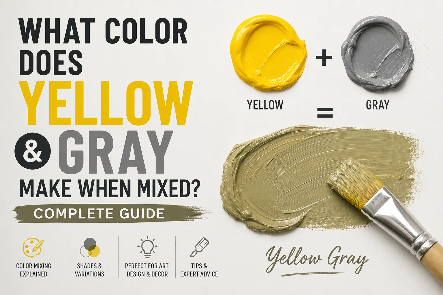
The direct answer is simple: yellow and gray make a muted yellow, often leaning toward olive, mustard, or khaki.
However, the final result isn’t always identical. The exact shade you get depends entirely on the undertones of your gray and the intensity of the yellow you start with. You could end up with a bright, sunny ochre or a cool, earthy green-gray. Understanding how these two pigments interact will completely change how you use them in your creative projects.
Main Takeaway:
Primary Yellow + Balanced Gray = Muted Yellow / Olive (depending on the gray’s base tint and the mixing proportions).
Quick Answer: What Color Do Yellow and Gray Make?
When you blend yellow and gray together, you create what artists refer to as a “tone.” In the art world, adding gray to any pure primary color lowers its high saturation without completely shifting its place on the color wheel.
Why does this happen? The presence of gray softens the raw, high-energy vibration of the yellow pigment. Instead of looking like a bright neon sign, the yellow becomes sophisticated, earthy, and calm.
If you add a splash of lemon yellow to a light dove gray, you’ll instantly get a soft, breezy muted yellow. If you mix a deep golden yellow with a dark charcoal gray, the color drops into a rich mustyard or olive shade. The transition is highly predictable, making it an easy color family to control.
The Science Behind Mixing Yellow and Gray
Color shifts properties depending on whether you are working with physical wet pigments or pixels on a screen. This happens because physical paint and digital light handle wavelengths in opposite ways.
Subtractive Color Mixing (Paint & Pigments)
When working with acrylics, house paints, or inks, you’re using subtractive color mixing. Physical pigments reflect certain light wavelengths while absorbing others. A bright yellow looks yellow because it reflects high-frequency yellow light while absorbing blues and purples.
When you introduce gray paint—which is a mix of white and black—the black particles inside the gray act like tiny sponges for light. They cut down the total amount of light bouncing off the paint surface. This causes the bright yellow to lose its piercing intensity, transforming it into a quiet, organic earth tone.
Additive Color Mixing (Digital / Light)
Digital displays rely on additive color mixing, where red, green, and blue (RGB) light emissions build colors. On a monitor, gray is created when all three channels have equal, medium-level values.
If you want to create an olive or mustard look on a computer screen, you don’t actually add a separate “gray light.” Instead, you lower the intensity of the red and green channels that combine to make yellow, while bringing the blue channel up slightly to match. For example, pure digital yellow is (255, 255, 0). By adjusting those values to something like (189, 183, 107), you create a beautiful digital dark khaki.
Common Shades Created When Mixing Yellow and Gray
Varying your proportions or changing your base yellow yields distinct, beautiful results. Here are the most common colors you can create with this mixture.
1. Olive Gray
Olive gray is a sophisticated, muddy green-gray that looks highly organic and natural. It sits comfortably between a deep military khaki and an urban slate.
This color happens because most black pigments used to make gray paint actually contain a hidden blue undertone. When that subtle blue meets the bright yellow, it creates a faint green reaction. Think of the color of sage leaves or a moss-covered rock in a forest.
2. Muted Mustard
Muted mustard is a warm, deep yellow that feels incredibly cozy and vintage. It retains enough yellow identity to look warm without being loud.
This shade occurs when you take a rich, warm yellow like Cadmium Yellow and mix it with a neutral, medium gray. Imagine the color of antique brass or spicy deli mustard. Interior designers love this shade for velvet accent pillows because it feels upscale and historic.
3. Smoky Chartreuse
Smoky chartreuse is an electric, bitter yellow-green shade that looks modern and high-contrast. It carries a distinctive edginess to it.
This tone comes forward when you mix a cold, green-leaning yellow like Lemon Yellow with a dark, cool gray. Think of lichen growing on a tree trunk or a rainy day in a tropical jungle. It’s a favorite among concept artists who want to create eerie, atmospheric lighting in sci-fi illustrations.
4. Grayish Yellow
Grayish yellow is a clean, stony neutral that looks like a warm cream or a soft tan. It is incredibly subtle and soft on the eyes.
This happens because the proportion of gray to yellow is heavily skewed toward gray. Imagine the color of wet river sand or raw linen fabric. Graphic designers often use this hue for website backgrounds because it feels warmer and more inviting than a sterile, flat gray.
5. Pale Sage
Pale sage is a soft, breezy pastel green-gray that feels incredibly peaceful and airy. It sits comfortably on the lighter end of the earth-tone spectrum.
This beautiful tone comes from mixing a touch of primary yellow into a large amount of light dove gray. The heavy presence of white within the gray lifts the value, creating a chalky, botanical hue. You’ll see this color used heavily in modern spa branding and minimalist packaging.
6. Charcoal Yellow
Charcoal yellow is a dark, brooding shade that sits on the edge of a nighttime shadow. It is a subtle alternative to deep black or brown.
This color occurs when you use an intense, deep yellow and darken it with a heavy charcoal or near-black gray. Think of tarnished gold or weathered industrial metal. Fashion designers often use this shade for autumn trench coats because it coordinates perfectly with dark boots and denims.
How to Control the Outcome
When mixing yellow and gray, small adjustments can alter your final color dramatically. Keeping track of your variables ensures you get the exact hue you need.
So what’s the difference between a clean mustard and a muddy olive? The answer lies entirely in your gray paint’s hidden lineage. Grays mixed from cool blacks will pull your yellow toward green, while grays made from burnt umber and white will keep your yellow beautifully warm and amber-like.
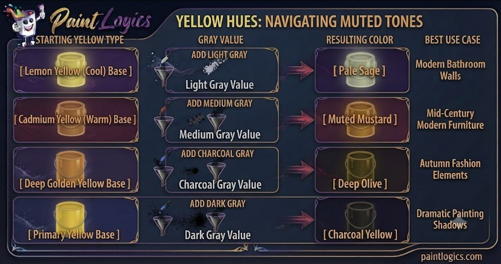
| Yellow Type | Gray Value | Resulting Color | Best Use Case |
| Lemon Yellow (Cool) | Light Gray | Pale Sage | Modern Bathroom Walls |
| Cadmium Yellow (Warm) | Medium Gray | Muted Mustard | Mid-Century Modern Furniture |
| Deep Golden Yellow | Charcoal Gray | Deep Olive | Autumn Fashion Elements |
| Primary Yellow | Dark Gray | Charcoal Yellow | Dramatic Painting Shadows |
Yellow and Gray in Paint: RYB, CMYK & Digital Color Models
Different creative industries use different color frameworks to mix yellow and gray. Here is a breakdown of how it works across mediums.
RYB Color Model (Paint – Subtractive Mixing)
The traditional Red-Yellow-Blue model is what you used in grade school art class. In this physical system, yellow is a pure primary color that cannot be created by mixing other paints. Gray is treated as a neutral modifier. Adding gray directly lowers the chroma of the yellow, making it perfect for fine art applications like painting realistic shadows on a bowl of fruit.
CMYK Color Model (Print – Subtractive Mixing)
The Cyan-Magenta-Yellow-Key (Black) system is used by commercial printing presses and desktop inkjet printers. To print a muted yellow or olive on paper, the printer dots pure yellow ink alongside small percentages of black (K) and cyan ink.
The cyan ink acts as the cooling agent, creating the visual illusion of gray-toned yellow once the page dries. That’s why your printer inks can create hundreds of beautiful olive tones using just four base colors.
RGB Color Model (Digital – Additive Mixing)
The Red-Green-Blue model rules over phone screens, monitors, and television displays. In the digital world, yellow is actually a secondary color created by blasting the Red and Green light channels at maximum power.
To create a yellow-gray tone digitally, web designers reduce the output of the Red and Green lights while slightly raising the Blue light channel. This softens the digital display, making the final color much more comfortable to view on a dark mobile screen.
What Happens When You Mix Yellow and Gray With Other Colors?
Once you have your basic yellow and gray mixture, introducing a third color can completely shift the mood. This is how professional designers build complex, custom color palettes.
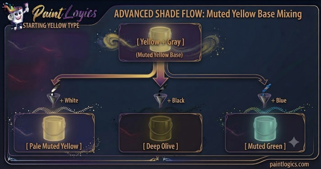
Yellow + Gray + White = Pale Muted Yellow
Adding white to your yellow-gray mix lifts the value and creates a pale muted yellow. Instead of looking like a bright banana yellow, it stays incredibly soft, muted, and chalky.
The white cuts through the heavy weight of the gray while keeping the desaturated look intact. This is an excellent choice for painting soft sunlight filtering through morning fog.
Yellow + Gray + Black = Deep Olive or Muted Mustard
If your yellow-gray mix feels a bit too light, adding a drop of pure black will instantly drop its value down into a heavy dark olive or deep mustard.
This happens because the black absorbs more light, turning the soft tones into a dramatic, high-contrast shade. Imagine a piece of dark military hardware or vintage leather.
Yellow + Gray + Blue = Muted Green
When you drop blue into the mix, the color moves quickly into a soft, desaturated muted green.
The blue combines with the yellow to form green, while the gray anchors the tone, preventing it from becoming a bright lime or grass green. Think of dried eucalyptus leaves or sagebrush in a desert landscape.
Yellow + Gray + Red = Warm Neutral
Adding a dash of red to your yellow and gray mixture creates an incredibly complex warm neutral or dusty terracotta color.
The warmth of the red cancels out the cool qualities of the gray, resulting in a beautifully balanced, weathered brick or natural clay tone that looks highly sophisticated.
Yellow + Gray + Green = Softer Earth Tones
Mixing green into your yellow-gray base creates a beautiful, rich softer earth tone that feels incredibly natural.
The green pulls the yellow toward a forest feel, while the gray keeps it mature and quiet. It’s an excellent option for modern exterior house paint or painting deep landscape backgrounds.
Tips for Mixing Yellow and Gray in Paint or Digital Art
If you’re ready to start mixing your own custom shades, keep these practical tips in mind to get the best results.
- Start With Small Additions: Always add your gray paint to your yellow paint in small increments. Yellow is a naturally weak pigment, meaning a heavy dark gray can overwhelm it quickly if you dump too much in at once.
- Test on a Palette or Sample Area: Acrylic and oil paints often look quite different when they are wet versus when they are dry. Acrylics, in particular, always dry a full shade darker.
- Adjust With White or Black for Lightness or Depth: If your mix looks too dark or muddy, don’t try to fix it by wasting tons of yellow paint. Instead, use a tiny speck of white to pull the color back into a readable tone.
- Consider Lighting Conditions: A mustard swatch might look beautifully warm under warm kitchen lights, but it could look like a cold, industrial green under a bright fluorescent office bulb. Always test your paint dried in its final location.
- Use High‑Quality Pigments or Digital Calibration: Cheap student-grade paints often contain chalky filler pigments that turn muddy or unpredictable when mixed. Investing in artist-grade paints with single-pigment listings gives you much cleaner, predictable results.
Real‑Life Examples of Yellow and Gray in Design, Art & Fashion
Seeing how this pair functions in the real world can give you instant inspiration for your next project.
Fashion
In the style world, pairing yellow and gray is a foolproof way to look effortlessly polished. Think of a charcoal gray wool overcoat worn over a muted mustard cashmere sweater. The gray tones down the brightness of the yellow, creating a timeless autumn outfit that looks highly deliberate and professional.
Interior Design
Interior designers treat muted yellow and gray as a classic mid-century modern combination.
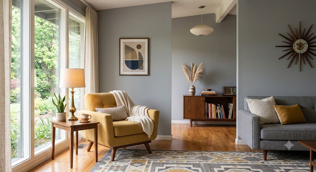
Pro Tip: A living room with soft gray walls, a muted mustard accent chair, and natural wood elements feels perfectly balanced, cozy, and incredibly peaceful without being boring.
Branding & Packaging
Look around and you’ll see this combination everywhere in organic food packaging and boutique coffee shops. The muted yellow represents sunshine, warmth, and friendliness, while gray signals maturity, stability, and sleek professionalism.
Art & Illustration
Consider landscape painters capturing a late autumn afternoon field. They rarely use straight bright yellow for the dried grass. Instead, they layer muted yellow, mustard, and gray tones together to give the fields a sense of immense weight, age, and lifelike depth.
Common Mistakes to Avoid When Mixing Yellow and Gray
Mixing these two colors seems straightforward, but it’s incredibly easy to end up with a dull, muddy mess if you aren’t paying attention.
1. Using Too Much Bright Yellow
This is the most frequent blunder. Because yellow is a transparent pigment, dropping a tiny bit of dark gray into a massive lake of yellow can cause the vibrant color to vanish into a muddy green color instantly.
How to avoid it: Treat your gray like a powerful modifier. Mix it into your yellow drop by drop until you reach the exact level of softness you want.
2. Ignoring Undertones
Not all yellow paints are built the same way. Lemon yellow has a cool green undertone, while golden yellow has a warm red bias. If you mix a cool yellow with a blue-toned gray, you might accidentally create an accidental olive green tone instead of a warm mustard.
How to avoid it: Check the manufacturer color index names on your paint tubes, or smear a thin layer of the paint on white paper to see its true undertone before mixing.
3. Not Testing the Mix
Never paint an entire canvas or a living room wall right after mixing your paint without testing a sample patch first.
How to avoid it: Paint a small swatch on a scrap piece of paper and let it dry completely under your room’s natural light before painting your final surface.
4. Forgetting Lighting Effects
Lighting can completely change how a muted yellow looks. Incandescent indoor lights will make the yellow stand out more, while cool morning sunlight will make the gray tones take over the space.
How to avoid it: Check your color samples at three different times of day: morning, noon, and night under artificial light.
Conclusion
To wrap things up, yellow and gray make a muted yellow. Depending on your mixing choices, that combination can transform into an elegant olive gray, a sharp muted mustard, or a soft grayish yellow.
The whole secret to mastering this color combo lies entirely in managing your proportions and understanding your base undertones. Treat gray as a tool to soften your color, add it slowly, and always test your results. Whether you are building an outfit, painting a fresh accent wall, or blending acrylics on a canvas, utilizing this organic pair adds instant maturity and sophistication to your work.
Love To Read More
#1 What Color Does Purple and Black Make When Mixed? Complete Guide
#2 What Color Does Red and White Make When Mixed? Complete Guide
FAQs
What color do yellow and gray make when mixed?
They make a muted yellow. Depending on the exact ratios and undertones used, the final color can look like olive, mustard, or a soft dark khaki.
Does yellow and gray make what color in paint?
In physical paint, they combine to make an earthy, desaturated yellow or olive green tone. This happens because the black particles in the gray paint tone down the high intensity of the yellow pigment.
Can yellow and gray make beige?
Yes, if you mix a very light cream yellow with a soft dove gray that has a slight warm undertone, the resulting color will look like a beautiful, sandy beige.
What happens if I mix yellow, gray, and white?
You create an incredibly soft, pastel tint known as pale muted yellow. The white lifts the darkness of the gray while preserving the sophisticated, quiet character of the yellow.
Is yellow and gray used in interior design?
Yes, it is a classic mid-century modern color combination. It serves as an excellent way to introduce the cheerful warmth of yellow into a home without making the space feel overly loud or childish.
Can I mix yellow and gray digitally?
Absolutely. In digital programs, you create this tone by lowering the red and green light channels while matching them closely with a lower blue light value.
What shade works best for living room design?
Muted mustard or a soft olive gray works beautifully. These shades add warmth and texture to a room, especially when paired with natural wood finishes and indoor plants.
Does the undertone matter?
Yes, immensely. A cool yellow mixed with a cool gray will lean heavily toward green, while a warm golden yellow mixed with a warm gray will create a rich, golden ochre.
What color does yellow + gray + black make?
This combination creates a very rich deep olive or a dark charcoal yellow shade. The extra black absorbs more light, turning the mixture into a heavy shadow color.
Can yellow and gray mix to a warm tone?
Yes, they can. If you use a warm, red-leaning yellow like deep gold or amber as your base, the final color will feel cozy, warm, and inviting despite the presence of the gray.