Blue and Purple Make What Color? Indigo Mixing Guide
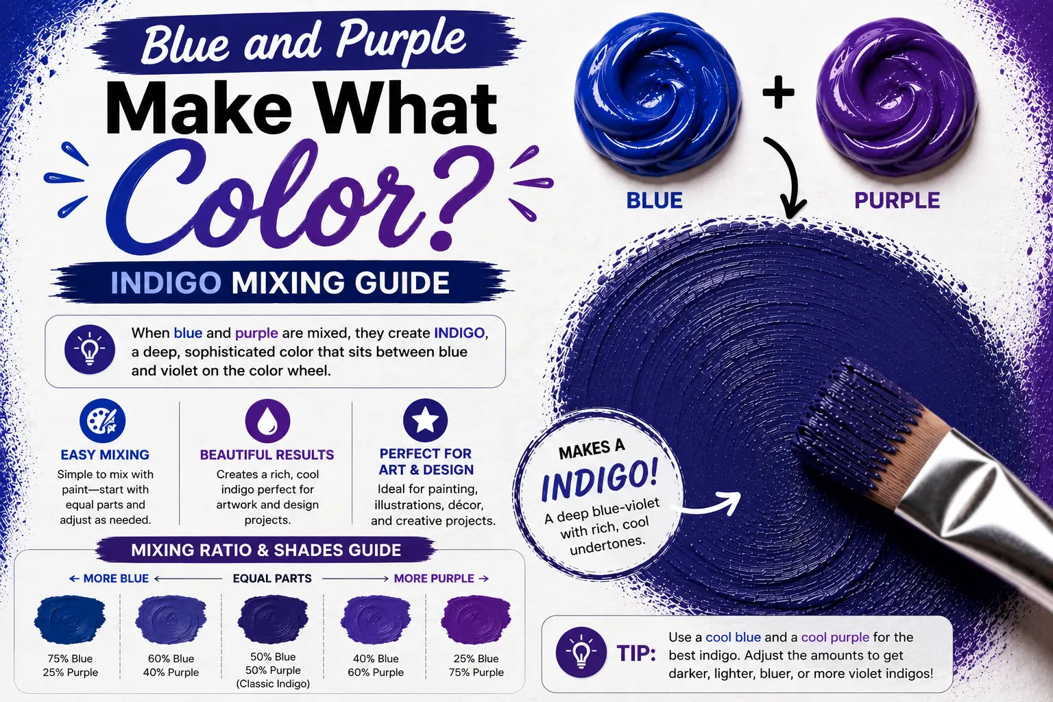
If you’ve ever wondered “blue and purple make what color,” you’re not alone. It’s a question that pops up constantly whether you are blending acrylic paints on a physical palette, building a digital website layout, or adjusting colors for a print design.
The straightforward answer is simple: mixing blue and purple creates a cool, rich tertiary color called blue-violet or indigo.
However, the final result isn’t always identical. The exact shade you get depends heavily on your mixing proportions, your light medium, and the specific pigment undertones you start with. Learning how these colors interact gives you absolute control over this beautiful, cool-toned family.
Main Takeaway:
Primary Blue + Secondary Purple = Blue-Violet / Indigo (ranging from bright, electric tones to deep, moody twilight shades depending on color ratios and medium).
Color Theory Basics
Before squeezing any tubes of paint, we need to understand how different mediums handle this color combination.
Why does the color change depending on where you see it? The reason is simple. Your eyes perceive color differently depending on whether you are looking at physical pigments that absorb light, or digital screens that emit it.
To keep things clear, we look at the three main color models used by artists and designers.
On the RYB Color Wheel (Traditional Paint Model)
The RYB (Red, Yellow, Blue) model is the classic system you likely learned in school. In this traditional system, blue is a primary color and purple is a secondary color (made by mixing red and blue).
When you mix blue and purple together, you are combining a primary with an adjacent secondary. This creates a tertiary color. Because both colors sit right next to each other on the cool side of the wheel, they blend smoothly without neutralizing or canceling each other out.
On the RGB Color Wheel (Light & Digital)
The RGB (Red, Green, Blue) model is the system used by digital screens, phones, and TVs. In this additive light system, blue is a primary color, but purple is not.
Instead, screens create purple (often called magenta or violet) by projecting red and blue light together. When you add more blue light to this mix, you are shifting the light waves toward a shorter, high-energy frequency. This creates incredibly bright, luminous digital violets and glowing neon indigos.
On the CMYK Color Wheel (Printing & Pigments)
The CMYK (Cyan, Magenta, Yellow, Black) model is the subtractive system used by professional commercial printers.
In this system, cyan (a bright greenish-blue) and magenta (a deep purplish-pink) are the actual primary pigments. “Standard” blue and purple are actually secondary colors created by mixing these primaries. When these inks overlay on paper, they create deeply saturated, clean shades of blue-purple because they don’t contain any yellow ink to muddy the mixture.
Mixing Blue and Purple in Paint (RYB Model)
When you are working at an easel with physical paint, mixing blue and purple is highly rewarding because the two colors are closely related.
This happens because they share a common ancestor: blue. Since purple is already made of red and blue, adding more blue to it simply tilts the color scale toward the cooler side.
Let’s look at how this plays out on your canvas.
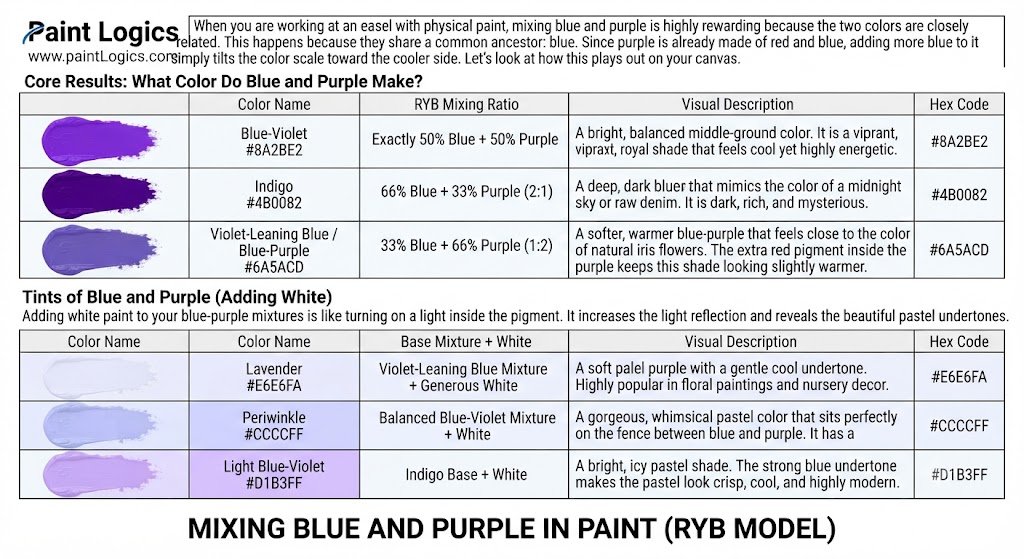
Core Results: What Color Do Blue and Purple Make?
By adjusting how much blue or purple you load onto your brush, you can easily shift between three distinct core colors.
Blue-Violet (#8A2BE2)
Blue-violet is a bright, balanced middle-ground color. This happens when you mix exactly equal parts of a standard blue and a standard purple. It is a vibrant, royal shade that feels cool yet highly energetic.
Indigo (#4B0082)
Indigo is a deep, dark blue-purple that mimics the color of a midnight sky or raw denim. This happens when you lean your mixture heavily toward blue, using a 2:1 ratio of blue to purple. It is dark, rich, and mysterious.
Violet-Leaning Blue / Blue-Purple (#6A5ACD)
This shade is a softer, warmer blue-purple that feels close to the color of natural iris flowers. This happens when you use a 2:1 ratio of purple to blue. The extra red pigment inside the purple keeps this shade looking slightly warmer.
Tints of Blue and Purple (Adding White)
Adding white paint to your blue-purple mixtures is like turning on a light inside the pigment. It increases the light reflection and reveals the beautiful pastel undertones.
Lavender (#E6E6FA)
Lavender is a soft, pale purple with a gentle cool undertone. To make this, take your violet-leaning blue mixture and fold in a generous amount of titanium white. It is highly popular in floral paintings and nursery decor.
Periwinkle (#CCCCFF)
Periwinkle is a gorgeous, whimsical pastel color that sits perfectly on the fence between blue and purple. To mix it, add white to your balanced blue-violet mixture. It has a dreamy, clean feeling.
Light Blue-Violet (#D1B3FF)
This is a bright, icy pastel shade. This happens when you add white to an indigo base. The strong blue undertone makes the pastel look crisp, cool, and highly modern.
Shades of Blue and Purple (Adding Black or Dark Pigments)
If you want to create heavy, atmospheric shadows, you can darken your blue-purple mix.
Deep Indigo (#310062)
Deep indigo is an incredibly rich, near-black violet. To achieve this, mix your indigo paint with a tiny pinprick of carbon black. It feels heavy and looks beautiful for painting deep folds in velvet fabric.
Midnight Violet-Blue (#2E0854)
This is a dark, velvet shade that looks like the sky just before complete blackness. This happens when you add a touch of black to your blue-violet mix. It is warmer than deep indigo but still highly dark.
Blue-Black Violet (#1B1035)
This shade is a cold, stark dark tone. This happens when you mix a heavy amount of dark blue paint with a touch of black and a tiny speck of purple. It is perfect for painting deep water or cold metal shadows.
Practical Pigment Combos for Artists
Not all paint tubes are created equal. The specific pigments you choose will completely alter your mixing results.
Ultramarine Blue + Dioxazine Purple
This is the ultimate combination for creating deep, rich, traditional indigos. Ultramarine blue is a warm blue that naturally leans toward red, making it a perfect match for the highly saturated, dark Dioxazine purple.
Cobalt Blue + Quinacridone Violet
This mix creates incredibly bright, clean, and jewel-like blue-purples. Because Quinacridone violet is highly transparent and vivid, it blends with the clean, neutral Cobalt blue to make luminous violet-blues that look beautiful in watercolor washes.
Phthalo Blue (Green Shade) + Violet
That’s where many beginners get confused. Phthalo Blue has a strong green undertone (yellow bias). When you mix it with purple, the yellow bias inside the blue will slightly neutralize the red in the purple, resulting in a much more muted, smoky, slate-like blue-violet.
Mixing Blue and Purple in Light (RGB Model)
When you design for digital screens, you are mixing light beams instead of physical paint pigments.
This happens because your screen combines colored light wavelengths to project images directly into your eyes. Since screens use an additive system, mixing colors actually makes them brighter, not darker.
Let’s explore the digital side of this cool-toned mix.
Core Results in RGB Mixing
When digital screens combine blue and purple light, the results are incredibly vivid.
Blue-Violet (#8A2BE2)
On a screen, this is a highly saturated, electric color. It is created by setting your blue channel to maximum brightness and adding a strong amount of red light.
Electric Indigo (#6F00FF)
Electric indigo is a piercing, modern digital color. This happens because the red light is kept low while the blue light is pushed to its absolute limit, creating a high-energy violet glow.
Bright Violet-Blue (#7C83FF)
This is a softer, punchier digital shade. It is created by mixing blue and purple light while allowing a small amount of green light to slip into the mix to soften the intensity.
Tints of Blue and Purple in Light (Adding White / Brightness)
In the digital world, “adding white” means turning up the brightness of all three color channels (Red, Green, and Blue) simultaneously.
Lavender Glow (#E6E6FA)
This is a soft, luminous digital pastel. By raising the green channel slightly alongside the high red and blue channels, you get a clean, glowing lavender that is easy on the eyes.
Periwinkle Glow (#CCCCFF)
Periwinkle glow is a highly popular color for modern app interfaces and UI buttons. The balanced red and blue channels are lightened with green to create a clean, friendly pastel blue-violet.
Light Blue-Violet Glow (#D1B3FF)
This is a bright, futuristic neon pastel. It is highly favored in sci-fi designs and digital cyber-punk art styles.
Shades of Blue and Purple in Light (Darkening / Lowering Brightness)
To create dark shades on a digital screen, you simply turn down the intensity (or value) of the light emitters.
Deep Digital Indigo (#310062)
This is a dark, moody background color. It is created by keeping the blue light emitter low and the red emitter even lower, with the green emitter turned completely off.
Midnight RGB Violet-Blue (#2E0854)
A highly luxurious dark purple-blue. It works beautifully as a high-contrast background for white digital text.
Blue-Black Violet RGB (#1B1035)
This is an ultra-dark shade that is just a few steps away from pure black. It is commonly used in “dark mode” settings for modern websites.
Practical Uses of Blue and Purple Mixing in RGB
Graphic designers frequently use blue and purple gradients for tech branding and digital products.
Think of a phone screen displaying a modern banking app or a music streaming platform. These platforms often use a blue-to-purple gradient because it feels premium, secure, and highly modern.
Mixing Blue and Purple in Printing (CMYK Model)
If you are designing a business card, a poster, or a book cover, your digital design must be translated into CMYK inks.
This happens because printing presses lay down tiny dots of cyan, magenta, yellow, and black ink onto white paper. The paper reflects light back to your eyes through these ink layers.
Let’s look at how to get perfect blue-purples in print.
Core Results in CMYK Mixing
Because cyan and magenta are highly pure primary pigments, they combine to make incredibly beautiful, clean purples and blues.
Blue-Violet (#8A2BE2)
To print a gorgeous, classic blue-violet, a printer mixes a high percentage of cyan ink with an almost equal amount of magenta ink.
Indigo (#4B0082)
To get a rich indigo on paper, the printer uses a high percentage of cyan (around 90%) and a moderate amount of magenta (around 60%), with a tiny touch of black ink to deepen the tone.
Violet-Blue (#6A5ACD)
This shade leans warmer on paper. The printer uses slightly more magenta ink than cyan ink to let those warm, reddish undertones pop.
Tints of Blue and Purple in CMYK (Adding White)
In printing, there is no “white ink” in standard CMYK setups. To make a color lighter, the printer simply spaces the ink dots farther apart, allowing the white paper underneath to shine through.
Lavender (#E6E6FA)
Lavender is printed using very low percentages of cyan and magenta ink dots scattered gently across the white page.
Periwinkle (#CCCCFF)
Periwinkle is created by printing a light, even dusting of cyan and magenta dots, keeping the cyan slightly dominant to maintain that cool, blue-leaning pastel look.
Light Blue-Violet (#D1B3FF)
This light, cool violet is highly useful for stationery designs, wrapping paper, and cosmetic packaging.
Shades of Blue and Purple in CMYK (Adding Black)
To darken your printed colors, you must use the “K” in CMYK, which stands for Key (black ink).
Deep Indigo (#310062)
This is printed by combining high percentages of cyan and magenta with a heavy dose (around 40%) of black ink.
Midnight Violet-Blue (#2E0854)
This shade is a luxurious, dark printed violet. The printer keeps the black ink moderate while maximizing the magenta to keep the shadow looking warm and rich.
Blue-Black Violet (#1B1035)
An extremely dark, cold shadow color. The printer uses a high percentage of cyan, a touch of magenta, and a very heavy dose of black ink.
Common Questions About Mixing Blue and Purple in CMYK
Printing purple can be tricky. Here are the answers to the most common print-room headaches.
Does mixing blue and purple make black in print?
No, mixing pure blue and purple inks will not make a true black. It will create a highly saturated, dark indigo. If you want a true black, you must add actual black (K) ink to the mixture.
How do I make indigo in CMYK?
To get a perfect, rich indigo on paper, use the following formula: C: 90%, M: 70%, Y: 0%, K: 30%. The black ink provides the depth, while the cyan and magenta keep the color saturated.
Can I get periwinkle with CMYK inks?
Yes, you can! Use a light formula such as C: 30%, M: 20%, Y: 0%, K: 0%. Keep the yellow and black inks completely out of the mix to ensure the color stays bright and clean.
Why does my purple print look blue?
Common Mistake: If your printed purple looks like a dull blue, you probably have too much yellow ink in your file. Yellow is the complement of purple, so even a tiny 5% of yellow ink will instantly muddy your beautiful purples.
Shades and Variations of Blue and Purple
To help you choose the perfect shade for your next project, let’s look at the entire family of blue-purple variations side-by-side.
Blue-Purple Shade Comparison
| Color Name | Color Family | Hex Code | Best Use Case |
| Electric Indigo | Core Hue | #6F00FF | Tech logos, digital designs, neon UI accents |
| Blue-Violet | Core Hue | #8A2BE2 | High-vibrancy artwork, floral paintings |
| Periwinkle | Light Tint | #CCCCFF | Modern branding, home decor, spring fashion |
| Lavender | Light Tint | #E6E6FA | Calming product packaging, floral designs |
| Deep Indigo | Dark Shade | #310062 | Evening gowns, luxury branding, dark mode web design |
| Midnight Violet-Blue | Dark Shade | #2E0854 | Dramatic interior accent walls, atmospheric shadows |
Real-World Examples of Blue and Purple Mixing
We see this beautiful color harmony all around us in both nature and human culture.
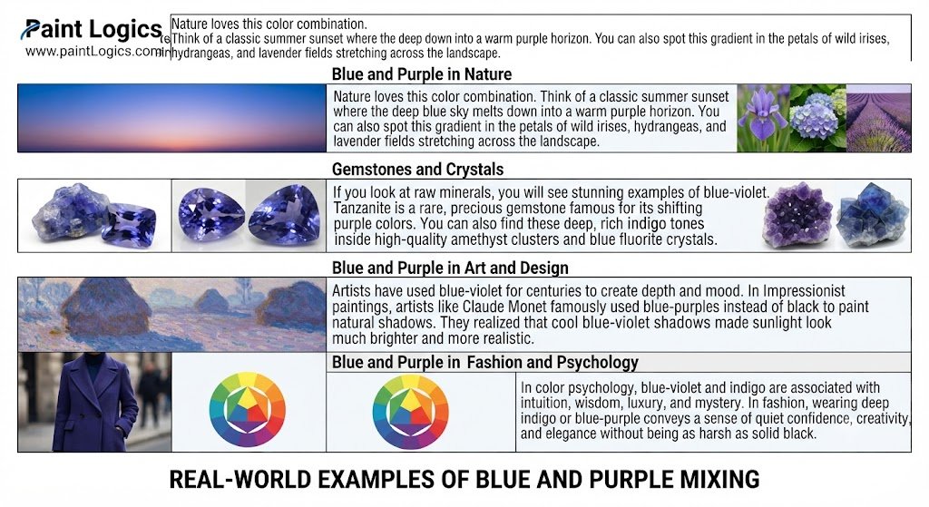
Blue and Purple in Nature
Nature loves this color combination. Think of a classic summer sunset where the deep blue sky melts down into a warm purple horizon. You can also spot this gradient in the petals of wild irises, hydrangeas, and lavender fields stretching across the landscape.
Gemstones and Crystals
If you look at raw minerals, you will see stunning examples of blue-violet. Tanzanite is a rare, precious gemstone famous for its shifting blue-purple colors. You can also find these deep, rich indigo tones inside high-quality amethyst clusters and blue fluorite crystals.
Blue and Purple in Art and Design
Artists have used blue-violet for centuries to create depth and mood. In Impressionist paintings, artists like Claude Monet famously used blue-purples instead of black to paint natural shadows. They realized that cool blue-violet shadows made sunlight look much brighter and more realistic.
Blue and Purple in Fashion and Psychology
In color psychology, blue-violet and indigo are associated with intuition, wisdom, luxury, and mystery. In fashion, wearing deep indigo or blue-purple conveys a sense of quiet confidence, creativity, and elegance without being as harsh as solid black.
Conclusion
So, to answer the main question: mixing blue and purple creates blue-violet or indigo.
Whether you are working with physical paint on a canvas, digital light on a screen, or ink on a printing press, this cool-toned combination is incredibly versatile. By adjusting your color ratios and adding white or black, you can easily shift from soft pastel periwinkle to rich midnight shadows.
Now that you know how these pigments behave, grab your favorite blues and purples and start experimenting on your own palette!
You Might Also Like:
- Purple and White Make What Color? Complete Mixing Guide
- What Color Do Pink and Purple Make? Best Results
FAQs
What color do blue and purple make?
They make a cool tertiary color called blue-violet or indigo. It is a rich, cool-toned color that sits directly between blue and purple on the color wheel.
Does mixing blue and purple make black?
No, mixing blue and purple paint will not make black. It will make a very deep, dark indigo. To make black, you would need to add a complementary color like orange or yellow to neutralize the pigments completely.
How do I make lighter shades of blue and purple?
To make lighter shades (tints) in paint, simply fold in small amounts of white paint to create colors like lavender or periwinkle. Digitally, you increase the brightness values of your red and green channels.
How do I make darker shades of blue and purple?
To make darker shades in paint, add a tiny pinprick of black paint or a deep brown like burnt umber. Be careful not to add too much black too quickly, or you will muddy the vibrant cool tones.
What is the difference between indigo and violet-blue?
Indigo is a darker, deeper shade that leans heavily toward the blue side of the spectrum. Violet-blue is a brighter, slightly warmer shade that contains more red pigment, making it look closer to a rich purple.
Where do we see blue and purple together in real life?
We see this harmony constantly in nature—such as during twilight sunsets, on the petals of pansies and irises, inside tanzanite gemstones, and across stormy evening skies.