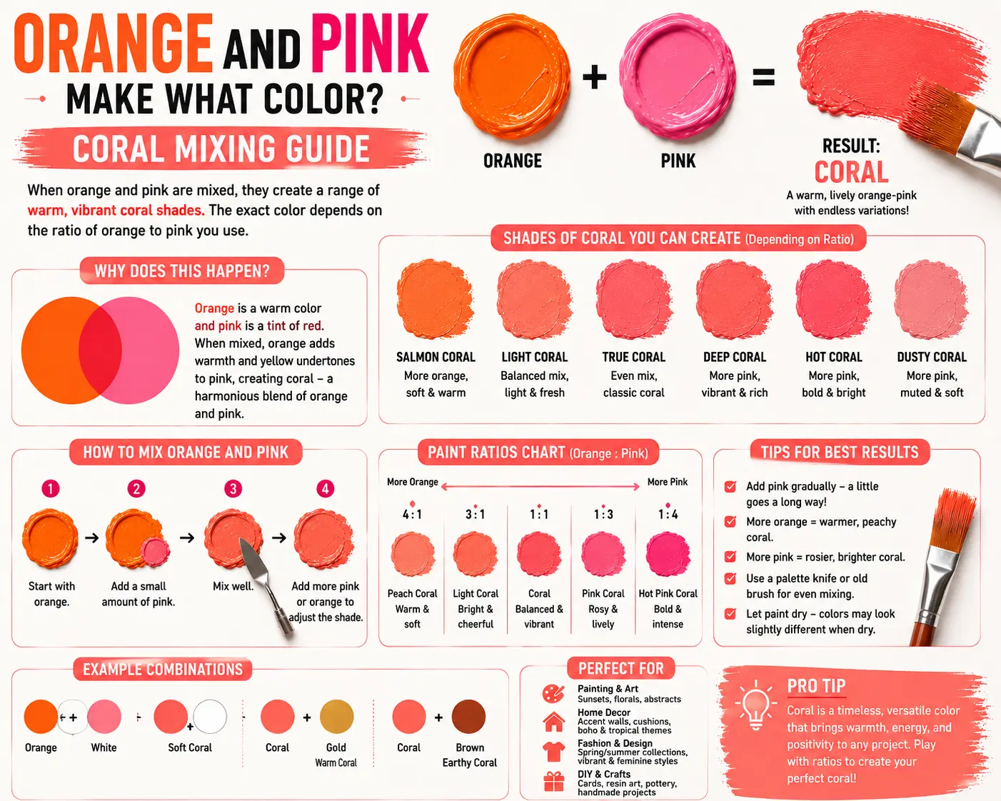
Orange and Pink Make What Color? Coral Mixing Guide
If you’ve ever wondered “orange and pink make what color,” you’re not alone. It’s a question that frequently pops up whether you’re trying to render the perfect warm sunset on canvas, design a trendy brand palette, or figure out how to mix the perfect shade of cosmetics.
The direct answer is simple: when mixed together in physical mediums, orange and pink combine to make a beautiful, warm hue like coral, salmon, or peach.
However, the final result isn’t always identical every time you sweep them together. The exact shade you get depends heavily on the specific undertones of your starting pigments, the opacity of the paint, and the exact mixing ratios you use. Understanding how these high-energy, warm tones interact will completely change how you approach tropical and sunset color schemes. In this guide, you’ll learn the explicit color theory mechanics behind this blend, how to avoid common mixing pitfalls, and how to use these shades effectively across digital and traditional mediums.
Main Takeaway:
Secondary Orange + Tinted Pink = Warm Pastel / Coral (depending entirely on the pigment undertones and mixing proportions used).
Quick Answer: What Color Do Orange and Pink Make When Mixed?
When you combine orange and pink on your mixing tray, you create a radiant, warm-toned color that generally falls into the peach, salmon, or coral color families. Instead of competing against each other, these two colors naturally merge to form a soft, sun-kissed hybrid shade.
Why does this happen? The reason is simple: pink is structurally a tint of red, meaning it’s composed of red pigment mixed with white. Because orange is a secondary color made from red and yellow, pink and orange are close cousins on the color wheel that share a heavy red foundation. When they blend, the white inside the pink automatically softens the intensity of the orange, shifting the mix into a smooth pastel.
Imagine you’re painting a slice of fresh fruit. If you start with a dollop of Cadmium Orange and slowly stir in a tiny bit of bubblegum pink, the sharp neon edge of the orange softens immediately. It transitions away from a bright traffic cone shade and turns into a luscious peach tone that looks instantly natural and inviting.
Why Do Orange and Pink Make This Color?
To get a grip on this blend, you have to look at how light wavelengths interact when these pigments collide. Both colors sit right next to each other on the warm side of the color spectrum, which prevents them from neutralizing each other.
This happens because neither paint contains blue or green wavelengths, which are the traditional culprits that ruin clean mixtures. Since there are no competing cool colors to cause a muddy gray downshift, the red and yellow light waves blend in perfect harmony, while the white base inside the pink handles the lightening duties.
Here’s a good example: if you mix a yellowish Mandarin Orange with a very light pastel pink, the yellow wavelengths dominate the light reflection, instantly giving you a soft, creamy color. Artists use this exact behavior to create transitions in human skin tones or floral petals where the light shifts from a cool highlight into a warm, glowing shadow.
What Happens When You Mix Different Shades of Orange and Pink?
The explicit tubes of paint you pull from your supply box dictate the ultimate outcome of your mixture. Subtle chemical variations in your paints change the vibe completely.
Now let’s look at how different starting variations interact:
- Vibrant Orange + Hot Pink: This intense combination creates a blazing, electrical coral. The high saturation of both paints means the white particles are overwhelmed, leaving a rich, tropical shade.
- Muted Burnt Orange + Dusty Rose: This formula yields a highly sophisticated, earthy salmon or terracotta hue. The built-in brown undertones inside the burnt orange tone down the playfulness of the pink.
- Light Yellow-Orange + Pastel Pink: This blend lands you squarely in a soft, delicate peach cream. It is highly reflective and works perfectly for airy background elements.
What Color Do Orange and Pink Make When Mixed?
Depending on whether you are working with wet fluids on a physical palette or using commercial design printing software, your mixing environment alters the behavior of the color.
What Color Do Orange and Pink Make in Paint?
In physical paint, mixing these two colors always pulls the final hue toward a creamy, desaturated intermediate shade. The white pigment locked inside your pink tube acts as a physical barrier that breaks up the pure saturation of the orange, yielding an organic salmon or coral tone.
Understanding the RYB Color Model
The traditional RYB (Red, Yellow, Blue) model is the standard framework for traditional studio art. In this subtractive system, every drop of paint you add filters out more light waves. Because orange and pink are closely related analogous colors, adding them together creates a smooth, warm transition without any muddy brown surprises.
Understanding the CMYK Color Model
The CMYK model governs commercial printing ink systems. When cyan, magenta, yellow, and black inks are layered on white paper, mixing orange and pink relies on transparent overlays. The printer lays down yellow and magenta dots closely together, creating a beautiful coral tint that looks incredibly clean on product packaging.
Making Peach Lighter or Darker
Once you have created your base mixture, you can easily shift its value to fit the specific needs of your project.
Mixing Tints
If your resulting color looks too heavy or dark for your liking, you can create a lighter tint by folding in a clean titanium white. This spreads the orange and red particles apart, turning a deep salmon into a very soft, light peach.
Mixing Shades
Want to make the color deeper? To mix a darker shade, do not add pure black paint, which will quickly turn the mix gray. Instead, introduce a tiny pinprick of burnt umber or raw sienna to lower the value while preserving the warm, sun-baked identity of the coral.
Read More: Pink and Black Make What Color? Complete Paint Mixing Guide
Common Mistakes When Mixing Pink and Orange
Even experienced creators can make simple formatting or mixing errors when balancing these two dominant hues.
- Using a Pink with Blue Undertones: If you accidentally use a cool, purple-leaning pink like Magenta or Fuchsia, the hidden blue pigments will fight the yellow inside the orange, causing your clean coral to turn into a dull, brownish brick color.
- Overpowering the Mix with Orange: Orange paint has a very high tinting strength. Dumping a massive puddle of orange into a tiny dot of pink will instantly wipe out the pink, forcing you to use massive amounts of white to get back to a true peach.
- Ignoring the Paint Opacity: Mixing a transparent zinc white pink with a highly opaque orange will yield inconsistent coverage on your canvas. Always check the transparency markers on your tubes before starting.
Peach Color Meaning
The resulting shades from this mixture carry a massive subconscious weight that directly influences human emotion.
The reason is simple: peach is the ultimate color of comfort, approachability, and gentle warmth. Because it mimics the natural colors of fresh fruit and soft morning light, it makes people feel instantly safe and nurtured. It completely avoids the aggressive, high-stress energy of pure red or neon orange, making it a favorite for modern wellness brands and calming hospitality interiors.
How to Make Orange and Pink Paint
If you don’t happen to have these pre-made tubes sitting in your art bin, you can easily manufacture your own orange and pink paint from scratch.
First, mix up your orange by combining two parts primary yellow with one part primary red until you have a smooth, rich secondary orange. Next, create your pink by mixing a generous dollop of titanium white with a tiny toothpick tip of primary red. Once both individual piles are mixed cleanly, you can gradually stir them together to hit your target coral shade.
Beginner Tip: Always mix your individual colors completely before blending them together. Mixing raw red, yellow, and white all in one big pile makes it impossible to track which color is throwing off your final hue.
What Color Do Orange and Pink Make in Lights?
When you step away from physical paint and look at electronic lighting systems, the mixing rules flip completely.
Understanding the RGB Color Model
Digital displays operate on the additive RGB (Red, Green, Blue) color model. In this environment, colors are created by projecting light waves directly into your eyes rather than reflecting off a physical canvas.
How Do You Mix Colored Lights?
When you mix orange light with pink light on a screen, you are layering high-powered red light photons with varying amounts of green and blue light. Because you are adding light energy rather than subtracting it, the screen doesn’t soften into a pastel paint color; instead, it turns into a brilliant, glowing, fiery yellow-orange or bright gold.
How Do Our Eyes Perceive Color?
Your eyes process this digital mix through specialized cone receptors tuned to red, green, and blue light frequencies. When the red and green receptors are stimulated at high levels by the overlapping lights, your brain automatically interprets the combined electronic signal as a highly luminous, bright warm tone.
Orange and Pink in Color Theory
Within formal color theory, orange and pink sit directly adjacent to one another, making them an excellent example of an analogous color scheme.
Because they share a massive genetic overlap through the red color family, they create a very smooth, low-contrast visual harmony that is highly pleasing to the eye. They don’t fight for dominance; instead, they naturally support each other, allowing designers to create high-energy color schemes that feel cohesive rather than chaotic.
Digital vs. Traditional: Mixing in RGB & CMYK
Understanding your medium is the only way to avoid frustrating surprises when moving from a computer screen to a physical printout.

To see how these values translate across different platforms, look at this structural color code table:
| Color Name | HEX Code | RGB Value | CMYK Value |
| Classic Peach | #FFCBA4 | (255, 203, 164) | (0%, 20%, 36%, 0%) |
| Soft Salmon | #FA8072 | (250, 128, 114) | (0%, 49%, 54%, 2%) |
| Vibrant Coral | #FF7F50 | (255, 127, 80) | (0%, 50%, 69%, 0%) |
Now compare that with traditional art: a graphic designer can dial in a brilliant, glowing coral hex code on a monitor, but if the commercial printer isn’t calibrated correctly for CMYK inks, the physical brochure will turn out looking like a dull, flat salmon. Always check your color gamuts before finalizing a digital print layout.
How to Adjust the Mix: Add White, Black, or Yellow
You can easily steer the mood of your peach or coral mixture by using small amounts of specific color adjusters.
Here’s how a third variable shifts the entire balance:
- Add White: This lifts the light reflectivity instantly, breaking up the heavy red tones to turn a deep coral into a clean, modern pastel peach.
- Add Black: This acts as a heavy light absorber, pulling the bright tropical mix down into a smoky, sophisticated mahogany or dark plum-khaki shadow.
- Add Yellow: This injects pure warmth, shifting a pink-heavy salmon into a sun-baked, golden apricot shade.
What Does Pink and Orange Make?
When these two colors collide, they enter a mathematical blending process that determines the exact visual dominance of the final color.
Color Mixing Math
If you look at this as a raw formula, you are essentially combining:
$$\text{Orange (Red + Yellow)} + \text{Pink (Red + White)}$$
Because red appears in both parent formulations, the final color is mathematically guaranteed to carry a dominant red-orange base value, while the yellow injects brightness and the white handles the desaturation.
About Salmon Color
Salmon is a distinct, beautiful pinkish-orange shade that mimics the real-life color of fresh seafood. It carries a much stronger, cooler pink bias than a standard peach, making it look highly elegant and traditional.
The Difference Between Salmon vs. Peach
So what’s the difference? It all comes down to the explicit balance of yellow versus pink. Peach is a warm, yellow-dominant pastel that looks soft and creamy, whereas salmon features a much higher concentration of pink and red pigments, giving it a deeper, cooler visual punch.
Peach vs Salmon vs Coral at a Glance
To help you identify these closely related shades instantly, look at this quick comparison matrix:
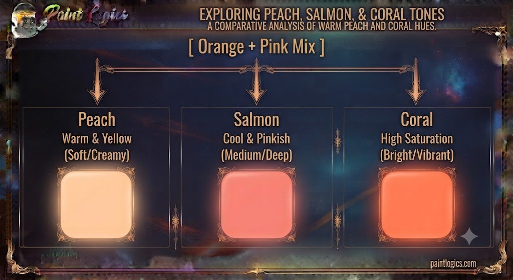
Peach, Salmon, and Coral Color Codes (RGB, HEX, CMYK)
Refer back to our digital code table above whenever you need to hard-code these precise values into your CSS stylesheets or graphic design software to ensure absolute visual consistency across your digital projects.
Red and Orange With Other Colors
Introducing a third foundational color to your warm mixtures completely rewrites the color theory rules.
What Color Do Red and Orange Make?
When you mix red and orange together without any white present, you create a blazing, high-energy tertiary color known as red-orange or vermilion. It looks incredibly fierce, hot, and highly saturated.
What Happens When You Mix Red and Orange With Pink?
Adding pink to a red-orange mix introduces white particles into a highly volatile pool, instantly cooling the flame down and transforming the aggressive color into a rich, deep coral rose.
What Happens When You Mix Orange, Pink, and Blue?
Because blue is the direct complement to orange, adding it introduces a massive desaturation process. This three-part mix cancels out the clean brightness, leaving you with a highly sophisticated, smoky slate-gray or muted plum neutral.
What Color Does Orange, Pink, and Yellow Make?
The yellow supercharges the warmth of the entire system, driving the mix straight into a brilliant, sun-baked apricot or bright tropical gold.
What Color Does Orange, Pink, and Purple Make?
Purple brings a mixture of blue and red light waves into the palette, creating a highly complex, exotic orchid or deep sunset magenta that looks incredibly luxurious.
Do Pink and Orange Go Together?
A common question among interior designers and fashion stylists is whether these two high-energy colors can live together without clashing.
The direct answer is yes; they go together beautifully. While traditional mid-century design rules often warned against mixing pink and orange, modern aesthetics embrace this pairing because it creates a highly joyful, energetic environment that feels incredibly fresh, confident, and summery.
Orange, Pink, and Peach in Art, Design, and Fashion
You can find this stunning, warm-toned color family anchoring premium creative projects across multiple massive global industries.
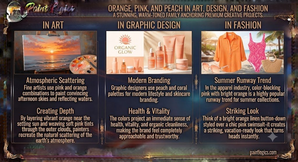
In Art
Fine artists use pink and orange combinations to paint convincing afternoon skies and reflecting waters. By layering vibrant orange near the setting sun and weaving soft pink tints through the outer clouds, painters recreate the natural scattering of the earth’s atmosphere.
In Graphic Design
Graphic designers use peach and coral palettes for modern lifestyle and skincare branding. The colors project an immediate sense of health, vitality, and organic cleanliness, making the brand feel completely approachable and trustworthy.
In Fashion
In the apparel industry, color-blocking hot pink with bright orange is a highly popular runway trend for summer collections. Think of a bright orange linen button-down styled over a chic pink swimsuit—it creates a striking, vacation-ready look that turns heads instantly.
Why This Color Mix Works
The reason is simple: it relies on nature’s most successful color transitions. Because our brains associate these tones with beautiful real-world sights like tropical flowers, fresh fruits, and warm summer horizons, the combination feels inherently satisfying and premium.
Do Pink and Orange Always Make Peach?
No, they do not always make peach. The final color is completely dependent on your mixing ratios and the purity of your starting tubes. If you mix a deep, reddish-orange with a very intense hot pink, you will bypass peach completely and land on a sharp, vivid coral or deep salmon.
What Does Pink and Orange Make, in Summary
To wrap things up, orange and pink make coral, salmon, or peach. Because these two warm hues share a massive red foundation, blending them together simply acts as a natural visual expansion, pulling the intense orange down into a soft, creamy pastel earth tone that radiates warmth and comfort.
Conclusion
So, blue and black make what color? In most cases, they create a deeper, richer shade of blue rather than an entirely new color. Depending on the amount of each color you use, the result can range from navy blue and midnight blue to charcoal blue, slate blue, or a striking blue-black mixture. The exact shade depends on your mixing ratio, the pigments you’re using, and whether you’re working with paint, ink, or digital colors.
The key is to add black gradually. A small amount deepens blue while keeping its vibrancy, but too much black can quickly overpower it and produce a dull, lifeless result. If the mixture becomes darker than you intended, adding a little white or more blue can help restore balance and bring back depth.
Whether you’re painting a landscape, designing a brand identity, decorating a room, or choosing an outfit, understanding how blue and black interact gives you far more control over the final look. Experiment with different ratios, test your colors under various lighting conditions, and don’t be afraid to create your own custom dark blue shades. Often, the most beautiful colors come from small adjustments that make your work feel unique and professionally crafted.
Read More: What Color Do Red and Pink Make? Mixing Guide
Frequently Asked Questions (FAQs)
Do pink and orange always make peach?
No. If your mixture contains more red pigment or an intense hot pink, it will skip peach entirely and create a rich salmon or vibrant coral instead.
Can pink and orange make salmon instead of peach?
Yes, absolutely. Leaning heavier on the pink side of the ratio reduces the yellow influence, snapping the mixture into a true, pink-dominant salmon.
What happens when pink and orange are mixed in CMYK?
The transparent magenta and yellow ink dots overlay on the white paper, creating a clean, professional coral tint that looks exceptional in print media.
What color do pink and orange make in digital design?
On a digital screen using the RGB light model, they project a highly luminous, bright golden-orange light rather than a creamy paint pastel.
Are pink and orange complementary colors?
No, they are analogous colors. They sit directly next to each other on the color wheel, creating a low-contrast, harmonious relationship rather than a high-contrast clash.
Is peach closer to pink or orange?
Classic peach is technically closer to orange because it relies on a strong yellow-orange base that is simply lightened and softened by the white inside the pink.