Brown and Yellow Make What Color? Color Mixing & Uses
If you’ve ever wondered “brown and yellow make what color,” you’re not alone. It’s one of those classic color mixing questions that pops up whether you are trying to paint a realistic autumn landscape, dye a piece of fabric, or mix up the perfect shade of icing for a cake.
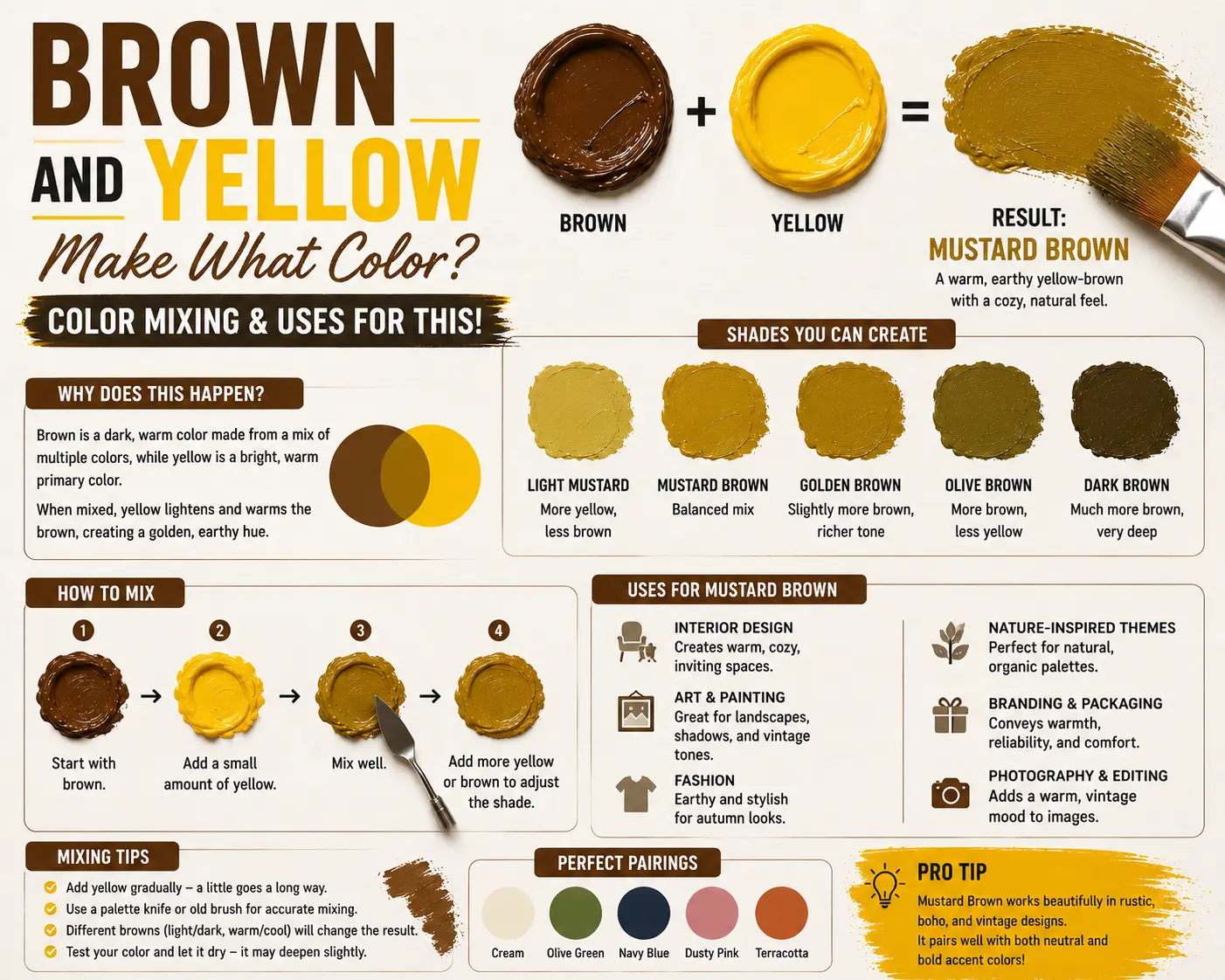
The direct answer is simple: when mixed together in physical paint, brown and yellow combine to make ochre, tan, or a warm, golden camel color.
However, the final result isn’t always identical every single time you mix them. The exact shade you get depends heavily on the specific undertones of the brown base, the warmth of your yellow pigment, and the ratio of each color you use. Understanding how these two warm tones interact will completely change how you approach color mixing in your creative projects. In this guide, you’ll learn the exact science behind this rich color combination, how to blend different shades with pinpoint accuracy, and how to use these earthy tones beautifully in your own designs.
Main Takeaway:
Earthy Brown + Primary Yellow = Warm Ochre / Tan / Camel (depending on the base undertones and mixing proportions).
Quick Answer: What Color Does Brown and Yellow Make?
When you combine brown and yellow in a physical medium like acrylic, oil, or watercolor paint, you generate a rich, warm, and golden earth tone. Instead of looking like a dirty stain, the mixture lifts the heavy darkness of the brown into a glowing, natural neutral.
Why does this happen? The reason is simple: brown is already a composite color, usually made by mixing complementary colors like blue and orange, or red and green. Because yellow is one of the foundational primary colors used to create brown in the first place, adding extra yellow back into a brown base simply alters the balance, boosting its brightness and warmth.
Imagine you’re painting a portrait and need a natural mid-tone for a leather jacket. If you start with a dollop of a dark chocolate brown and slowly fold in a bright cadmium yellow, the deep darkness yields immediately. It shifts into a beautiful, buttery leather shade that mimics real-world textures.
The Science Behind Mixing Brown and Yellow
To truly get a handle on why this color blend behaves the way it does, it helps to examine how light waves and pigment structures interact on your mixing palette.
Subtractive Color Mixing: How Colors Interact
When you are working with physical liquids like paint or ink, you are dealing with subtractive color mixing. Every pigment particle you add into the pool acts as a tiny filter that blocks, or subtracts, certain wavelengths of light from bouncing back to your eyes. Brown paint is a highly absorbent mixture that swallows up a massive portion of the light spectrum, making it look very dark and muted.
When you introduce a bright yellow pigment, you are inserting particles that highly reflect red and green light waves. Because these reflective waves blend into the brown, the heavy darkness gets scattered. This creates a much lighter, warm neutral that your brain interprets as ochre or a golden tan.
Color Theory
According to classic color theory, brown doesn’t actually exist as a unique standalone wavelength on the light spectrum. It is simply a highly desaturated, dark value of orange or red-orange. Because yellow sits directly next to orange on the color wheel, mixing them together is a form of analogous color blending.
The yellow coaxes the dark orange undertones of the brown out into the open. Instead of creating a messy, muddy conflict, the two colors work together in harmony because they share similar warm roots. That’s why the final result retains such a clean, natural, and inviting appearance.
Common Shades Created When Mixing Black and Yellow
By tweaking the amount of paint you use, or altering the specific type of raw pigments, you can pull this mixture into several distinct, beautiful warm neutrals.
Mustard
Mustard is a deep, slightly muted yellow that feels heavy, mature, and deeply grounded. It carries a beautiful vintage aesthetic that works exceptionally well in retro designs.
This color happens because you use a very large amount of bright yellow and add a tiny, microscopic drop of dark brown. Imagine traditional spicy deli mustard or retro velvet armchairs from the mid-20th century.
Olive
Olive is a dark, organic shade of greenish-yellow that carries a distinctly natural, leafy personality. It feels quiet and sophisticated.
This shade occurs if your brown paint contains hidden blue undertones (like a cool Raw Umber). When the yellow meets those faint blue frequencies, it triggers a subtle green shift. Think of fresh green olives or heavy military utility jackets.
Beige
Beige is a soft, highly reflective light neutral that carries a calm, clean, and completely understated energy.
You get this tone when you start with a white base, drop in a generous amount of yellow, and balance it out with a tiny speck of brown. Think of soft sandy beaches, linen clothing, or traditional minimalist stoneware.
Ochre
Ochre is a classic, rich, golden-yellow earth pigment that looks like warm clay. It feels incredibly historic, raw, and artistic.
This color comes forward when you mix equal parts of a standard primary yellow with a warm, reddish-brown like Burnt Sienna. Imagine ancient cave paintings, autumn leaves, or old terracotta tiled roofs baking under the sun.
Khaki
Khaki is a balanced tan-brown with subtle dusty yellow and green undertones. It looks highly practical, functional, and clean.
This happens when you take a medium brown, stir in a moderate splash of yellow, and temper it with a tiny hint of black or white to take away the shine. Think of classic school uniform trousers or rugged outdoor safari gear.
Tan
Tan is a clean, medium-valued brown that feels warm, comforting, and deeply connected to natural materials.
This shade occurs when your mixing ratio leans slightly more toward the brown side, using just enough yellow to brighten the mixture without turning it completely golden. Imagine a smooth leather belt, toasted almonds, or cardboard packaging.
How Ratios Affect the Result
Because brown paint carries a much lower light value than yellow, changing the exact percentages of each pigment will rapidly shift your final color outcome. Keeping an eye on your ratios is vital if you want to reproduce your favorite shades.
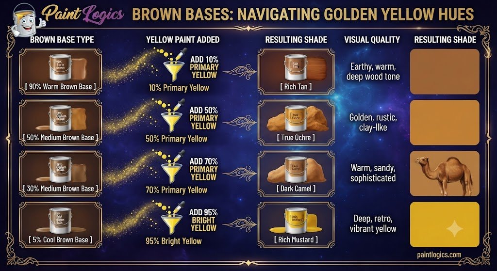
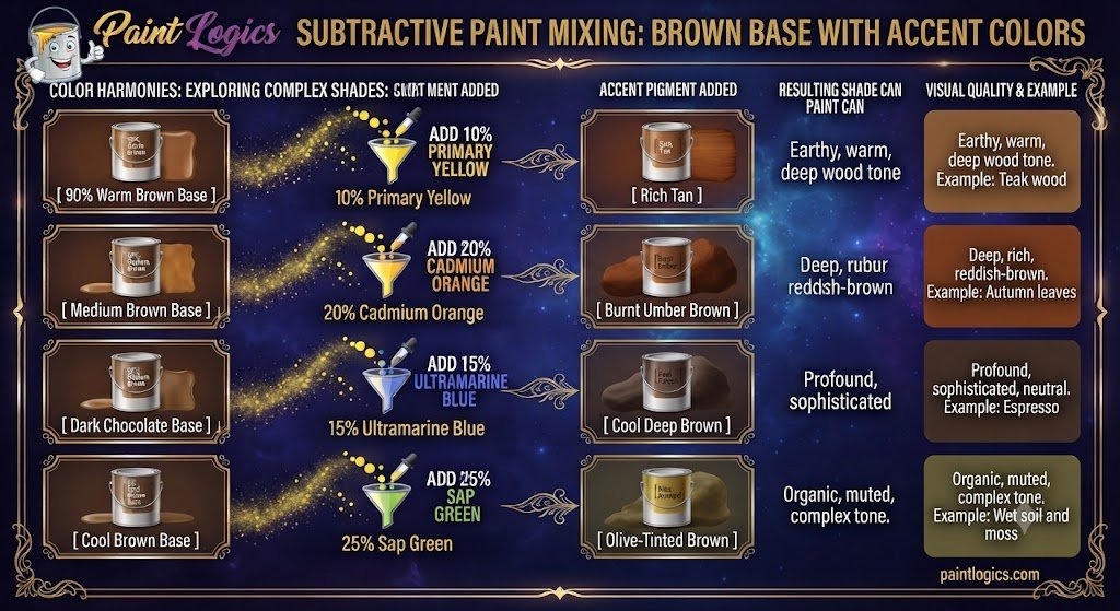
The reason is simple. Yellow has a very low tinting strength, which means it can be easily overwhelmed if you add too much dark paint too quickly. To see how these combinations look across different portions, check out this mixing chart:
| Brown Base Type | Yellow Paint Added | Resulting Shade | Visual Quality |
| 90% Warm Brown | 10% Primary Yellow | Rich Tan | Earthy, warm, deep wood tone |
| 50% Medium Brown | 50% Primary Yellow | True Ochre | Golden, rustic, clay-like |
| 30% Medium Brown | 70% Primary Yellow | Dark Camel | Warm, sandy, sophisticated |
| 5% Cool Brown | 95% Bright Yellow | Rich Mustard | Deep, retro, vibrant yellow |
Brown and Yellow in Paint: RYB Color Model Results
In the traditional Red-Yellow-Blue (RYB) color model used by fine art painters, brown is treated as a low-intensity version of orange or red. When you work inside this system, mixing brown and yellow is classified as an analogous value shift.
Artists frequently use this specific model to blend realistic shadow transitions in their work. For example, if you are painting a golden sunset hitting a wooden barn, you wouldn’t use pure black paint to shade the yellow areas of the wood. Instead, you mix brown directly into the yellow. This keeps the color temperature warm and lifelike, preventing the shadow from looking flat or dirty.
What Happens When Brown and Yellow Are Mixed with Other Colors?
Once you have created your core brown and yellow mixture, dropping in a third pigment color can completely change its temperature and character.
Now let’s look at what happens when you introduce a third color component to your palette:
Brown + Yellow + White = Maroon, Burgundy, or Plum
Note: While mixing pure white into a brown and yellow base typically creates soft shades like camel, tan, or beige, changing the underlying red and purple balances in your brown base can unlock deeper jewel tones.
Introducing white paint directly to your standard mixture lifts the opacity and lightens the value, transforming a heavy clay tone into a soft, highly sophisticated tan or creamy sand color. The white particles spread the dark brown pigments apart, allowing the golden yellow to shine through clearly. Think of cozy cashmere sweaters or interior paint colors used to make a living room feel warm and open.
Brown + Yellow + Blue = Olive or Sage
Dropping a touch of pure blue into your warm mixture triggers a dramatic shift, pulling the entire palette straight into an organic olive or a dusty sage green.
This happens because blue and yellow are the essential components needed to create green. The brown paint acts as a built-in desaturator, instantly dulling the new green down so it looks natural and earthy rather than artificial. It’s the perfect recipe for painting mossy rocks or pine needles.
Brown + Yellow + Green = Earthy Tones
Adding an explicit green pigment into your active pool creates a rich variety of natural earthy tones that mimic a dense forest floor.
The green amplifies the cool side of the spectrum, while the brown and yellow keep the overall color feeling deeply connected to wood and soil. Landscape designers and artists use this combination constantly to build believability in natural environments.
Brown + Yellow + Red = Burnt Orange or Ochre
Tossing a vibrant red into your active mixture supercharges the warmth, turning your golden neutral into a fiery burnt orange or deep russet red.
The red reinforces the hidden orange foundations of the brown paint, creating a high-energy autumnal tone. Imagine dried spice racks, cayenne pepper, or clay pottery.
Brown + Yellow + Black = Dark Mustard or Deep Olive
If you add a tiny sliver of pure black to your brown and yellow base, you will rapidly lower its reflectivity, creating a heavy dark mustard or swampy charcoal-green.
The black paint swallows up the remaining light energy, making the color look highly intense and industrial. This is an excellent choice for creating deep, dramatic shadows on textured surfaces.
Brown + Yellow + Purple = Rustic Plum or Earthy Mauve
Introducing purple acts as a direct color complement to the yellow, neutralizing its brightness and shifting the mix into a quiet rustic plum or muted mauve.
Because purple and yellow cancel each other out on the color wheel, they create a highly complex, sophisticated neutral shadow that looks beautiful in textile designs and evening wear.
Common Mistakes When Mixing Brown and Yellow
Even though these two colors naturally work well together, it is still quite easy to make a mess if you don’t watch your workflow steps.
Adding Too Much Yellow
If you have a large pool of dark brown paint and try to lighten it by dumping yellow straight into it, you will waste an enormous amount of paint before you see a noticeable change.
How to avoid it: Always establish your light yellow paint as your main base pile first, then pull a tiny corner of brown into it to darken it slowly.
Not Testing the Mix
Acrylic paints always dry a full shade darker than they look when they are wet, glossy, and fresh on your palette. If you apply the paint immediately to your project, your golden ochre might turn into a dark, heavy tan once it fully cures.
How to avoid it: Keep a scrap piece of white paper next to your station to brush a quick test patch and let it dry before committing to your canvas.
Ignoring Lighting Conditions
Mixing warm tones under a cheap, yellow-tinted incandescent light bulb will hide the true values of your color, making it look much warmer and brighter than it actually is.
How to avoid it: Mix your paint colors near a natural window or install a color-corrected daylight bulb (around 5000K) over your workspace to see the unskewed hue transitions.
Tips for Mixing Brown and Yellow in Paint
To ensure your mixtures remain clean, intentional, and perfectly balanced, use these quick practical rules:
- Start Slowly: Always treat your dark brown paint like a highly concentrated dye. Add it to your yellow base in microscopic increments using the absolute corner of your palette knife.
- Test on a White Surface: Never mix your colors on a dark gray or brown mixing board. A crisp white palette is the only way to see the true undertones of your ochre or tan as they develop.
- Use High-Quality Paints: Cheap student paints are packed with chalky chemical fillers that quickly turn your mixture into a flat, dead gray soup. Investing in professional artist-grade paint ensures your colors stay luminous and rich.
- Add White for Softer Tones: If your golden tan looks a bit too intense or aggressive, introduce a tiny pinprick of titanium white. This lifts the opacity and softens the color into a gentle, creamy camel shade.
How to Use Brown and Yellow Together in Design
This classic earth-toned combination is heavily relied upon across multiple creative industries to build environments that feel timeless, comfortable, and sophisticated.
Interior Design
Interior designers treat brown, yellow, and tan as the ultimate grounding toolkit for cozy living spaces. Using a deep chocolate brown for leather furniture or wooden beams provides a solid, structured anchor for a room. Designers then bring in golden yellow accents—like mustard throw pillows, ochre rugs, or brass light fixtures—to bounce light around the space and keep the room from feeling dark or claustrophobic.
Fashion
In the fashion world, these tones form the absolute backbone of classic autumn and winter wardrobes. Think of a high-end camel wool coat paired with a rich dark brown leather boot and a warm ochre scarf. This palette is universally loved in apparel design because it looks expensive, coordinates effortlessly with classic blue denim, and carries a natural warmth that looks flattering on almost every skin tone.
Branding and Logos
Many heritage brands, outdoor companies, and organic food businesses use a brown and yellow color scheme for their logos. Brown communicates reliability, history, and honesty, while a touch of golden yellow injects energy, friendliness, and optimism. It’s a spectacular way to make a company feel trustworthy and approachable right at first glance.
Conclusion
To wrap things up, brown and yellow make ochre, tan, or camel. Because brown is structurally just a dark, desaturated version of orange, adding yellow acts as a natural harmonic lift, pulling the dark base out of the shadows and turning it into a beautiful, glowing earth tone.
The secret to mastering this warm pairing is simple: always start with your bright yellow paint as your main base pile, introduce your dark brown pigment in tiny, controlled steps, and pay close attention to whether your brown carries cool or warm undertones. Whether you are illustrating a scenic autumn forest, picking out a sophisticated new color scheme for your living room, or building a timeless brand logo, utilizing this organic mixture adds instant warmth, depth, and comfort to your creative work.
Read More Guide’s
#1 What Color Does Brown and Purple Make When Mixed? Complete Guide
#2 Brown and Pink Make What Color? Mixing Guide with Swatches
FAQs
What color do brown and yellow make when mixed?
They combine to create a warm earth tone like ochre, tan, or a golden camel color, depending entirely on your mixing proportions.
Does brown and yellow make what color in hair?
In hair color, blending brown and yellow tones results in a warm golden brown, honey blonde, or a rich amber shade, depending on how dark the starting brown base is.
What happens when you add white to brown and yellow?
Adding white paint lifts the darkness and softens the mixture, transforming a intense clay ochre into a beautiful, creamy camel or soft sand color.
Can brown and yellow be used in interior design?
Yes, exceptionally well! They create a comforting, grounding, and organic atmosphere that makes living rooms and kitchens feel incredibly inviting.
How does brown and yellow work in fashion?
They are staple colors for autumnal style, used in premium leather goods, cozy knitwear, and classic wool trench coats that look timeless and sophisticated.
What happens when you mix brown, yellow, and blue?
They combine to create a beautiful, muted olive green or a dusty sage tone that perfectly mimics natural wilderness colors.
Can brown and yellow be used for branding?
Absolutely. Companies use this pairing to project an image of heritage, sustainability, outdoor ruggedness, and trustworthy warmth.
What color does brown and yellow make when mixed with red?
They shift into a beautiful, fiery burnt orange or a deep, rich autumnal amber.
How do brown and yellow work in art?
Artists use them as analogous warm tones to paint realistic highlights on wood, autumn leaves, and to create lifelike skin tones in portraiture.
Can I use brown and yellow together for a vintage look?
Yes, this specific color palette was highly popular in 1970s design, making it the perfect choice for creating a retro, nostalgic aesthetic.
What happens when brown, yellow, and black are mixed?
The black lowers the light reflection dramatically, turning the mix into a dark, moody mustard or a deep, swampy khaki shade.
How can I use brown and yellow for a natural look in design?
Keep your ratios balanced by using soft tan as your main background color, dark brown for structural elements, and warm ochre purely for small accent highlights.