What Color Does Brown and Purple Make When Mixed? Complete Guide
If you’ve ever wondered ‘brown and purple make what color,’ you’re not alone. It’s an unusual combination that leaves many artists, decorators, and clothing designers scratching their heads before they start blending pigments.
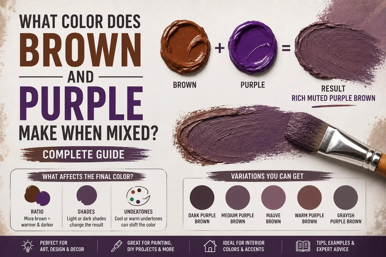
The direct answer is simple: brown and purple make a dark, earthy berry tone, usually referred to as a plum brown or a deep, desaturated burgundy.
However, the final result isn’t always identical. The exact shade you get depends entirely on the original warmth of your brown and whether your purple leans toward blue or red. You could end up with a rich chocolate raisin color, a dusty mauve, or a deeply shadowed eggplant. Understanding how these two complex pigments interact will completely change how you use them in your creative projects.
Main Takeaway:
Earthy Brown + Base Purple = Plum Brown / Muted Dark Purple (depending on the mixing ratio and the undertone of each component).
Quick Answer: What Color Do Brown and Purple Make?
When you mix brown and purple together, you create a desaturated, darker version of purple with a strong, comforting earthiness. In color theory, combining an earthy secondary or tertiary tone with a secondary color lowers the overall brightness, pulling the hue toward a natural shadow tone.
Why does this happen? Brown is essentially a mixture of all three primary colors (red, yellow, and blue), with a heavy bias toward yellow and red. Purple consists of red and blue. When they collide, the yellow inside the brown acts as a direct complementary dampener to the purple, instantly muting its vivid brilliance.
If you introduce a tiny drop of burnt umber to a bright violet, it softens into a velvety plum brown. If you keep adding more brown, the purple qualities slowly recede, leaving you with a rich, complex dark brown that carries a beautiful wine-colored undertone. The shift happens smoothly, giving you excellent control over the gradient.
The Science Behind Mixing Brown and Purple
Color behaves quite differently depending on whether you are working with physical liquids or digital light waves. This happens because physical paint and digital pixels handle light reflections in opposite ways.
Subtractive Color Mixing (Paint & Pigments)
When working with acrylics, oils, or household paint, you’re using subtractive color mixing. Physical pigments reflect certain light wavelengths into your eyes while soaking up the rest. Purple looks purple because it reflects red and blue wavelengths while absorbing yellow.
When you mix in brown, you are adding an earth pigment that contains heavy amounts of yellow oxide. Because yellow and purple sit opposite each other on the traditional color wheel, they work to neutralize one another. The yellow dampens the violet’s energy, which is why the mixture quickly drops into a quiet, organic muted purple shade.
Additive Color Mixing (Digital / Light)
Digital displays rely on additive color mixing, where red, green, and blue (RGB) light beams blend to build colors. On your computer screen, black is the absence of light, while gray and brown are created by reducing the brightness percentages of primary colors.
If you want to create a plum brown digitally, you don’t actually add an earthy brown light to a violet light. Instead, you raise your red light channel significantly, keep your blue channel at a medium level, and introduce a small amount of green light to desaturate the mix. For example, a balanced digital plum brown looks like RGB value (110, 60, 90).
Common Shades Created When Mixing Brown and Purple
Varying your proportions or choosing a different base paint yields distinct, beautiful results. Here are the most common colors you can create with this combination.
1. Plum Brown
Plum brown is a rich, warm hue that mimics the skin of dark autumn fruits. It balances the stability of earth tones with the luxury of purple.
This color happens because a warm chocolate brown is mixed with a red-leaning purple. Think of an antique leather armchair or a heavy woolen winter coat.
Quick Tip: If you want a clean plum brown, look for a brown paint like Burnt Sienna, which has a natural reddish warmth built right into the pigment.
2. Dusty Mauve
Dusty mauve is a soft, chalky pastel shade that looks highly vintage, calming, and understated. It rests comfortably on the lighter side of the earth-tone spectrum.
This shade occurs when you take a light tan or raw umber, mix it with a splash of purple, and lift the entire blend with white paint. Imagine dried flower petals or weathered stone pathways. Interior designers frequently use this shade in bedrooms to create a relaxed, stress-free sanctuary.
3. Burgundy Brown
Burgundy brown is a deep, velvety shade that carries immense warmth and luxury. It looks highly sophisticated and classic.
This tone comes forward when you mix a dark chocolate brown with a heavy dose of magenta or cadmium red-violet. Think of a glass of aged Merlot wine held up to the light. It is an incredibly popular color choice for autumn cosmetics, such as lipsticks and nail polishes.
4. Eggplant Brown
Eggplant brown is a dark, heavy shade with a distinctly cool, industrial undertone. It carries an aura of mystery and weight.
This look happens because you mix a dark, neutral brown with a blue-heavy violet or indigo. Imagine the deep shadows on a fresh eggplant at the grocery store. Artists use this blend to paint realistic landscape shadows because it feels much deeper and more natural than standard black paint.
5. Violet Brown
Violet brown is a balanced mid-tone color where the purple identity remains clearly visible despite the heavy presence of earth tones. It feels creative yet grounded.
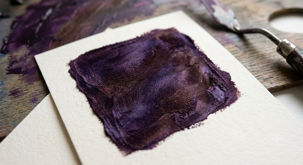
This unique color comes from mixing equal parts primary purple and a cool, gray-leaning brown like Raw Umber. Think of the natural variations found in tropical hardwood timber or semi-precious stones. It works beautifully as a transition color in abstract illustrations.
6. Muted Lavender
Muted lavender is a hazy, desaturated pale violet that feels peaceful, gentle, and quiet. It sits on the border of the neutral color family.
This happens because you take a large amount of a light, sandy brown and drop in just a tiny splash of violet. The brown strips away the child-like brightness of the purple, leaving you with a mature, stony pastel. It’s a favorite choice for modern hotel lobbies and minimalist spa packaging.
7. Dusky Plum
Dusky plum carries a heavy, moody atmosphere that feels completely organic. It leans darker and more gray than a standard fruit-toned plum.
This shade occurs when your base brown is dark and cool, and it is mixed with a medium violet pigment. Imagine the color of heavy clouds hanging over an autumn vineyard at dusk. Fine artists use this combination to block in background hills because it naturally pushes elements back in space.
8. Mocha Purple
Mocha purple is a delicious, warm brown that features just a whisper of a purple or berry-tinted glow. It is highly comforting and rich.
This color occurs when you use a heavy base of dark mocha brown and stir in a tiny drop of violet paint. The purple acts as a secret ingredient, giving the brown a unique complexity that stops it from looking flat or muddy on a large surface.
Shades of Brown and Purple
To make your mixing process simpler, it helps to see how altering the ratios between these two paints completely shifts the final name and appearance of the color.
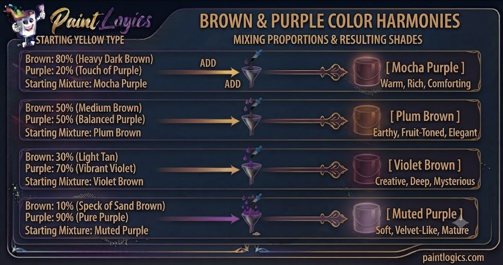
Now let’s look at this visual breakdown table:
| Brown Proportions | Purple Proportions | Resulting Shade | Color Personality |
| 80% (Heavy Dark Brown) | 20% (Touch of Purple) | Mocha Purple | Warm, Rich, Comforting |
| 50% (Medium Brown) | 50% (Balanced Purple) | Plum Brown | Earthy, Fruit-Toned, Elegant |
| 30% (Light Tan) | 70% (Vibrant Violet) | Violet Brown | Creative, Deep, Mysterious |
| 10% (Speck of Sand Brown) | 90% (Pure Purple) | Muted Purple | Soft, Velvet-Like, Mature |
What Happens When You Mix Brown and Purple with Other Colors?
Once you have your basic brown and purple mixture, tossing a third color into your palette will completely shift the emotional weight of the color.
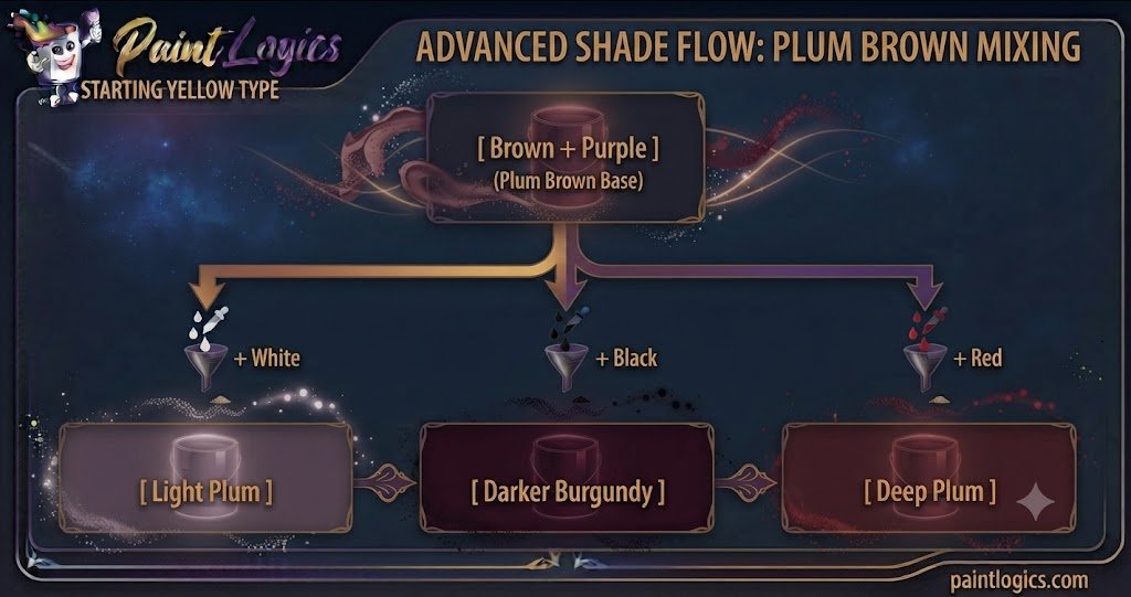
1. Brown + Purple + White = Light Plum
Adding pure white to your plum brown mix lifts the value and creates a light plum or dusty rose tone. Instead of looking like a bright candy pink, it stays incredibly soft, chalky, and mature.
The white cuts through the heavy darkness of the brown while keeping the rich, desaturated character intact. This is an excellent choice for painting soft light reflections on fabric.
2. Brown + Purple + Black = Darker Burgundy
If your mixture feels a bit too vibrant, adding a drop of pure black will instantly drop its value down into a heavy darker burgundy or deep espresso raisin tone.
The black absorbs almost all light reflections, turning the soft berry tones into a dramatic, high-contrast shadow shade. Imagine a piece of dark mahogany wood or luxury leather boots.
3. Brown + Purple + Red = Deep Plum
When you drop red into the mix, the temperature rises immediately. The color moves away from an earthy brown and transforms into a deep plum or rich crimson berry tone.
The red emphasizes the warmth inside the mixture, while the brown keeps it grounded and expensive-looking. Think of luxurious silk drapes in a high-end restaurant.
4. Brown + Purple + Yellow = Muted Olive
Tossing yellow into your brown-purple base will quickly dull the violet tones, shifting the entire mixture into a deep, earthy muted olive or dark khaki color.
This happens because yellow is purple’s direct opposite on the color wheel. The addition forces the paint to cancel out its own colorfulness, leaving you with a highly realistic forest tone.
5. Brown + Purple + Blue = Dark Violet
Adding blue to your plum brown mixture drops the temperature instantly, pulling the color away from a red wine tone and converting it into a cold dark violet.
The blue stretches the physical depth of the paint, making it look cool, oceanic, and moody. This combination is highly effective for painting heavy winter coats or shadowy mountain ridges.
6. Brown + Purple + Green = Earthy Taupe
Green and purple are complex opposites. When you mix them alongside brown, they break down into a beautiful, smoky earthy taupe or weathered stone tone.
The green fights the red components inside the plum base, resulting in a dark, atmospheric neutral that works perfectly for rendering tree bark or rugged rocks.
7. Brown + Purple + Pink = Mauve Brown
If you introduce a soft pink to your brown-purple base, you will create a stunning mauve brown or dusty desert rose color.
The white and red pigments hidden inside the pink soften the heavy qualities of the earth tones, leaving you with a vintage color that feels highly nostalgic.
8. Brown + Purple + Gray = Dusty Lavender
Adding standard gray to your mixture creates a beautiful dusty lavender that is incredibly easy on the eyes and structurally stable.
The gray reduces the saturation without making the color lighter or darker than it already is, which makes it an exceptional choice for background textures in graphic design layouts.
Using Brown and Purple in Design
Brown and purple are a classic, high-contrast color pairing found all over luxury products and premium interior spaces.
Fashion
In the wardrobe world, pairing brown and purple is a foolproof way to look effortlessly polished during the autumn and winter months. Think of a chocolate brown leather jacket worn over a deep plum knit sweater. The earthiness of the leather tethers the colorful purple, creating an ensemble that feels mature, cozy, and highly deliberate.
Interior Design
Interior designers use this combination to introduce mood, wealth, and warmth into an executive office or a principal bedroom. A room featuring dark mocha wood floors, a plum brown accent wall, and brass light fixtures feels incredibly grounded and secure.
Another thing worth knowing is that these tones naturally absorb harsh light, making bright rooms feel instantly cozier.
Branding & Packaging
Look around and you’ll spot this combination heavily in artisan coffee shops, high-end chocolate packaging, and premium organic cosmetic lines. Brown signals organic authenticity, reliability, and earthiness, while purple communicates creativity, luxury, and premium quality. Together, they tell consumers that a product is hand-crafted and worth a premium price.
Tips for Mixing Brown and Purple in Paint or Digital Art
If you’re ready to start mixing your own custom earth shades, keep these practical tips in mind to get the cleanest results.
- Start Small: Always add your purple paint to your brown paint in small increments. Brown is a highly dominant earth pigment, but a heavy violet can swamp a light tan quickly if you aren’t paying attention.
- Adjust with White or Black: If your mix looks too dark or muddy, don’t try to save it by dumping in cups of pure purple paint. Instead, use a tiny speck of white or a bright magenta to lift the color back into a readable zone.
- Test Under Different Lighting Conditions: A deep plum brown might look beautifully purple under warm studio bulbs but turn entirely black when placed in a dim hallway. Always test your dried swatch where it will actually live.
- Use High-Quality Materials: Cheap student paints contain heavy chalky fillers that turn muddy or gray when mixed. Investing in artist-grade paints with single-pigment listings ensures your dark berry tones stay rich and clean.
Real‑Life Examples of Brown and Purple in Design, Art & Fashion
Seeing how these colors function in daily life can give you instant inspiration for your next project.
Fashion
Think of a classic winter look: a deep violet wool scarf styled over a tailored camel or dark brown trench coat. The vibrant purple scarf adds a splash of creative energy to the outfit without clashing against the neutral brown coat.
Interior Design
Imagine a contemporary master bathroom featuring dark espresso wood cabinetry, light gray marble tiles, and deep plum bath towels and rugs. The purple towels prevent the wood and marble from feeling too cold or institutional, adding a layer of hotel-like luxury.
Art & Illustration
Consider fantasy illustrators painting ancient enchanted forests at sunset. They rarely use straight black for tree trunks or shadows. Instead, they layer rich chocolate browns, plum browns, and dark violets to give the forest a magical, living texture.
Common Mistakes to Avoid When Mixing Brown and Purple
Mixing these two dark tones is straightforward, but it’s incredibly easy to end up with a dull, muddy mess if you aren’t careful.
1. Too Much Purple
This is the most common blunder. Because purple can carry heavy blue undertones, dropping a massive dollop of violet into a light brown can cause the warm earth qualities to vanish into a cold gray color instantly.
How to avoid it: Treat your purple paint like a potent ingredient. Mix it into your brown paint bit by bit until you hit your sweet spot.
2. Not Testing the Mix
Acrylic and oil paints shift character as they dry. Acrylics, in particular, always dry a full shade darker than they look when they are wet on your palette.
How to avoid it: Paint a quick test stroke on a scrap piece of paper and let it dry completely under your room’s natural light before painting your main surface.
3. Forgetting Undertones
Not all brown paints are made the same way. Raw umber has a cool, green undertone, while burnt sienna carries a warm red bias. If you mix a green-toned brown with purple, you will end up with an accidental gray-mud color instead of a rich wine shade.
How to avoid it: Smear a paper-thin layer of your brown paint on white paper to inspect its true undertone hiding beneath the surface before you mix.
4. Ignoring Proportions
If you don’t track your mixing amounts, you will never be able to recreate that exact beautiful shade of plum brown if you run out halfway through your canvas or accent wall.
How to avoid it: Use precise parts, drops, or a measuring spoon to note down your recipe so you can duplicate the color flawlessly down the road.
Conclusion
To wrap things up, brown and purple make a plum brown or a desaturated dark purple. Depending on your mixing choices, that combination can transform into an elegant burgundy brown, a mysterious eggplant brown, or a soft, vintage dusty mauve.
The whole secret to mastering this color pairing lies entirely in managing your proportions and respecting your base undertones. Treat brown as a grounding anchor to soften your color, add your purple slowly, and always test your results. Whether you are assembling a fresh autumn outfit, painting a twilight canvas, or redecorating a cozy room, utilizing this organic pair adds instant maturity and wealth to your work.
Love To Read More
#1 Red and Blue Make What Color? The Ultimate Color Mixing Guide
#2 What Color Does Yellow and Gray Make When Mixed? Complete Guide
FAQs
What color do brown and purple make when mixed?
They combine to make a dark, earthy berry color known as plum brown, mocha purple, or dark desaturated burgundy.
Can brown and purple make a neutral color?
Yes. If you mix a heavy amount of a cool brown like raw umber with a tiny touch of purple, the color tones down into a sophisticated, slate-like dark taupe neutral.
What shade of purple works best with brown?
Warm purples that contain a strong red undertone, such as magenta, plum, or red-violet, blend beautifully with brown to create rich, expensive-looking wine shades.
How do I make brown and purple mix more vibrant?
Brown naturally breaks down vibrancy. To keep the mix as bright as possible, use a pure primary purple base and a warm, golden tan brown, while avoiding any extra black or green paint.
Does mixing brown and purple result in a dark color?
Yes, absolutely. Both brown and purple are naturally low in value, meaning they absorb a high amount of light waves and will always create a deep, shadowy color when joined.
Can I lighten the brown and purple mix?
Yes, you can. Adding a small splash of white paint will break up the heavy weight of the pigments, turning the dark mix into a soft, vintage dusty mauve or light plum tint.
How can I make the brown and purple mix more neutral?
To push the color closer to a true gray or brown neutral, introduce a tiny drop of yellow or green paint. This cancels out the colorful purple characteristics completely.
What color do I get if I mix brown, purple, and white?
You will create a gorgeous dusty rose or light mauve color. The white lifts the heavy darkness while preserving the sophisticated, quiet nature of the earth tones.
What happens if I mix brown and purple with yellow?
Because yellow is purple’s direct complement on the color wheel, adding yellow will strip away the purple identity, turning the mixture into a rich, deep muted olive green or khaki.
Is brown and purple a good combination for interior design?
Yes, it is highly favored for creating luxurious, intimate spaces. Pairing dark wood furniture with plum or eggplant textiles creates a grounded, upscale atmosphere perfect for libraries or bedrooms.
What color do brown and purple make when mixed digitally?
On a computer screen, they combine to make a rich plum brown or deep violet-gray tone. This is achieved by balancing high red values with medium blue and low green values in the RGB system.
Can brown and purple work well in fashion?
Absolutely. A perfect real-life example is wearing a cozy plum knit scarf over a classic chocolate brown trench coat for a stylish, sophisticated autumn look.