Red and Blue Make What Color? The Ultimate Color Mixing Guide
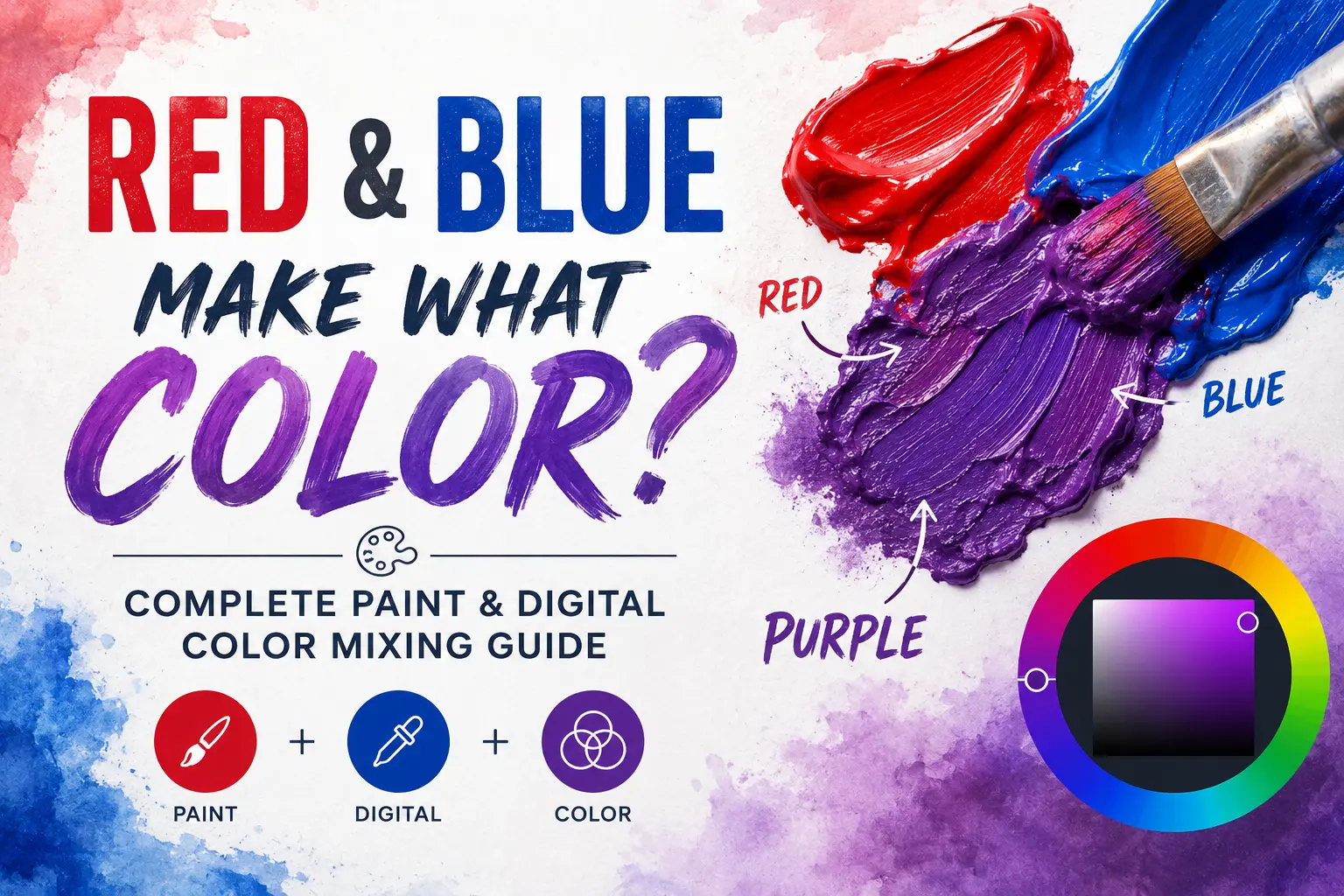
If you’ve ever wondered “red and blue make what color,” you’re not alone. The short answer is that red and blue make purple.
But as anyone who has ever picked up a paintbrush knows, the actual result isn’t always that simple. Sometimes you end up with a gorgeous, vibrant violet, and other times you get a dull, muddy brown that looks like sludge. The final shade depends entirely on the medium you’re using, the light in the room, and the specific pigments you choose to mix.
In this guide, you’ll learn exactly how to control your color mixing to get the exact shade of purple you want every single time. We will break down the science of light versus paint, explore different mixing ratios, and troubleshoot why your colors might not be turning out the way you planned.
Main Takeaway:
Red (Primary) + Blue (Primary) = Purple (Secondary), depending on the ratio, the underlying color bias, and whether you are mixing paint or light.
Now let’s look at how these colors interact on a fundamental level.
Understanding Red and Blue as Primary Colors
Red and blue are traditionally known as primary colors. In the standard color wheel most of us learned about in school, primary colors are the building blocks of all other shades. You cannot create them by mixing other colors together, but you can combine them to build an entire spectrum.
Why does this happen? The reason is simple. Your eyes perceive specific wavelengths of light, and our traditional color systems categorize red, blue, and yellow as the foundational hues for physical mediums. When you mix two primaries together, you create a secondary color.
To do this successfully, you just need to combine equal parts of each color on your palette. For example, when you blend a standard primary red with a standard primary blue, the two wavelengths work together to form a brand-new secondary color: purple.
Quick Tip: While red and blue are primaries in art class, modern printing and digital screens use different foundational colors. Keep this in mind as we explore how mediums change your results.
Let’s see how this plays out in the real world when you’re working with physical materials.
What Color Do You Get When Mixing Red and Blue Paint?
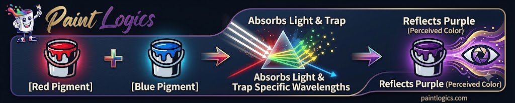
When you physically mix red and blue paint, you enter the world of subtractive color mixing. This means the pigments absorb certain wavelengths of light and reflect back the colors you see. The exact shade of purple you get depends entirely on how much of each color you put into the mix.
Example 1: Equal Mix of Red and Blue to make Medium purple (1:1)
When you combine a perfect 1:1 ratio of red and blue, you get a classic, balanced medium purple. This happens because neither color overpowers the other, allowing the warm tones of the red and the cool tones of the blue to meet right in the middle. Think of the classic purple grape or a standard violet crayon.
Example 2: More Red than Blue to make Reddish purple or magenta (2:1)
What if you use more red? Pushing the ratio to two parts red and one part blue shifts the temperature of your mixture. The dominant red pigments warm up the blend, resulting in a rich reddish-purple, plum, or magenta. You see this exact mix in nature when looking at orchids or ripe raspberries.
Example 3: More Blue than Red to make Bluish purple or violet (1:2)
If you tip the scales the other way and use more blue than red, the color cools down dramatically. This 1:2 ratio creates a deep bluish-purple or violet. It’s a regal, cool shade that mimics the night sky just after sunset or the petals of an indigo flower.
Common Real-Life Example for mixing Red and Blue:
Imagine you’re painting a sunset canvas. You’ll naturally blend a streak of blue sky directly into a streak of red sun glare to create those beautiful, glowing purple clouds in the transition zone.
Now that you know how the ratios change the hue, let’s look at a visual breakdown of these mixtures.
Red and Blue Make What Color When Mixed? See the Full Mixing Chart of Color Swatches
To make your mixing process easier, it helps to see how different ratios create completely different visual results. The chart below breaks down exactly what color does red and blue make depending on your measurements.
| Red Ratio | Blue Ratio | Resulting Color | Color Description | Common Example |
| 2 Parts | 1 Part | Reddish Purple / Magenta | Warm, vibrant, berry-toned purple | Raspberry, Orchid petals |
| 1 Part | 1 Part | Medium Purple | Balanced, classic secondary purple | Amethyst, Grape |
| 1 Part | 2 Parts | Bluish Purple / Violet | Cool, deep, royal purple tones | Indigo, Lavender fields |
Another thing worth knowing is that these rules completely change when you step away from physical paint and look at a screen. Let’s look at how light behaves differently.
What Color Does Red and Blue Light Make? (Additive Mixing (RGB) Explained)
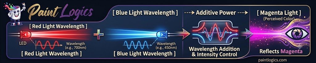
When you look at a digital screen, red and blue mixed together do not make a dark, traditional purple. Instead, they create a bright, vibrant color called magenta.
Additive Mixing: How It Works
This happens because screens use additive mixing, also known as the RGB (Red, Green, Blue) color model. Instead of pigments absorbing light, your screen projects light directly into your eyes. When you turn on a red pixel and a blue pixel at maximum brightness, their lights combine to create a much brighter, neon-like pink-purple hue.
Use Cases:
Think of a phone screen, a computer monitor, or the stage lighting at a music concert. Lighting technicians and digital designers mix red and blue light beams to wash a stage or screen in glowing magenta or hot pink.
That’s where many beginners get confused. Let’s clarify why paint and light behave like opposites.
Subtractive vs. Additive Mixing: How Red and Blue Behave Differently
To master color theory, you must understand the two different ways colors combine. The difference comes down to whether you are adding light or subtracting it.
Subtractive Mixing RYB (Paints)
When mixing physical paints, dyes, or inks, you are using the RYB (Red, Yellow, Blue) or CMYK system. Physical pigments absorb (subtract) light wavelengths. The more paint you mix together, the darker the color becomes because less light is reflected back to your eyes.
Additive Mixing (Lights)
When mixing lights, you are using the RGB system. Because you are casting light beams directly into space, the colors add brightness together. The more light colors you combine, the closer you get to pure white light.
| Feature | Subtractive Mixing (RYB / Paints) | Additive Mixing (RGB / Lights) |
| Medium | Acrylics, Oils, Watercolors, Inks | Phone screens, TVs, Stage Lights |
| Red + Blue Result | Deep Purple / Violet | Bright Magenta |
| Light Behavior | Absorbs light wavelengths | Projects light wavelengths |
| Ultimate Goal | Mixing all colors makes Black/Brown | Mixing all colors makes White |
Now compare that with how simple tweaks to your ratios can change your daily art projects.
How the Ratio of Red to Blue Affects the Final Color
Adjusting your color ratios is like adjusting the volume on a speaker. You can completely change the mood and tone of your purple just by nudging the amount of red or blue you add to the pile.
Ratio Examples:
- The 3:1 Warm Mix: Adding three parts red to one part blue gives you a warm, fiery maroon or dark mauve. It feels cozy and autumnal.
- The 1:3 Cool Mix: Dropping in three parts blue to one part red creates a dark navy-purple, often called midnight violet. It feels cold, distant, and heavy.
Pro Tip: Always add your darker color (usually blue) into your lighter color (red) in small increments. It is much easier to make a red mix darker than it is to fix a blue mix that has gone too dark too fast.
But what happens when your mixture doesn’t look like any of these pretty shades, and instead looks like mud?
Why Your Purple Looks Muddy — And How to Fix It
Every artist has been there: you mix your red and blue paint expecting a royal purple, but you end up with a dull, dingy gray-brown. What causes muddy colors?
Common Issues:
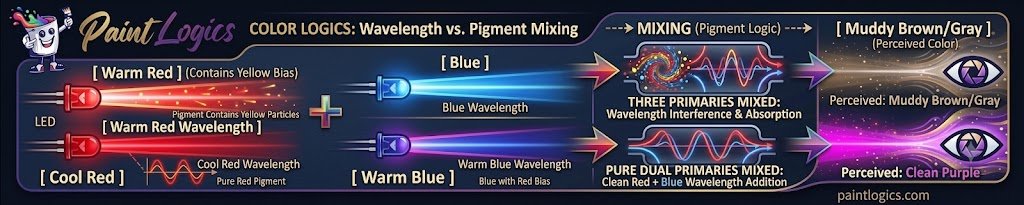
The problem usually stems from a hidden third color hiding inside your paint tubes. Many paint pigments are not “pure” colors; they have color biases. If your red paint has a yellow bias (like a warm tomato red), you are accidentally mixing red, blue, and yellow together. Because mixing all three primaries creates brown, your purple turns muddy.
How to Fix It:
To get a clean purple, you must use a “cool” red that tilts toward blue or pink (like Crimson), and a “warm” blue that tilts toward red (like Ultramarine). Avoid any reds that look orange or any blues that look green (like Phthalo Blue).
Now let’s look at the exact paint names you should shop for to get perfect results.
Best Paint Pigments to Mix Red and Blue for Clean Purples
If you want to stop guessing at the art supply store, look for specific pigment names on the tubes.
Recommended Combos for Clear Results:
- Ultramarine Blue + Quinacridone Magenta: This is the gold standard combo. It yields an incredibly vibrant, clean, and intense purple.
- Cobalt Blue + Alizarin Crimson: This pair creates a rich, classic deep violet that works beautifully for shadows and traditional landscapes.
Tips for Reliable Mixing:
- Check the color swatch on the tube for any hints of orange or green.
- Stick to single-pigment paints rather than pre-mixed convenience blends.
Now that your palette is set up, let’s see how these blends look in real-world applications.
Real-Life Examples of Red and Blue Mixing
Artists and designers use these red blue mixed combinations every day to create specific visual effects.
- Landscape Painting: Artists often mix Ultramarine blue with a touch of red to paint distant mountains. Because cool purple tones recede from the eye, it makes the mountains look miles away.
- Shadow Work: Instead of using black paint for shadows, painters will blend a deep blue-purple to create natural, lifelike shadows under trees or clothing folds.
What if you want to alter your purple even further? Let’s see what happens when you introduce other common colors.
What Happens When You Add White, Yellow, or Black?
Once you have mixed your initial red and blue base, adding a third color completely transforms the tint, shade, or tone.
Red + Blue + White = Lavender or Periwinkle
White reflects all light, so adding it to your purple mix lightens the value without changing the hue. This creates beautiful pastel shades like lavender, lilac, or a soft periwinkle.
Red + Blue + Black = Eggplant or Deep Plum
Black absorbs light and darkens your mixture. A tiny drop of black paint added to your purple will create heavy, rich shades like deep eggplant, dark plum, or onyx violet.
Red + Blue + Yellow = Brown or Gray
As we discovered in the troubleshooting section, yellow is the enemy of a clean purple. Adding yellow completes the primary trio, neutralizing the vibrant tones and leaving you with an earthy brown or muted slate gray.
Mixing Red and Blue in Paint vs. Digital Media
Let’s do a quick side-by-side comparison to solidify how your environment changes the behavior of red and blue.
In Paint (Subtractive Mixing)
- The Goal: Reflected light.
- The Result: A rich, deep purple or violet.
- The Experience: Feels tactile, relies on pigment purity, and gets darker the more you mix.
In Light (Additive Mixing)
- The Goal: Projected light.
- The Result: A glowing neon magenta.
- The Experience: Happens instantly on screens, relies on electronic pixels, and gets brighter the more light you add.
Tips for Artists: How to Mix Clean, Vivid Purples from Red and Blue
Here is a quick checklist to keep on your studio wall for your next painting session.
Use Cool Pigments
Always check that your red paint leans toward pink or blue rather than orange. Orange contains yellow, which will ruin the mix.
Mix on a White Palette
Always mix your colors on a clean, pure white surface. Mixing on wood or gray palettes can trick your eyes, making it hard to see the true tone of your purple.
Add in Layers
If you are working with watercolors or glazes, try layering a thin sheet of transparent blue over a dried layer of transparent red. This creates an optical purple mix that looks incredibly luminous.
Purple in Fashion and Interior Design
The colors you create by mixing red and blue have major cultural and psychological impacts on our spaces and clothing.
Fashion
Throughout history, purple was incredibly rare and expensive to make, making it the color of royalty. Today, mixing a deep, blue-heavy purple creates an air of luxury, elegance, and mystery in an outfit. Warm magenta mixes, on the other hand, signal high energy and creativity.
Interior Design
Interior designers usually use purple as an accent color. A cool lavender in a bedroom promotes calm and sleep, while a rich eggplant or plum in a dining room or study adds dramatic, sophisticated warmth.
Where Purple Sits on the Color Wheel
To tie everything together, let’s look at where your new color fits into the grand scheme of color theory.
Between Red and Blue
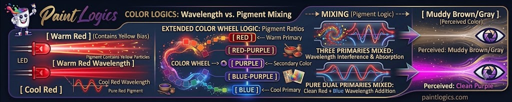
Purple sits comfortably on the color wheel right between its two parent colors, acting as a bridge between the hottest color on the wheel (red) and the coldest color (blue).
Complementary Colors
Directly across from purple on the color wheel sits yellow. This means yellow is purple’s complementary color. When placed next to each other, they make each other pop brilliantly; when mixed together, they cancel each other out.
Analogous Colors
Purple’s neighbors are red-purple and blue-purple. Using these three shades together in a design or painting creates a harmonious, pleasing look because they share similar DNA.
Conclusion: What Color Does Red and Blue Make?
At the end of the day, the answer to “red and blue make what color” is always purple—but the journey to getting the perfect shade is an art form in itself. Whether you are aiming for a soft lavender, a royal violet, or a digital magenta, understanding how ratios, light, and pigment biases interact gives you total control over your palette.
Next time you mix up a batch of paint, check your tubes for those hidden yellow biases, take your time balancing the ratios, and enjoy the process of creating the perfect purple.
FAQs
1. What color does red and blue make when mixed?
When you mix red and blue paint together, they make purple. If you are mixing red and blue light beams on a digital screen or monitor, they combine to make a bright neon magenta.
2. Do red and blue always make purple?
In theory, yes. However, if your red paint contains yellow pigments or your blue paint contains green pigments, the mixture will turn out brownish or gray instead of a clean, bright purple.
3. Why does my red and blue mix turn brown or gray?
This happens because of color bias. If you use a warm red (like Cadmium Red) that contains hints of yellow, you are accidentally mixing all three primary colors together. Mixing red, blue, and yellow naturally creates brown or gray.
4. How do I make red and blue create a vibrant purple?
To get a highly vibrant purple, use cool-toned paints with no yellow biases. The best combination is an Ultramarine Blue mixed with a Quinacridone Magenta or a cool Alizarin Crimson.
5. What color do red and blue make on a digital screen?
On digital screens, red and blue light mix using the additive RGB color model. Instead of a dark purple, they combine to form a glowing, bright magenta or hot pink light.
6. Can I make purple without using red and blue?
You cannot make a true, pure secondary purple without starting with some form of red and blue pigments. However, you can alter pre-made purples by adding white to make lavender, or black to make deep plum.
7. What happens when I add white, yellow, or black to red and blue?
Adding white softens the mixture into a pastel lavender or lilac. If Adding black darkens the blend into an eggplant or deep plum color. Adding yellow neutralizes the vibrancy, turning your purple into an earthy brown or gray tone.