Blue and White Make What Color? Light Blue Mixing Guide
If you’ve ever wondered ‘blue and white make what color,’ you’re not alone. It’s one of the most common questions for anyone picking up a paintbrush, designing a bedroom, or setting up a digital layout.
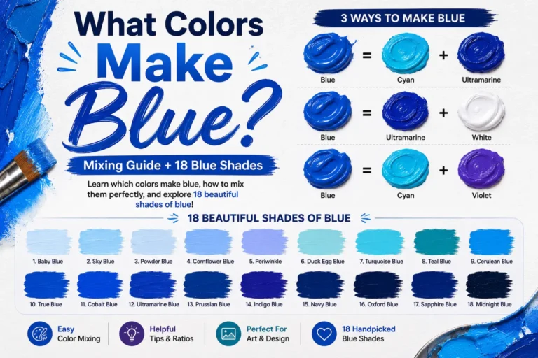
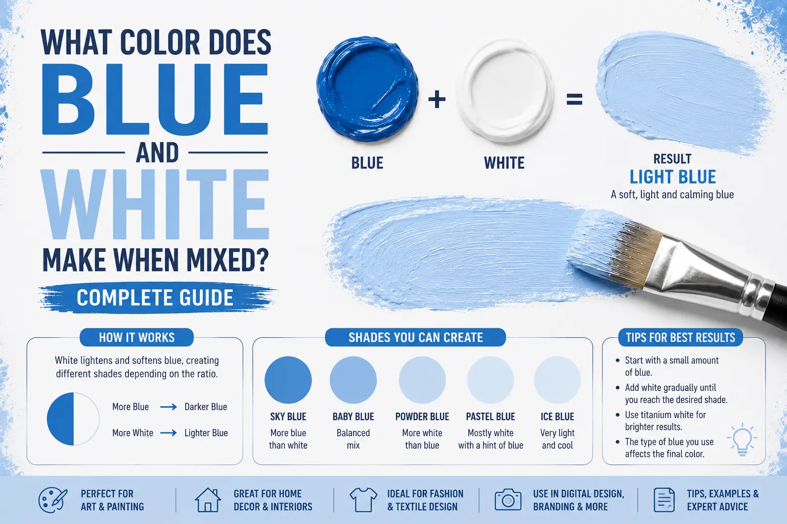
The direct answer is simple: blue and white make light blue, often taking the form of sky blue, baby blue, or a soft pastel blue.
However, the final result isn’t always identical. The exact shade you get depends entirely on the original depth of your blue and the amount of white you stir into the mix. You could end up with a crisp ice blue, a rich azure tint, or a dreamy powder blue. Understanding how these two pigments interact will completely change how you use them in your creative projects.
Main Takeaway:
Primary Blue + Pure White = Light Blue Tint (depending on the mixing ratio and the base blue’s undertone).
Quick Answer: What Color Do Blue and White Make?
When you mix blue and white together, you create what artists call a “tint.” In color theory, adding white to any pure primary color raises its value, making it lighter without shifting its actual place on the color wheel.
Why does this happen? White doesn’t change the core identity of the blue; it simply dilutes its darkness. The white paint reflects all light wavelengths, which decreases the saturation of the blue and spreads out the color density.
If you introduce a tiny drop of cobalt blue to a large puddle of white, you’ll instantly get a soft, airy pastel blue. If you mix a deep navy blue with a bit of white, the color softens into a medium denim tone. The transition is highly predictable, making it an incredibly easy color family to master.
The Science Behind Mixing Blue and White
Color shifts its behavior depending on whether you are working with physical liquids or digital screens. This happens because physical paint and digital light emissions handle wavelengths in opposite ways.
Subtractive Color Mixing (Paint & Pigments)
When working with acrylics, water colors, or house paint, you’re using subtractive color mixing. Physical pigments look like a specific color because they reflect certain wavelengths into your eyes while absorbing others. Blue paint looks blue because it absorbs red and yellow light waves.
When you add white paint, you aren’t adding a new color wavelength. Instead, you’re introducing highly reflective particles that bounce all light back to the viewer. This dilutes the concentration of the blue particles, transforming a heavy, dark hue into a lightweight, bright shade.
Additive Color Mixing (Digital / Light)
Digital displays rely on additive color mixing, where red, green, and blue (RGB) light channels build colors. On a monitor, white isn’t an opaque fluid; it’s what happens when all three light channels are blasted at maximum power.
If you want to create a digital sky blue, you don’t add a separate white light to your screen. Instead, you keep your blue channel at its maximum level while raising the red and green channels equally. For example, pure digital blue is (0, 0, 255), while a beautiful light sky blue sits around RGB values (135, 206, 235).
Common Shades Created When Mixing Blue and White
Varying your proportions or changing your base blue yields distinct, beautiful results. Here are the most common colors you can create with this mixture.
1. Sky Blue
Sky blue is a bright, clear tint that perfectly mimics the look of a cloudless afternoon sky. It feels energetic, fresh, and completely open.
This color happens because you mix a vibrant primary blue, like Cobalt or Cyan, with a generous amount of white. Think of summer beach towels or clean tech logos.
Quick Tip: This shade is highly effective for making small rooms look larger because it visually recedes from the eye.
2. Baby Blue
Baby blue is a classic, ultra-soft pastel shade that looks incredibly gentle, comforting, and sweet. It sits comfortably on the quiet end of the color spectrum.
This shade occurs when you take a balanced primary blue and mix it into a massive base of pure white. Imagine traditional nursery blankets or vintage cotton candies. Graphic designers often use this hue for wellness branding because it lowers visual stress instantly.
3. Powder Blue
Powder blue is a soft, muted light blue that carries a very subtle, sophisticated gray undertone. It looks mature and elegant rather than bright.
This tone comes forward when your base blue has a slight neutral bias, like Ultramarine, which naturally contains a trace of red-violet. Think of antique china patterns or fine linen shirts. Interior designers love this shade for dining rooms because it feels upscale and historic.
4. Ice Blue
Ice blue is a crisp, freezing tint that carries a distinctive sharp edge to it. It feels highly modern, clean, and clinical.
This look happens because you use a cold, green-leaning blue like Phthalo Blue and mix it with stark titanium white. Imagine glaciers, frosted glass windows, or modern smartphone metal backings. It’s an excellent choice for minimalist design layouts.
5. Light Azure
Light azure is a glowing, semi-vibrant tint that sits comfortably between light blue and cyan. It carries a tropical, high-energy mood.
This beautiful tone comes from mixing a brilliant cerulean blue with small increments of white. Think of the clear water over a white sand beach in the Caribbean. It works wonderfully as an accent color in modern web layouts to draw attention to buttons.
6. Periwinkle Blue
Periwinkle blue is a dreamy, floral tint that sits beautifully on the border between light blue and lavender. It feels highly whimsical and creative.
This color occurs when you use a warm blue that carries a strong purple undertone, like Ultramarine Blue, and lift it with white. Think of spring wildflowers or satin bridesmaid dresses. Fashion designers love this shade because it complements a wide variety of skin tones.
What Happens When You Mix Blue and White with Other Colors?
Once you have your basic blue and white mixture, introducing a third color can completely shift the mood and create entirely new color families.
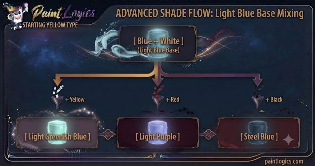
1. Blue + White + Yellow = Light Greenish Blue
Adding yellow to your light blue mix pulls the color quickly toward green, creating a beautiful light greenish blue or soft minty aquamarine.
The yellow combines with the blue components, while the white keeps the value incredibly high and pastel-like. This is an excellent choice for painting tropical waters or spring landscapes.
2. Blue + White + Red = Light Purple
When you drop red into the mix, the temperature shifts instantly. The color transitions away from a pure sky tone and becomes a light purple or soft lavender.
The red introduces a warm counter-weight to the blue, while the white prevents the mix from becoming a heavy, dark violet. Think of field heather or a hazy dawn sky.
3. Blue + White + Green = Soft Teal
Mixing green into your light blue base creates a beautiful, rich soft teal or seafoam shade that feels highly coastal and calming.
The green expands the oceanic qualities of the mix, while the white keeps it light and breezy. Interior designers frequently use this combination in beach house bathrooms.
4. Blue + White + Black = Steel Blue
If your light blue feels a bit too child-like or bright, adding a drop of pure black will instantly convert it into a serious, modern steel blue.
The black absorbs the bright reflections, adding a smoky, slate-like depth to the tint. Imagine weathered denim jeans or industrial steel beams.
5. Blue + White + Pink = Light Periwinkle
If you introduce a soft pink to your blue and white base, you will create a gorgeous light periwinkle or dusty violet tone.
The red and white inside the pink soften the starkness of the blue, resulting in a nostalgic pastel hue that looks beautiful in floral illustrations.
6. Blue + White + Brown = Dusty Denim
Tossing brown into your blue-white mix creates a highly complex, organic neutral known as dusty denim or slate blue.
The yellow and red tones hidden inside the brown work to neutralize the blue’s raw saturation, resulting in a mature, sophisticated color perfect for cozy living room walls.
Using Blue and White in Design
Blue and white are a timeless, universally loved color pairing found all over historical art, modern branding, and architecture.
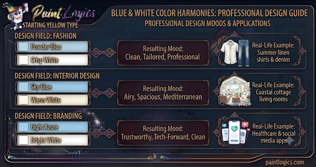
Now let’s look at this comparison table for design applications:
| Design Field | Best Shade Combination | Visual Mood | Real-Life Example |
| Fashion | Powder Blue + Crisp White | Clean, Tailored, Professional | Summer linen shirts & denim |
| Interior Design | Sky Blue + Warm White | Airy, Spacious, Mediterranean | Coastal cottage living rooms |
| Branding | Light Azure + Bright White | Trustworthy, Tech-Forward, Clean | Healthcare & social media apps |
Tips for Mixing Blue and White in Paint or Digital Art
If you’re ready to start blending your own custom light blue shades, keep these practical tips in mind to ensure you get the cleanest results.
- Start Small: Always add your blue paint into your white paint in tiny increments. Blue is a highly concentrated, powerful pigment, whereas white is easily overwhelmed. It takes far less blue to tint white than it takes white to lighten a dark blue.
- Adjust with Other Colors: If your mix looks too chalky or electric, don’t try to fix it by adding more white. Instead, use a microscopic speck of yellow to warm it up, or a touch of black to ground it into a slate tone.
- Test Under Different Lighting Conditions: A soft baby blue swatch might look beautifully peaceful under cool morning sunlight, but it could look like a cold, institutional gray under a warm yellow living room lamp. Always test your paint dried in its final space.
- Use High-Quality Materials: Cheap student-grade white paint often contains filler pigments that turn gray or muddy when mixed. Investing in artist-grade Titanium White gives you clean, opaque, and highly predictable tints every time.
Real‑Life Examples of Blue and White in Design, Art & Fashion
Seeing how this classic pair functions in daily life can give you instant inspiration for your next project.
Fashion
Think of classic summer style: a crisp white cotton t-shirt paired with faded, light blue denim jeans. The white contrasts beautifully against the light blue denim, creating an effortlessly fresh, timeless outfit that looks clean and comfortable.
Interior Design
Interior designers treat blue and white as the gold standard for coastal or Greek-inspired spaces.
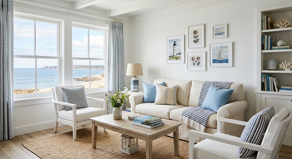
Pro Tip: Painting a ceiling a soft pastel blue while keeping the crown molding a bright, glossy white creates the optical illusion of a much higher ceiling, mimicking the open sky.
Art & Illustration
Consider historical landscape painters capturing ocean waves. They rarely use flat, unmixed blue paint. Instead, they layer deep blues, sky blues, and pure white seafoam together to give the moving water a sense of immense weight, motion, and translucent life.
Common Mistakes to Avoid When Mixing Blue and White
Mixing these two colors seems completely straightforward, but it’s incredibly easy to end up with a flat, chalky mess if you aren’t paying attention to details.
1. Using Too Much White
This is the most common pitfall. If you dump a massive amount of white paint directly into a pool of dark blue, you will waste an immense amount of paint trying to correct the shade if it goes too light.
How to avoid it: Pull a tiny dollop of blue over to your white paint palette cluster, blending it in slowly until you reach your sweet spot.
2. Not Testing the Mix
Acrylic and oil paints shift character as they dry. Acrylic paints, in particular, always dry a full shade darker than they look when they are wet on your palette.
How to avoid it: Paint a quick test stroke on a scrap piece of paper and let it dry completely under your room’s natural light before painting your main surface.
3. Ignoring Undertones
Not all blue paints are made the same way. Phthalo blue has a cool green undertone, while Ultramarine blue carries a warm red bias. If you ignore these undertones, your pastel blue might turn into a faint green or a muddy lavender instead of a clean sky tone.
How to avoid it: Smear a paper-thin layer of your base blue on white paper to inspect its true undertone hiding beneath the surface before you mix.
Conclusion
To wrap things up, blue and white make light blue. Depending on your mixing choices, that simple combination can transform into a breezy sky blue, a sweet baby blue, a sophisticated powder blue, or a crisp ice blue.
The whole secret to mastering this color pairing lies entirely in starting with your white base, adding your blue pigment slowly, and respecting your base undertones. Treat white as a lifting tool to bring out the hidden brilliance of your blue. Whether you are building a fresh summer wardrobe, painting a landscape canvas, or redecorating a bedroom, utilizing this clean pair adds instant freshness and tranquility to your work.
Love To Read More
#1 What Color Does Yellow and Gray Make When Mixed? Complete Guide
#2 What Color Does Blue and Black Make When Mixed? Complete Guide
FAQs
What color do blue and white make when mixed?
They combine to make light blue. Depending on the exact ratios and base blues you choose, you can create shades like sky blue, baby blue, or powder blue.
Can I make other colors by mixing blue and white?
No, blue and white alone will only create shades within the light blue family. To create other colors like purple or green, you must introduce a third pigment like red or yellow.
How do I make a darker blue with blue and white?
White will only lighten blue. If your mix has gone too light, you must add more of your original dark blue paint to pull the value back down.
Is baby blue a cool or warm color?
Baby blue is generally a cool color because it is rooted in the blue family. However, if it is made using a warm blue base like Ultramarine, it can carry a very subtle, cozy warmth.
Can blue and white be used in branding?
Yes, absolutely. It is one of the most popular combinations for healthcare, tech, and corporate software because light blue and white communicate cleanliness, trust, and absolute reliability.
Is periwinkle blue made with blue and white?
Yes, but it requires a warm blue base that contains a natural red undertone. When mixed with white, that hidden red bias emerges, turning the light blue into a soft floral periwinkle.
What is the difference between powder blue and sky blue?
Sky blue is a bright, clear, high-energy tint, whereas powder blue contains a very subtle gray or red-violet undertone, giving it a muted, vintage appearance.
How do I make a pastel blue?
To make a beautiful pastel blue, start with a generous base of pure white paint on your palette and blend in a microscopic dot of primary blue until the color softens.
How is ice blue different from regular blue?
Ice blue is an extremely light tint that uses a cool, green-leaning blue base. It looks incredibly crisp, frosty, and almost white compared to a standard mid-tone blue.
Can blue and white be used in modern interior design?
Yes, it is excellent for minimalist and Scandinavian designs. Pairing crisp white walls with light blue accent textiles creates a spacious, clean, and completely uncluttered mood.
What happens if I add too much white to blue?
The blue will lose its colorful identity and turn into an off-white shade with a faint blue tint. You can fix this easily by stirring more raw blue paint back into the mixture.
Is blue and white a good combination for clothing?
Yes, it is a timeless fashion staple. It looks clean, crisp, and professional, making it a go-to choice for corporate uniforms, business shirts, and classic summer wear.