Purple and White Make What Color? Complete Mixing Guide
If you’ve ever wondered “purple and white make what color,” you’re not alone. It is a puzzle that artists, graphic designers, and home decorators run into constantly when trying to capture the soft, delicate beauty of early spring flowers or modern pastel trends.
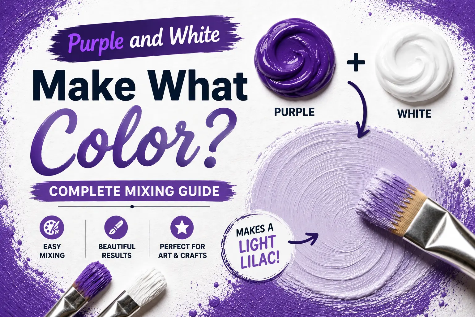
The direct answer is simple: mixing purple and white together creates a lighter tint of purple, producing soft, beautiful shades like lavender, lilac, or thistle.
However, the final result isn’t always identical every single time you mix them. The exact color you get depends heavily on whether your base purple is warm or cool, the type of white pigment you use, and how much paint you fold into the pool. Understanding these subtle shifts gives you complete control over this elegant, calming color family. In this guide, you’ll learn the color theory behind this blend, how different paint pigments behave, and how to mix a flawless floral tint for your next creative project.
Main Takeaway:
Base Purple + Titanium White = Light Purple (varying from lavender to lilac, depending on your blue-to-red pigment ratios).
What Color Do White and Purple Make?
When you mix a pure white with purple on your palette, you are performing a classic color theory process known as tinting. This process is the secret to softening intense, dark pigments.
Why does this happen? The reason is simple: white paint reflects all light wavelengths, whereas purple paint absorbs green and yellow wavelengths while reflecting red and blue. When you mix them, white acts as a light diluter, scattering the reflection and raising the overall value of the purple.
Imagine you are painting a misty mountain horizon. If you take a rich, dark dioxazine violet and slowly blend in a healthy dollop of titanium white, the heavy shadow tone lifts instantly. It transitions away from a dark eggplant and settles into a serene, light purple that instantly pushes the mountains back into the distance.
How Do You Mix Purple with White? (RYB & RGB Breakdown)
To understand how these colors blend across different mediums, you have to look at how physical paint pigments behave compared to digital pixels.
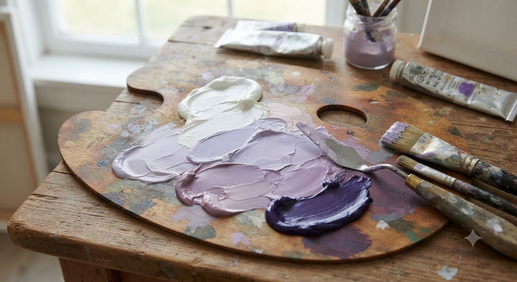
In the physical world (the RYB paint model), mixing purple and white is a subtractive process. You start with a big puddle of white paint first, then slowly introduce the purple with your palette knife. Always fold the darker color into the lighter one, or you’ll end up wasting half your tube of white trying to correct a pool that got too dark too fast.
Now compare that with digital screens, which operate on the additive RGB (Red, Green, Blue) model. Here’s how the color creation changes across these systems:
| Color System | Base Inputs | Mixing Method | Typical Result |
| Paint (RYB) | Violet Pigment + White Paint | Physical blending with palette knife | Opaque, light-reflective paste |
| Screens (RGB) | Red, Green, Blue Light Channels | Turning up all light channels towards maximum | Luminous, glowing pastel pixel |
Digital screens create light purple by combining high values of red and blue light, then adding green light to desaturate the hue and raise the overall screen brightness. This digital transition mimics the physical tinting process, giving you a clean, glowing screen color.
What Color Variations do Purple and White Make?
By adjusting the amount of white you add and the undertone of your starting purple, you can create an entire spectrum of distinct, beautiful pastel tones.
Let’s look at how these differences behave in practice:
Lavender
When you mix a cool, blue-leaning purple with a generous amount of white, you get a classic, soothing [lavender]. Because this shade leans heavily toward the blue end of the spectrum, it brings a tranquil, cool atmosphere to any project.
Lilac
If you start with a warm, red-leaning purple and tint it with white, you’ll create a soft [lilac]. The subtle reddish-pink undertone makes this color feel warm, sweet, and highly floral.
Dusty Mauve
To create a sophisticated, antique look, add a tiny pinpoint of raw umber or black to your purple and white mixture. This desaturates the color, leaving you with a beautiful, earthy dusty mauve that looks gorgeous in interior spaces.
Periwinkle
What if you add a generous drop of cobalt blue to your purple and white mix? You’ll pull the shade toward a light, dreamy periwinkle, which sits perfectly on the border between blue and purple.
Orchid Tint
Mixing a vibrant magenta-leaning purple with a high amount of white creates a bright, energetic orchid tint. This shade is highly lively and pops beautifully against cool backgrounds.
Wisteria
A soft, pale purple with a tiny touch of gray and blue gives you wisteria. This elegant, historic tone mimics the drooping blossoms of the wisteria vine and is highly prized for its quiet grace.
What Does Purple, White, and Black Make?
Adding black to a purple and white mixture introduces a third color dimension known as a tone.
Why does this happen? The reason is simple: black paint absorbs all light, while white reflects it, meaning a combination of black and white is a neutral gray. When you mix gray with purple, you desaturate the pigment, stripping away its bright, childish energy and transforming it into a quiet, dusty shadow tone.
Imagine you are painting the folds of a silk dress. Instead of using pure black for the shadows, mixing a touch of black, white, and purple together creates a deep, atmospheric shadow that looks incredibly realistic and rich under gallery lighting.
How Can You Lighten or Darken Your Purple Tints?
Controlling the overall value of your light purple is the key to creating realistic depth and contrast on your canvas or digital layout.
Lightening Your Tint
To make your light purple even brighter, continue to add small amounts of pure white. If you want the color to feel sunlit and cheerful, try adding a microscopic pinpoint of warm cadmium yellow instead of white, which will warm up the tone without washing it out.
Darkening Your Tint
To push your light purple into the shadows, slowly feed in more of your original base purple.
Pro Tip: Avoid adding pure black paint to darken your pastel purples. Black can quickly muddy the color and strip away its floral quality; instead, use a tiny drop of deep ultramarine blue or burnt umber to darken the shade naturally.
Can You Create Purple and White Paint from Scratch?
While you can easily mix purple by combining red and blue, you cannot create white paint from scratch on your palette.
The reason is simple: white is a primary subtractive color, meaning it requires raw, pure mineral pigments (like titanium dioxide or zinc oxide) to reflect light. If you run out of white paint, no combination of red, blue, yellow, or black will ever yield white; you will simply need to buy a fresh tube.
Another thing worth knowing is that mixing red and blue paint doesn’t always guarantee a bright purple. If your red paint has yellow undertones (like Cadmium Red), those yellow pigments will neutralize the blue, leaving you with a dull, muddy brown-purple instead of a clean violet.
What Color Do Purple and White Make with Lights?
When you step away from physical paint and work with theatrical lights or digital projectors, purple and white light combine using the rules of additive mixing.
Why does this happen? The reason is simple: white light already contains all the colors of the visible spectrum. When you project a purple light beam onto a white light beam, you are adding more blue and red wavelengths to an already full spectrum.
This results in a highly luminous, desaturated light purple glare. Designers often use this trick during live concerts or theater shows to bathe the stage in a dreamy, high-contrast glow that makes the scene feel magical and vast.
How Do Our Eyes Perceive Light Purple?
The human eye perceives light purple through a complex dance between the color-sensitive receptors in our retinas and the ambient light of our surroundings.
This happens because our eyes have three types of cone cells: red, green, and blue. A light purple stimulates both our red and blue cones while leaving our green cones mostly resting. Because white light is also bouncing off the surface, our brains combine these signals, translating the mixture into a soft, non-threatening pastel tone.
Think of walking through a lavender field on a cloudy afternoon. The overcast sky filters the light, causing the purple blossoms to appear cool, calm, and deeply integrated with the natural, gray-toned atmosphere of the day.
What Do Light Purple Tints Symbolize and Evoke?
Because light purple is so closely tied to rare, delicate spring blossoms, it carries a heavy psychological and emotional weight across art, history, and interior design.
The reason is simple: historically, purple pigments were incredibly expensive to harvest, associating the color family with royalty and wealth. When diluted with white into lavender and lilac, the color sheds its intimidating, royal power and transforms into a symbol of serenity, youth, healing, and quiet nostalgia.
Another thing worth knowing is that aroma-therapists and designers frequently use lavender tones in spas and wellness retreats because the color has been shown to naturally lower heart rates and promote physical relaxation.
What Colors Go with Purple and White?
Creating a balanced color scheme around purple and white is incredibly easy once you understand how neighboring colors interact on the color wheel.
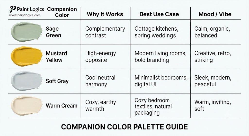
Let’s look at some of the best color pairings for your next project:
| Companion Color | Why It Works | Best Use Case | Mood / Vibe |
| Sage Green | Complementary contrast | Cottage kitchens, spring weddings | Calm, organic, balanced |
| Mustard Yellow | High-energy opposite | Modern living rooms, bold branding | Creative, retro, striking |
| Soft Gray | Cool neutral harmony | Minimalist bedrooms, digital UI | Sleek, modern, peaceful |
| Warm Cream | Cozy, earthy warmth | Cozy bedroom textiles, natural packaging | Warm, inviting, soft |
Conclusion
To bring it all home, purple and white make a lighter tint of purple, which produces beautiful pastel shades like lavender, lilac, and thistle.
The secret to mastering this mix lies in starting with your white paint as your main base, introducing your purple in tiny, controlled steps, and choosing the right red-to-blue pigment balance to steer your mixture toward a warm lilac or a cool lavender. Whether you are painting a floral landscape, picking a calming color for a home remodel, or designing a clean brand logo, this versatile pastel family brings an instant sense of peace, luxury, and organic beauty to your work.
You Might Also Like:
- What Color Does Yellow and Gray Make When Mixed? Complete Guide
- What Color Do Pink and Purple Make? Best Results
FAQs
What color do white and purple make when mixed?
They make a lighter tint of purple, which can range from a cool, blue-toned lavender to a warm, red-toned lilac depending on the exact pigments you use.
What does purple and white make in paint vs. light?
In physical paint, they physically blend to create an opaque pastel paint tint. In light, projecting purple and white light together adds wavelengths to create a brilliant, desaturated, glowing light purple highlight.
Can I mix purple and white paint to get lilac?
Yes, you can! To get a true lilac, make sure your starting purple has a slight pink or red undertone (like a violet-magenta) before blending it into your white base.
What does purple, black, and white make together?
They combine to create a muted, desaturated gray-purple tone, often referred to as a dusty mauve or smoky plum.
Does purple and white always make lavender?
No, it depends on the undertone of your purple. A blue-toned purple with white makes lavender, while a red-toned purple with white makes lilac.
Can I make white paint by mixing other colors?
No, you cannot. White is a primary paint pigment that cannot be mixed from other colors; you must purchase a tube of pure titanium or zinc white paint.
What colors go with purple and white?
Soft sage greens, warm mustard yellows, clean grays, and cozy creams pair beautifully with purple and white, creating a balanced and professional look.
What is the difference between purple on white and white on purple?
In design and printing, laying dark purple text on a white background offers maximum readability and clean contrast, while placing white text on a dark purple background creates a dramatic, modern, and high-impact look.
Do purple and white always make the same color?
No. The final shade will change based on the ratio of white to purple, the specific brand of paint, and whether your starting purple leans warm or cool.