What Color Does Yellow and White Make? Complete Guide
If you’ve ever wondered “yellow and white make what color,” you’re not alone. It’s a question shared by acrylic painters working on sunlit landscapes, home decorators hunting for the perfect inviting hallway tone, and graphic designers trying to establish a soft, airy digital aesthetic.
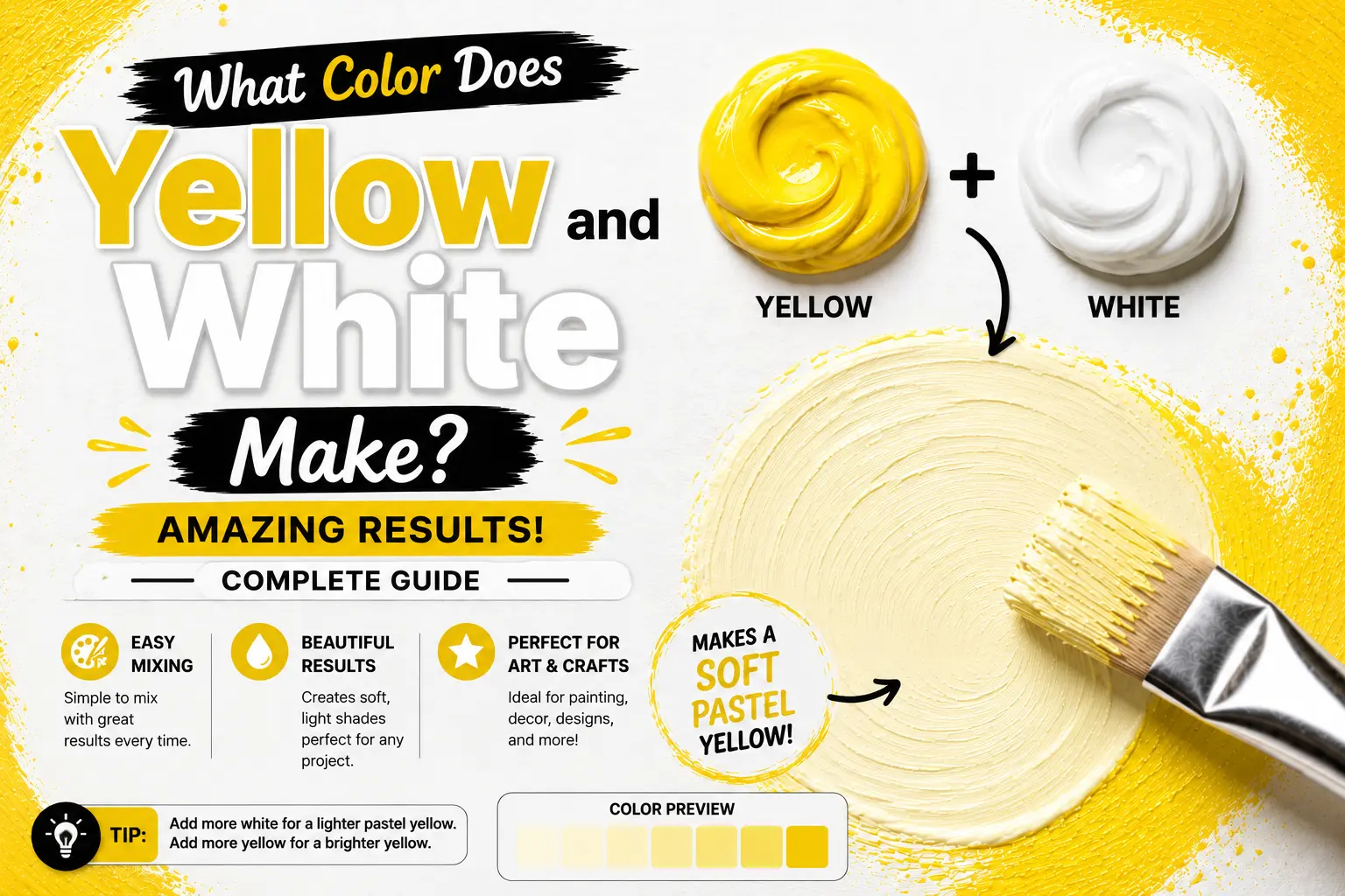
The direct answer is simple: mixing yellow and white together creates a lighter, softened tint of yellow, commonly known as pastel yellow, cream, butter, or ivory.
However, the final result isn’t always identical every single time you mix them. The exact color you get depends heavily on the specific undertone of your starting yellow pigment, the opacity of the white paint you choose, and the exact ratio of your blend. Understanding these subtle visual differences gives you total control over this bright, cheerful color palette. In this guide, you’ll learn the color science of this classic tinting process, how to mix custom paint formulations, and how to use these creamy shades in your creative work.
Main Takeaway:
Vibrant Yellow + Pure White = Pastel Yellow / Cream (varying in warmth, coolness, and transparency based on the starting pigment’s specific undertones).
Quick Answer – What Color Does Yellow and White Make?
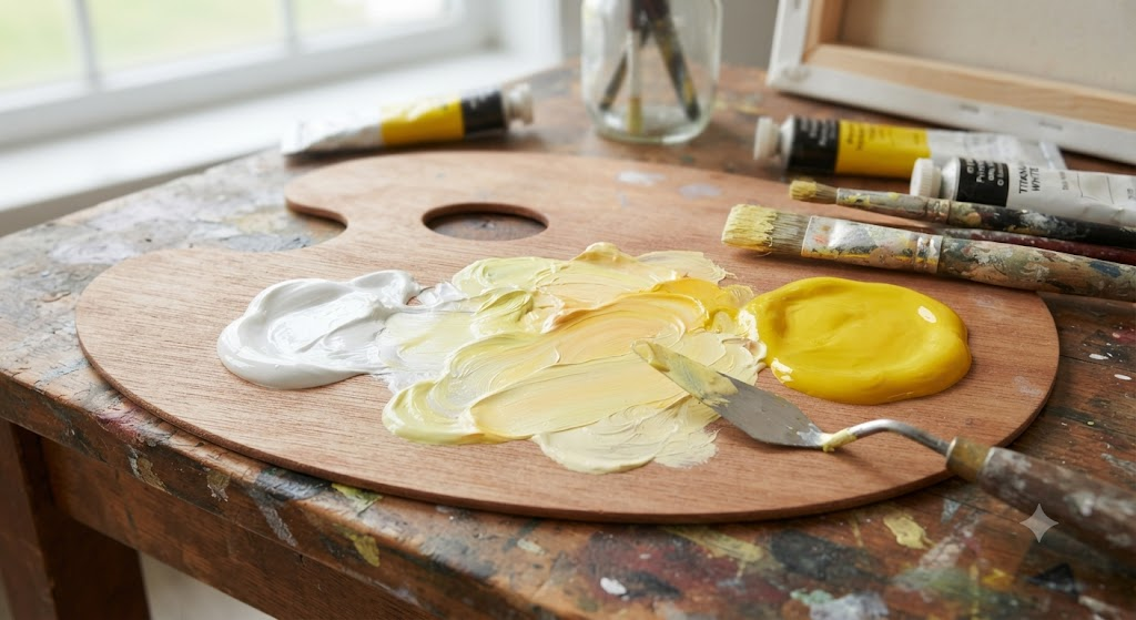
When you combine a standard primary yellow with titanium white, the result is a soft, delicate tint known as pastel yellow. This occurs because white paint acts as a physical light diluter on your palette.
Why does this happen? The reason is simple: yellow pigment naturally absorbs high-frequency blue light wavelengths while reflecting yellow, red, and green back to your eyes. Introducing white paint blocks some of that absorption, scattering the reflected light and visually softening the intensity of the pure yellow.
Think of a freshly churned block of salted butter. That classic, soft yellow-cream is the perfect representation of what happens when you dilute a highly saturated yellow with a clean white base.
Understanding Yellow and White in Color Theory
In classical art training, mixing white into any pure color on the color wheel is called creating a tint. It’s one of the most fundamental skills for controlling value and depth.
The reason is simple: primary yellow sits at the absolute brightest spot on the physical color spectrum. Because it’s already so visually light, adding white doesn’t dramatically change its value (lightness) as much as it changes its saturation (intensity). The white acts as a mute button, shifting the energetic, loud yellow into a soothing, quiet neutral.
Imagine you’re painting a soft summer sky. If you use pure cadmium yellow for the horizon, it will look unnaturally harsh and electric. By tinting it with a generous amount of white, you soften the contrast, allowing the golden light to sit peacefully against the blue sky.
How to Make Different Yellow Pigments with Paint
Not all yellows are created equal. Because different paint tubes contain different raw chemical compounds, your starting yellow will radically alter your mixed results when combined with white.
How to Make Lemon Yellow
Lemon yellow is a crisp, cool primary that naturally leans slightly toward green.
Why does this happen? The reason is simple: lemon yellow pigments naturally absorb red light wavelengths, pushing the color toward the cooler side of the spectrum. To mix it on your palette, start with a cold yellow base (like Hansa Yellow Light) and add a tiny pinpoint of cool zinc white.
Artists often use this combination to paint the highlighted skin of citrus fruits or to show cold, direct sunlight reflecting off metallic surfaces.
How to Make Cadmium Yellow
Cadmium yellow is a heavy, highly opaque pigment that leans slightly warm, with a subtle orange undertone.
This happens because cadmium compounds naturally block blue-green light waves. To mix this classic tone, take pure Cadmium Yellow Medium and fold in a small touch of Titanium White to create a solid, highly visible yellow base.
If you’re painting a field of sunflowers, this is the exact opaque blend you need to layer over darker background colors without losing any brightness.
How to Make Yellow Ochre
Yellow ochre is a rich, earthy, natural yellow-brown pigment that mimics the colors of raw clay.
The reason is simple: yellow ochre contains natural iron oxides that dull the color’s brightness, turning it into a warm, grounded gold. To mix it, combine a warm yellow base with a pinpoint of raw umber and a generous dollop of white.
Interior designers usually rely on this warm, sandy tone to make large, cold spaces feel cozy, historical, and inviting.
How to Make Naples Yellow
Naples yellow is a historically rich, warm, semi-opaque pastel color that leans heavily toward cream.
Why does this happen? The historical pigment relied on toxic lead antimoniate, but modern paints recreate this tone using a blend of titanium white, yellow ochre, and red pigments. To mix a modern equivalent, combine three parts white, one part yellow ochre, and a micro-dot of warm red.
This color is highly prized by portrait painters who use it to capture the soft, natural highlights on human skin under warm lighting.
How to Make Hansa Yellow Light
Hansa yellow light is a modern, organic, highly transparent yellow that has a brilliant, greenish undertone.
This happens because organic hansa pigments do not contain heavy metal bases, letting light pass straight through the paint layer. To utilize this tone, mix it with a very transparent white, like Zinc White, rather than opaque Titanium White.
If you are painting thin, glowing glazes over a landscape sketch, this transparent mix will let your underlying sketch lines show through beautifully.
How to Make Golden Yellow
Golden yellow is a deep, warm, fiery yellow that sits right on the edge of orange.
The reason is simple: it reflects high amounts of red-orange light. To mix it, start with a warm yellow base (like Cadmium Yellow Deep), add a tiny pinpoint of warm red, and soften the mix with a small touch of white.
Think of a late autumn forest sunset; this warm, heavy blend captures that thick, cozy golden hour light perfectly.
How to Make Medium Yellow
Medium yellow is a perfectly balanced neutral yellow that doesn’t lean distinctly warm or cool.
This happens because it reflects yellow wavelengths evenly without drifting toward orange or green. To mix it, use a standard primary yellow tube (often labeled Azo Yellow) and add a balanced ratio of Titanium White.
Beginner artists should start with this mixture because it behaves predictably and acts as a fantastic baseline for learning value transitions.
How to Make Indian Yellow
Indian yellow is a deep, warm, golden-brown yellow that is incredibly transparent and glowing when thinned out.
Why does this happen? Historically made from unique raw ingredients, modern Indian yellow uses synthetic organic pigments to mimic that deep, amber glow. To mix it, take a warm amber-yellow base and blend it with a highly transparent glazing white.
Imagine you are painting glowing candle flames; this transparent golden-orange tint creates a stunning, warm halo effect when layered outward from the flame.
How to Make Pastel Lemon
Pastel lemon is an incredibly pale, icy, cool yellow tint that feels fresh and modern.
This happens because you are mixing a cold yellow pigment into a massive puddle of bright white paint. To mix it, place a large dollop of titanium white on your palette, then use a toothpick to drag in a microscopic dot of Hansa Yellow Light.
Quick Tip: When mixing pastel yellows, always add your dark pigment into your white paint. If you try to add white into a pool of pure yellow, you will waste vast amounts of white paint trying to lighten the mix.
How to Make Butter Tint
Butter tint is a soft, warm, delicious pale yellow that mimics the color of rich dairy butter.
The reason is simple: it sits slightly warmer than pastel lemon, utilizing a soft orange undertone rather than a green one. To mix it, take a large base of Titanium White and slowly blend in a tiny dot of warm Cadmium Yellow Medium.
This comforting shade is a favorite for nursery walls because it feels bright and cheerful without overstimulating a child’s eyes.
How to Make Cream Ochre
Cream ochre is a highly muted, sandy, earth-toned off-white that feels deeply organic.
This happens because the natural iron oxides in the ochre pigment are heavily diluted by a stark white base. To mix it, blend five parts Titanium White with one part Yellow Ochre, then neutralize it with a microscopic speck of burnt umber.
This is a fantastic color choice for painting sandy beaches, dried leaves, or rustic plaster walls in architectural sketches.
How to Make Antique Ivory
Antique ivory is a highly sophisticated, warm, antique off-white that has a distinct, aged character.
Why does this happen? It mimics the natural, slow yellowing of bone or historic paper over centuries. To mix this tone, blend a large dollop of white with a pinpoint of yellow ochre and a microscopic speck of warm red paint.
Think of a vintage wedding gown; this soft, historic color pairs beautifully with warm lace textures and natural linen.
How to Make Soft Glow
Soft glow is an airy, barely-there yellow tint that functions as a highly reflective, welcoming off-white.
The reason is simple: it uses a very high ratio of white paint (around 98%) with just a tiny whisper of medium yellow pigment. To mix it, place a pool of white on your palette and barely touch the corner of your brush to a primary yellow before blending.
Interior designers frequently use this shade on ceilings to bounce light back down into a dark room, making the entire home feel taller and sunnier.
How to Make Banana Color
Banana color is a bright, creamy, medium-value pastel yellow that mimics the fleshy inside of a ripe banana.
This happens because it balances the coolness of a lemon tint with the weight of a warm cream. To mix it, combine eight parts Titanium White with two parts primary yellow and a tiny, almost invisible speck of raw umber to ground the saturation.
This playful, comforting shade looks fantastic on kitchen accessories, retro-themed packaging, and summer apparel.
How to Make Warm Sunlight
Warm sunlight is a luminous, glowing yellow-cream that feels like a sunbeam passing through a window.
The reason is simple: it relies on warm light reflections to create a sense of radiant energy. To mix this, blend a large base of Zinc White with a warm, reddish-yellow pigment, keeping the paint layer thin and translucent.
Imagine you’re painting sunlight catching the edge of a mountain trail; layering this warm, transparent glaze over your shadows will make your entire canvas pop with life.
Yellow and White Mixing Chart: Real Shade Outcomes
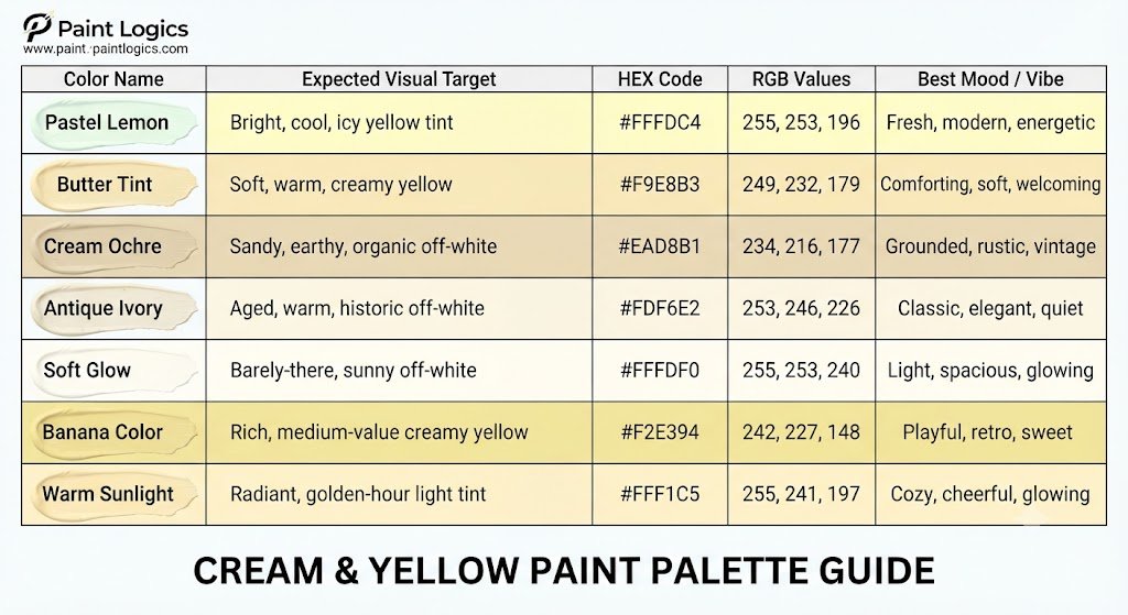
To make planning your physical crafts, home renovations, or digital canvas lines easier, use this quick-reference palette display showing how these shades line up:
| Color Name | Expected Visual Target | HEX Code | RGB Values | Best Mood / Vibe |
| Pastel Lemon | Bright, cool, icy yellow tint | #FFFDC4 | 255, 253, 196 | Fresh, modern, energetic |
| Butter Tint | Soft, warm, creamy yellow | #F9E8B3 | 249, 232, 179 | Comforting, soft, welcoming |
| Cream Ochre | Sandy, earthy, organic off-white | #EAD8B1 | 234, 216, 177 | Grounded, rustic, vintage |
| Antique Ivory | Aged, warm, historic off-white | #FDF6E2 | 253, 246, 226 | Classic, elegant, quiet |
| Soft Glow | Barely-there, sunny off-white | #FFFDF0 | 255, 253, 240 | Light, spacious, glowing |
| Banana Color | Rich, medium-value creamy yellow | #F2E394 | 242, 227, 148 | Playful, retro, sweet |
| Warm Sunlight | Radiant, golden-hour light tint | #FFF1C5 | 255, 241, 197 | Cozy, cheerful, glowing |
Mixing Yellow and White in Acrylics, Watercolor, and Oils
The physical medium you choose completely alters how you must handle your yellow and white mixtures.
Acrylic Paint
In acrylic painting, you must account for a physical shift known as drying color shift.
Why does this happen? The reason is simple: acrylic binders dry completely transparent, whereas they look milky and white when wet. This means your wet yellow-white mix on your palette will dry slightly darker and more saturated on your canvas.
Beginner Tip: Always mix your wet acrylic yellow-white tints one or two shades lighter than your target color to compensate for this natural darkening process.
Watercolor Paint
Watercolors handle white differently because artists rarely use physical white pigment from a tube.
Instead, watercolorists use the natural white of their paper to lighten colors. By adding clean water to a pure yellow pigment, you thin the paint layer out, letting more of the highly reflective paper fibers shine through the transparent wash.
Oil Paint
Oil painting offers the most luxurious blending experience because the slow drying time allows for seamless value transitions directly on the canvas.
To mix in oils, use Titanium White for solid, opaque coverage, or switch to Zinc White (often called Flake White) when you want to build up soft, transparent transitions that blend naturally into your under-paintings.
What to Expect at Each Tinting Stage
As you slowly add yellow to a white paint base, the mixture transitions through distinct visual milestones.
This happens because the pigment concentration increases step-by-step, shifting the mixture from a subtle off-white to a rich, saturated pastel.
Let’s look at the stages of this transformation:
- Stage 1: The Off-White Zone (98% White, 2% Yellow): The starkness of the white is stripped away, creating a soft, warm ivory that looks incredibly clean and cozy on large walls.
- Stage 2: The Cream Zone (90% White, 10% Yellow): The color develops a distinct, edible quality, transforming into a rich [yellow and white make what colorcream] or soft vanilla tint.
- Stage 3: The Pastel Zone (75% White, 25% Yellow): The color becomes a true [pastel yellow], offering a bright, cheerful personality that stands out clearly against neighboring colors.
Troubleshooting Yellow + White Mixing Issues
Yellow is one of the trickiest colors to paint because it has a very low pigment density and is highly sensitive to contamination.
Problem 1: My yellow-white mix looks muddy or gray.
- Why it happens: Your brush or palette was likely contaminated with a tiny trace of a complementary color, like blue or purple.
- How to fix it: Clean your mixing tools thoroughly with mineral spirits or soap, and always use a clean palette knife to scrape pure paint from your tubes.
Problem 2: My pastel yellow turns a strange greenish tone.
- Why it happens: This is a classic color trap. If you mix a cool, green-leaning yellow (like lemon yellow) with a white paint that has cool blue undertones, the subtle blue and green undertones combine to create a distinct sickly-green cast.
- How to fix it: Switch to a warmer yellow base (like Cadmium Yellow) or use a neutral, warm-white paint to pull the mixture back into a healthy, sunny territory.
Symbolic Meanings of Light Yellow Shades
Because light yellow is so closely tied to the return of spring flowers and morning sunbeams, it carries a very specific psychological impact.
The reason is simple: it mimics the natural rhythms of our world. Dark, heavy yellows can feel warning or acidic, but diluting them with white transforms them into symbols of warmth, optimism, fresh beginnings, cleanliness, and quiet intellect.
Another thing worth knowing is that hospitals and wellness centers often paint their interior recovery rooms in soft butter tints because the color has been shown to boost a patient’s mood without inducing anxiety or eye strain.
What About Yellow and White in Digital Color?
When working on digital screens, mixing colors uses the rules of additive RGB (Red, Green, Blue) light rather than physical pigments.
Why does this happen? The reason is simple: your screen creates white by firing red, green, and blue pixels at 100% capacity. To create a light pastel yellow, your screen combines maximum red and green light (which makes pure yellow) and adds a high amount of blue light to wash out the saturation.
This digital transition allows web designers to use soft, sunny backgrounds (like #FFFDD0 for cream) that are highly readable and easy on the eyes.
Can You Make Yellow or White Paint from Other Colors?
If you run out of yellow or white paint on your desk, you cannot mix them from other colors in your kit.
This happens because both yellow and white are primary subtractive elements. Yellow pigment is a primary color, meaning there are no physical paint pigments you can blend to create it. Similarly, white is a pure base pigment that must be harvested from raw minerals like titanium dioxide.
Expert Advice: Always buy larger tubes of Titanium White and primary yellow than you think you need. Because you will use them constantly to tint and lighten your entire color palette, they are always the first tubes to run dry.
Designing with Yellow and White: Real-Life Pairing Tips
Creating a professional, modern color scheme around a soft yellow and white base is incredibly easy once you understand how to balance their high reflectivity.
Let’s look at some of the best color pairings for your next design project:
| Companion Color | Why It Works | Best Use Case | Mood / Vibe |
| Soft Charcoal | Grounding, high-contrast shadow | Modern home exteriors, editorial layouts | Sleek, industrial, sophisticated |
| Sage Green | Organic, leafy harmony | Country kitchen cabinets, branding | Peaceful, fresh, natural |
| Dusty Rose | Warm, vintage sweetness | Floral wedding designs, packaging | Romantic, cozy, nostalgic |
| Navy Blue | Classic complementary contrast | Nautical bedrooms, corporate logos | Trustworthy, clean, striking |
Conclusion: The Gentle Alchemy of Yellow and White
To bring it all home, yellow and white make a lighter tint of yellow, yielding beautiful, soft shades like pastel yellow, cream, butter, and ivory.
The secret to mastering this mix lies in starting with your white paint as your main base, introducing your yellow in tiny, controlled steps, and choosing the right warm or cool yellow pigment to guide your mixture toward a cold lemon pastel or a cozy warm cream. Whether you are painting a sun-drenched landscape, choosing an inviting paint color for a living room remodel, or creating an organic digital interface, this sunny, gentle color family brings an instant sense of warmth, light, and peaceful energy to your creative space.
You Might Also Like:
- Green and Gray Make What Color? Complete Color Mixing Guide
- What Colors Make White? Paint vs Light Color Mixing Explained
- Purple and White Make What Color? Complete Mixing Guide
FAQs
Do yellow and white always make light yellow?
Yes, in physical paint, they will always combine to create a lighter, softer version of your starting yellow, though the undertone can vary from a warm cream to a cool pastel lemon.
Can I make cream from yellow and white?
Absolutely! To make a classic cream, start with a white paint base, add a tiny pinpoint of medium yellow, and ground the mixture with an incredibly microscopic speck of warm red or yellow ochre.
Can I use water instead of white in watercolor?
Yes, watercolorists rarely use white paint. By adding more water to your yellow, you thin the paint layer so the highly reflective white paper shines through, creating a brilliant, transparent light yellow.
Can I use black to darken the mixture?
Be very careful. Adding black paint to yellow will immediately create an olive green tone rather than a darker yellow. To darken a yellow-white mix naturally, use a touch of yellow ochre or raw umber instead of black.
Can I use yellow and white to make skin tones?
Yes, they are essential base colors. By mixing yellow and white with small pinpoints of red and blue (or burnt sienna), you can create a wide range of realistic human flesh tones.
What’s the best white paint to use for tinting yellow?
Use Titanium White when you need strong, opaque coverage to block out underlying paint layers. Use Zinc White when you want to build up delicate, transparent, and smooth color transitions.
Why does my yellow turn green when I add white?
This happens because your starting yellow has a cool green undertone (like lemon yellow) which combines with the cool blue undertones naturally present in many white paints. Switch to a warmer yellow or use a warm-neutral white to fix this.
Can yellow and white ever make a neutral color?
Yes. If you add a small pinch of a neutral brown (like raw umber) to a yellow-white mix, you will create a stunning, sandy, organic neutral similar to antique ivory or light stone.
Is it better to mix on the palette or directly on the canvas?
For beginners, it is always better to mix your yellow and white thoroughly on your palette first. This ensures you have a consistent, clean color value before applying it to your canvas.
Does the type of brush affect the yellow and white blend?
Yes. Stiff, synthetic bristle brushes are fantastic for laying down flat, opaque blocks of pastel yellow, while soft natural hair brushes are better for feathering out smooth, glowing transitions.