What Color Do Blue and Gray Make? Complete Mixing Chart & Shades

If you’ve ever wondered “blue and gray make what color,” you’re not alone. It’s a common dilemma when picking out a new living room paint, building a graphic design palette, or trying to mix the perfect shade for a foggy landscape on canvas.
The quick answer is that blue and gray make a toned-down, muted blue, often referred to as a slate, steel, or dusty blue.
However, the final result isn’t always identical. The exact hue you get depends entirely on the undertones of the original blue and the lightness of the gray you use. You could end up with a crisp, industrial steel tone or a soft, comforting pastel. Understanding how these two pigments interact will completely change how you use them in your creative projects.
Main Takeaway:
Primary Blue + Gray Tone = Muted Blue-Gray (depending on the base blue’s undertone and the black-to-white ratio in the gray).
Quick Answer: What Color Do Blue and Gray Make?
When you blend blue and gray together, you create what artists call a “tone.” In color theory, adding gray to a pure color lowers its intensity and saturation without completely changing its core color family.
Why does this happen? The presence of gray softens the striking brightness of the blue pigment. Instead of looking like a loud, energetic primary color, the mix becomes sophisticated, subtle, and calming.
If you use a very light gray, you’ll end up with a breezy dusty blue. If you use a heavy, dark gray, the mix drops into a deep steel blue or slate blue. The transition is incredibly smooth, making it one of the easiest color families to control.
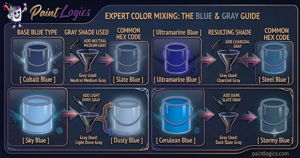
| Base Blue Type | Gray Shade Used | Resulting Shade | Common Hex Code |
| Cobalt Blue | Neutral Medium Gray | Slate Blue | #708090 |
| Ultramarine Blue | Charcoal Gray | Steel Blue | #4682B4 |
| Sky Blue | Light Dove Gray | Dusty Blue | #B0C4DE |
| Cerulean Blue | Dark Slate Gray | Stormy Blue | #4F6F80 |
Now that you see the basic outcomes, let’s look at why this happens from a scientific perspective.
The Science Behind Mixing Blue and Gray
Color shifts character depending on whether you’re working with physical materials or pixels on a screen. This happens because physical pigments and digital light behave in completely opposite ways.
Subtractive Color Mixing (Paint & Pigments)
When working with acrylics, oils, or household paint, you’re dealing with subtractive color mixing. Physical pigments reflect specific light wavelengths while absorbing the rest. A bright blue paint looks blue because it absorbs red and yellow wavelengths.
When you introduce gray paint—which is a blend of light-reflecting white and light-absorbing black—it acts as a dampener. The black components absorb a bit of the blue light’s intensity, while the white scatters it. This leaves less raw color reflecting back to you, turning a loud blue into a quiet, muted variation.
Additive Color Mixing (Digital / Light)
Digital displays use additive color mixing, where red, green, and blue (RGB) light emissions build colors. On a screen, gray is created when all three channels have equal, medium-level values.
If you want to create a slate or steel look on a monitor, you don’t actually add a separate “gray light.” Instead, you bring the red and green channels closer to the value of your blue channel. For example, pure digital blue is (0, 0, 255). By raising the red and green values slightly to something like (70, 130, 180), you create a beautifully balanced steel blue.
Common Shades Created When Mixing Blue and Gray
Varying your mixing proportions or changing your base blue yields distinct, gorgeous shades. Here are the most common colors you can create.
1. Slate Blue
Slate blue is a rock-toned, classic shade that balances equal parts blue and gray. It’s a highly stable, popular color that feels structural and confident.
This color happens because a strong primary blue is mixed with a neutral, medium gray. Imagine the color of natural slate stone shingles after a heavy rain shower. Interior designers often use this specific tone on front doors to give a home a welcoming, timeless entrance.
2. Stormy Blue
Stormy blue carries a heavy, dramatic mood that feels highly organic. It leans slightly darker and colder than standard slate.
This shade occurs when your base blue has a faint green bias, like phthalo blue, and is mixed with a dark charcoal gray. Think of the violent, heavy skies right before a summer thunderstorm hits. It’s a favorite among landscape painters who want to create deep atmosphere and tension without using harsh black paint.
3. Steel Blue
Steel blue is a cool, metallic shade that looks crisp, clean, and industrial. It has a distinctive sharpness to it that sets it apart from softer shades.
This tone comes forward because a vivid blue, like ultramarine, is mixed with a cool, white-heavy gray. Think of the polished surface of high-end tools or sleek architectural steel. Graphic designers frequently use this hue for corporate branding because it signals strength, tech-savviness, and reliability.
4. Dusty Blue
Dusty blue is a soft, romantic pastel that feels incredibly peaceful and airy. It sits comfortably on the lighter end of the spectrum.
This beautiful color comes from mixing a sky blue base with a very light dove gray. The heavy presence of white within the gray pulls the color into a hazy, chalky realm. You’ll see this color used everywhere in modern spring weddings, from bridesmaid dresses to floral arrangements.
5. Pewter Blue
Pewter Blue is an ultra-muted, heavy shade where gray clearly takes the driver’s seat. It looks mostly like a metallic gray with just a whisper of cool blue hiding inside.
This happens because the proportion of gray to blue is heavily skewed toward gray. Imagine a vintage pewter mug or old antique silverware. Artists use this combination to paint shadows on reflective metal surfaces because it feels highly realistic.
6. Ice Blue
Ice blue is a freezing, high-contrast shade that looks crisp and frosty. It has a luminous quality that feels bright yet completely desaturated.
This unique look comes from mixing a touch of bright cyan or cerulean with an ultra-light, almost white gray. Think of glacial ice shelves or a crisp winter morning. It’s an excellent choice for modern kitchens or bathrooms where you want a clean, sterile, yet refreshing atmosphere.
7. Midnight Slate
Midnight slate is a dark, brooding tone that borders on the edge of a nighttime shadow. It’s a subtle alternative to deep black.
This color occurs when you use a deep indigo base and darken it with an intense charcoal or near-black gray. Fashion designers love this shade for evening wear because it catches the light beautifully, revealing hints of sophisticated blue as the fabric moves.
8. Cloud Blue
Cloud blue is an incredibly soft, barely-there shade that mimics a hazy overcast morning. It is highly delicate and rests on the edge of the neutral spectrum.
This happens because you take a standard light gray and drop in just a tiny splash of primary blue. The blue tint is so subtle that it only shows up clearly when placed directly next to a pure white surface. Interior designers usually use this on ceilings to make small rooms feel infinitely taller.
What Happens When You Mix Blue and Gray with Other Colors?
Once you have your basic blue and gray mixture, introducing a third color can completely shift the mood. This is how professional designers build complex, custom color palettes.
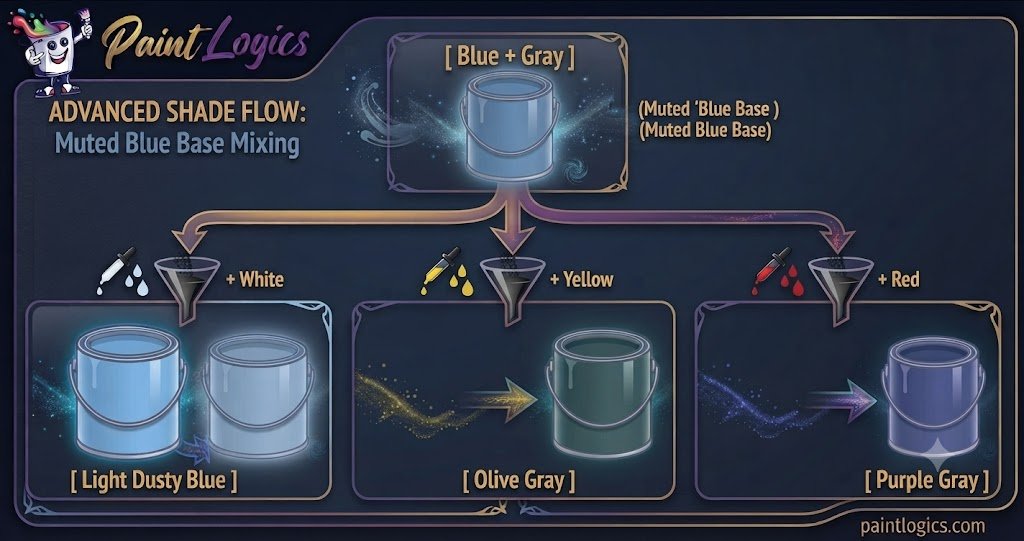
1. Blue + Gray + White = Light Dusty Blue
Adding white to your blue-gray mix lifts the value and creates a light dusty blue. Instead of looking like a bright baby blue, it stays incredibly soft, muted, and chalky.
The white cuts through the heavy weight of the gray while keeping the desaturated look intact. This is an excellent choice for painting hazy skies or creating a serene backdrop for a nursery.
2. Blue + Gray + Yellow = Olive Gray
When you toss yellow into the mix, things take an earthy turn. Yellow and blue naturally combine to make green, but the gray anchors the tone, preventing it from becoming a bright lime or grass green.
The result is a complex olive gray or sage tone with a cool undertone. Think of lichen growing on a tree trunk or vintage military gear.
3. Blue + Gray + Red = Purple Gray
Red and blue naturally create purple, so adding red to a blue-gray base shifts the color into a smoky plum, lavender gray, or deep heather tone.
The gray ensures the purple stays grounded and sophisticated rather than bright like a cartoon. Wardrobe stylists often use this combination to create rich, neutral outfits that flatter cool skin tones perfectly.
4. Blue + Gray + Green = Teal Gray
Mixing green into your blue-gray base creates a rich, smoky teal gray or slate eucalyptus color.
The green pulls the cool blue toward a natural, forest-like feel, while the gray keeps it incredibly sophisticated. It’s an excellent option for modern exterior house paint or painting deep evergreen foliage in a foggy setting.
5. Blue + Gray + Black = Charcoal Blue
If your blue-gray mix feels a bit too airy, adding a drop of pure black will instantly drop its value down into a heavy charcoal blue.
This happens because the black absorbs more light, turning the soft tones into a dramatic, high-contrast shade. Imagine a piece of dark volcanic rock or industrial machinery.
6. Blue + Gray + Brown = Warm Slate
Adding a dash of brown to your blue and gray mixture creates an incredibly complex warm slate color.
That’s where many beginners get confused. They assume brown and blue will just make mud. Instead, the warmth of the brown cancels out the icy coldness of the blue-gray, resulting in a beautifully balanced, weathered wood or stone tone.
Using Blue and Gray in Design
Blue and gray aren’t just for mixing on an artist’s palette. Together, they form one of the most reliable, classic color combinations used across modern industries.
Fashion
In the style world, pairing blue and gray is a foolproof way to look effortlessly polished. Think of a heather gray cashmere sweater worn over a crisp light-blue button-down shirt. The gray tones down the brightness of the blue, making the overall outfit look intentional, calm, and highly professional without being boring.
Interior Design
Interior designers treat blue-gray as a functional neutral. While pure gray can sometimes feel cold and institutional, adding a splash of blue instantly brings life and personality into a room. A living room with slate blue walls, a light gray sofa, and natural wood accents feels balanced, cozy, and incredibly peaceful.
Branding & Packaging
Look around and you’ll see this combination everywhere in healthcare, finance, and software development. Blue represents trust, logic, and stability, while gray signals professionalism, maturity, and sleek modernity. Together, they tell consumers that a company is both highly secure and cut-ting-edge.
Tips for Mixing Blue and Gray in Paint or Digital Art
If you’re ready to start mixing your own colors, keep these practical tips in mind to get the best results.
- Start Small: Always add your gray paint to your blue paint in small increments. Blue is a vibrant primary color, but a heavy dark gray can overwhelm it quickly if you dump too much in at once.
- Adjust with White or Black: If your blue-gray mix looks too dark or muddy, don’t try to fix it by wasting tons of blue paint. Instead, use a tiny speck of white to pull the color back into a readable tone.
- Test Under Different Lighting Conditions: A slate blue swatch might look beautifully blue under warm kitchen lights, but it could look like a cold, industrial gray under a bright fluorescent office bulb. Always test your paint dried in its final location.
- Use High-Quality Materials: Cheap student-grade paints often contain chalky filler pigments that turn muddy or unpredictable when mixed. Investing in artist-grade paints with single-pigment listings gives you much cleaner, predictable results.
Real-Life Examples of Blue and Gray in Design, Art & Fashion
Seeing how this pair functions in the real world can give you instant inspiration for your next project.
Fashion
Think of a classic business casual look: a tailored steel gray blazer paired with crisp dark-blue denim. The slight texture of the gray fabric contrasts beautifully against the deep blue jeans, creating a timeless outfit that transitions easily from the office to dinner.
Interior Design
Imagine a modern master bathroom featuring dusty blue vanity cabinets, light gray marble tiling, and brushed nickel faucets. The gray in the marble ties the room together, making the blue cabinets feel sophisticated and spa-like rather than overly colorful.
Art & Illustration
Consider maritime painters capturing a stormy harbor scene. They rarely use straight blue for the water or sky. Instead, they layer slate blues, steel blues, and dark grays to give the waves a sense of immense weight, coldness, and lifelike motion.
Common Mistakes to Avoid When Mixing Blue and Gray
Mixing these two colors seems straightforward, but it’s incredibly easy to end up with a dull, muddy mess if you aren’t paying attention.
1. Using Too Much Gray
This is the most frequent blunder. Because gray contains black particles, dropping equal parts blue and gray together can cause the vibrant blue to vanish, leaving you with a dull, dingy gray that looks accidental.
How to avoid it: Treat your gray like a powerful modifier. Mix it into your blue drop by drop until you reach the exact level of softness you want.
2. Not Testing the Mix
Acrylic and oil paints look quite different when they are wet versus when they are dry. Acrylics, in particular, tend to dry a full shade darker.
How to avoid it: Paint a small swatch on a scrap piece of paper and let it dry completely under your room’s natural light before painting your final surface.
3. Ignoring Undertones
Not all blue paints are built the same way. Ultramarine blue has a warm red undertone, while phthalo blue has a cool green bias. If you mix a warm blue with a cool gray, you might accidentally create a muddy violet tone you didn’t want.
How to avoid it: Check the manufacturer color index names on your paint tubes, or smear a thin layer of the paint on white paper to see its true undertone before mixing.
4. Not Considering Proportions
If you don’t keep track of how much paint you’re combining, you’ll never be able to recreate that exact beautiful shade of steel blue if you run out halfway through your art piece or home improvement project.
How to avoid it: Use measuring spoons, drops, or specific parts to note down your mixing ratio so you can duplicate the color perfectly down the road.
Conclusion
To wrap things up, blue and gray make a beautifully muted blue. Depending on your choices, that mixture can transform into an elegant slate blue, a sharp steel blue, or a breezy dusty blue.
The secret to mastering this color combo lies entirely in managing your proportions and understanding your base undertones. Treat gray as a tool to soften your color, add it slowly, and always test your results. Whether you are building an outfit, painting a fresh accent wall, or blending acrylics on a canvas, utilizing this calm pair adds instant maturity and sophistication to your work.
Love To Read More
#1 What Color Does Blue and Black Make When Mixed? Complete Guide
#2 Red and Blue Make What Color? The Ultimate Color Mixing Guide
FAQs
What color do blue and gray make when mixed?
They make a muted, desaturated blue. The exact shade varies based on your mixing ratios, resulting in hues like slate blue, steel blue, or dusty blue.
Can blue and gray make other colors?
On their own, they will only produce variations of muted blue. However, if you introduce a third color like yellow, red, or green, you can create entirely new tones like olive gray, lavender gray, or teal gray.
How do I make blue and gray more vibrant?
Gray naturally strips away vibrancy. To keep the mix as lively as possible, use a high-saturation blue like cobalt as your base, and use a very light gray or a mix of white and blue instead of a heavy gray.
Does blue and gray result in a dark color?
Not necessarily. If you mix blue with a light dove gray, you will get a soft, pastel dusty blue. It will only turn dark if you use a deep charcoal or slate gray.
Can I lighten the blue and gray mix?
Yes, absolutely. You can easily lighten the mixture by adding a touch of pure white paint, which turns the color into a brighter, airy cloud blue or light dusty blue.
What happens when I mix blue, gray, and white?
You create an incredibly soft, pastel tint known as light dusty blue. The white lifts the darkness of the gray while preserving the sophisticated, muted character of the blue.
Can I create a more vibrant blue with blue and gray?
No. Gray will always reduce the saturation of a color. If you want a more vibrant blue, you should blend your base blue with a brighter primary blue or a touch of pure white light.
Is midnight slate the same as navy?
No, they are different. Navy blue is a highly saturated, deep blue that clearly shows its rich color. Midnight slate is much more desaturated, functioning as a dark gray with a subtle blue undertone.
Is blue and gray used in interior design?
Yes, it is one of the most popular modern color combinations. It serves as a living room neutral that brings the calming qualities of blue without feeling overly loud or colorful.
What is the difference between stormy blue and slate blue?
Stormy blue leans darker and carries a cool, green or dark charcoal undertone. Slate blue is a more neutral, balanced medium blue-gray that mimics natural stone.
How do I create teal by mixing blue and gray?
Start with a blue base that has a strong natural green bias, like Phthalo Blue or Cerulean. When you mix it with a medium gray, it softens into a beautiful, smoky teal gray.
Can I use blue and gray for casual wear?
Absolutely. A classic everyday example is pairing a comfortable heather gray t-shirt with your favorite blue jeans. It’s an effortless, universally flattering look.