Yellow and Green Make What Color? Lime & Chartreuse Guide
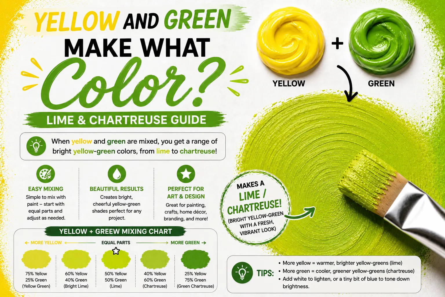
If you’ve ever wondered “yellow and green make what color,” you’re not alone. The simple answer is that mixing yellow and green creates yellow-green, a bright tertiary color that includes popular shades like lime and chartreuse. But if you have ever picked up a paintbrush or designed a digital graphic, you know the exact shade depends on your mixing ratios and starting pigments.
Getting the exact hue you want requires a basic understanding of color warmth and medium properties. In this guide, you’ll learn how to control your ratios, work across paint and digital screens, and use vibrant yellow-greens effectively in your art and design projects.
Main Takeaway: Primary Color (Yellow) + Secondary Color (Green) = Tertiary Color (Yellow-Green), depending on pigment temperature and base ratio.
What Does Yellow and Green Make? Quick Answer
Mixing yellow and green produces yellow-green, a vivid shade that sits directly between its two parent colors on the traditional color wheel.
This happens because yellow naturally brightens and warms up the cooler blue tones found inside green paint. Instead of getting a deep forest shade, adding yellow pulls the mixture toward high-energy tones like citrus, lime, and chartreuse.
Here’s a good example. If you take a puddle of bright lemon yellow paint and add a tiny drop of medium green, you’ll instantly see a glowing lime color take shape on your palette.
Beginner Tip: Yellow is a weaker, lighter pigment than green. Always use yellow as your base color and add green in tiny, gradual amounts so you don’t accidentally overpower your mix.
Now let me break down how this works when working with physical paints.
Yellow and Green Make What Color In Paint (RYB Model)
In traditional paint mixing (the RYB model), yellow is a primary color and green is a secondary color created from blue and yellow.
When you combine yellow and green, you are technically adding more yellow to an existing blue-yellow blend. Because tertiary colors are made by mixing one primary color with one secondary color, yellow-green fits the definition perfectly.
![[Yellow] (Primary)
│
├─────────► [Yellow-Green] (Tertiary)
│
[Green] (Secondary: Yellow + Blue)](https://paintlogics.com/wp-content/uploads/2026/07/An-artist-palette-showing-Lemon-Yellow-and-Grass-Green-paint-mixing-together-to-form-a-bright-lime-color.jpg)
Imagine you’re painting a sunlit lawn in early spring. Mixing pure green directly onto the canvas often looks flat or harsh, but blending extra yellow into your green creates the fresh, glowing tone of new grass catching direct sunlight.
That’s where many beginners get confused—they assume all greens react the same way. Now compare that with what happens when you adjust the temperature of your starting colors.
How Yellow and Green Mix on the Color Wheel (Warm vs. Cool Shift)
Where your mix lands on the spectrum depends heavily on whether your starting colors carry warm or cool undertones.
Colors have temperatures based on their underlying bias. Warm yellows carry a hint of red or orange, while cool yellows carry a tiny hint of green. Similarly, warm greens contain more yellow, whereas cool greens lean heavily toward blue.
![[Warm Yellow + Warm Green] ──► Golden Moss / Olive Shift
[Cool Yellow + Cool Green] ──► Electric Chartreuse / Neon Lime](https://paintlogics.com/wp-content/uploads/2026/07/A-color-wheel-displaying-tertiary-colors-highlighting-the-position-of-yellow-green-between-primary-yellow-and-secondary-green.jpg)
If you mix Cadmium Yellow (a warm, reddish-yellow) with Phthalo Green (a cool, blue-green), the tiny hint of red inside the warm yellow will slightly neutralize the mix, giving you a warm, earthy moss tone. However, if you combine Lemon Yellow (a cool yellow) with a light grass green, you get an electric, high-visibility chartreuse.
Pro Tip: For the brightest lime or chartreuse shades, strictly use cool yellows and cool greens that have zero red undertones in their chemical pigments.
What Color Does Yellow and Green Make in RGB and CMYK?
The physical rules of mixing paint on a palette change completely when you move to digital art or commercial printing.
This happens because digital screens use the additive color model (RGB), while printers use the subtractive ink model (CMYK). On a screen, light is added together to build brightness, whereas printer ink absorbs light.
![DIGITAL LIGHT (RGB) PRINTER INK (CMYK)
[Red + Green Light] = Yellow [Cyan + Yellow Ink] = Green
│ │
▼ ▼
[High Green + Med Red] [High Yellow + Low Cyan]
│ │
▼ ▼
Electric Lime Vibrant Leaf Green](https://paintlogics.com/wp-content/uploads/2026/07/126822b1-924d-43a0-897e-1944607b4707.jpg)
To make a bright yellow-green on a computer screen, you turn your Green (G) value to maximum intensity and bring your Red (R) value to around 50–70%, leaving Blue (B) at zero. In CMYK printing, you print 100% Yellow ink layered with roughly 20–40% Cyan ink to create a rich, leafy green.
Is the Result Chartreuse, Lime, or Yellow-Green? (Differences Explained)
People often use the terms lime, chartreuse, and yellow-green interchangeably, but they are technically distinct shades with different warmth levels.
So what’s the difference? Yellow-green is the overarching family name for any color created by this combination. Chartreuse leans heavily toward yellow with just a hint of green, while lime leans slightly more toward green with a high-energy citrus brightness.
| Color Name | Dominant Parent | Visual Appearance | Common Use Case |
| Chartreuse | 70% Yellow / 30% Green | Acidic, yellowish-gold green | High-fashion accents, modern web design |
| Lime Green | 40% Yellow / 60% Green | Sharp, vibrant citrus green | Packaging, tropical illustrations |
| Yellow-Green | 50% Yellow / 50% Green | Balanced, bright leaf color | Landscape art, nature graphics |
Another thing worth knowing is how different painting mediums behave when you prepare these shades on paper.
How to Mix Yellow-Green with Paint: Acrylic, Watercolor & Gouache
Each painting medium handles pigment density differently, which affects how your yellow and green layers blend.
Acrylics are opaque, watercolors rely on transparent washes, and gouache gives a flat, velvety matte finish.
- Acrylic Paint: Acrylics dry quickly and tend to look a shade darker once the water evaporates. Mix your yellow-green slightly lighter on the palette than your target canvas color.
- Watercolor: Instead of mixing heavy paint, paint a thin wash of Lemon Yellow, let it dry completely, and glaze a light wash of Sap Green over top. The paper reflecting through both transparent layers produces a brilliant, glowing lime tone.
- Gouache: Gouache contains chalky white fillers that can make bright chartreuse shades look slightly pastel. Keep your water ratio balanced to maintain the vivid punch of your color.
What Is the Yellow-Green Hex Code? (#9ACD32 and Other Variants)
If you are working in web design or digital art, precise color codes ensure your yellow-green looks consistent across all screens.
The standard web-safe hex code for traditional Yellow-Green is #9ACD32. However, depending on whether you want a glowing neon lime or a sophisticated chartreuse, you can use these digital variants:
![[Chartreuse: #7FFF00] ──► [Lime Green: #32CD32] ──► [Yellow-Green: #9ACD32]](https://paintlogics.com/wp-content/uploads/2026/07/2e69e660-040c-4c6d-b24d-a2614dbec7c9.jpg)
- Standard Yellow-Green: #9ACD32 (RGB: 154, 205, 50)
- Chartreuse: #7FFF00 (RGB: 127, 255, 0)
- Lime Green: #32CD32 (RGB: 50, 205, 50)
- Bright Neon Lime: #00FF00 (RGB: 0, 255, 0)
Shades of Yellow-Green: From Soft Citrus to Mossy Olive
By adjusting your ratios or adding subtle darkeners, you can craft a wide array of custom shades within the yellow-green family.
The reason for this range comes down to value and saturation. Adding white lightens the shade into pastels, while adding earthy neutrals pulls it into deep forest or moss tones.
[Yellow + Green + White] ──► Soft Pistachio / Creamy Citrus
[Yellow + Green + Umber] ──► Deep Olive / Golden Moss
- Soft Citrus: A light, refreshing shade created by blending extra yellow with green and adding a splash of Titanium White.
- Pistachio: A soft, pale pastel tone achieved by adding white paint to a balanced yellow-green mix.
- Golden Moss: A warm, earthy shade created by mixing warm Cadmium Yellow with green and a microscopic dot of Raw Umber or Burnt Sienna.
Where You’ll See Yellow-Green in Nature and Design
Yellow-green is one of the most prominent shades in the natural world, signalling growth, freshness, and vitality.
Think of new plant shoots pushing through soil in spring, fresh lime wedges, or sunlit leaves in a dense canopy. Because human eyes are naturally sensitive to green and yellow wavelengths, this shade catches our attention instantly.
Interior designers frequently use muted yellow-green accents in living rooms and kitchens to bring a fresh, outdoor feel indoors without overwhelming the space.
Meaning and Color Psychology of Yellow-Green
In color psychology, yellow-green combines the optimistic energy of yellow with the calming, renewing qualities of green.
It represents growth, youthfulness, creativity, and vitality. Because chartreuse and lime are so bright, they evoke feelings of excitement and freshness.
However, using an overly saturated neon lime in large spaces can create visual fatigue or feeling overwhelmed. Balancing high-energy chartreuse with calm neutrals like gray, beige, or white keeps the visual energy harmonious.
Best Color Pairings with Yellow-Green in Art, Fashion, and Decor
Pairing yellow-green with complementary or neutral shades makes your artwork or design palette pop effortlessly.
Because yellow-green sits near yellow on the color wheel, its direct complementary color is a rich reddish-purple or magenta.
![[Yellow-Green] + [Magenta / Plum] ──► High-Contrast Pop
[Yellow-Green] + [Navy Blue] ──► Elegant & Sophisticated
[Yellow-Green] + [Slate Gray] ──► Modern Neutral Balance](https://paintlogics.com/wp-content/uploads/2026/07/a8e6ef11-d8db-4bdf-9479-1399435ee1b7.jpg)
- High-Contrast Dynamic: Pair chartreuse with deep plum or violet for bold graphic design and eye-catching floral arrangements.
- Sophisticated Elegance: Combine lime green accents with deep navy blue or charcoal gray in interior decor.
- Earthy Harmony: Blend soft yellow-green with warm terracotta browns and beige tones for organic, natural illustrations.
Conclusion: Yellow and Green Make More Than Just a Color
When asking “yellow and green make what color,” the answer goes far beyond a single shade. By adjusting your ratios, temperatures, and base pigments, you unlock a dynamic range of colors from high-energy chartreuse to soft pistachio. Keep experimenting on your palette, test your medium glazes, and enjoy bringing these vibrant citrus tones into your creative projects.
You May Also Like
- What Colors Make Green? Easy Color Mixing Guide for Every Shade
- Red And Green Make What Color? Color Mixing Guide
- Pink and Green Make What Color? Complete Mixing Guide
FAQs About Yellow and Green Color Mixing
What color does yellow and green make?
Mixing yellow and green produces yellow-green, a bright tertiary color that includes shades like lime, chartreuse, and citrus green.
Is yellow-green the same as lime?
Not quite. Lime is a specific, high-energy shade within the yellow-green color family that contains slightly more green and vivid brightness, whereas yellow-green covers the entire spectrum between pure yellow and pure green.
Can you make yellow-green without using green paint?
Yes. Since green is made of blue and yellow, you can make yellow-green by mixing a large amount of yellow paint with a very tiny touch of blue paint.
What happens if I add white to yellow-green?
Adding white to yellow-green lightens its value and lowers its intensity, turning a bold lime or chartreuse into a soft pastel shade like pistachio or mint-citrus.
Does the shade change in different lighting?
Yes. Yellow-green shades look brighter and yellow-toned under warm daylight or incandescent bulbs, while cool LED lighting highlights the underlying blue-green tones in your paint.