Red And Green Make What Color? Color Mixing Guide
If you’ve ever wondered “red and green make what color,” you’re not alone. It’s a classic question that comes up whether you’re working with acrylic paints, choosing living room colors, or trying to design a digital logo.
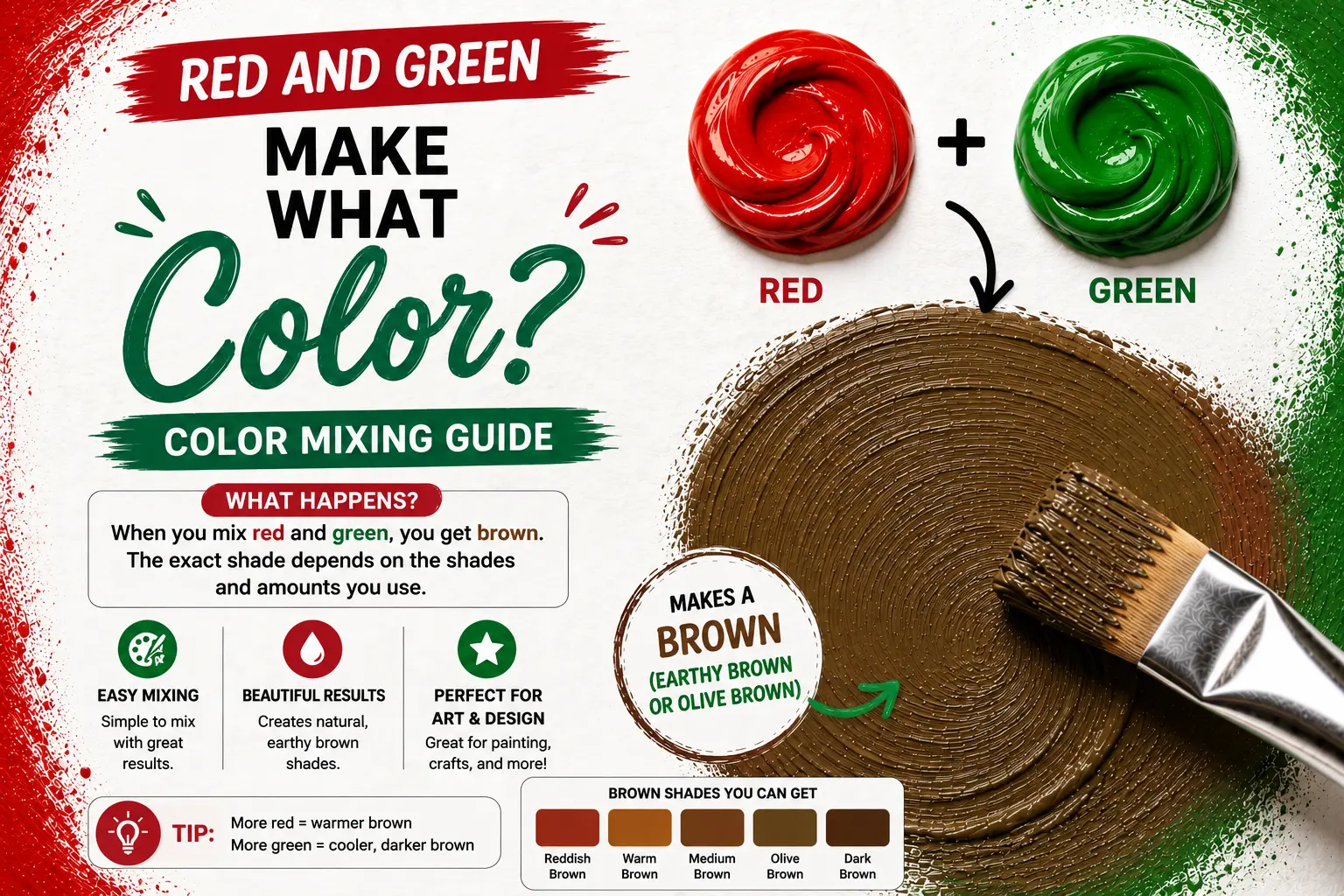
The direct answer is simple: mixing red and green together creates brown, which is a rich neutral color.
However, the final result isn’t always a boring, muddy shade. The exact tone you get depends heavily on the temperature of your colors, the type of medium you use, and your mixing proportions. Understanding these variables gives you complete control over this incredibly useful color family.
Main Takeaway:
Primary Red + Secondary Green = Brown / Neutral Tone (varying from warm chocolate to olive khaki depending on the mixing ratios and color bias).
Key Takeaways:
- The Direct Answer: In physical mediums like paint, red and green combine to make brown.
- The Scientific Reason: Red and green are complementary colors on the color wheel. When mixed, they cancel each other out to create a neutral color.
- Proportions Matter: Adding more red results in warm reddish-browns like mahogany or burgundy, while adding more green produces cool, earthy olive and khaki tones.
- Light vs. Paint: Mixing red and green light (additive mixing) produces yellow, which is completely different from mixing physical paint pigments (subtractive mixing).
The Basics of Color Mixing
To understand why these colors combine the way they do, we have to look at how pigments behave.
This happens because of the way we learn color as children. We are taught that red, yellow, and blue are the primary building blocks. When you mix primary colors, you get secondary colors like green (made from yellow and blue).
So, what happens when you mix a primary color like red with a secondary color like green? You are actually mixing all three primary colors together at once.
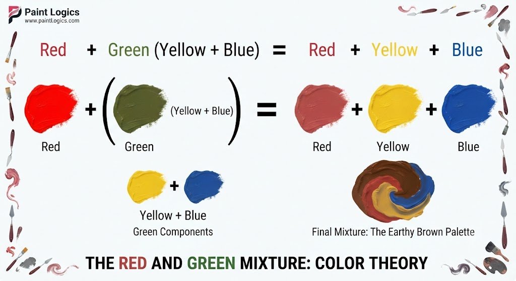
When you combine all three primaries, they absorb almost all visible light. This leaves you with a dark, earthy neutral color. Imagine you’re painting a forest scene. Knowing how to combine these elements allows you to create shadows without ever reaching for a tube of black paint.
Quick Tip: Never use pure black paint straight from the tube to darken your warm colors. It can make your artwork look flat and lifeless. Instead, use a complementary mix to create a vibrant, natural-looking dark tone.
Next, we’ll examine how these opposing colors interact on the color wheel.
Complementary Colors and Their Effects
Complementary colors sit directly across from each other on the color wheel. Red and green are one of the most famous complementary pairs.
Why does this happen? The contrast between them is incredibly high because they don’t share any of the same base colors. When placed next to each other, they make each other look brighter and more intense.
Here’s a good example: think of a classic holiday wreath. The bright red berries look incredibly vibrant because they sit against a deep green pine background.
When you mix them together, the opposite effect occurs. Instead of making each other pop, they actively neutralize each other. They cancel out the other’s brightness, pulling the mixture toward a quiet, balanced neutral color.
The Surprising Result of Mixing Red and Green
For many beginners, squeezing bright red and vibrant green onto a palette and ending up with a pile of brown is a bit of a shock.
That’s where many beginners get confused. They expect a fun, bright new color, but instead, they get what looks like mud. The reason is simple: when you blend opposites, you are stripping away their chroma (color intensity).
But this “mud” is actually an artist’s secret weapon.
Imagine you are painting a portrait and need a realistic skin tone, or you are painting a landscape and need a rich, warm soil shade. You can’t get those natural looks with bright primary colors. Mixing red and green provides a highly sophisticated range of organic tones that look authentic to the real world.
Shades of Brown from Red and Green Mixture
The beautiful thing about making your own brown is that you aren’t stuck with just one shade. By adjusting your ratios, you can create a wide spectrum of earthy colors.
Why does this happen? The pigments compete for dominance. If you use a high-tinting red, it will quickly overpower a transparent green, shifting the mixture toward a warm tone.
Here is how different mixing formulas behave on your palette:
- More Red (3:1 Ratio): This creates a warm, rich reddish-brown. Think of terracotta pots, mahogany wood, or autumn leaves.
- Equal Parts (1:1 Ratio): This gives you a balanced, deep chocolate brown. It is dark, quiet, and works perfectly for deep shadows.
- More Green (1:3 Ratio): This yields a cool, earthy brown that leans toward olive green or khaki. It is excellent for painting foliage, moss, and natural landscapes.
Now let’s compare these mixtures in a simple table to see how they look in practice:
| Color Ratio | Dominant Base | Visual Result | Common Name | Best Use Case |
| 3 Parts Red : 1 Part Green | Red | Warm, brick-red brown | Auburn / Mahogany | Warm wood tones, hair, autumn leaves |
| 1 Part Red : 1 Part Green | Balanced | Deep, neutral dark brown | Umber / Chocolate | Deep shadows, soil, tree trunks |
| 1 Part Red : 3 Parts Green | Green | Cool, greenish-brown | Olive / Khaki | Army camouflage, moss, deep foliage |
You Might Also Like:
Practical Uses of the Red and Green Mixture
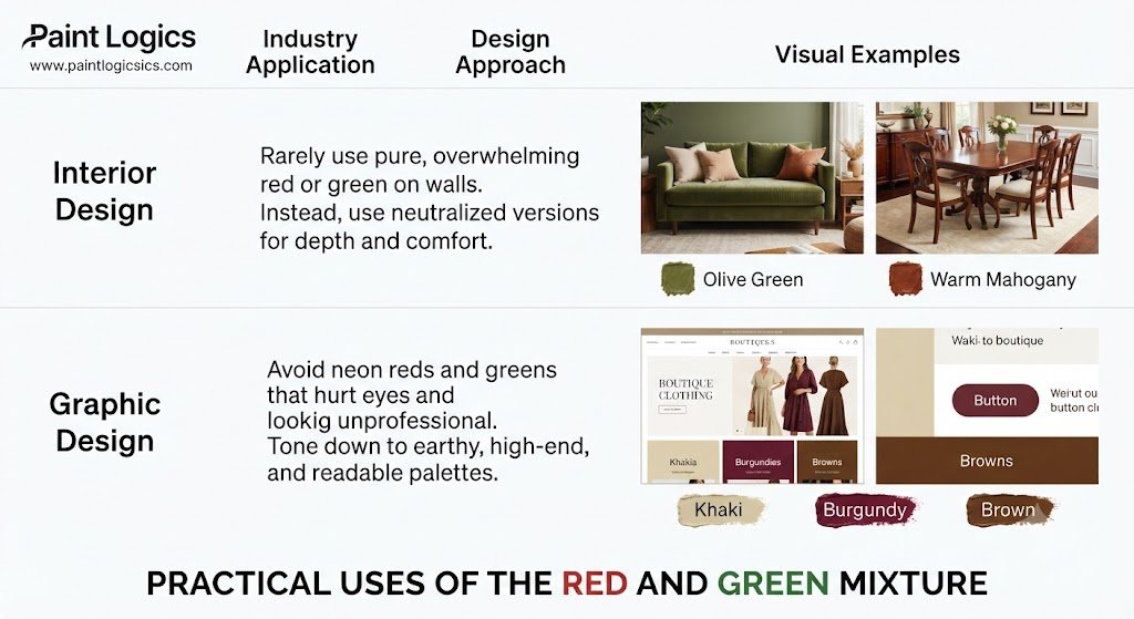
Understanding this mix isn’t just useful for fine art painters. It has massive practical value across several industries.
In interior design, professionals rarely use pure red or green on every wall because it can feel overwhelming. Instead, they use the neutralized versions. An olive green couch or a warm mahogany dining table adds incredible depth and comfort to a space without clashing.
In graphic design, a website built with neon reds and greens will hurt the user’s eyes and look unprofessional. By toning those colors down into soft khakis, warm burgundies, and rich browns, designers can create a website layout that feels earthy, high-end, and easy to read.
Additive vs. Subtractive Mixing
To truly master color, you must understand that color behaves differently depending on whether you are working with physical pigments or digital screens.
That’s where many beginners get confused. They try to mix red and green on a computer program and get a bright yellow instead of brown. Why does this happen? It comes down to the difference between mixing paint and mixing light.
Additive Color Mixing
Additive color mixing applies to light. This is how your phone screen, television, and computer monitor display images.
The primary colors of light are Red, Green, and Blue (RGB). When you mix red light and green light together, they combine to create yellow.
This happens because light waves add together to stimulate the red and green cones in your eyes simultaneously. If you turn all three primaries (RGB) on at maximum brightness, you get pure white light.
Subtractive Color Mixing
Subtractive color mixing applies to physical substances like paint, ink, and dye.
The traditional primary colors here are Red, Yellow, and Blue (RYB) (or Cyan, Magenta, and Yellow in professional printing). When you mix red and green paint, they subtract (absorb) light waves.
Because the pigments absorb almost all the light wavelengths, very little color is reflected back to your eyes. This leaves you looking at a dark, earthy brown.
Key Differences Between Additive and Subtractive Mixing
Let’s look at a quick comparison to make these differences easy to remember:
| Feature | Additive Mixing (Light) | Subtractive Mixing (Paint/Ink) |
| Primary Colors | Red, Green, Blue (RGB) | Red, Yellow, Blue (RYB) / CMYK |
| Red + Green Result | Yellow | Brown |
| How It Works | Adds wavelengths together | Absorbs (subtracts) light |
| Ultimate Result | All colors mixed = White | All colors mixed = Black/Dark Brown |
| Common Medium | Screens, projectors, stage lights | Acrylics, watercolors, printer ink |
The Color Spectrum Unveiled: Hues of Brown, Khaki, and Burgundy
When you mix red and green, you open the door to three highly popular neutrals: brown, khaki, and burgundy. Let’s look at how each of these behaves.
Brown: The Earthy Neutral
Brown is a classic neutral color that represents stability, comfort, and reliability.
This happens because we associate it with the earth, soil, and wood. In design, it acts as an anchor, allowing brighter colors to pop without making the space feel busy.
Khaki: The Practical Neutral
Khaki is a light, yellowish-brown with a distinct green undertone.
The reason is simple: it is made by adding a larger proportion of green and a touch of yellow or white to your red-green mix. It is highly practical and widely used in military uniforms and outdoor gear because it blends seamlessly with natural environments.
Burgundy: The Sophisticated Red
Burgundy is a deep, dark red with purple-brown undertones.
You can create this sophisticated hue by starting with a deep red and adding just a tiny touch of cool green. This darkens the red and pulls it toward a wine-like shade, making it highly popular in fashion and luxury branding.
Comparing Hues: Brown, Khaki, and Burgundy
While they all come from the same basic color family, these three hues serve very different purposes in design.
| Color | Mood / Vibe | Complementary Partner | Best Used For |
| Brown | Stable, cozy, grounded | Sky Blue | Backgrounds, heavy furniture, leather |
| Khaki | Practical, rustic, casual | Navy Blue | Outdoor apparel, casual wear, wall paint |
| Burgundy | Elegant, luxurious, bold | Emerald Green / Gold | Evening wear, formal dining rooms, accents |
Versatility of the Spectrum
The sheer versatility of the red and green spectrum is why professional painters and designers love it.
By simply adjusting your mixing ratios, you can go from a warm, cozy living room palette to a rugged outdoor apparel brand. It proves that neutral colors are anything but boring—they are the quiet workhorses of the design world.
So, in Conclusion: Red and Green Make What Color When Mixed?
At the end of the day, mixing red and green is the easiest way to create a gorgeous, natural brown.
While they look incredibly vibrant when placed side-by-side as complementary opposites, blending them cancels out their intensity, resulting in a rich neutral color.
Just remember the golden rule: start with your lighter color or use small amounts of your dark green first, slowly folding in your red until you hit your perfect, earthy target shade.
You Might Also Like:
Frequently Asked Questions
What color does green and red make when mixed?
When mixed in physical mediums like paint, acrylics, or ink, green and red make brown. Because they are complementary colors, they neutralize each other’s brightness to create a warm, earthy dark shade.
Does the shade of brown depend on the type of red and green used?
Absolutely. If you use a warm, yellowish-green (like Sap Green) and a bright orange-red (like Cadmium Red), you will get a warm, tan-brown. If you use a cool, bluish-green (like Viridian) and a cool red (like Alizarin Crimson), you will get a very dark, cool charcoal-brown.
Is brown the only color red and green can make?
No. Depending on your ratios, you can make a wide variety of colors. Adding a lot of red with a tiny touch of green creates a deep burgundy or maroon. Adding a lot of green with a tiny touch of red creates an olive green or deep khaki.
What happens when you mix red and green in additive color mixing?
In additive mixing (which uses light, like on computer screens), red and green mix to make yellow. This is because light waves add together to stimulate the color receptors in your eyes, rather than absorbing light like paint pigments do.
How can I lighten or darken the brown made by mixing red and green?
To lighten your homemade brown, add a small amount of white paint (to make a warm tan) or yellow paint (to make a golden ochre). To darken it, add a tiny touch of blue or a dark green pigment. Avoid adding black paint, as it can make your brown look dull and muddy.
What color does red, blue, and green make?
If you mix red, blue, and green light together (additive mixing), you get white light. If you mix red, blue, and green paint pigments together (subtractive mixing), you get a very dark, near-black muddy color.
What does red, blue, and green make in painting?
In painting, mixing red, blue, and green together creates a very dark, neutral shade that is almost black. Because you are combining two primary colors (red and blue) with a secondary color (green), you are essentially mixing all three primary pigments together, which absorbs almost all light.