Black and White Make What Color? Gray Mixing Guide
If you’ve ever wondered “black and white make what color,” you’re not alone. It seems like the most straightforward question in all of art and design, but the moment you start mixing them on a real canvas or digital screen, you realize there is a massive difference between a dull, muddy smudge and a clean tone.
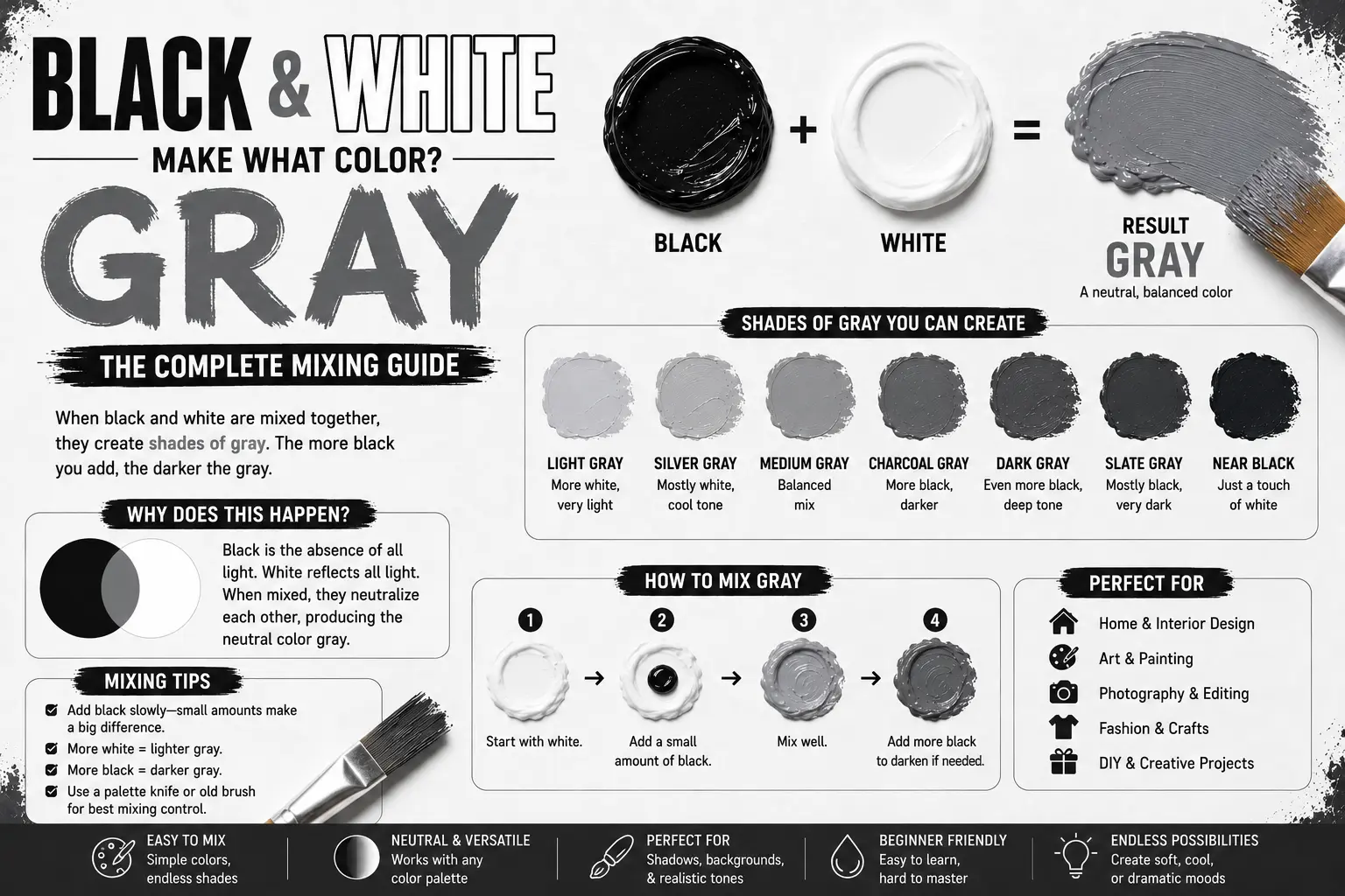
The direct answer is simple: when mixed together, black and white make gray.
However, the final result isn’t always a single, predictable shade. The exact tone you get depends on the physical pigments hiding inside your tubes of paint, the ratio of light to shadow you choose, and the lighting in your workspace. Understanding how these two dynamic forces interact will completely change how you approach values and shades in your creative projects. In this guide, you’ll discover the exact science behind creating beautiful, clean neutrals and how to avoid the common mistakes that leave your color palettes looking flat and lifeless.
Main Takeaway:
Pure Black + Pure White = Neutral Gray (depending entirely on the specific pigment bases and mixing ratios used).
Quick Answer: What Color Does Black and White Make?
When you combine black and white in physical paint, they form gray. By adding varying amounts of white to a dark base, you are changing its overall value, transforming a deep shadow into a workable spectrum of light-reflecting neutrals.
Why does this happen? The reason is simple: black absorbs all visible wavelengths of light, while white reflects them all equally. When they combine, they compromise, reflecting a partial amount of light that your brain perceives as a cool or warm neutral gray.
Imagine you’re mixing up a batch of acrylic paint to paint the stone walls of a house. If you start with a dollop of titanium white and drop in a pinprick of lamp black, the white immediately softens, sliding away from absolute brightness and heading straight toward a clean, soft silver. The transformation happens fast, making it an essential foundational technique for any artist.
The Science Behind Mixing Black and White
To understand how these two non-colors interact, you have to look at how light behaves on a physical surface versus a glowing screen. This is where the core physics of color comes into play.
Subtractive Color Mixing
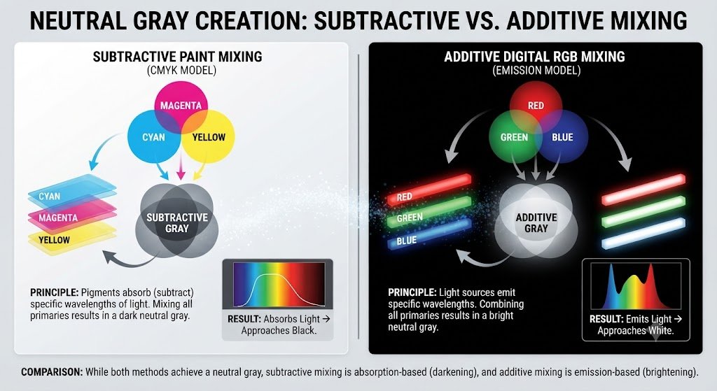
In the world of physical paints and inks, you are using subtractive color mixing. This means that every pigment you stir into the puddle subtracts, or absorbs, more light waves from the room. White paint reflects almost all light, while black paint absorbs it.
When you blend them together, the black pigment particles soak up a massive chunk of the light energy, leaving only a fraction of the wavelengths to bounce back to your eyes. This remaining light is what creates a physical neutral gray. A great example of this is mixing traditional oil paints on a wooden palette; the more black you drop in, the less light escapes the canvas.
Additive Color Mixing
Digital screens operate on an entirely different system called additive color mixing, which relies on red, green, and blue (RGB) light channels. In this environment, black is the complete absence of light, meaning the pixels are completely turned off. White, conversely, occurs when all three light channels are blasting at 100% maximum power.
So what’s the difference? When you want to mix a digital gray on a monitor, you aren’t blending physical liquids; you are simply dimming the brightness of the light channels equally. For instance, if pure white is RGB (255, 255, 255), cutting the energy directly in half gives you RGB (128, 128, 128). This creates a perfectly balanced digital gray on your phone screen without any physical pigments involved.
Common Shades Created When Mixing Black and White
Varying the exact proportions of your mixture yields distinct shades that carry different emotional weights and design utilities. Here are the most common values you can create.
1. Light Gray
Light gray is a soft, highly reflective shade that carries an airy, clean, and spacious feeling. It provides a subtle alternative to harsh, pure white backgrounds.
This happens because you take a large base of white paint and add an incredibly microscopic touch of black. Think of natural morning mist, polished silver spoons, or clean concrete floors in a modern gallery.
2. Medium Gray
Medium gray is the ultimate balanced neutral, sitting exactly halfway between total darkness and pure light. It has no strong emotional lean, making it highly versatile.
The reason you get this shade is a balanced 50/50 corporate mix of your pigments. Imagine the color of industrial steel beams, standard asphalt roads, or a stormy rain cloud passing overhead.
3. Dark Gray
Dark gray is a heavy, commanding value that brings a moody, serious, and deeply grounding energy to a color palette.
This shade occurs when your mixing ratio leans heavily toward the black side, utilizing just enough white to break the absolute darkness. Artists often use this to map out deep shadows under a bridge or the dark side of a mountain peak.
4. Charcoal Gray
Charcoal gray is an incredibly deep, rich shade of gray that carries faint smoky tones, making it feel organic and sophisticated.
This happens because you use a heavy, carbon-based black like Bone Black and split it with a tiny hint of white. Think of burnt wood embers, expensive tailored business suits, or a clean slate chalkboard.
5. Steel Gray
Steel gray is a cool, rigid, and metallic-looking neutral that features distinct, icy undertones.
This tone comes forward when the black pigment you use carries a natural blue or cool charcoal bias. It is highly popular in industrial manufacturing and automotive finishes because it looks sharp and resilient.
6. Slate Gray
Slate gray is a complex neutral that features a heavy blend of blue and purple undertones, making it look like a natural stone texture.
This shade occurs when you introduce a microscopic trace of a cool primary color into your standard black and white mix. Imagine wet river rocks, traditional roof tiles, or coastal cliffs on a foggy afternoon.
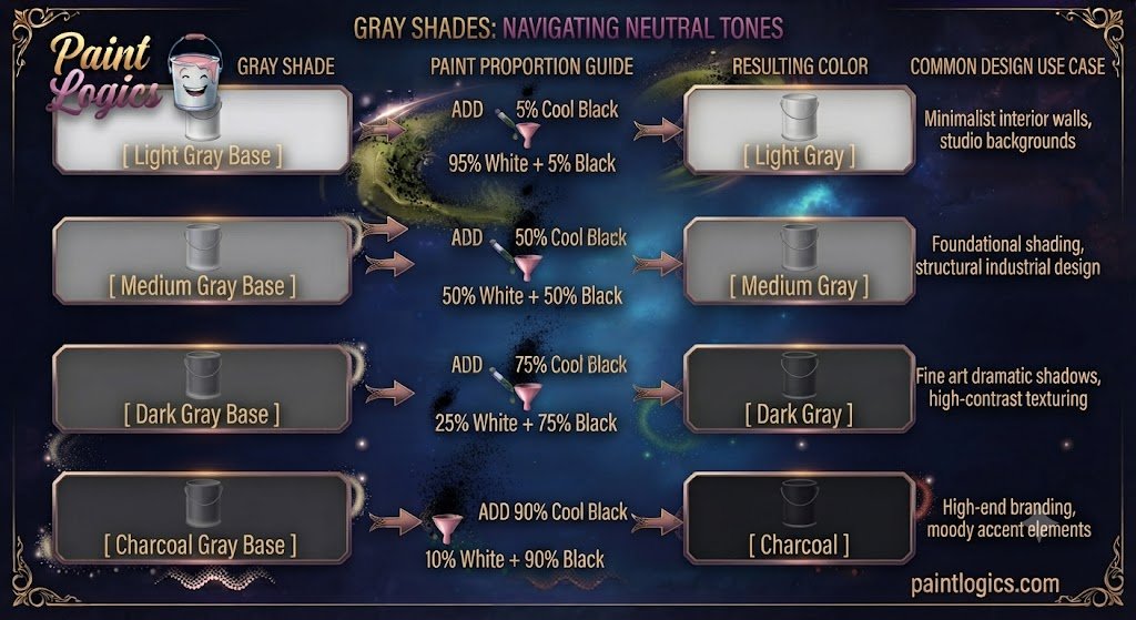
| Gray Shade | Paint Proportion Guide | Common Design Use Case |
| Light Gray | 95% White + 5% Black | Minimalist interior walls, studio backgrounds |
| Medium Gray | 50% White + 50% Black | Foundational shading, structural industrial design |
| Dark Gray | 25% White + 75% Black | Fine art dramatic shadows, high-contrast texturing |
| Charcoal | 10% White + 90% Black | High-end branding, moody accent elements |
Black and White in Paint: RYB and CMYK Color Models
Different professional industries organize these values using specific color frameworks to ensure absolute precision.
RYB Color Model: Traditional Paint Mixing
The Red-Yellow-Blue model is the classic system used by fine artists and painters. In this model, black and white are not considered colors, but rather tools used to adjust the value of primary and secondary pigments. Artists use white to create a “tint” and black to create a “shade,” mixing them together to build a neutral value scale that allows a painting to look three-dimensional.
CMYK Color Model: Black and White in Printing
The Cyan-Magenta-Yellow-Key (Black) framework runs the commercial printing industry. When a commercial printing press wants to create a clean gray area on a poster, it rarely uses a dedicated tube of gray ink. Instead, it sprays tiny, microscopic patterns of Key (black) ink dots directly onto the white paper, letting the white background of the page bleed through the gaps so your eyes blend the values together from a distance.
What Happens When You Mix Black and White with Other Colors?
Once you have established a clean gray base, dropping in a third vibrant color creates a series of sophisticated, muted tones known as “tones.”
Black + White + Red = Light Pink or Light Red
When you introduce a vibrant red to a black and white mixture, you wind up with a beautiful, dusty rose or muted pastel red.
The white shifts the red toward a lighter pink, while the black steps in to desaturate the brightness, keeping the color from looking like a loud neon bubblegum. Think of vintage brick dust or dried rose petals.
Black + White + Blue = Light Blue or Baby Blue
Adding blue to your neutral gray base instantly cools the temperature down, giving you a foggy baby blue or a soft denim tone.
The gray base acts as a mute button on the blue’s natural intensity, turning it into a calm, coastal hue. This is exactly how landscape painters paint the flat, hazy horizons of distant oceans.
Black + White + Yellow = Light Yellow or Pale Yellow
Mixing yellow into a gray base yields a soft, muted pale yellow or a quiet khaki-tan.
Because yellow is so light, the gray easily tames its brightness, transforming a loud, sunny hue into an earthy, sophisticated cream tone that looks incredible on interior walls.
Black + White + Green = Light Green or Mint Green
Dropping green into a blend of black and white creates a sophisticated mint green or a chalky sage tone.
The black and white mixture dial back the artificial look of factory-made greens, leaving behind an organic, leafy pastel that mimics natural foliage growing in the shade.
Black + White + Purple = Lavender or Light Purple
Tossing purple into your gray mix gives you a beautiful, smoky lavender or muted plum color.
The neutral gray acts as a perfect counter-weight to the high drama of purple, softening it into a restful tone often found in luxury spa branding and evening apparel.
Black and White in Art and Design
These two polar opposites form the absolute backbone of visual storytelling across multiple creative industries.
Monochrome Art
Monochrome and grayscale art strip away the distraction of vibrant colors, forcing the viewer to focus entirely on composition, form, and texture. By utilizing nothing but varying values of gray, an artist can create incredible drama and mood. Think of a charcoal sketch where the stark white paper fights against deep, heavy charcoal shadows to create a lifelike portrait.
Photography
Black and white photography is highly revered because it highlights raw emotion, geometry, and lighting patterns that color film sometimes masks. Without the distraction of red or yellow, a photographer can emphasize the harsh contrast of bright sunlight hitting a subject, creating a timeless, artistic look that feels incredibly cinematic.
Interior Design
Interior designers treat black, white, and gray as the ultimate timeless toolkit. Using a crisp white base makes a small room feel massive and bright, while black accents—like steel window frames or matte light fixtures—provide structural lines that anchor the space. Soft grays are then used on carpets or sofas to bridge the gap between the two extremes beautifully.
Common Mistakes to Avoid When Mixing Black and White
Even though it seems simple, mixing these two basic components can go wrong quickly if you aren’t careful with your workflow.
1. Adding Too Much White
White paint has a very weak tinting strength compared to black. If you have a puddle of pure black and try to turn it into a light silver by dumping white directly into it, you will waste a massive amount of paint before the color changes.
How to avoid it: Always start with white as your main base pile first, then pull a tiny, microscopic dot of black into it to darken it slowly.
2. Adding Too Much Black
Black paint is an absolute bully on your palette. A single large drop can instantly overpower a cup of white paint, plunging your clean neutral straight into a dark charcoal.
How to avoid it: Treat black paint like a highly concentrated dye. Add it using the absolute tip of your brush or palette knife in tiny, controlled steps.
3. Not Testing the Mix
Acrylic paints always dry a full shade darker than they look when they are wet and glossy on your palette. If you paint directly onto a surface without checking, your clean gray might turn into a dark slate once it dries.
How to avoid it: Keep a scrap piece of cardboard next to your station to dry a quick test patch before painting your main subject.
4. Ignoring Lighting Conditions
Mixing neutrals under a cheap, warm yellow desk lamp will mask the true nature of your gray, making it look far warmer than it actually is.
How to avoid it: Always mix your paints near a window with natural daylight or use a color-corrected daylight bulb over your desk to see the clean, unskewed tones.
Tips for Using Black and White Together in Design
If you want to maximize the impact of these classic neutrals in your graphic layouts or home projects, use these strategic design rules:
1. Start with a Balanced Base
When setting up a room or a website layout, choose one dominant value to handle roughly 60% of the visual space—usually a clean white or light gray. This keeps the environment from feeling chaotic, cluttered, or overly heavy.
2. Add Accent Colors
A pure black-and-white canvas acts as the perfect stage for a single accent color. Dropping a bright yellow pillow onto a charcoal couch, or using a vibrant red button on a monochrome website design, instantly draws the human eye directly to that specific spot.
3. High Contrast for Impact
If you want to create something bold, dramatic, and unforgettable, place pure black elements directly against crisp white backgrounds. This maximum contrast is highly readable and commands instant attention, which is why it’s the gold standard for text and luxury logos.
4. Soft Grays for Elegance
To create an environment that feels restful, quiet, and sophisticated, skip the harsh extremes of pure black and white. Instead, build your palette using a gradient of soft, layered grays to create a gentle, inviting atmosphere.
Conclusion
To wrap things up, black and white make gray. While it’s the most basic rule in color theory, the magic lies in how you manage your ratios to create beautiful sub-shades like charcoal, steel, and light silver.
The secret to mastering this classic mix is simple: always start with your white paint as the base, introduce your dark black pigment in tiny increments, and pay close attention to whether your materials lean warm or cool. Whether you are editing a dramatic photograph, painting a landscape shadow, or designing a clean modern logo, mastering the balance between these two opposites gives you complete control over light and depth in your work.
Read More Guide’s
#1 Pink and Black Make What Color? Complete Paint Mixing Guide
#2 What Color Does Brown and Purple Make When Mixed? Complete Guide
FAQs
What color do black and white make when mixed?
They combine to make gray. By adjusting your portions, you can create anything from a bright silver to a deep charcoal.
What is the result of mixing black and white in hair dye?
In hair dye, mixing these two creates a salt-and-pepper look or a uniform gray shade, depending on how evenly the pigments are blended throughout the hair strands.
How do black and white work in photography?
They remove the distraction of color, forcing the viewer to focus entirely on light contrast, shadows, textures, and the raw geometric composition of the shot.
What happens when black and white are mixed with red?
They create a muted, sophisticated tone often called dusty rose or pastel red. The white brightens the red, while the black takes away its aggressive intensity.
Can I use black and white for interior design?
Absolutely. It is a timeless, high-contrast combination that makes rooms feel clean, structured, and modern when balanced with soft gray furniture.
Can I mix black and white to create any color?
No. Black and white can only alter the value and intensity of existing colors. You cannot create primary hues like red, yellow, or blue using black and white alone.
What happens when black and white are mixed with blue?
They turn the vibrant blue into a calm, desaturated steel blue or foggy baby blue, which is perfect for painting realistic skies and water shadows.
Can black and white be used for branding?
Yes, many luxury brands use a strict black-and-white color palette because it communicates elegance, authority, and timeless sophistication.
What happens when you mix black, white, and yellow?
You get a soft, muted pastel cream or a quiet khaki-tan. The gray mixture tames the natural loudness of the yellow pigment.
Does the mix of black and white change in digital art?
In digital art, you are dimming the brightness of pixels rather than mixing physical fluids, resulting in a perfectly balanced mathematical gray.
What is the difference between mixing black and white in paint and light?
Paint absorbs light waves subtractively, creating a physical gray. Light adds energy; turning off light channels creates digital gray on a screen.
How can I use black and white in fashion?
You can layer a crisp white shirt under a sharp black jacket for a timeless, high-contrast look that never goes out of style and looks universally professional.