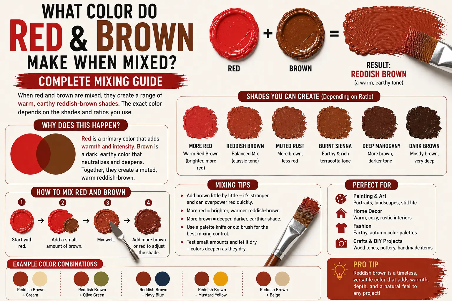
What Color Do Red and Brown Make When Mixed? Complete Mixing Guide
If you’ve ever wondered “red and brown make what color,” you’re not alone. It’s one of those classic color-mixing scenarios that pops up when you’re trying to capture the warm tones of an autumn forest, blend a natural hair dye, or choose the perfect accent wall for your home.
The direct answer is simple: when mixed together, red and brown make reddish-brown, brick red, rust, or deep mahogany.
However, the final result isn’t always identical every time you mix them. The exact shade you get depends on the specific undertones of your red base, the warmth or darkness of your brown pigment, and the ratio of each color you use. Understanding how these two rich, warm shades interact will completely change how you approach value and hue control in your projects. In this guide, you’ll discover the science behind this warm blend, how to control your proportions for target shades, and how to use these rich tones across various design disciplines.
Main Takeaway:
Primary/Secondary Red + Earthy Brown = Brick Red / Rust / Mahogany (depending on the mixing ratio and base undertones).
Quick Answer: What Color Do Red and Brown Make?
When you combine red and brown in a physical medium like acrylic or oil paint, you create a deep, warm reddish-brown, brick red, or earthy rust. Instead of dulling into a flat gray or black, the red infuses energy into the brown, while the brown anchors the fiery nature of the red.
Why does this happen? The reason is simple: brown is already an earthy, desaturated color made by combining all three primary colors (red, yellow, and blue). Because red is already an active ingredient inside most brown pigments, adding extra red simply boosts the red wavelength reflection, shifting the mixture toward a warmer, richer territory.
Imagine you’re painting a sunset scene over a canyon. If you start with a dollop of deep chocolate brown paint and fold in a splash of vibrant cadmium red, the brown immediately lifts. It transforms into a rich terracotta or brick shade that mimics real geological formations.
The Science Behind Mixing Red and Brown
Understanding how light and pigments interact on a physical level makes it much easier to predict your mixing results before your brush ever touches the canvas.
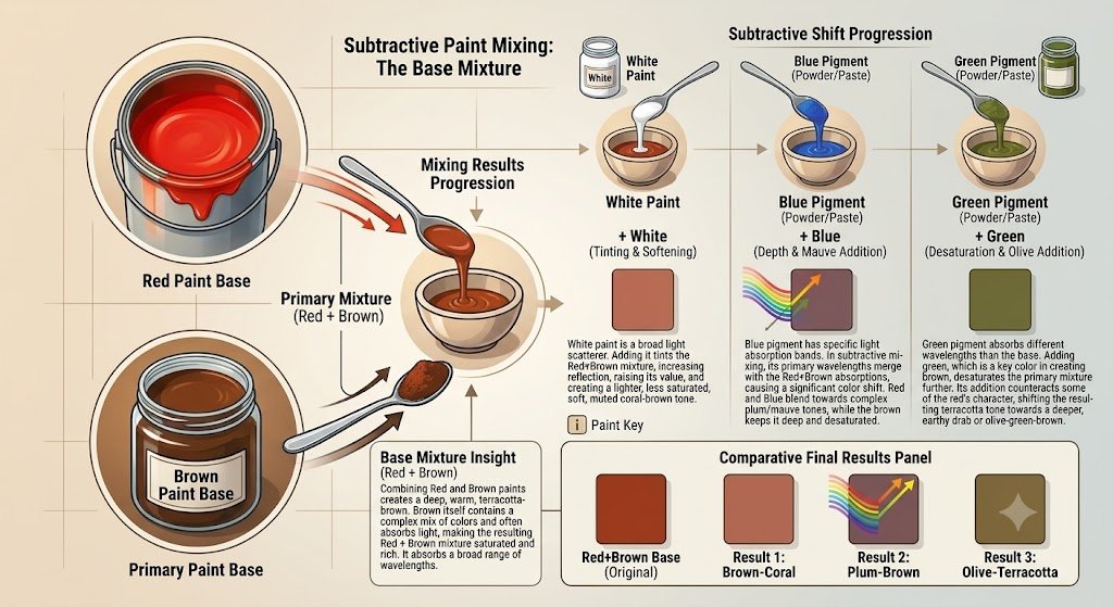
Subtractive Mixing: How Colors Interact
In physical mediums, you are working with subtractive color mixing. This means that every pigment you blend into your pile absorbs (subtracts) specific light waves while reflecting others back to your eyes. Brown paint absorbs a massive portion of the light spectrum because it contains a mix of primary colors, making it look dark and grounded.
When you add bright red paint into the mix, you introduce pigments designed to reflect long-wavelength red light. Because the brown absorbs the cool blue components while letting the red bounce free, the resulting blend looks like a deepened, shadow-toned version of red. A great example is mixing burnt umber with alizarin crimson; the crimson lightens the dark umber, giving you a glowing, wine-like warmth.
How Different Shades of Red and Brown Affect the Result
Changing the proportions or using different raw paint undertones yields distinct, beautiful colors. Here are the most common shades you can create:
Reddish-Brown
Reddish-brown is a balanced, warm earth tone that feels natural, grounded, and rich. It serves as a classic bridge between pure earth pigments and vibrant primary shades.
This shade occurs when you mix roughly equal parts of a standard medium brown with a warm crimson red. Imagine polished cherry wood furniture, autumn oak leaves, or natural leather boots.
Rust
Rust is a warm, orange-leaning shade of reddish-brown that carries an oxidized, weathered quality. It looks organic, rustic, and full of character.
The reason you get rust is simple: you combine a yellow-leaning red (like Cadmium Red Light) with a warm brown. Think of weathered metal gates, fallen autumn leaves, or terracotta roof tiles.
Maroon
Maroon is a dark, sophisticated red with deep brown undertones that feels luxurious and stately.
This shade comes forward when you add a small amount of dark brown to a cool red base. Imagine fine velvet drapery, vintage leather-bound books, or deep red wine stains on oak.
Burgundy
Burgundy is a rich red shade that carries subtle purple and deep brown undertones, giving it a cool, elegant depth.
This tone happens when your brown base carries a subtle blue tint (like Raw Umber) mixed with a cool ruby red. Think of aged fine wine, rich winter coats, or high-end leather accessories.
Mahogany
Mahogany is an exceptionally dark, rich reddish-brown shade with strong reddish highlights hiding beneath a dark wood surface.
You create mahogany by taking a heavy, dark chocolate brown and stirring in a small, concentrated amount of deep red. Imagine high-end antique furniture, executive wooden desks, or rich, dark hair dye shades.
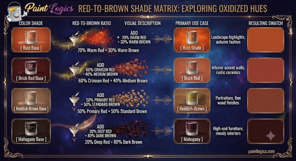
| Color Shade | Red-to-Brown Ratio | Visual Description | Primary Use Case |
| Rust | 70% Warm Red + 30% Warm Brown | Bright, oxidized, orange-red tone | Landscape highlights, autumn fashion |
| Brick Red | 60% Crimson Red + 40% Medium Brown | Earthy, warm, balanced terracotta | Interior accent walls, rustic ceramics |
| Reddish-Brown | 50% Primary Red + 50% Standard Brown | Balanced, warm, natural wood tone | Portraiture, fine wood finishes |
| Mahogany | 20% Deep Red + 80% Dark Brown | Dark, rich brown with red highlights | High-end furniture, moody interiors |
What Happens When You Mix Red and Brown with Other Colors?
Once you have established your base blend of red and brown, dropping in a third color component unlocks a whole new palette of complex hues.
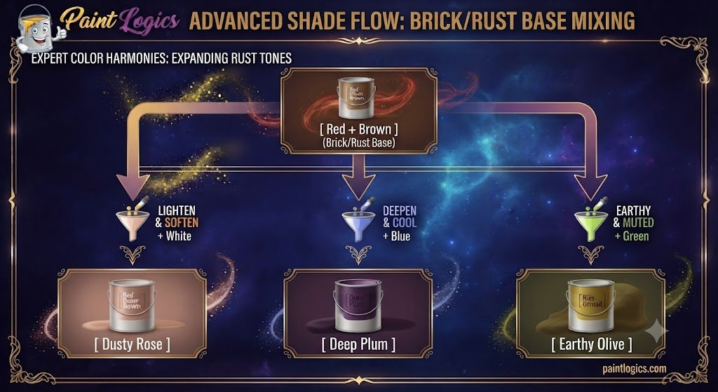
Red + Brown + White = Maroon, Burgundy, or Plum
Note: While pure red and brown make a dark rust or brick base, introducing white paint lifts the overall value, shifting dark tones into soft, dusty rose or pastel mauve shades.
Adding white paint to your red and brown base spreads the dark pigment particles apart. This lifts the heavy shadow quality, yielding a soft dusty rose, muted blush, or light terracotta pastel. Think of dried rose petals, desert sandstone, or cozy linen bedding.
Red + Brown + Yellow = Earthy Brown or Muted Red
Tossing a bright yellow into your red and brown pool supercharges the warmth, pushing the mixture straight into a fiery burnt orange or rich golden ochre.
The yellow interacts with the red to form orange, while the brown keeps the new secondary color muted and earthy. Imagine autumn pumpkin patches, dried spices, or sunbaked clay pottery.
Red + Brown + Blue = Deep Burgundy or Plum
Dropping a splash of cool blue into your active mixture introduces a dark primary element that shifts the blend toward a moody deep burgundy or shadowy plum.
The blue combines with the red to create purple, while the brown desaturates the brightness. This creates a luxurious shade often used by portrait painters to map out deep shadows under velvet cloth.
Red + Brown + Black = Dark Brown or Charcoal
If you introduce a small sliver of pure black to your red and brown mixture, you lower its light reflection dramatically, creating a heavy dark mahogany or near-black reddish charcoal.
The black swallows up the remaining brightness, leaving behind a subtle, warm undertone. This is an excellent choice for painting dark leather textures or deep wood grain.
Red + Brown + Green = Olive or Earthy Tones
Adding green to your red and brown base introduces red’s direct complement on the color wheel. This neutralizes the vibrant red, resulting in a rich, muddy earthy brown or deep forest olive.
Because red and green cancel each other out, the mixture loses its fiery edge and settles into an organic shade that mirrors damp soil or decayed autumn leaves.
Common Mistakes When Mixing Red and Brown
Even though red and brown naturally blend well together, it’s still easy to mess up your target value if you aren’t careful with your proportions.
Adding Too Much Brown
Brown paint carries a lower value and strong desaturating power. If you dump a large puddle of dark brown directly into red, it will swallow the red’s luminosity instantly, turning your pile into a flat brown.
How to avoid it: Always establish your red paint as your main starting base, then pull small slivers of brown into it until you reach your target shade.
Not Testing the Mix
Acrylic paints dry roughly a full shade darker than they look when wet and glistening on your mixing palette.
How to avoid it: Keep a scrap piece of heavy paper or cardboard next to your easel to dry a test swatch before painting your main subject.
Ignoring Lighting
Mixing warm colors under cool fluorescent lights or warm yellow desk bulbs will skew how you see the hue shift.
How to avoid it: Mix your paint near a natural window or use a color-corrected 5000K daylight bulb to see clean, accurate tones.
Tips for Mixing Red and Brown in Paint
To keep your color blends clean, predictable, and vibrant, follow these practical palette rules:
Start Slow
Treat your dark brown paint like a concentrated dye. Add it to your bright red base in microscopic increments using the tip of a palette knife, blending thoroughly after each addition.
Test on a White Surface
Never mix your paints on a dark wood or gray palette if you need accurate value reads. A crisp white surface is the only way to see the true warm undertones of your rust or brick red mixtures.
Use High-Quality Paints
Cheap student paints contain excessive fillers that quickly turn red-brown mixtures into a muddy gray. High-grade artist paints use pure iron oxide and crimson pigments that maintain luminosity.
Add White for Softer Tones
If your rust or mahogany mix looks too dark or intense, introduce a tiny pinprick of titanium white. This lifts the value and reveals the hidden warmth locked inside the mixture.
Consider the Lighting
Evaluate your dried swatches in the exact environment where the final work will hang. A deep mahogany that looks rich under bright gallery lights may look almost black in a dimly lit hallway.
How to Use Red and Brown Together in Design
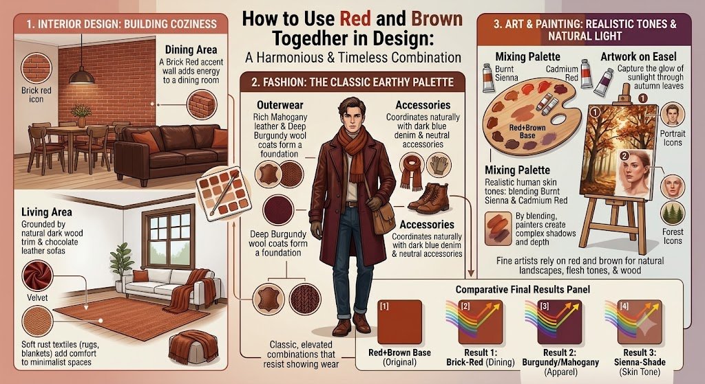
This rich, organic color combination is heavily utilized across interior design, fashion, and visual arts to create spaces and products that feel warm, timeless, and grounded.
Interior Design
Interior designers use red and brown pairings to build cozy, inviting spaces. A brick red accent wall brings energy to a dining room without feeling overly aggressive, especially when paired with natural dark wood trim or chocolate leather sofas. Soft rust textiles, like woven rugs or velvet throw blankets, add depth and comfort to minimalist living rooms.
Fashion
In apparel, red and brown blends form the foundation of classic autumn and winter wardrobes. Think of a rich mahogany leather jacket paired with a rust-colored knit scarf, or a deep burgundy wool coat. These earthy combinations look elevated, resist showing wear, and coordinate naturally with dark blue denim and neutral accessories.
Art and Painting
Fine artists rely on red and brown mixtures to paint realistic human skin tones, natural landscapes, and wooden objects. By blending burnt sienna with cadmium red, painters can create realistic shadows on flesh or capture the glow of sunlight passing through autumn tree canopies.
Real-Life Examples of Red and Brown Mixing in Art and Design
You can spot this versatile warm palette across commercial branding, interior architecture, and luxury apparel collections.
Fashion
High-end heritage brands frequently use mahogany and rust leather finishes for boots, saddles, and handbags. These shades age gracefully over time, developing a natural patina that accentuates the warm red undertones hiding beneath the surface.
Interior Design
Mid-century modern architecture makes extensive use of warm red-brown tones. Exposed brick fireplaces paired with stained walnut paneling showcase how these two colors harmonize naturally within open-plan homes.
Branding
Food and beverage brands often pair warm red with rich brown to communicate warmth, quality, and heritage. Think of artisan coffee packaging or craft chocolate wrappers that use deep rust and mahogany palettes to evoke a sense of rich flavor.
Conclusion
To wrap things up, red and brown make reddish-brown, brick red, rust, or mahogany. Because brown is built from a desaturated mix of primary colors, adding vibrant red simply restores warmth and luminosity to the mixture, turning a dark earth base into a glowing, rich shade.
The key to mastering this mix is simple: start with your vibrant red as your base, introduce dark brown slowly in tiny steps, and keep an eye on your pigment undertones. Whether you are painting a sunset, picking a cozy new wall color, or styling an autumn outfit, combining red and brown brings timeless warmth, depth, and sophistication to your work.
Read More Guide’s
Brown and Yellow Make What Color? Color Mixing & Uses
FAQs
What color do red and brown make when mixed?
They combine to create a warm reddish-brown, brick red, rust, or deep mahogany tone, depending on your mixing ratios.
Does red and brown make what color in hair?
In hair dye, blending red and brown creates shades like auburn, chestnut brown, mahogany, or dark warm cinnamon.
What happens when you add white to red and brown?
Adding white lightens the dark value, transforming a heavy brick or rust tone into a soft dusty rose, blush, or terracotta pastel.
Can I make red from brown?
No. Red is a primary color, meaning you cannot create it by mixing other colors together. You can only alter existing red pigments by adding brown to them.
How do red and brown create contrast in art?
They create subtle, tonal contrast rather than harsh chromatic contrast. Artists use bright red highlights over dark brown shadows to give objects a warm, three-dimensional form.
Can red and brown be used for branding?
Yes! They are widely used by coffee shops, outdoor outfitters, and heritage leather brands to communicate warmth, quality, and natural reliability.
Is red and brown used in autumn fashion?
Extremely often. Rust, mahogany, and brick red are quintessential fall fashion shades that mimic changing leaves and natural textures.
Can I mix red and brown for darker tones?
Yes. Mixing a dark brown (like Van Dyke Brown) into a deep red is a great way to create rich shadow tones without using pure black paint.
What happens if I add yellow to red and brown?
Adding yellow brightens the mixture and shifts the color toward a fiery burnt orange, terracotta, or golden ochre.
How do red and brown work in print design?
In CMYK printing, layering magenta, yellow, and black ink channels produces deep brick and mahogany tones that look rich and grounded on textured paper.
How does red and brown work in interior design?
They create grounding, cozy environments. Brick red and rust work well on walls and textiles, while dark brown provides structural balance through furniture and flooring.
What color does red, brown, and green make when mixed?
Because green is the direct complement of red, adding green neutralizes the red hue, pulling the mix into an earthy, desaturated brown or dark muddy olive.