What Color Do Red and Black Make? Complete Mixing Guide
If you’ve ever wondered “red and black make what color,” you’re not alone. It’s one of the most common experiments on the studio palette, whether you’re trying to paint a dramatic evening shadow, mix a deep hair dye, or design a moody color palette for a branding project.
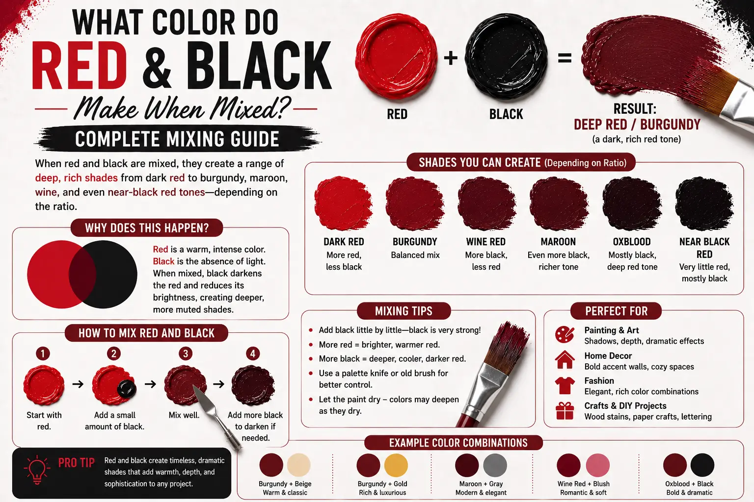
The direct answer is simple: when mixed together in physical paint, red and black combine to make burgundy, maroon, or a deep oxblood shade.
However, the final result isn’t always identical across every single canvas. The exact shade you get depends on the underlying undertone of your black paint, the warmth of your primary red tube, and the specific ratios you choose to blend. Understanding how these two high-contrast forces interact will completely change how you approach deep values and shadows in your work. In this guide, you’ll learn the hidden science behind this timeless mix, how to adjust your proportions for the perfect jewel tone, and how to avoid the muddy pitfalls that ruin many color palettes.
Main Takeaway:
Primary Red + Pure Black = Burgundy / Maroon / Oxblood (depending entirely on the mixing ratios and specific pigment undertones used).
Quick Answer: What Does Red and Black Make?
When you combine red and black in physical paint, you create a deep, sophisticated, and dark red hue known generally as burgundy or maroon. Instead of washing out the red color identity, the black lowers its value, turning a high-energy primary color into a rich, moody jewel tone.
Why does this happen? The reason is simple: black paint acts as a light absorber, lowering the brightness of any pigment it touches without shifting its position on the color spectrum. Because red is an intense, long-wavelength color, adding a touch of black simply pulls it down into a heavy shadow state while preserving its warm, dramatic core.
Imagine you’re painting a bowl of fresh cherries under a single spotlight. If you start with a vibrant pool of Cadmium Red and stir in a tiny toothpick edge of Ivory Black, the brightness drops immediately. It shifts away from looking like a bright stop sign and turns into a deep, luxurious wine shade that instantly gives your painting physical depth.
Color Mixing Tool — Mix Colors Online | Free Color Mixer
Before you squeeze expensive physical paint out of your tubes, using a digital color mixer can save you a lot of time and resources. A free online color mixer lets you drag sliders to adjust percentages, giving you a quick visual preview of your final shade.
This happens because digital tools can instantly simulate basic color blending math before you make a physical mess. By testing your ideas on a screen first, you can pinpoint the exact ratio you need for your project without wasting materials. For instance, you can dial in a specific blend to see exactly when red loses its brightness and transitions into an oxblood tone.
Traditional painters often use these online preview tools to map out their color charts before picking up a palette knife. It acts as a perfect structural blueprint for your color scheme.
Why Do Red and Black Make Darker Tones?
The shift toward deeper values happens because black paint functions as a total light sponge on a physical canvas.
The reason is simple. When daylight hits pure red paint, the surface reflects long red wavelengths back to your eyes while absorbing everything else. When you introduce black pigment particles into that same space, they swallow up a massive portion of those remaining red wavelengths too. Because less light energy manages to escape the surface, your brain registers the resulting mixture as a heavily darkened, desaturated tone rather than a bright primary hue.
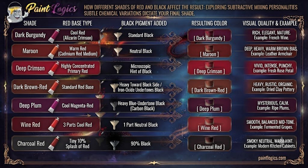
How Different Shades of Red and Black Affect the Result
The exact tubes of paint you select from your art box completely dictate the structural personality of your final mixture. Subtle chemical variations change everything.
1. Dark Burgundy
Dark burgundy is a rich, high-end shade of dark red that carries a highly visible, cool purple undertone. It looks incredibly elegant, mature, and luxurious.
This shade happens when you mix a cool, blue-leaning red like Alizarin Crimson with a standard black paint. Think of premium velvet theater curtains, luxury sports car interiors, or a glass of fine French wine.
2. Maroon
Maroon is a deep, heavy brick-red shade that features a distinct, warm brown bias running through its core.
The reason you get this shade is by combining a warm, orange-leaning red (like Cadmium Red Medium) with a neutral black. Imagine classic autumn university sweaters, traditional leather armchairs, or weathered exterior barn paint.
3. Deep Crimson
Deep crimson is a vivid, intense shade of dark red that sits right on the edge of brightness, retaining a powerful visual punch.
This tone comes forward when you use a highly concentrated primary red base and introduce the most microscopic hint of black possible. Artists use this color to paint real-world elements like fresh rose petals or dramatic sunset horizons.
4. Dark Brown-Red
Dark brown-red is a heavy, completely desaturated neutral that looks highly rustic, organic, and deeply grounded.
This happens when your mixing ratio leans heavily toward the black side, or when you use a black paint that naturally features heavy iron-oxide undertones. Think of dried clay pottery, old rusted iron beams, or dark mahogany tree bark.
5. Deep Plum
Deep plum is a dark, moody shade that carries a strong purple and violet identity, making it look mysterious and calm.
This color occurs when you use a black paint that carries heavy blue undertones (such as Carbon Black) and mix it with a cool magenta-red. Imagine ripe plums hanging from a branch or expensive evening gowns.
6. Wine Red
Wine red is a smooth, balanced mid-tone that perfectly mimics the look of fermented grapes under direct sunlight.
This shade comes forward when you mix roughly three parts cool red with one part neutral black paint. Think of high-end cosmetic lipstick shades, formal winter neckties, or polished leather shoes.
7. Charcoal Red
Charcoal red is an incredibly dark, smoky neutral that looks almost entirely black until the daylight hits it directly, revealing a faint red tint.
This tone comes forward when your mixing ratio is pushed to the extreme, using about 90% black paint mixed with a tiny 10% splash of red. Interior designers frequently use this shade for modern kitchen cabinets to add a subtle layer of warmth that standard black lacks.
Paint vs. Light: Does It Change the Mixed Color?
This is where many graphic designers and traditional studio painters run into massive communication issues. Color behaves completely differently depending on whether you are working with wet fluids or electronic light waves.
Subtractive Mixing (Paint)
Physical paint relies entirely on subtractive color mixing. Every pigment you stir into your palette adds more physical particles that block, or subtract, light from escaping the canvas. When you mix red and black paint together, you are physically reducing the light reflection, which pulls the primary red straight down into a beautiful, rich maroon or burgundy.
Additive Mixing (Light)
Digital screens operate on additive color mixing using red, green, and blue (RGB) light channels. In this environment, black isn’t a physical material—it is simply the complete shut-off of pixel energy.
So what’s the difference? If you are working in a digital art app and try to mix “black light” into red light, you are simply lowering the brightness slider of your red pixels. If pure digital red is RGB (255, 0, 0), cutting its power directly in half gives you RGB (128, 0, 0). On a computer monitor, this displays as a clean, dark crimson red, but it lacks the organic chemical undertones you get when real paint pigments collide.
Can You Make Red from Black?
A very common question among beginners is whether you can manufacture a bright red paint by starting with a black base and adding other modifiers.
The direct answer is no: you can never create red from black, because red is a primary color.
The reason is simple. Primary colors are the foundational building blocks of all color theory, meaning their pigments cannot be created by mixing any other combinations together. Black paint can only darken or desaturate a primary color that is already present on your palette. If you don’t have a tube of red paint to start with, you cannot create it out of darkness.
Red and Black Color Mixing Chart (Paint Examples)
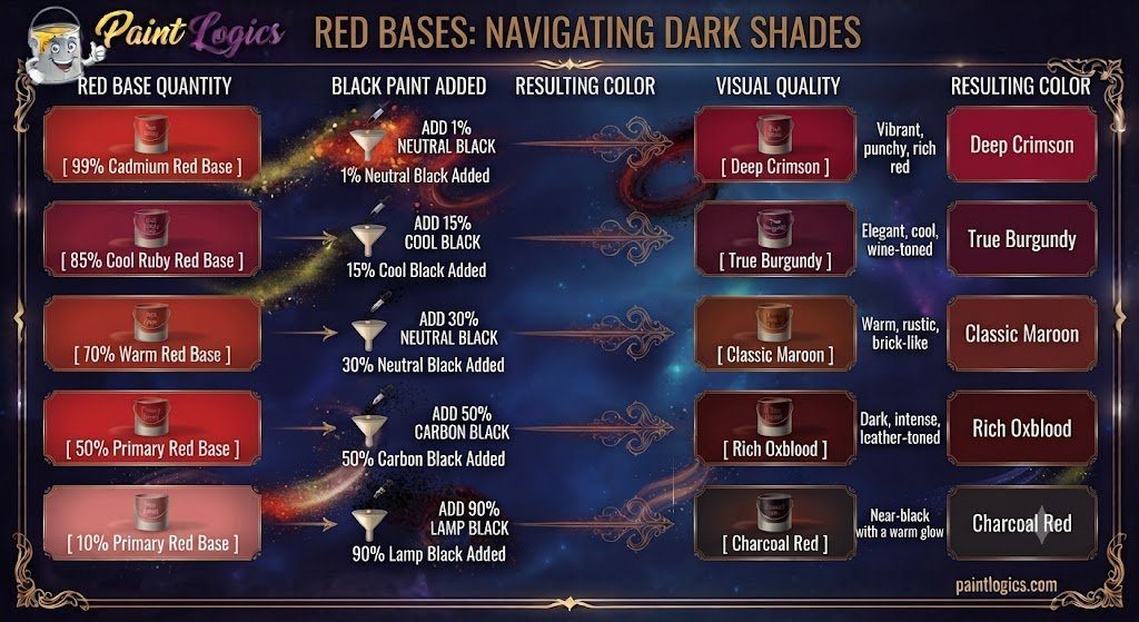
To help you hit your target shade with pinpoint accuracy, check out this structural pigment breakdown table:
| Red Base Quantity | Black Paint Added | Resulting Color | Visual Quality |
| 99% Cadmium Red | 1% Neutral Black | Deep Crimson | Vibrant, punchy, rich red |
| 85% Cool Ruby Red | 15% Cool Black | True Burgundy | Elegant, cool, wine-toned |
| 70% Warm Red | 30% Neutral Black | Classic Maroon | Warm, rustic, brick-like |
| 50% Primary Red | 50% Carbon Black | Rich Oxblood | Dark, intense, leather-toned |
| 10% Primary Red | 90% Lamp Black | Charcoal Red | Near-black with a warm glow |
What Happens When You Add White, Yellow, or Black to Red and Black?
Once you have established your core red and black mixture, introducing a third color variable will alter the temperature and mood instantly.
Now let’s look at this multi-color mixing matrix:
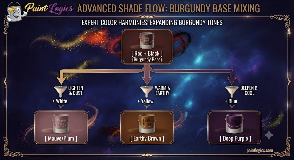
Red + Black + White = Maroon, Burgundy, or Plum
Introducing white paint directly to your active dark red mixture lifts the value instantly, transforming a heavy shadow tone into a soft, sophisticated mauve or dusty plum.
This happens because the highly reflective white particles spread the dark pigments apart without destroying the cool blue tones. Think of antique heather clothing or desert rocks at twilight.
Red + Black + Yellow = Brown or Muted Red
Tossing a splash of bright yellow into your mixture supercharges the warmth, turning your deep burgundy base into a rich earthy brown or muted autumn red.
The yellow cancels out the cool undertones, pulling the mix toward the orange side of the color wheel. Imagine dried chili powder, warm terracotta clay, or fresh cinnamon sticks.
Red + Black + More Black = Very Dark Brown or Charcoal
If you continuously feed more black paint into the pile, you will rapidly choke out the red wavelengths completely, leaving a very dark brown or charcoal gray behind.
The black particles overwhelm the red identity, pulling the mixture right to the absolute edge of total light absorption. Artists use this extreme combination to paint midnight shadows or burnt wood textures.
Red + Black + Blue = Deep Burgundy or Plum
Dropping a touch of pure ultramarine blue into your active pool accelerates the cool shift, turning your mixture into a rich deep burgundy or royal plum.
The extra blue coordinates with the red to form a dark violet undertone, making the color look highly complex and dramatic under direct spotlighting.
Mixing Red and Black in Digital vs. Traditional Art
Understanding how your tools process values is the only way to maintain complete control over your creative outputs.
Digital Art (RGB Color Model)
In digital design programs like Photoshop or Procreate, mixing is purely mathematical. Designers use the RGB color model, where values scale from 0 to 255. To create a clean maroon on a website, a programmer simply inputs a lower number into the red channel while leaving the green and blue channels completely at zero.
Traditional Art (RYB Color Model)
Traditional painters work within the Red-Yellow-Blue model using real, physical chemical liquids. This means you must deal with the texture, opacity, and explicit chemical purity of the paint itself, making the mixing process much more experimental and tactile.
Difference
So what’s the difference? Digital art gives you absolute mathematical perfection without any muddy surprises, but traditional art provides a rich, multi-dimensional texture because real paint pigments feature unpredictable, organic undertones that reflect light beautifully.
Common Mistakes When Mixing Red and Black
Even experienced designers can run into trouble when handling these two highly dominant color families.
- Adding Too Much Black Too Fast: Black paint has an immense tinting strength that will instantly conquer a lighter color. Dumping a large puddle of black into red will turn your entire batch of paint into an irreversible dark soup.
- Ignoring the Undertones: Using a cheap black paint that contains hidden green pigments can accidentally neutralize your red, leaving you with a dead, muddy gray instead of a rich burgundy.
- Skipping Test Swatches: Acrylic paint always cures a full shade darker than it looks when it is wet and glistening on your palette. Applying it immediately to your project without a test is an enormous gamble.
Tips for Mixing Red and Black in Paint
To ensure your color blends remain crisp, clean, and completely intentional, follow these quick workflow rules:
- Start with Red as the Base: Always establish your red paint as your main base pile first, then pull a microscopic sliver of black paint over using a palette knife. Mix it in slow, controlled increments.
- Test on a Crisp White Surface: Never mix your colors on a dark gray or brown mixing board. A white palette is the only way to see the true warm undertones as they develop.
- Invest in Single-Pigment Paints: Cheap student paints are packed with chalky chemical fillers that quickly turn your mixture into a flat, dead gray soup. Professional-grade paints ensure your earth tones stay luminous.
Pro Tip: If you want a more vibrant, glowing shadow color, try mixing a dark green or deep blue into your red instead of pure black. It creates a much more lively, multi-dimensional shadow.
Complementary Colors for Red and Black
When you build a design layout around a deep red-black mixture like burgundy, choosing the right companion colors makes all the difference.
The reason is simple: placing a color next to its direct complement makes both hues pop with maximum visual energy. For a rich maroon base, pairing it with a soft sage green or a muted olive creates a beautiful, natural balance. If you want a high-contrast modern look, accenting your deep dark reds with warm metallic golds or crisp, bright creams provides a stunning, premium aesthetic.
Real-Life Examples of Red and Black Mixing in Art and Design
You can find this classic, intense color combination hidden across multiple premium industries worldwide.
Fashion:
Luxury fashion labels rely heavily on burgundy and oxblood for premium autumn clothing lines. Think of a high-end leather handbag, a tailored winter trench coat, or expensive leather boots. These tones are universally loved because they look incredibly expensive, resist showing dirt, and harmonize beautifully with standard blue denim.
Interior Design:
Interior designers treat deep dark reds as spectacular anchor colors for intimate spaces. Painting a dining room or home library wall in a rich maroon shade creates a cozy, secure environment that pairs beautifully with dark walnut wood, brass hardware, and warm ambient lighting.
Branding and Logos:
Many historic universities, high-end wineries, and premium automotive brands use a red-and-black color scheme for their logos. The black projects absolute authority, history, and sophistication, while the red injects passion, energy, and power, making the company feel instantly trustworthy and prestigious.

Conclusion:
To wrap things up, red and black make burgundy, maroon, or oxblood. While your intuition might tell you that adding black should simply make things darker, the unique light-absorbing qualities of physical pigments pull primary red down into a luxurious, deep jewel-tone family.
The entire secret to mastering this striking pairing lies in starting with your bright red paint as your main base, introducing your dark black pigment in microscopic increments, and respecting the hidden undertones of your tools. Whether you are illustrating a dramatic fine art shadow, designing a modern website interface, or picking a bold new look for your home interior, utilizing this rich mixture adds instant depth, warmth, and luxury to your creative work.
Read More Guide: Black and White Make What Color? Gray Mixing Guide
FAQs
What color do red and black make when mixed?
In physical paint, they combine to make a deep red tone like burgundy, maroon, or oxblood, depending entirely on your specific proportions.
Why does red and black make maroon?
Black paint acts as a powerful light sponge. When it mixes into red, it lowers the overall light reflection, pulling the primary red down into a deep, warm shadow value.
Can I make red from black?
No. Red is a foundational primary color, which means its raw pigments cannot be created by mixing any other colors together.
Does the ratio of red to black matter in the mix?
Yes, immensely. Because black has an incredibly high tinting strength, even a tiny 1% shift in the ratio can transform a bright crimson into a dark charcoal red.
Can you use red and black together for interior design?
Absolutely. They are excellent for creating a moody, intimate accent wall in dining rooms or libraries when balanced out with bright white trim.
What happens if I add white to the mix?
Adding white paint lifts the darkness, transforming a heavy burgundy into a soft, sophisticated mauve or dusty plum tone.
What if I add yellow to the red and black mix?
The yellow injects high-energy warmth, shifting your deep maroon mix into a rich earthy brown or warm autumn amber.
How can I mix red and black for fashion?
Layer a rich oxblood leather jacket over a clean black shirt to create a high-contrast, sophisticated look that feels modern and high-end.