What Colors Make Turquoise? Easy Mixing Guide for Beginners
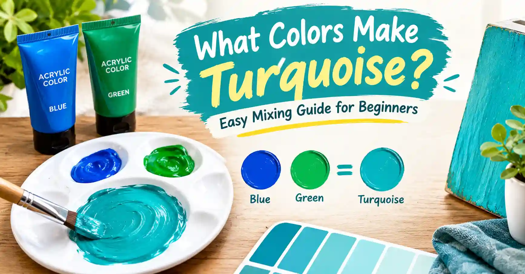
Ever mixed blue and green and ended up with a dull, murky swamp color instead of that bright, tropical turquoise you had in mind? Figuring out what colors make turquoise trips up a lot of beginners, and the fix is simpler than you’d think.
Main takeaway: Mix Blue and Green in roughly a 2:1 ratio, then add White until the color lightens and brightens into turquoise. That’s the whole formula. The tricky part is getting the blue-to-green balance right, which this guide walks through step by step.
By the end, you’ll know exactly how to mix turquoise paint, how to fix it when it goes wrong, and how to match the digital hex code if you’re working on a screen instead of a canvas.
What Is Turquoise?
Turquoise is a cool color that sits right between blue and green on the color wheel. It’s named after the gemstone of the same name, a mineral prized for thousands of years for its bright, sky-meets-sea coloring.
Because turquoise blends two cool hues, it reads as fresh, calming, and slightly tropical. It’s brighter and lighter than teal, and it carries more green than a pure sky blue. That in-between quality is exactly what makes it tricky to mix on the first try.
Turquoise carries strong associations with water, clarity, and relaxation. It shows up constantly in beach and resort branding, spa design, and jewelry, all places where that calm, refreshing quality matters.
What Colors Make Turquoise?
So, what colors make turquoise when you’re standing at a palette? The short answer: Blue + Green + White, mixed in roughly a 2:1:1 ratio.
Start with Blue as your dominant color. Phthalo Blue or Cerulean Blue both work well, since they lean cool and clean rather than muddy. Add Green, roughly half the amount of blue, using Phthalo Green or Viridian for the clearest result.
Once the blue and green are combined, you’ll have something closer to teal than turquoise. That’s where White comes in. Add White gradually until the mix lightens and brightens into that unmistakable turquoise glow.
Image caption: Swatch strip showing Blue and Green mixing together, then lightening into bright turquoise as White is added.
Step-by-Step: How to Mix Turquoise in Paint
Here’s exactly how to make turquoise paint from scratch, whether you’re working in acrylic, oil, or gouache.
- Start with two parts Phthalo Blue or Cerulean Blue on your palette. This forms the base of your mix.
- Add one part Green, ideally Phthalo Green or Viridian, since both stay clean and don’t muddy easily.
- Blend the blue and green together fully before adding anything else. You should see a deep teal at this stage.
- Add White gradually, a small amount at a time, mixing thoroughly between additions.
- Watch the color shift from deep teal into a brighter, lighter turquoise as more white gets incorporated.
- Adjust warmth or coolness. Too green? Add a touch more blue. Too blue? Add a touch more green.
- Test dry. Turquoise often looks slightly different once it dries, so let a small sample dry fully before judging the final shade.
Beginner Tip: Add white in small increments rather than all at once. Turquoise can go from perfect to pastel in just one extra dollop of white, and it’s much easier to lighten a mix further than to darken it back down.
Mixing Chart: Paint Combinations for Turquoise
Different pigment pairs produce slightly different turquoises, some leaning more blue, some leaning more green, some brighter or more muted. The chart below shows ten combinations worth knowing, along with the hex code each one lands closest to.
Use this table as a starting reference rather than a strict rulebook. Paint brands vary in pigment strength, so treat these ratios as a launchpad for your own testing.
| Pigment Combination | Ratio | Resulting Shade | Approx. Hex |
| Phthalo Blue + Phthalo Green + White | 2:1:1 | Bright, vivid turquoise | #30D5C8 |
| Cerulean Blue + Viridian + White | 2:1:1 | Soft, classic turquoise | #40E0D0 |
| Cyan + Yellow (touch) + White | 3:1:2 | Light, tropical turquoise | #48D1CC |
| Prussian Blue + Sap Green + White | 2:1:2 | Deep, muted turquoise | #2E8B8B |
| Cobalt Blue + Emerald Green + White | 2:1:1 | Jewel-toned turquoise | #20B2AA |
| Ultramarine Blue + Phthalo Green + White | 1:2:2 | Green-leaning turquoise | #3EB489 |
| Phthalo Blue + Lemon Yellow (tiny touch) + White | 3:1:2 | Aqua-leaning turquoise | #7FFFD4 |
| Cerulean Blue + Yellow Ochre (tiny touch) + White | 3:1:2 | Warm, muted turquoise | #66CDAA |
| Manganese Blue + Viridian + White | 2:1:1 | Bright sea-glass turquoise | #40E0D0 |
| Indigo + Emerald Green + White | 1:1:2 | Deep, shadowed turquoise | #367588 |
Notice how the green-heavy mixes drift toward teal or aqua, while the blue-heavy mixes stay closer to a true turquoise or sky-blue lean. Small shifts in ratio move the result surprisingly far along the blue-green spectrum.
How to Make Turquoise With Different Starting Colors
Not everyone has Phthalo Blue and Phthalo Green sitting on their palette. Here’s how to make turquoise paint using whatever colors you already own.
If you only have basic Blue, Yellow, and White, start by mixing Blue and Yellow to create Green first. Then add more Blue to that green until it shifts toward turquoise, and finish with White to lighten. This takes an extra step but works with a limited palette.
If you have a warm and cool version of blue, use the cool one. Cool blues like Cerulean or Phthalo Blue produce a cleaner turquoise than warm blues like Ultramarine, which tend to pull the mix toward purple instead.
If you’re working with a basic student-grade set, look for the closest thing to “Sky Blue” or “Turquoise” already in the box, and use that as your starting point instead of building the color entirely from scratch. Many beginner sets include a pre-mixed base you can simply brighten or adjust.
How to Make Turquoise Digitally (RGB/Hex)
Digital turquoise skips the pigment guesswork entirely. What colors make turquoise on a screen comes down to one exact value.
The standard hex code for turquoise is #40E0D0. In RGB, that’s 64, 224, 208, meaning a moderate amount of red, a high amount of green, and a high amount of blue.
In Photoshop, type #40E0D0 directly into the hex field of the color picker. In Procreate, tap the color wheel, and either drag the selector to the blue-green region or type the hex code into the value field at the top. In CSS, use color: #40E0D0; or the shorthand color: turquoise; both render identically, since turquoise is one of the standard named web colors.
Image caption: Digital color picker interface showing the hex field set to 40E0D0 for standard turquoise.
Common Mistakes and How to Fix Them
Your turquoise turns out too gray. This usually means the blue and green were overmixed, or too much white was added too quickly. Fix it by adding a fresh small amount of Phthalo Blue or Green to reintroduce vibrancy, rather than adding more white.
Your turquoise turns out too blue. Too much blue relative to green pulls the mix toward sky blue instead of turquoise. Add small amounts of Green gradually until the balance shifts back.
Your turquoise turns out too green, almost like teal. The opposite problem: too much green pigment overwhelming the blue. Add a touch more Blue to pull it back toward a true turquoise.
Your turquoise looks dull or muddy instead of bright. This often happens when warm pigments sneak into the mix, even in small amounts. Double-check that your blue and green are both cool-leaning, since a single warm undertone can flatten the whole mix.
Tips for a Consistent, Vivid Turquoise
Getting a great turquoise once is easy. Getting the same great turquoise every time takes a bit more care.
Use artist-grade pigments when possible. Phthalo Blue and Phthalo Green in particular are known for strong, clean tinting power, and cheaper student-grade versions often contain fillers that dull the final result.
Test on scrap paper first. Never mix your final turquoise directly where it needs to go. Dab a small test patch on the side of your palette and let it dry before committing to the full batch.
Mix in small batches. Turquoise is genuinely difficult to remix identically, since even a tiny shift in blue-to-green ratio changes the result noticeably. If you need a large amount, mix slightly more than you think you’ll need in one go.
Keep a mixing log. Write down the exact ratio that worked for a specific project. Turquoise is one of the colors most worth documenting, since guessing your way back to it later rarely works.
As one muralist once put it, “mixing turquoise is like tuning a guitar string, a tiny turn in either direction changes everything, so you adjust slowly and listen closely.”
Real-Life Uses of Turquoise
Turquoise shows up constantly once you start noticing it. In fashion, it’s a reliable warm-weather staple, especially in swimwear and summer accessories where its fresh, tropical quality does a lot of the work on its own. In interior design, a turquoise accent wall or turquoise textiles add instant energy to an otherwise neutral coastal or bohemian room.
In branding, turquoise signals calm trustworthiness with a touch of playfulness, which is why it shows up often in wellness, travel, and tech branding that wants to feel approachable rather than corporate. Painters reach for a hand-mixed turquoise specifically because it can be tuned exactly to a project’s mood, brighter for something playful or more muted for something sophisticated.
Shades and Variations of Turquoise
Not every project calls for the exact standard turquoise. These four named variations offer useful alternatives, each with its own hex code and best use case.
Aquamarine (#7FFFD4) is lighter and more pastel, ideal for soft, airy branding or nursery decor. Teal (#008080) pulls much darker and greener, popular in sophisticated, moody interior palettes. Robin Egg Blue (#00CCCC) leans brighter and more playful, a favorite in retro and mid-century design. Persian Green (#00A693) sits deeper and more saturated, often used in bold, jewel-toned branding.
| Variation | Hex | Best Use |
| Aquamarine | #7FFFD4 | Soft, airy branding and nursery decor |
| Teal | #008080 | Sophisticated, moody interiors |
| Robin Egg Blue | #00CCCC | Retro and mid-century design |
| Persian Green | #00A693 | Bold, jewel-toned branding |
Where Turquoise Sits on the Color Wheel
Turquoise sits between blue and green on the standard color wheel, making it a tertiary color in most color models. It borrows its coolness from both neighbors, which is exactly why blue and green are the two colors needed to mix it.
Turquoise’s complementary color, the shade sitting directly opposite it on the wheel, is a warm coral-red. That contrast is why turquoise and coral pairings show up so often in design, from beach-themed branding to summer fashion collections.
Its closest analogous colors are cyan and spring green, both sitting adjacent to turquoise on the wheel. Any of these three work well together in a palette without clashing, since they share the same cool, watery family.
Conclusion
What colors make turquoise comes down to one dependable formula: mix Blue and Green in roughly a 2:1 ratio, then lighten with White until the color brightens into that classic, tropical turquoise. If your first attempt leans too blue or too green, small adjustments in either direction will pull it back into balance.
The real secret is patience and small increments, especially with the white. Mix a test batch, let it dry, compare it to what you actually need, and adjust from there. Once you’ve found your ratio, write it down, since turquoise is one of the harder colors to match from memory alone.
FAQs
What colors make turquoise paint?
Blue and Green, mixed in roughly a 2:1 ratio and lightened with White, produce a reliable turquoise. Phthalo Blue and Phthalo Green give the cleanest, most vivid result.
How do you make turquoise color without turquoise paint?
Mix any cool-leaning blue with any cool-leaning green, then add white gradually until the shade brightens. Avoid warm blues like Ultramarine, since they can pull the mix toward purple instead of turquoise.
What is the hex code for turquoise?
The standard hex code for turquoise is #40E0D0, with RGB values of 64, 224, 208. That’s a mix of moderate red with high green and high blue.
Why does my mixed turquoise look gray instead of bright?
Overmixing or adding white too quickly usually causes a gray, washed-out result. Add a small fresh amount of blue or green pigment to reintroduce vibrancy rather than adding more white.
Can you make turquoise from primary colors alone?
Yes. Mix Blue and Yellow first to create Green, then add more Blue to that green until it shifts toward turquoise, finishing with White to lighten. It takes an extra step but works well with a limited palette.
What’s the difference between turquoise and teal?
Turquoise is lighter and brighter, leaning slightly more blue, while teal is darker and more saturated, leaning slightly more green. Adding more white and blue to teal moves it toward turquoise.
How do I make my turquoise paint brighter?
Add a small amount of fresh Phthalo Blue or Phthalo Green rather than more white, since white alone can wash out the vibrancy. A tiny touch of yellow can also boost brightness if the mix feels flat.