Blue and Yellow Make What Color? Easy Color Mixing Guide
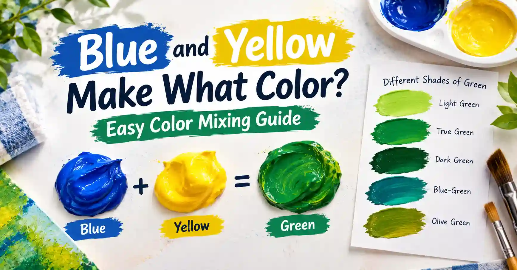
Staring at two tubes of paint and wondering blue and yellow make what color when you finally squeeze them together? You’re about to get the clearest, most complete answer anywhere, including the twist most people never learn.
Main takeaway: In paint, Blue and Yellow make Green. In light, on a screen or under a stage spotlight, Blue and Yellow actually make White. Same two colors, two completely different results, depending on whether you’re mixing pigment or mixing light.
This guide covers both answers in full, plus ratios, mixing charts, common mistakes, and exactly how to fix a green that turns out muddy instead of vibrant.
Understanding Blue and Yellow as Colors
Before answering blue and yellow make what color, it helps to understand why this particular pairing behaves the way it does. Blue and yellow are both primary colors in traditional paint mixing, which is exactly why combining them produces something new rather than just a blend of the same family. Blue sits firmly in the cool category, evoking calm and depth. Yellow sits firmly in the warm category, evoking energy and brightness.
Because they’re opposites in temperature as well as primaries on the color wheel, this particular pairing carries a lot of visual tension and balance. That tension is part of why green, the color that results, feels so natural and calming. It’s warmth and coolness meeting in the middle.
Understanding why this pairing matters also explains the twist with light. In pigment, blue and yellow are two of the three primaries. In light, yellow isn’t primary at all; it’s already a mix of red and green. That difference is the entire reason paint and light give you two different answers.
What Color Do You Get When You Mix Blue and Yellow Paint?
So here’s the direct answer to what color blue and yellow make in paint: Green. But the exact shade of green shifts a lot depending on the ratio you use, so let’s look at three common starting points.
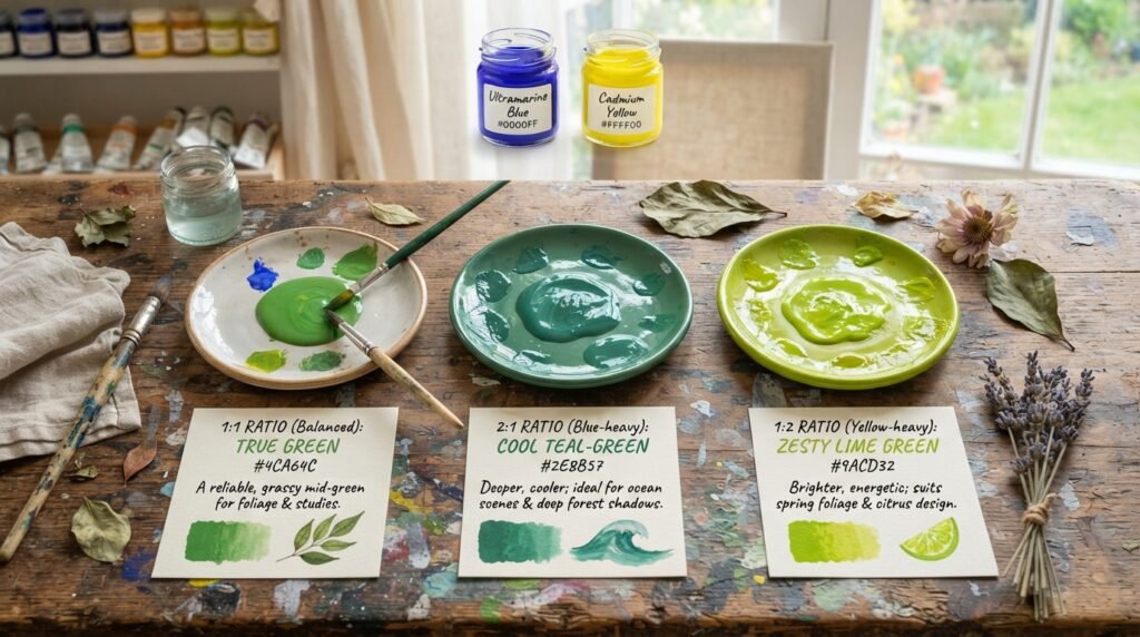
1:1 ratio (equal parts Blue and Yellow): This produces a balanced, true Green, close to hex #4CA64C. It’s a reliable, grassy mid-green useful for foliage, basic color studies, or any project needing a neutral green starting point.
2:1 ratio (Blue-heavy): More blue shifts the result toward a cooler, deeper Teal-Green, close to hex #2E8B57. This works well for ocean scenes, deep forest shadows, or anywhere you want green with a cool, moody edge.
1:2 ratio (Yellow-heavy): More yellow pushes the result toward a brighter, zestier Lime Green, close to hex #9ACD32. This shade suits spring foliage, citrus-themed design, or anywhere you want green to feel energetic rather than calm.
Full Mixing Chart: Blue and Yellow Pigment Combinations
If you’re still wondering what color blue and yellow make across different pigment brands, this chart settles it. Different blue and yellow pigments produce noticeably different greens, since no two paint brands or pigment types behave identically. The chart below walks through ten combinations worth knowing, each with its resulting color name and closest hex code.
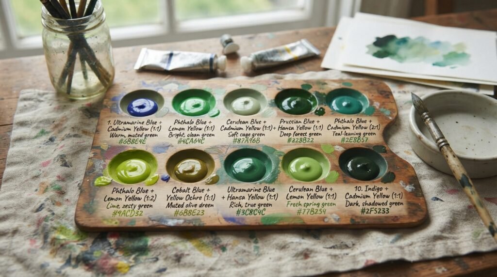
Treat this chart as a practical starting reference rather than an exact science, since humidity, paint brand, and pigment age can all shift the final result slightly.
| Pigment Combination | Ratio | Resulting Color | Approx. Hex |
| Ultramarine Blue + Cadmium Yellow | 1:1 | Warm, muted green | #6B8E4E |
| Phthalo Blue + Lemon Yellow | 1:1 | Bright, clean green | #4CA64C |
| Cerulean Blue + Cadmium Yellow | 1:1 | Soft sage green | #87A96B |
| Prussian Blue + Hansa Yellow | 1:1 | Deep forest green | #228B22 |
| Phthalo Blue + Cadmium Yellow | 2:1 | Teal-leaning green | #2E8B57 |
| Phthalo Blue + Lemon Yellow | 1:2 | Lime, zesty green | #9ACD32 |
| Cobalt Blue + Yellow Ochre | 1:1 | Muted olive green | #6B8E23 |
| Ultramarine Blue + Hansa Yellow | 1:1 | Rich, true green | #3C8C4C |
| Cerulean Blue + Lemon Yellow | 1:1 | Fresh spring green | #77B254 |
| Indigo + Cadmium Yellow | 1:1 | Dark, shadowed green | #2F5233 |
Notice how Phthalo Blue tends to produce brighter, cleaner greens, while Ultramarine and Prussian Blue both lean toward deeper, more muted results. The yellow you choose matters just as much, since Lemon Yellow pushes everything brighter while Yellow Ochre pulls everything toward olive.
What Color Do Blue and Yellow Light Make?
Here’s where the answer flips entirely. What color do blue and yellow make when you’re talking about light instead of paint? The answer is White, and the reason comes down to how additive color mixing actually works.
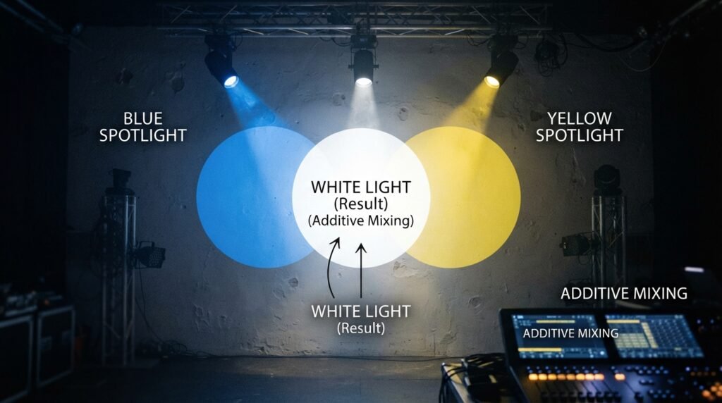
Light mixing follows completely different rules than pigment mixing. Red, Green, and Blue are the three primary colors of light. Yellow light isn’t primary at all; it’s already a combination of Red and Green light at full strength. So when you add Blue light to Yellow light, you’re really combining Red, Green, and Blue all at once, which produces White.
This matters in very practical contexts. Screens, LED displays, and stage lighting all use additive color mixing, not paint mixing. A lighting designer combining blue and yellow gels on a stage spotlight will see the beams blend toward white or a very pale, neutral tone, not green.
Subtractive vs. Additive Mixing: Side-by-Side Comparison
The difference between paint and light mixing confuses almost everyone at first, so a direct comparison helps make the distinction stick. Both systems use the words “blue” and “yellow,” but they behave in opposite ways.
The table below lines up the key differences so you can see exactly why the same two color names produce two different results depending on the medium.
| Feature | Subtractive (Paint) | Additive (Light) |
| Primary colors | Red, Yellow, Blue | Red, Green, Blue |
| How mixing works | Absorbs more light as colors combine | Adds more light as colors combine |
| Blue + Yellow result | Green | White |
| Common mediums | Paint, ink, dye | Screens, LEDs, stage lights |
| Mixing more colors leads to | Darker, muddier results | Brighter, whiter results |
This table explains why painters and lighting designers genuinely speak different visual languages, even when they’re both technically talking about “blue” and “yellow.” Neither answer is wrong; they’re just describing different physical processes.
How Ratio Affects the Final Color
What color blue and yellow make depends on more than just the two pigments themselves. Even once you’ve accepted that blue and yellow make green in paint, the exact ratio still does a lot of heavy lifting in determining the final shade. Small shifts in proportion move the result surprisingly far along the green spectrum.
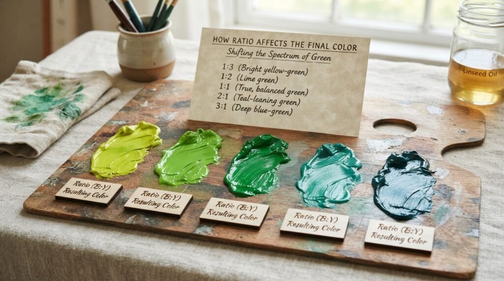
| Ratio (Blue:Yellow) | Resulting Color | Best Use Case |
| 1:3 | Bright yellow-green | Spring foliage, citrus branding |
| 1:2 | Lime green | Energetic, youthful design |
| 1:1 | True, balanced green | General-purpose green, foliage |
| 2:1 | Teal-leaning green | Ocean scenes, cool shadows |
| 3:1 | Deep blue-green | Forest depth, moody backgrounds |
Use this table as a quick reference whenever a project calls for a specific green mood rather than a generic one. Shifting the ratio by even a small amount can take a mix from cheerful to somber without needing to add any new pigment at all.
Why Your Mix Looks Muddy — And How to Fix It
Knowing that blue and yellow make green in theory doesn’t always match what shows up on your palette. One of the most common frustrations with this exact pairing is ending up with a flat, gray-brown mess instead of a clean green. There are a few predictable reasons this happens, and all of them are fixable.
Using warm-biased blue and cool-biased yellow together (or vice versa) is the most frequent culprit. Ultramarine Blue leans slightly warm, and when paired with a cool yellow, the clashing undertones can dull the result. Stick to cool-leaning pairs, like Phthalo Blue and Lemon Yellow, for the cleanest green.
Overmixing is another common issue. Stirring a mix too long or too thoroughly can overdevelop the pigments and flatten their vibrancy. Mix just until the colors combine evenly, and stop there.
Cheap, filler-heavy paint causes problems that no amount of careful mixing can fix. Student-grade paints often contain chalky additives that mute the final color no matter how precise your ratio is. If your green consistently looks dull, the pigment quality is usually the real issue.
Beginner Tip: If your green looks muddy, don’t just add more yellow or more blue. Start a fresh, small test batch instead. Muddy mixes rarely fix themselves with more of the same ingredients; they just become a bigger muddy mix.
Best Pigments to Mix for Clean Results
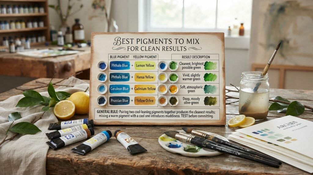
Not all blues and yellows are created equal when your goal is a clean, vibrant green. Some pigment combinations are simply more reliable than others, producing consistent results with minimal risk of muddiness.
The table below lists the pairings most painters reach for when they want dependable, clean green every time, along with a quick note on what each combination tends to produce.
| Blue Pigment | Yellow Pigment | Result Description |
| Phthalo Blue | Lemon Yellow | Cleanest, brightest possible green |
| Phthalo Blue | Hansa Yellow | Vivid, slightly warmer green |
| Cerulean Blue | Cadmium Yellow | Soft, atmospheric green |
| Prussian Blue | Yellow Ochre | Deep, moody olive-green |
As a general rule, pairing two cool-leaning pigments together produces the cleanest results, while mixing a warm pigment with a cool one tends to introduce at least some muddiness. Testing a small sample before committing to a full batch is always worth the extra two minutes.
Real-Life Examples of Blue and Yellow Making Green
Once you know blue and yellow make what color in practice, it’s easier to spot the mix everywhere. This exact color mix shows up constantly once you start paying attention to it. In traditional art, landscape painters rely on blue-and-yellow green mixing constantly for foliage, grass, and distant hills, since hand-mixed green offers far more natural variation than a single tube of pre-made green paint.
In interior design, green walls and decor are frequently described in terms of their blue or yellow lean, with designers specifically choosing a “cooler, blue-based green” or a “warmer, yellow-based green” depending on the room’s mood. In digital media, this exact relationship explains why colorists adjust screen displays using blue and yellow sliders to fine-tune on-screen greens for video and photography work.
What Happens When You Add White, More Yellow, or Black
Once you’ve landed on a base green, a few simple additions can shift it dramatically. Each modifier changes the mood of the color in a distinct, predictable way.
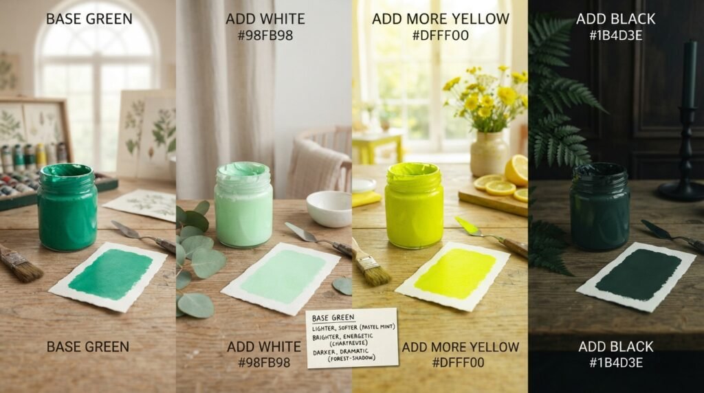
Adding White lightens the green into a soft, pastel mint, closer to hex #98FB98. This works well for nursery decor or gentle, airy design work. Adding more Yellow pushes the green brighter and more energetic, shifting it toward a vivid chartreuse near hex #DFFF00. Adding Black darkens the green into a deep, almost forest-shadow tone close to hex #1B4D3E, useful for moody, dramatic backgrounds.
Paint vs. Digital Media: A Closer Comparison
It’s worth returning to the paint-versus-light distinction one more time, since it trips up even experienced creatives moving between physical and digital work. In paint, you’re working with pigments that absorb certain wavelengths of light and reflect others back to your eye, which is why mixing colors together removes more and more light, pushing toward darker results.
In digital media, you’re working directly with emitted light. A pixel showing “blue” and a pixel showing “yellow” are both actively producing light, and combining that light adds brightness rather than removing it. This is the exact mechanism behind why blue and yellow make green in one context and white in the other, and keeping this distinction in mind prevents a lot of confusion when switching between a canvas and a screen.
Tips for Artists
Getting a consistently great green from blue and yellow takes a bit of practice, but a few habits make the process far more reliable.
Choose cool-leaning pigments for the cleanest results, since warm undertones in either color tend to introduce muddiness. Test on a white palette surface rather than judging color on a colored or wooden palette, since the background can distort how you perceive the mix. Build up in layers when working on canvas, since layering thin washes of blue and yellow can produce more luminous, dimensional green than mixing the two directly on a palette.
As one landscape painter put it, “mixing your own green is like making your own bread, the store-bought version works fine, but the homemade one has a character you just can’t buy.”
Green in Fashion and Interior Design
The green that results from this classic pairing shows up constantly in both fashion and home design, carrying associations with nature, growth, and calm. In fashion, green has surged in recent seasons as a grounding neutral alternative to classic black and navy, especially in deeper, blue-leaning shades that feel sophisticated rather than purely seasonal.
In interior design, green walls and furniture remain one of the most requested choices for rooms meant to feel calming and connected to nature, from sage-toned living rooms to deep forest-green kitchen cabinetry. If you’re planning a room refresh and want to test exactly how a blue-yellow green will look under your home’s lighting, sampling a few painted swatches directly on your wall before committing to a full room is always worth the extra step.
Where Green Sits on the Color Wheel
The reason blue and yellow make what color they do comes down to position on the wheel. Green holds secondary status on the traditional color wheel, sitting directly between its two parent colors, blue and yellow. That positioning is exactly why mixing those two primaries produces it, and why green always carries a bit of both parents’ character.
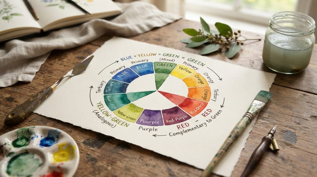
Green’s complementary color, the shade sitting directly opposite it on the wheel, is red. That’s why red and green pairings create such strong visual contrast, showing up everywhere from holiday branding to classic complementary color schemes in art and design.
Green’s closest analogous colors are blue-green and yellow-green, both sitting directly adjacent to it on the wheel. Any of these work naturally together in a single palette, since they all share green’s core character while leaning slightly toward one parent color or the other.
Conclusion
To sum up the full answer to blue and yellow make what color: in paint, you get Green, with the exact shade depending heavily on your ratio and pigment choice. In light, on a screen or under a spotlight, the same two colors combine into White instead, thanks to the completely different rules of additive mixing.
Keep an eye on muddiness, since this particular pairing is one of the easier ones to accidentally dull with the wrong undertones or cheap pigment. Test a small batch first, adjust your ratio to taste, and you’ll land on a green worth using again and again.
FAQs
Blue and yellow make what color in paint?
Blue and yellow make green in traditional paint mixing. The exact shade shifts from teal to lime depending on whether blue or yellow dominates the ratio.
What color do blue and yellow make when mixed as light?
Blue and yellow light combine to make white, not green. This happens because yellow light is already a mix of red and green, so adding blue completes all three light primaries.
Why does blue and yellow make green in paint but not in light?
Paint mixing is subtractive, removing light as colors combine, while light mixing is additive, adding light as colors combine. The same two color names follow completely different physical rules in each medium.
What ratio of blue and yellow makes the best green?
A 1:1 ratio produces a balanced, true green suitable for most general purposes. Shifting toward more blue creates a cooler teal-green, while more yellow creates a brighter lime-green.
Why does my blue and yellow mix look muddy instead of green?
Mismatched warm and cool undertones between your specific blue and yellow pigments usually cause muddiness. Switching to cool-leaning pigments like Phthalo Blue and Lemon Yellow typically fixes the problem.
What color do blue and yellow make if you add white?
Adding white to a blue-and-yellow green mix produces a soft, pastel mint shade. The more white you add, the lighter and more muted the green becomes.
Does the type of blue or yellow pigment change the resulting color?
Yes, significantly. Phthalo Blue tends to produce brighter, cleaner greens, while Ultramarine or Prussian Blue lean toward deeper, more muted results depending on the yellow paired with them.