Green and Purple Make What Color? How to Mix the Perfect Shade
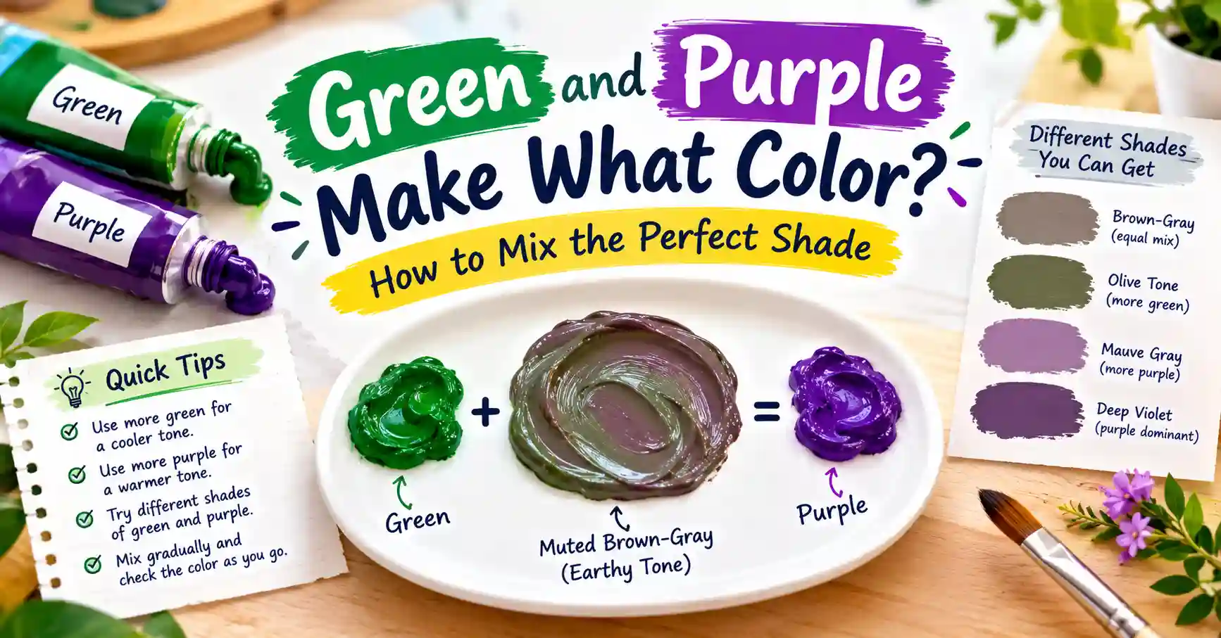
Wondering green and purple make what color when they actually meet on a palette? Most people guess wrong, and the real answer depends entirely on whether you’re mixing paint or mixing light.
Main takeaway: In paint, Green and Purple make a muddy, dark brown, close to a deep slate-brown. In light, something genuinely surprising happens: mixing standard Green and Purple light produces a clean, neutral Gray. Same two colors, two completely different outcomes.
This guide walks through both answers in full detail, plus exact ratios, a complete mixing chart, and how to avoid the murky, lifeless result that trips up most beginners trying this combination for the first time.
Understanding Green and Purple as Colors
Green and purple are both secondary colors, which already makes this pairing unusual compared to mixing two primaries. Green comes from blue and yellow. Purple comes from red and blue. Notice the overlap: both colors already contain blue, which shapes everything about how they behave together.
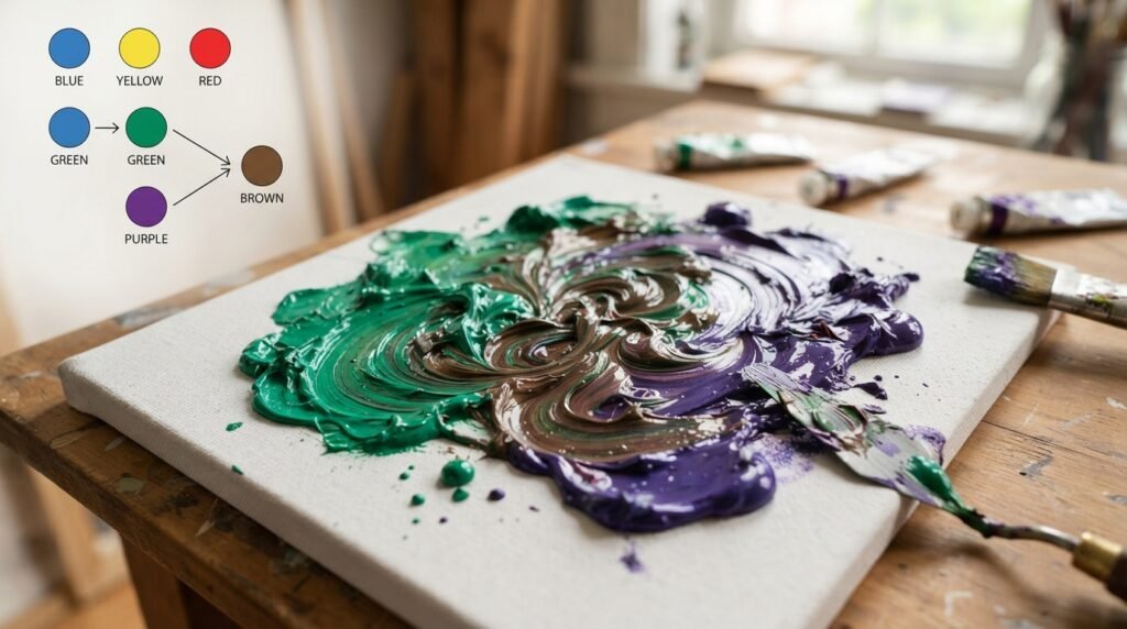
Green sits on the cool side of the wheel, evoking nature and calm. Purple straddles both warm and cool, carrying red’s intensity and blue’s depth at once. That combination of shared blue and clashing extra pigments, yellow on one side and red on the other, is exactly why this mix tends toward murkiness rather than a clean, vibrant result.
Understanding this overlap matters because it explains the entire rest of this guide. When green and purple make what color in paint, you’re essentially combining all three primaries unevenly: red, yellow, and double the blue, which is the classic recipe for brown in subtractive mixing.
What Color Do You Get When You Mix Green and Purple Paint?
So here’s the direct answer to what color green and purple make in paint: a dark, muddy brown. But the exact shade shifts depending on which color dominates, so let’s look at three ratios.
1:1 ratio (equal parts Green and Purple): This produces a balanced, dark Slate Brown, close to hex #4A3C40. It reads as moody and neutral, useful for shadow work or deliberately muted backgrounds.
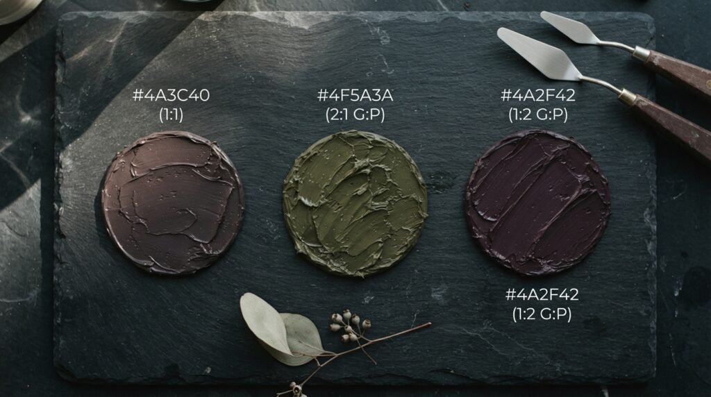
2:1 ratio (Green-heavy): More green shifts the result toward an Olive Brown, close to hex #4F5A3A. This works well for earthy, natural-feeling design or camouflage-style palettes.
1:2 ratio (Purple-heavy): More purple pushes the mix toward a deep Plum Brown, close to hex #4A2F42. This shade suits rich, moody florals or gothic-inspired design work.
Full Mixing Chart: Green and Purple Pigment Combinations
Different green and purple pigments produce noticeably different browns, since the specific undertones in each tube change the final result. The chart below covers ten combinations worth knowing.
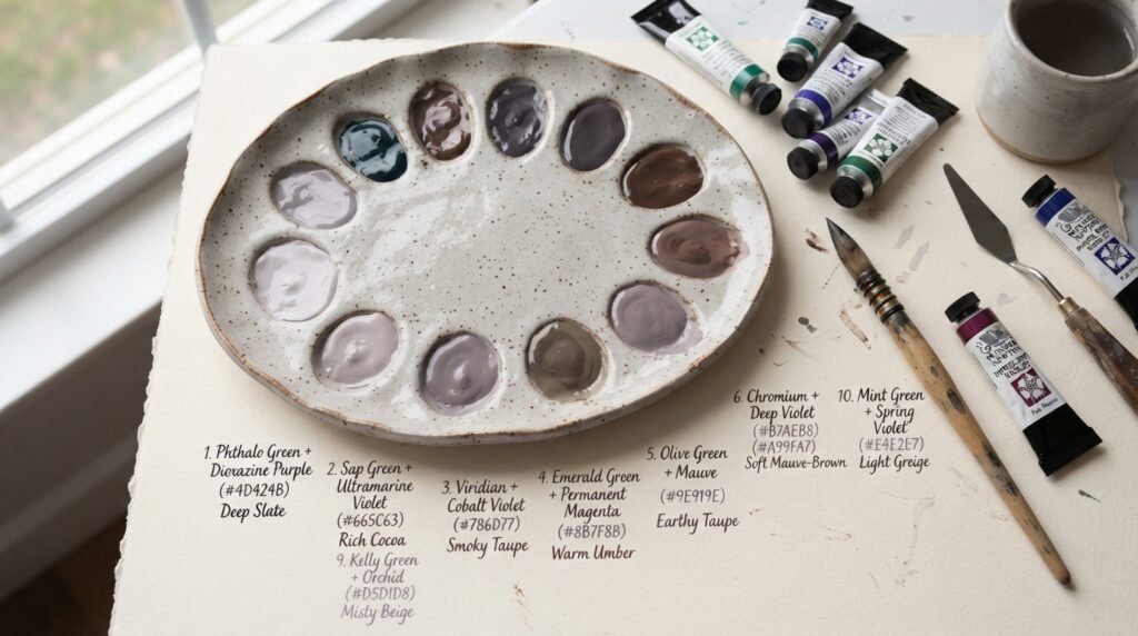
Treat this chart as a practical starting reference, since pigment brand and age can shift results slightly from what’s listed here.
| Pigment Combination | Ratio | Resulting Color | Approx. Hex |
| Phthalo Green + Dioxazine Purple | 1:1 | Deep slate brown | #4A3C40 |
| Sap Green + Ultramarine Violet | 1:1 | Muted olive-brown | #4F5A3A |
| Viridian + Royal Purple | 1:1 | Cool gray-brown | #45413F |
| Hooker’s Green + Dioxazine Purple | 2:1 | Earthy olive brown | #52543A |
| Phthalo Green + Alizarin-Ultramarine Purple | 1:2 | Deep plum brown | #4A2F42 |
| Emerald Green + Mauve | 1:1 | Soft dusty brown | #5E4F52 |
| Forest Green + Amethyst Purple | 1:1 | Warm forest brown | #4A4034 |
| Chrome Green + Violet | 1:1 | Rich chocolate-brown | #40302C |
| Spring Green + Lavender | 1:1 | Light grayish mauve-brown | #6E5F64 |
| Pine Green + Deep Purple | 2:1 | Dark, near-black brown | #332B2E |
Notice how green pigments with more yellow in them, like Sap Green or Hooker’s Green, tend to push the final brown toward olive. Purple pigments leaning more red, like Royal Purple, pull the result toward a warmer, plum-leaning brown instead.
What Color Does Green and Purple Light Make?
Here’s the twist. What color do green and purple make when you’re talking about light instead of paint? Using the standard web-safe values for each color, Green light and Purple light combine into Gray.
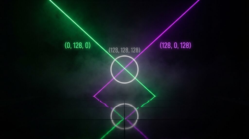
This isn’t a rough approximation either. Standard Green light sits at RGB (0, 128, 0), and standard Purple light sits at RGB (128, 0, 128). Add those values together, channel by channel, and you land exactly on (128, 128, 128), which is pure, neutral gray, hex #808080.
That’s additive color mixing at work. Light doesn’t absorb and darken the way pigment does; it combines and brightens. Two colors that read as a murky brown on a palette can land on a perfectly clean, mathematically neutral gray once you’re working with light instead.
Subtractive vs. Additive Mixing: Side-by-Side Comparison
The paint-versus-light split explains why the same two color names give you two completely different results. Both systems use “green” and “purple,” but the underlying mechanics are opposites.
| Feature | Subtractive (Paint) | Additive (Light) |
| Primary colors | Red, Yellow, Blue | Red, Green, Blue |
| How mixing works | Absorbs more light as colors combine | Adds more light as colors combine |
| Green + Purple result | Muddy dark brown | Neutral gray |
| Common mediums | Paint, ink, dye | Screens, LEDs, stage lights |
| Mixing more colors leads to | Darker, muddier results | Brighter, more neutral results |
This table is worth bookmarking any time a color-mixing question feels contradictory. The medium you’re working in changes the math entirely, even when the color names stay identical.
How Ratio Affects the Final Color
Even within paint, where green and purple make a brown rather than anything vibrant, the ratio still shapes the final mood considerably.
| Ratio (Green: Purple) | Resulting Color | Best Use Case |
| 3:1 | Earthy olive-brown | Natural, grounded design |
| 2:1 | Warm, muted brown | Rustic branding, autumn palettes |
| 1:1 | Balanced slate brown | Neutral shadow tones |
| 1:2 | Deep plum-brown | Gothic, moody florals |
| 1:3 | Near-black purple-brown | Dramatic backgrounds |
Use this table when a project calls for a specific mood of brown rather than a generic one. Even though neither extreme stays close to green or purple individually, the lean still shows up clearly in the final result.
Why Your Mix Looks Muddy — And How to Fix It
Since green and purple make what is already a muddy brown by nature, “fixing” muddiness here means something slightly different than with other color pairs. The goal usually shifts from avoiding mud entirely to controlling exactly how muddy and in which direction.
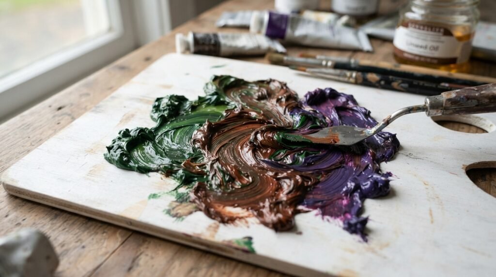
Overmixing flattens the result fast. Stir only until the colors combine evenly, since continued mixing dulls whatever richness remains in the brown. Using two pigments with strong, clashing undertones, like a yellow-heavy green with a red-heavy purple, often produces an unpleasant, grayish mud rather than a rich, usable brown. Pick pigments with closer undertones for a more harmonious result.
Adding too much of either color too fast can also push the mix further toward flat gray-brown than intended. Build up gradually, testing as you go, rather than combining large amounts at once.
Beginner Tip: If your green-and-purple mix looks lifeless, don’t panic. Add a tiny touch of a third color, like a warm red or burnt sienna, to nudge the brown toward something richer and more intentional rather than accidental.
Best Pigments to Mix for Clean Results
“Clean” here means a rich, usable brown rather than a flat, gray mess, since green and purple were never going to stay vibrant together. Some pairings produce far more attractive browns than others.
| Green Pigment | Purple Pigment | Result Description |
| Sap Green | Dioxazine Purple | Warm, earthy olive-brown |
| Phthalo Green | Royal Purple | Cool, sophisticated slate-brown |
| Hooker’s Green | Amethyst Purple | Rich, balanced forest-brown |
| Viridian | Mauve | Soft, dusty gray-brown |
As a general rule, pairing a warmer green with a warmer purple produces a more harmonious brown than mixing a cool green with a warm purple, which tends to introduce a grayer, less appealing undertone.
Real-Life Examples of Green and Purple Making Brown
This pairing shows up more often than people realize once they start noticing it. In traditional art, landscape and botanical painters use green-and-purple mixing constantly for tree bark, shadowed foliage, and rich soil tones, since a hand-mixed brown carries far more natural variation than a flat tube brown.
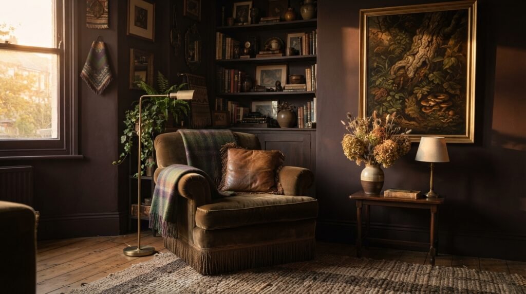
In interior design, deep plum-brown and olive-brown tones, both achievable through this exact mix, have become popular in moody, maximalist spaces that want richness without pure black. In digital media, understanding that green and purple light actually combine into gray helps colorists and lighting designers predict unexpected results when overlapping colored gels or screen elements.
What Happens When You Add White, Yellow, or Black
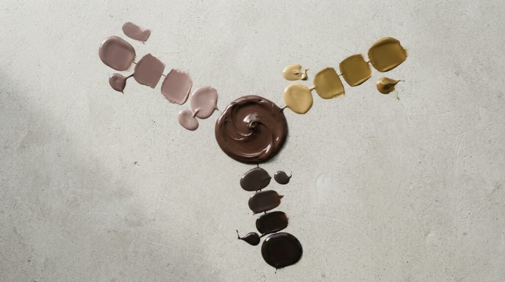
Once you’ve landed on a base green-purple brown, a few additions shift it in predictable directions. Adding White lightens the mix into a soft, dusty mauve-brown, closer to hex #8C7A80, useful for gentle, vintage-inspired palettes. Adding Yellow pulls the brown toward a warmer, more olive-gold tone near hex #6B5E3A, good for autumn-themed design. Adding Black deepens the mix into a near-black, shadowy brown close to hex #241E20, useful for dramatic, moody backgrounds.
Paint vs. Digital Media: A Closer Comparison
The contrast between these two mixing systems deserves one more direct look, since it’s easy to forget once you’re deep into a project. In paint, pigments absorb certain wavelengths of light and reflect the rest to your eye, so combining more pigments removes more light and pushes the result darker and muddier.
In digital media, you’re working with emitted light directly. Combining Green and Purple light adds brightness rather than removing it, which is exactly why the math lands on a clean, neutral gray instead of a muddy brown. Keeping this distinction in mind prevents real confusion when a digital colorist and a traditional painter describe the “same” mix completely differently.
Tips for Artists
Working successfully with this particular pairing takes a slightly different mindset than mixing colors that produce something vibrant.
Decide on your target brown before mixing, since green and purple can lean olive, slate, or plum depending on ratio, and knowing your destination prevents aimless adjusting. Test on a white palette surface, since judging a muddy brown against a colored background can make it look muddier or cleaner than it really is. Mix small batches first, since this particular combination is genuinely hard to remix identically once you’ve found a result you like.
As one textile designer once said, “mixing green and purple is like blending two strong spices; you’re never going to taste either one individually again, so make sure the result is a flavor you actually wanted.”
Brown in Fashion and Interior Design
The deep, complex brown that results from this mix carries a distinct richness that straightforward browns often lack. In fashion, this kind of nuanced, slightly plum-leaning brown has shown up in recent moody, jewel-toned collections, offering something more sophisticated than a standard tan or chocolate brown.
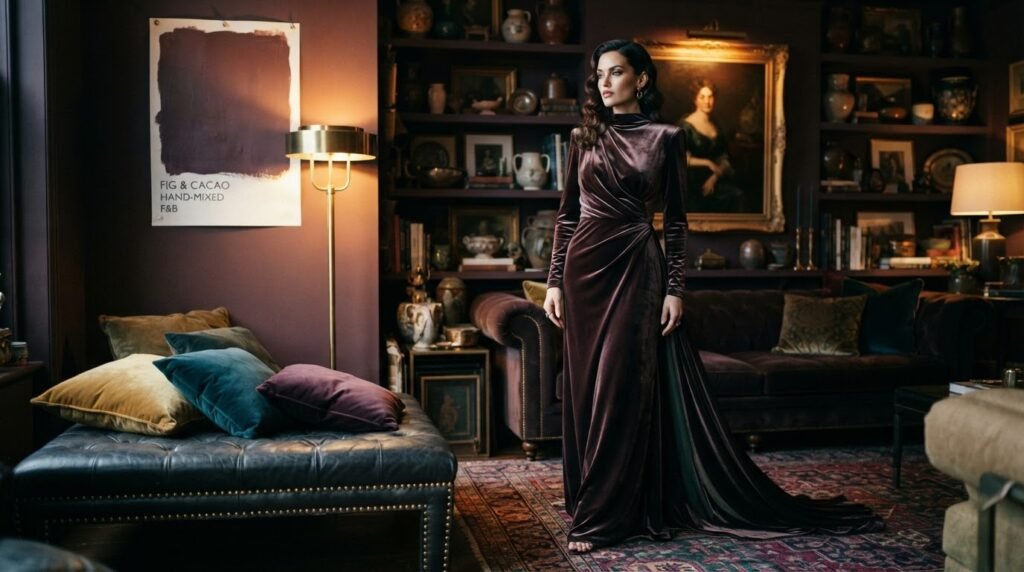
In interior design, this shade works beautifully as a deep accent wall or furniture tone in spaces aiming for a maximalist, layered feel. If you’re considering this kind of rich, complex brown for a room refresh, testing a hand-mixed sample swatch directly on your wall under your actual lighting is always worth doing before committing to a full room.
Where This Result Sits on the Color Wheel
Unlike green or purple individually, the brown that results from mixing them doesn’t occupy a clean position on the standard color wheel at all. Brown generally sits outside the wheel entirely, functioning as a tertiary, desaturated neutral rather than a pure hue.
Green’s complementary color is red, and purple’s complementary color is yellow, which is part of why combining green and purple essentially pulls in elements of every direction on the wheel at once. That’s the real mechanism behind why this particular mix drifts toward neutral brown rather than staying vibrant as most two-color combinations do.
Conclusion
To sum up, green and purple make what color: in paint, you get a muddy, dark brown that shifts from olive to plum depending on your ratio. In light, using standard color values, the same two colors combine into a clean, neutral gray, a genuinely surprising result most people never expect.
Keep your ratios intentional with this pairing, since it’s easy to end up with an accidental, lifeless mud instead of a rich, usable brown. Test a small batch, lean the ratio toward whichever undertone you want, and you’ll land on a shade worth using rather than one worth scraping off the palette.
FAQs
Green and purple make what color in paint?
Green and purple make a muddy, dark brown in traditional paint mixing. The exact shade shifts from olive-brown to plum-brown depending on which color dominates the ratio.
What color do green and purple make when mixed as light?
Using standard RGB values, green and purple light combine into neutral gray. This happens because additive light mixing adds brightness rather than removing it, unlike paint.
Why do green and purple make brown instead of something brighter?
Green and purple are both secondary colors that already share blue as a common ingredient. Combining them essentially brings in all three primaries unevenly, which is the classic recipe for brown.
What ratio of green and purple makes the best brown?
A 1:1 ratio produces a balanced slate-brown suitable for general use. More green pushes the result toward olive, while more purple pushes it toward a deeper plum-brown.
Why does my green and purple mix look gray and lifeless instead of rich?
Overmixing or pairing pigments with clashing undertones usually causes a flat, lifeless gray-brown. Choosing a warmer green and a warmer purple together typically produces a richer, more harmonious result.
What color do green and purple make if you add white?
Adding white to a green-and-purple brown mix produces a soft, dusty mauve-brown. The more white added, the lighter and more muted the final shade becomes.
Does the type of green or purple pigment change the resulting brown?
Yes, significantly. A yellow-heavy green paired with a red-heavy purple tends to produce a grayer, muddier result, while pigments with closer, more harmonious undertones produce a richer, more usable brown.