Warm Colors vs Cool Colors: What They Are and How to Use Them at Home
Every color has a temperature, and temperature quietly controls how a room feels before you notice anything else about it. Warm colors make spaces feel closer, cosier, and more energetic. Cool colors make them feel calmer, larger, and fresher. Neither is better — but using the wrong temperature for a room’s light and purpose is one of the most common reasons a freshly painted space feels “off” even when the color itself is lovely. This guide explains how to tell warm from cool, how undertone fits in, and how to use temperature deliberately at home and in your paint mixing.
The Warm Side of the Wheel
Warm colors are the reds, oranges, and yellows, plus the colors that lean toward them, such as coral, peach, terracotta, mustard, warm browns, and gold-leaning greens like olive and chartreuse. They are associated with sunlight and fire, and they have a real psychological effect: warm colors seem to advance toward you, which makes walls feel nearer and large rooms feel more intimate. They also stimulate appetite and conversation, which is why restaurants and living rooms so often use them.
See how a warm palette behaves in practice in our terracotta color palette guide — warm does not have to mean bright; earthy, muted warms are among the easiest colors to live with.
The Cool Side of the Wheel
Cool colors are the blues, blue-greens, and blue-leaning purples, plus colors that lean toward them, such as teal, mint, lavender, slate, and blue-grays. They are associated with water, shade, and distance. Cool colors recede, making walls feel further away and small rooms feel more open. They slow a space down emotionally, which is why bedrooms, bathrooms, and home offices so often use them — and why hospitals and spas default to blue-green palettes.
The Borderline Colors: Green and Purple
Green and purple sit at the temperature border, and their lean decides everything. A yellow-leaning green (lime, olive, chartreuse) reads warm; a blue-leaning green (teal, emerald, mint) reads cool. A red-leaning purple (plum, magenta, wine) reads warm; a blue-leaning purple (violet, lavender, periwinkle) reads cool. When a green or purple “does not work” in a room, it is almost always because its temperature lean fights the room — the fix is usually a shift in lean, not a different color altogether.
Undertone: Temperature Hidden in Neutrals
Temperature matters most in the neutrals people treat as safe. A warm white leans yellow or pink and feels creamy; a cool white leans blue or gray and feels crisp. Warm grays (“greiges”) lean beige; cool grays lean blue. Problems start when temperatures are mixed unknowingly — a cool blue-gray wall with a warm yellow-toned floor, or warm white woodwork against a cool white wall, where one of them ends up looking dirty. Compare neutrals side by side against pure white paper and their temperature shows itself immediately. If you are choosing a room color now, our step-by-step room color guide shows how to test undertone in your own light.
Matching Temperature to the Room
Fix a cold, north-facing room
North light is cool and grayish, and it exaggerates cool colors until they feel chilly. Warm and warm-leaning colors compensate: warm whites instead of blue-whites, soft terracottas, warm grays, and muted yellows all restore balance.
Calm a hot, south-facing room
Strong warm sunlight intensifies everything. Cool colors hold their nerve here — blue-grays, sage and blue-greens, and cool whites stop a sun-baked room feeling overwhelming by afternoon.
Small rooms
Cool, light colors recede and maximise space. But temperature is not the only lever: a small room in a deep warm color can feel deliberately cosy rather than cramped if lighting and furniture agree — rules of thumb guide you, they do not decide for you.
Social vs restful rooms
Living and dining rooms generally reward warmth; bedrooms, bathrooms, and studies generally reward coolness. Kitchens can go either way — decide by the light first, then by taste.
Mixing Warm and Cool in One Space
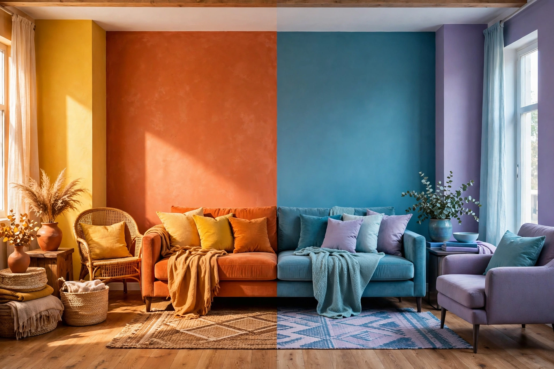
The most interesting rooms rarely use one temperature alone. The reliable pattern is a dominant temperature with deliberate accents of the opposite: a cool blue room warmed by wood, leather, brass, and a terracotta cushion; a warm cream room sharpened by black, slate, and a blue-green plant-filled corner. Keep the ratio uneven — roughly 80/20 — so one temperature clearly leads. Equal warm-cool splits tend to look undecided rather than balanced.
Temperature in Paint Mixing
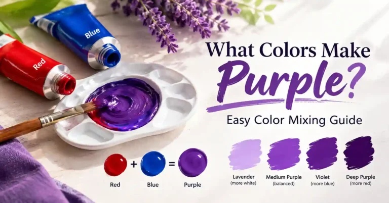
When you mix your own colors, temperature explains results that ratios alone cannot. Two blues are not interchangeable: ultramarine leans purple (warm for a blue), while cerulean and phthalo blue lean green (cool). Mixing a warm blue with a warm red gives a clean, lively purple; mixing a cool blue with a warm red dulls it, because you have effectively added a hint of the complement. This is the idea of color bias from our color theory for beginners guide, and it is why our color mixing chart notes the lean of results as well as the ingredients.
Frequently Asked Questions
Is gray warm or cool?
Either. Gray’s temperature comes from its undertone: blue-gray is cool, greige (gray-beige) is warm, and green-gray sits in between. Always judge a gray next to pure white.
Can warm and cool colors go in the same room?
Yes — and most well-designed rooms do it. Let one temperature dominate and use the other as a controlled accent in furniture, textiles, or art.
What is the warmest color and the coolest color?
Orange is generally considered the warmest color and blue the coolest, which is exactly why they sit opposite each other on the color wheel as complements.
The Bottom Line
Temperature is the invisible half of every color decision. Learn to see the lean in greens, purples, and neutrals, match temperature to the room’s light and purpose, and let one temperature lead with the other as an accent. Do that, and colors that once felt mysteriously wrong start making obvious sense — in decorating and at the mixing palette alike.