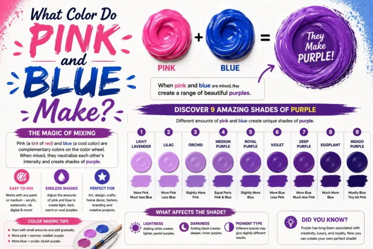
What Color Does Red and Grey Make? Complete Mixing Guide
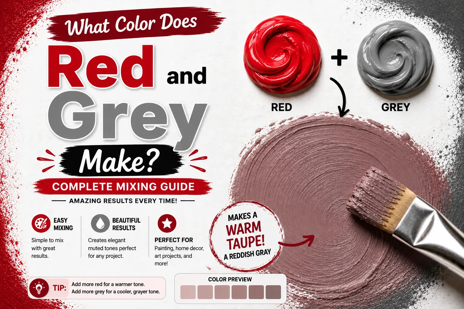
If you’ve ever wondered “red and gray make what color,” you’re not alone. It’s a common design question shared by artists trying to paint natural-looking shadows, graphic designers looking to build a sophisticated color palette, and home decorators aiming to tone down a loud room.
The direct answer is simple: mixing red and gray together creates a toned-down, muted red, often producing sophisticated shades like dusty rose, brick red, or a smoky crimson.
However, the final result isn’t always identical every single time you mix them. The exact color you get depends heavily on the temperature of your starting red, the value of the gray you introduce (light, medium, or dark), and whether your gray contains cool blue or warm yellow undertones. Understanding these subtle visual shifts gives you complete control over this rich, grounded color family. In this guide, you’ll learn the color science behind this blend, how different paint mediums behave, and how to mix a flawless smoky rose for your next creative project.
Main Takeaway:
Vibrant Red + Neutral Gray = Muted Red / Dusty Rose (varying in depth, temperature, and value depending on your mixing ratios and gray base).
Understanding the Science of Mixing Red and Grey
When you mix a vibrant primary color like red with gray, you are performing a classic art technique known as toning. This process is the secret to taking bright, aggressive pigments and turning them into highly sophisticated, livable shades.
Why does this happen? The reason is simple: gray paint (which is a mixture of light-reflecting white and light-absorbing black) acts as a visual dampener. When mixed into red, the gray pigment swallows up the highly saturated wavelengths of the red. This pulls the color’s overall intensity down into a quiet, organic [muted red] instead of a fiery primary.
Imagine you are painting a realistic brick house. If you paint it straight with pure, unmixed cadmium red, the building will look like a cartoon or a fire engine. By folding in a neutral gray, the bright red softens immediately, transforming into an organic earthy tone that looks like real, kiln-fired clay.
Common Shades Created When Mixing Red and Grey
By adjusting the value of your gray and the type of red pigment you start with, you can create a wide spectrum of elegant, dusty colors.
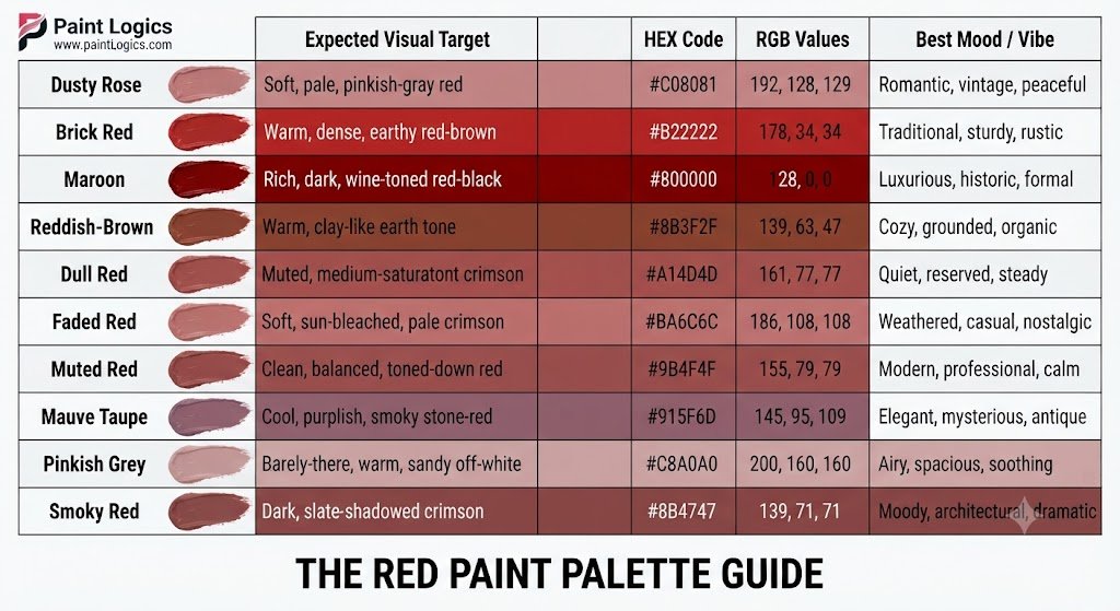
Here is a look at the most popular shades you can achieve:
| Color Name | Expected Visual Target | HEX Code | RGB Values | Best Mood / Vibe |
| Dusty Rose | Soft, pale, pinkish-gray red | #C08081 | 192, 128, 129 | Romantic, vintage, peaceful |
| Brick Red | Warm, dense, earthy red-brown | #B22222 | 178, 34, 34 | Traditional, sturdy, rustic |
| Maroon | Rich, dark, wine-toned red-black | #800000 | 128, 0, 0 | Luxurious, historic, formal |
| Reddish-Brown | Warm, clay-like earth tone | #8B3F2F | 139, 63, 47 | Cozy, grounded, organic |
| Dull Red | Muted, medium-saturation crimson | #A14D4D | 161, 77, 77 | Quiet, reserved, steady |
| Faded Red | Soft, sun-bleached, pale crimson | #BA6C6C | 186, 108, 108 | Weathered, casual, nostalgic |
| Muted Red | Clean, balanced, toned-down red | #9B4F4F | 155, 79, 79 | Modern, professional, calm |
| Mauve Taupe | Cool, purplish, smoky stone-red | #915F6D | 145, 95, 109 | Elegant, mysterious, antique |
| Pinkish Grey | Barely-there, warm, sandy off-white | #C8A0A0 | 200, 160, 160 | Airy, spacious, soothing |
| Smoky Red | Dark, slate-shadowed crimson | #8B4747 | 139, 71, 71 | Moody, architectural, dramatic |
Now let’s look at exactly how to construct each of these beautiful colors on your palette.
How to Mix Grey and Red to Create Beautiful Shades
To get these shades right, you have to control your ratios and watch your color temperatures closely.
Dusty Rose (#C08081)
A highly popular shade, [dusty rose] is a soft, romantic pinkish-red that feels vintage and peaceful.
This happens because you are mixing a cool, slightly blue-leaning red into a very light, soft gray base. To mix it on your palette, place a large dollop of light gray (mostly white with a pinpoint of black) and slowly blend in a tiny touch of cool crimson (like Alizarin Crimson).
Interior designers usually use this cozy shade for bedroom textiles or accent chairs to create a relaxing, spa-like escape.
Brick Red (#B22222)
Brick red is a warm, dense, earth-toned red that feels incredibly solid and timeless.
The reason is simple: it relies on a warm red base combined with a medium-neutral gray. To mix it, combine a warm red (like Cadmium Red Medium) with a neutral gray, and add a microscopic speck of yellow ochre to enhance the clay-like warmth.
Think of painting a rustic barn; this dense, warm color blends perfectly with surrounding landscape greens.
Maroon (#800000)
Maroon is a deep, dark, regal red-black that carries a heavy sense of luxury and history.
Why does this happen? It is created when your gray base is incredibly dark, leaning heavily toward black. To mix this tone, start with your red paint and slowly add dark charcoal gray in tiny drops until the value drops into a deep wine color.
This shade is a favorite for leather book covers, classic sports cars, and traditional dining room walls.
Reddish-Brown (#8B3F2F)
Reddish-brown is a warm, rustic color that perfectly mimics the shades of natural autumn leaves or red clay soil.
This happens because the red pigment is combined with a warm gray containing yellow or brown undertones. To mix it, blend your red paint with a gray that has a tiny touch of raw umber folded into it.
Artists often use this earthy mix to lay down the base layers of tree trunks, sandy cliffs, and animal fur.
Dull Red (#A14D4D)
Dull red is a balanced, medium-value red with a highly reserved, quiet personality.
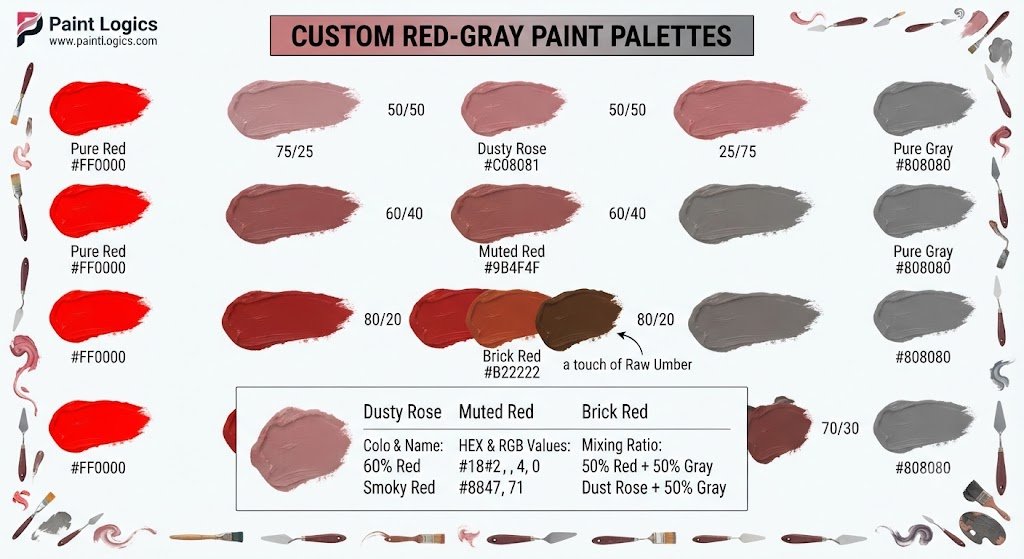
The reason is simple: it uses a 50/50 balance of primary red and neutral gray, completely neutralizing any aggressive, bright glares. To mix it, combine equal parts of primary red and a medium gray on your palette.
It makes a brilliant choice for background elements in paintings that need to be recognizable as red but must not draw the viewer’s eye away from the main focus.
Faded Red (#BA6C6C)
Faded red mimics the beautiful, sun-bleached appearance of historic linen or old coast guard boats.
This happens because a light, highly reflective gray is used to lift the red’s value while pulling down its saturation. To mix it, combine three parts light gray with one part red.
This color looks spectacular on relaxed summer apparel, vintage beach branding, and weathered shingle siding.
Muted Red (#9B4F4F)
Muted red is a modern, professional, clean shade that sits right in the sweet spot of color balance.
This happens because it uses a medium-dark gray to gently temper a vibrant scarlet base. To mix this, blend your primary red with a medium-neutral gray, maintaining about a 2-to-1 ratio of red to gray.
Graphic designers often use this specific shade for corporate branding and web design because it feels confident and warm without screaming for attention.
Mauve Taupe (#915F6D)
Mauve taupe is a gorgeous, cool, purplish-gray red that looks highly artistic and complex.
Why does this happen? This color is achieved when your red leans toward magenta, and your gray contains a cool blue or purple undertone. To mix it, combine a cool magenta-red with a cool gray.
This highly sophisticated color is frequently chosen by high-end cosmetic brands for dusty eyeshadow palettes and luxury nail polishes.
Pinkish Grey (#C8A0A0)
Pinkish grey is a beautiful, airy off-white that features just a tiny whisper of warm red undertone.
The reason is simple: it uses a massive pool of light gray (nearly 95%) with a microscopic touch of red. To mix it, start with a white paint base, add a tiny speck of black to create a very light gray, then touch the corner of your brush to red and blend.
This color is highly prized by interior decorators who want to paint walls in a soft, bright neutral that feels much warmer and more inviting than pure, cold gray.
Smoky Red (#8B4747)
Smoky red is a dark, moody crimson that feels like it’s covered in slate shadows.
This happens because you are mixing a dark, charcoal-value gray with a rich ruby red. To mix it, take a dark charcoal gray and blend in a balanced amount of deep red.
This dramatic tone is perfect for painting deep shadows in red drapery, rich velvet fabrics, and moody floral still lifes.
You Might Also Like:
How Gray Changes Red in the RYB Color Model
In traditional physical painting (the RYB model), mixing gray into red behaves quite differently from mixing red with other pure primaries.
Why does this happen? The reason is simple: gray is a neutral, non-chromatic value. When you add it to red, you are not shifting the hue (the color’s position on the color wheel); instead, you are modifying the value (lightness) and the chroma (intensity). The physical pigments of the gray coat the vibrant red particles, scattering the light and creating a soft, misty look.
Common Mistake: Beginners often try to tone down red by adding green (its complementary opposite). While this does neutralize the red, it can easily turn into a muddy brown if your proportions are off by even a tiny fraction. Using gray to tone down your red is much safer, more predictable, and yields clean, dusty shades every single time.
Mixing Red and Grey for Painting (Acrylic, Oil, and Watercolor)
Each physical paint medium has its own unique characteristics that change how you must handle your red and gray blends.
Acrylic Paint
In acrylic painting, you must account for drying color shift.
Why does this happen? Acrylic binders dry completely clear, whereas they look milky and light when wet. This means your wet red-gray mix on your palette will dry slightly darker and more saturated on your canvas.
- Beginner Tip: Always mix your wet acrylic red-gray tints one shade lighter than your target color, as they will deepen as the moisture evaporates.
Watercolor Paint
Watercolors rely on transparency, meaning you rarely use white paint to make gray.
Instead, watercolorists create a light gray by heavily diluting black paint with water, letting the white of the paper shine through. To mix a dusty rose in watercolor, lay down a highly diluted wash of black, let it dry slightly, then glaze a thin wash of crimson over the top.
Oil Paint
Oil paints dry incredibly slowly, which allows you to mix your red and gray directly on the canvas to create seamless, smoky transitions.
To mix in oils, use Titanium White and Ivory Black to construct your gray base first, then use a clean brush to blend it into your red shapes. This slow-drying process is fantastic for painting soft skin tones, smoky shadows, and realistic fabrics.
Digital Design – Hex Codes for Red + Grey Shades
When working on digital screens, mixing colors uses the rules of additive RGB (Red, Green, Blue) light rather than physical pigments.
On a screen, gray is created by running the red, green, and blue light channels at equal, moderate intensities. When you add more power to the red channel while keeping the green and blue channels locked at identical, lower values, you create a gorgeous, desaturated digital red.
Here is a quick-reference chart of these digital hex codes for your design layouts:
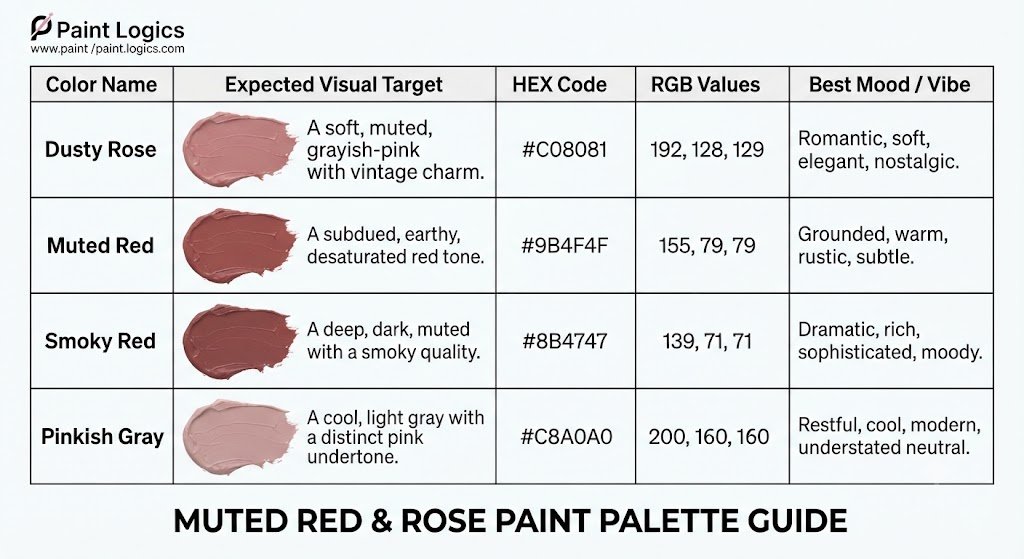
If you are building a website, using a very light Pinkish Gray (#F7F3F3) as a background coupled with Smoky Red (#8B4747) for your headers creates a beautiful, low-contrast, and modern reading environment.
Interior Design & Fashion Uses of Red and Grey Mixes
This soft, muted color family is incredibly popular because it acts as a peaceful neutral that brings warm life without overwhelming a space.
Interior Design
In home decor, pure primary red is often too aggressive and alarming for large walls.
Here’s a good example: painting bedroom walls in a soft dusty rose or a warm muted red instantly warms up the room. It pairs beautifully with light oak wood floors, cream linen curtains, and matte black hardware. It creates a cozy, welcoming atmosphere that feels historic, calm, and incredibly chic.
Fashion and Textiles
In clothing design, red-gray tones serve as highly sophisticated year-round neutrals.
A dusty rose wool coat or a muted red sweater offers a soft, elegant alternative to standard tans and grays. It pairs effortlessly with raw denim, cream knitwear, and rich brown leather boots, giving you a warm, natural look.
Cultural & Emotional Meanings of Red + Grey Shades
Because red is the color of fire and passion, tempering it with gray changes its psychological and emotional impact dramatically.
The reason is simple: it balances energy with stability. Pure red can evoke feelings of danger or urgency, but adding gray transforms those feelings. The resulting shades symbolize:
- Dusty Rose: Romance, quiet nostalgia, gentleness, and healing.
- Muted Red: Grounded confidence, timelessness, hospitality, and comfort.
- Smoky Red: Mystery, deep intellect, architectural elegance, and quiet strength.
You Might Also Like:
Color Wheel Placement for Red + Grey Shades
On the traditional color wheel, red-gray shades do not sit on the outer rim with the pure, saturated colors.
Instead, these toned colors sit deep inside the wheel, moving toward the neutral center hub. Because they are desaturated, they function as warm neutrals, making them incredibly easy to pair with other colors without causing visual clashing.
Another thing worth knowing is that because they sit closer to the center, they act as bridge colors, helping to transition your viewer’s eye smoothly from high-contrast primaries to quiet neutral backgrounds.
Comparing Red + Grey with Other Red Mixes
It is easy to get confused between a red-gray mix and other common red mixtures on your palette.
Let’s look at how they compare side-by-side:
| Mixture | Visual Result | Key Difference | Best Use Case |
| Red + Gray | Toned Red (e.g., Dusty Rose) | Soft, smoky, and highly muted | Realistic shadows, vintage home decor |
| Red + White | Tinted Red (e.g., Bright Pink) | Bright, sweet, and highly saturated | Cheerful florals, children’s designs |
| Red + Black | Shaded Red (e.g., Deep Crimson) | Dark, heavy, and intense | Dramatic shadows, luxury branding |
FAQs
What color does red and grey make?
They make a muted, desaturated shade of red. Depending on your mixing ratios, this can range from a soft, pinkish dusty rose to a deep, dark brick red.
What color does grey and red make in simple terms?
In simple terms, they make a dusty, smoky red. The gray softens the bright, intense energy of the primary red, turning it into a quiet neutral.
What happens if I mix light grey with red?
Mixing light gray with red creates a soft, pale, pastel-like red, such as faded pinkish-red or a beautiful classic dusty rose.
What happens if I mix dark grey with red?
Mixing dark gray with red creates a deep, moody, shadow-toned crimson, such as a rich smoky red or maroon.
What color do grey and red make at equal parts?
At equal parts, they make a balanced, medium-value dull red (#A14D4D). It is a highly reserved color that sits perfectly between gray and red.
Does the undertone of grey matter?
Yes, absolutely! If your gray has cool blue undertones, it will pull your red-gray mix toward a cool mauve. If your gray has warm yellow undertones, it will push the mix toward a warm reddish-brown.
What HEX code works for a classic dusty rose?
The HEX code #C08081 is a perfect digital representation of a classic, balanced dusty rose.
How do I avoid a muddy result in paint?
To avoid mud, make sure your gray is mixed from pure black and white without any green or blue contamination. Always use clean brushes and palette knives.
Is mixing red and grey different from red + black or red + white?
Yes. Red + white makes a bright, sweet pink. Black + red makes a deep, heavy shade. Red + gray softens the color’s intensity without making it too bright or too dark, creating a beautiful dusty tone.
Can I create the grey first for consistency?
Yes, this is highly recommended! Mixing your gray to your desired value (light, medium, or dark) first ensures you can recreate your custom muted red consistently throughout your painting.
Conclusion
Mixing red and grey creates a muted, sophisticated shade that can range from dusty pink and rose grey to deep muted burgundy, depending on the type of red and the amount of grey you use. Adding a little grey softens bright reds without removing their warmth, while more grey produces elegant, understated tones perfect for modern artwork and interior design. By adjusting the mixing ratio and experimenting with different pigments, you can create a wide variety of balanced red-grey shades for painting, crafts, and decorative projects.