Colors That Start With W: 65 Shades & Hex Codes
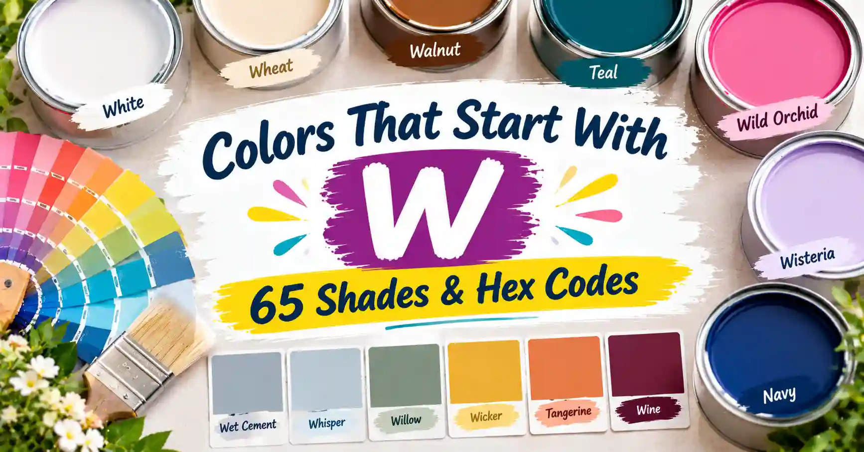
If you’ve ever called a color warm, woody, or wonderfully soft, you already know the letter W. It is full of calm and cozy names. Here are the colors that start with W, from pure white to deep wine.
This guide lists 65 of them. You will meet wheat and walnut. You will also find wine, wisteria, and a whole range of soft whites.
Each entry has a name, a Hex code, RGB values, and CMYK values. Copy any code and use it in your next project. Each color also has a short note on how it looks.
Quick Tip: Pick Hex or RGB for anything on a screen. Pick CMYK for anything you print. The CMYK values are approximate screen-to-print conversions. Always check a printed proof.
Quick Jump Guide: Color Families Covered
Not sure where to start? Here is what you will find among these color names that start with W:
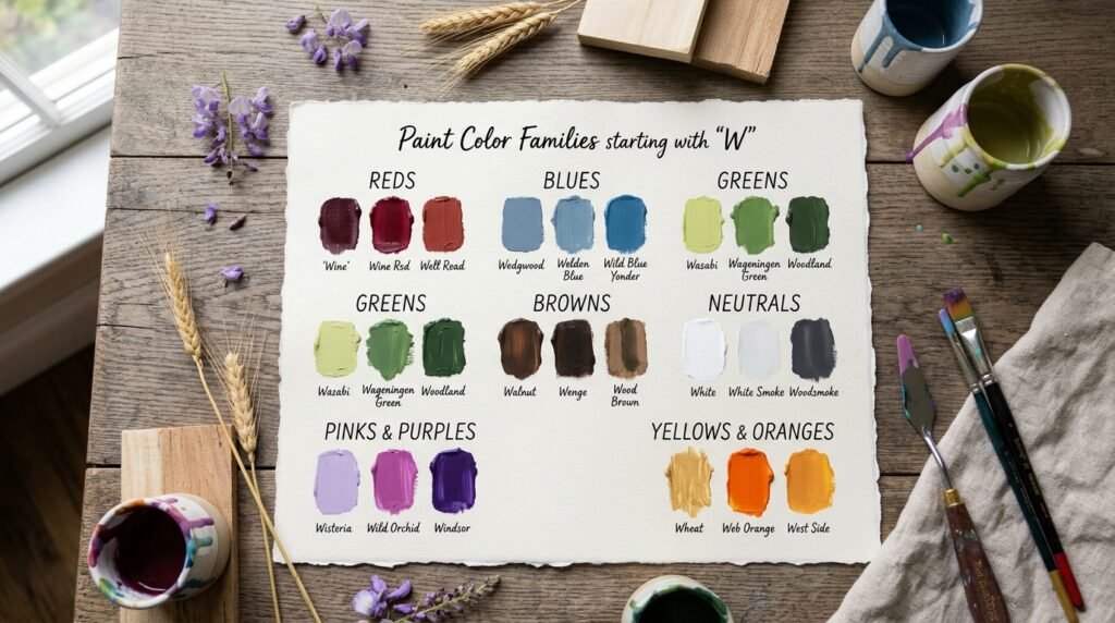
- Reds: Wine, Wine Red, Well Read
- Blues: Wedgwood, Weldon Blue, Wild Blue Yonder
- Greens: Wasabi, Wageningen Green, Woodland
- Browns: Walnut, Wenge, Wood Brown
- Neutrals: White, White Smoke, Woodsmoke
- Pinks and purples: Wisteria, Wild Orchid, Windsor
- Yellows and oranges: Wheat, Web Orange, West Side
Want to browse by hue? Skip to the family table after the list. If not, let’s dive in.
The Full List of Colors That Start With W
Below are all 65 shades starting with the letter W. They run in alphabetical order. Take your time. Many of the whites look alike. We point those out as we go.
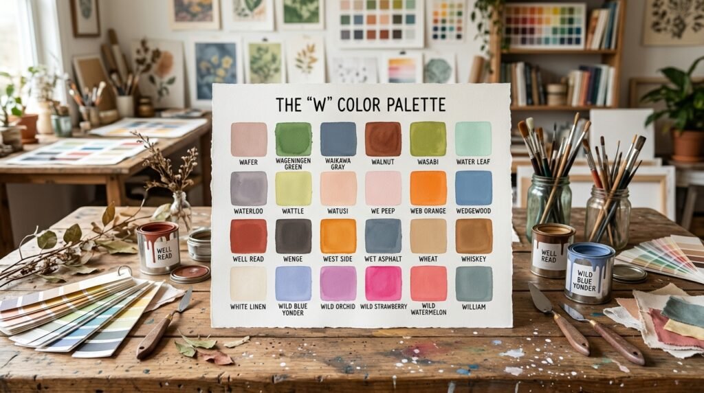
Wafer
Pale, dusty pink–beige. It looks soft and gentle. Hex: #DECBC6 | RGB: 222, 203, 198 | CMYK: 0, 9, 11, 13
Wageningen Green
Fresh, medium-bright green with a clean, leafy feel. It looks lively and natural. Hex: #34B233 | RGB: 52, 178, 51 | CMYK: 71, 0, 71, 30
Waikawa Gray
Muted slate blue with a cool lean. It looks calm and steady. Hex: #5A6E9C | RGB: 90, 110, 156 | CMYK: 42, 29, 0, 39
Waiouru
Very dark olive green. It looks deep and earthy. Hex: #363C0D | RGB: 54, 60, 13 | CMYK: 10, 0, 78, 76
Walnut
Deep, warm brown with a reddish glow. It is named for the wood. Hex: #773F1A | RGB: 119, 63, 26 | CMYK: 0, 47, 78, 53
Warm Black
Very dark teal that reads close to black. Despite the name, its tone is cool and deep. Hex: #004242 | RGB: 0, 66, 66 | CMYK: 100, 0, 0, 74
Wasabi
Olive-lime green with a yellow tint. It is named for the green paste served with sushi. Hex: #788A25 | RGB: 120, 138, 37 | CMYK: 13, 0, 73, 46
Water Leaf
Pale aqua-mint with a cool glow. It looks light and clean. Hex: #A1E9DE | RGB: 161, 233, 222 | CMYK: 31, 0, 5, 9
Watercourse
Deep green with a teal hint. It looks cool and rich. Hex: #056F57 | RGB: 5, 111, 87 | CMYK: 95, 0, 22, 56
Waterloo
Muted gray with a violet hint. It looks quiet and cool. Hex: #7B7C94 | RGB: 123, 124, 148 | CMYK: 17, 16, 0, 42
Waterspout
Pale, bright aqua with an icy glow. It looks light and splashy. Hex: #A4F4F9 | RGB: 164, 244, 249 | CMYK: 34, 2, 0, 2
Image caption: Swatch grid of W colors including Wattle, We Peep, Well Read, and West Side.
Wattle
Soft yellow-green with a sunny glow. It looks fresh and mild. Hex: #DCD747 | RGB: 220, 215, 71 | CMYK: 0, 2, 68, 14
Watusi
Pale peach-pink. It looks warm and light. Hex: #FFDDCF | RGB: 255, 221, 207 | CMYK: 0, 13, 19, 0
Wax Flower
Soft, peachy salmon. It looks gentle and warm. Hex: #FFC0A8 | RGB: 255, 192, 168 | CMYK: 0, 25, 34, 0
We Peep
Very pale pink with a soft glow. It looks sweet and light. Hex: #F7DBE6 | RGB: 247, 219, 230 | CMYK: 0, 11, 7, 3
Web Orange
Bright, true orange with a warm glow. It is the standard orange on the web. Hex: #FFA500 | RGB: 255, 165, 0 | CMYK: 0, 35, 100, 0
Wedgewood
Muted, medium blue with a calm tone. It looks cool and classic. Hex: #4E7F9E | RGB: 78, 127, 158 | CMYK: 51, 20, 0, 38
Weldon Blue
Soft, dusty blue with a gray undertone. It looks calm and quiet. Hex: #7C98AB | RGB: 124, 152, 171 | CMYK: 27, 11, 0, 33
Well Read
Strong brick red. It looks bold and a bit vintage. Hex: #B43332 | RGB: 180, 51, 50 | CMYK: 0, 72, 72, 29
Wenge
Dark gray-brown with a warm lean. It is named for a tropical hardwood. Hex: #645452 | RGB: 100, 84, 82 | CMYK: 0, 16, 18, 61
West Coast
Dark olive-brown. It looks earthy and deep. Hex: #625119 | RGB: 98, 81, 25 | CMYK: 0, 17, 74, 62
West Side
Bright orange-amber. It looks warm and sunny. Hex: #FF910F | RGB: 255, 145, 15 | CMYK: 0, 43, 94, 0
Image caption: Swatch grid of W colors including Westar, Wheat, White, and White Linen.
Westar
Pale, warm gray. It looks smooth and soft. Hex: #DCD9D2 | RGB: 220, 217, 210 | CMYK: 0, 1, 5, 14
Wet Asphalt
Dark slate blue-gray with a cool tone. It looks like a rainy road. Hex: #34495E | RGB: 52, 73, 94 | CMYK: 45, 22, 0, 63
Wewak
Soft pink with a coral lean. It looks sweet and fresh. Hex: #F19BAB | RGB: 241, 155, 171 | CMYK: 0, 36, 29, 5
Wheat
Pale, warm beige with a golden hint. It is named for the grain. Hex: #F5DEB3 | RGB: 245, 222, 179 | CMYK: 0, 9, 27, 4
Wheatfield
Pale cream with a soft yellow hint. It is lighter than Wheat. Hex: #F3EDCF | RGB: 243, 237, 207 | CMYK: 0, 2, 15, 5
Whiskey
Light caramel brown with a peach hint. It looks warm and smooth. Hex: #D59A6F | RGB: 213, 154, 111 | CMYK: 0, 28, 48, 16
Whisper
Nearly white with a faint lavender tint. It looks light and airy. Hex: #F7F5FA | RGB: 247, 245, 250 | CMYK: 1, 2, 0, 2
White
Pure, clean white with no tint. It is the lightest shade on any screen. Hex: #FFFFFF | RGB: 255, 255, 255 | CMYK: 0, 0, 0, 0
White Ice
Pale mint-white with a cool glow. It looks icy and crisp. Hex: #DDF9F1 | RGB: 221, 249, 241 | CMYK: 11, 0, 3, 2
White Lilac
Nearly white with a faint lilac tint. It looks soft and clean. Hex: #F8F7FC | RGB: 248, 247, 252 | CMYK: 2, 2, 0, 1
White Linen
Warm off-white with a cream hint. It looks like fresh cloth. Hex: #F8F0E8 | RGB: 248, 240, 232 | CMYK: 0, 3, 6, 3
White Pointer
Nearly white with a faint pink-lilac tint. It looks light and delicate. Hex: #FEF8FF | RGB: 254, 248, 255 | CMYK: 0, 3, 0, 0
White Rock
Pale gray-cream with a warm hint. It looks soft and plain. Hex: #EAE8D4 | RGB: 234, 232, 212 | CMYK: 0, 1, 9, 8
White Smoke
Near-white with the faintest gray. It looks soft and clean. Hex: #F5F5F5 | RGB: 245, 245, 245 | CMYK: 0, 0, 0, 4
Wild Blue Yonder
Soft periwinkle with a gray hint. It looks airy and far away, like a distant sky. Hex: #A2ADD0 | RGB: 162, 173, 208 | CMYK: 22, 17, 0, 18
Wild Orchid
Medium pink-purple with a warm glow. It looks lush and flowery. Hex: #D470A2 | RGB: 212, 112, 162 | CMYK: 0, 47, 24, 17
Wild Rice
Soft, pale yellow with a golden hint. It looks mellow and warm. Hex: #ECE090 | RGB: 236, 224, 144 | CMYK: 0, 5, 39, 7
Wild Sand
Very light neutral gray. It is almost the same as White Smoke. Hex: #F4F4F4 | RGB: 244, 244, 244 | CMYK: 0, 0, 0, 4
Wild Strawberry
Hot, bright pink with a magenta lean. It looks juicy and bold. Hex: #FF43A4 | RGB: 255, 67, 164 | CMYK: 0, 74, 36, 0
Wild Watermelon
Bright coral-pink with a fruity glow. It looks sweet and lively. Hex: #FC6C85 | RGB: 252, 108, 133 | CMYK: 0, 57, 47, 1
Wild Willow
Soft yellow-green with an olive lean. It looks fresh and leafy. Hex: #B9C46A | RGB: 185, 196, 106 | CMYK: 6, 0, 46, 23
William
Muted gray-teal. It looks calm and cool. Hex: #53736F | RGB: 83, 115, 111 | CMYK: 28, 0, 3, 55
Willow Brook
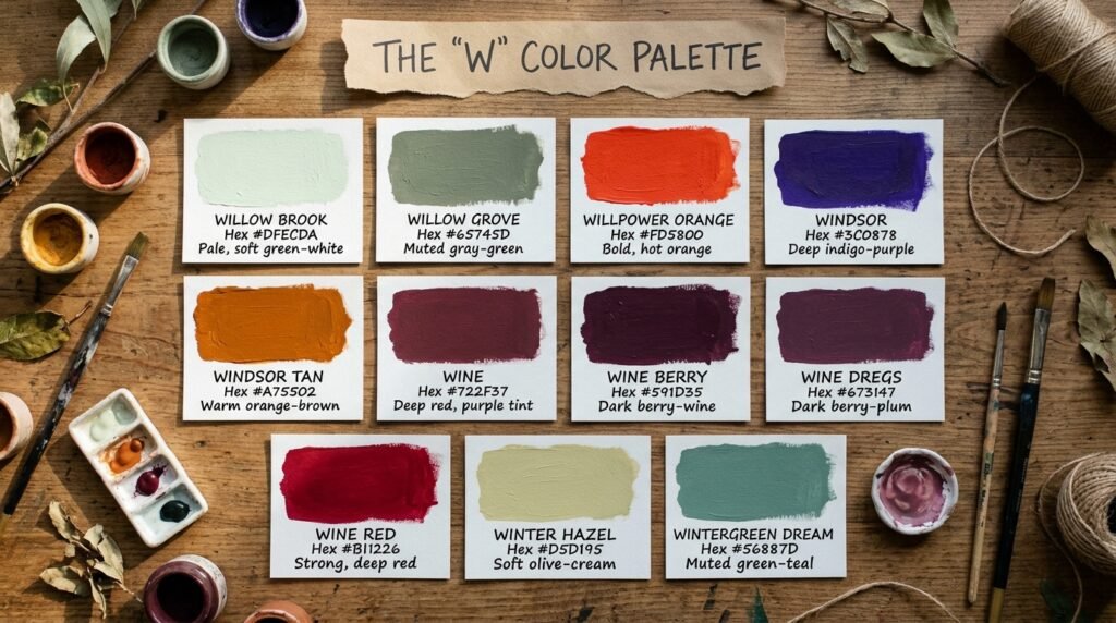
Pale, soft green-white. It looks light and fresh. Hex: #DFECDA | RGB: 223, 236, 218 | CMYK: 6, 0, 8, 7
Willow Grove
Muted gray-green with an olive lean. It looks calm and earthy. Hex: #65745D | RGB: 101, 116, 93 | CMYK: 13, 0, 20, 55
Willpower Orange
Bold, hot orange with a red lean. It looks strong and full of energy. Hex: #FD5800 | RGB: 253, 88, 0 | CMYK: 0, 65, 100, 1
Windsor
Deep indigo-purple. It looks royal and rich. Hex: #3C0878 | RGB: 60, 8, 120 | CMYK: 50, 93, 0, 53
Windsor Tan
Deep, warm orange-brown. It looks rich and a bit rugged. Hex: #A75502 | RGB: 167, 85, 2 | CMYK: 0, 49, 99, 35
Wine
Deep red with a purple-brown tint. It is named for red wine. Hex: #722F37 | RGB: 114, 47, 55 | CMYK: 0, 59, 52, 55
Wine Berry
Very dark berry with a wine tone. It is deeper than Wine Dregs. Hex: #591D35 | RGB: 89, 29, 53 | CMYK: 0, 67, 40, 65
Wine Dregs
Dark berry-plum with a muted tone. It looks rich and moody. Hex: #673147 | RGB: 103, 49, 71 | CMYK: 0, 52, 31, 60
Wine Red
Strong, deep red with a slight cool lean. It is brighter than Wine. Hex: #B11226 | RGB: 177, 18, 38 | CMYK: 0, 90, 79, 31
Winter Hazel
Soft olive-cream. It looks dry and gentle. Hex: #D5D195 | RGB: 213, 209, 149 | CMYK: 0, 2, 30, 16
Wintergreen Dream
Muted green-teal with a cool, gray hint. It looks calm and fresh. Hex: #56887D | RGB: 86, 136, 125 | CMYK: 37, 0, 8, 47
Wisp Pink
Very pale pink, almost white. It looks light and delicate. Hex: #FEF4F8 | RGB: 254, 244, 248 | CMYK: 0, 4, 2, 0
Wisteria
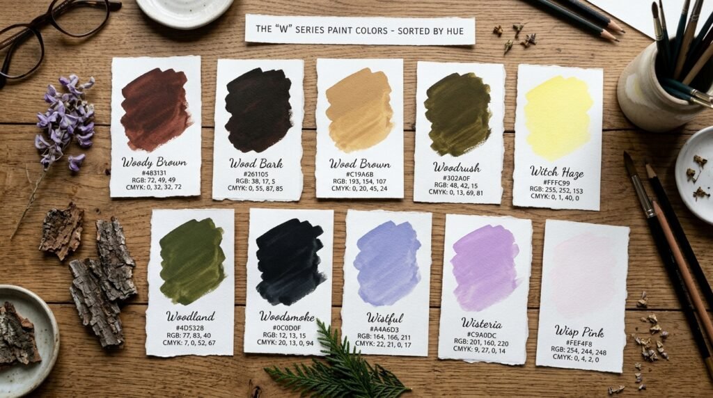
Soft lavender-purple with a light, airy feel. It is named for the climbing flower. Hex: #C9A0DC | RGB: 201, 160, 220 | CMYK: 9, 27, 0, 14
Wistful
Soft lavender-blue. It looks dreamy and cool. Hex: #A4A6D3 | RGB: 164, 166, 211 | CMYK: 22, 21, 0, 17
Witch Haze
Pale, bright lemon. It looks light and zesty. Hex: #FFFC99 | RGB: 255, 252, 153 | CMYK: 0, 1, 40, 0
Wood Bark
Very dark brown, close to black. It looks like old, damp bark. Hex: #261105 | RGB: 38, 17, 5 | CMYK: 0, 55, 87, 85
Wood Brown
Warm, light-medium tan with a golden hint. It looks like pale oak. Hex: #C19A6B | RGB: 193, 154, 107 | CMYK: 0, 20, 45, 24
Woodland
Deep olive green. It looks leafy and natural. Hex: #4D5328 | RGB: 77, 83, 40 | CMYK: 7, 0, 52, 67
Woodrush
Very dark olive-brown. It looks deep and earthy. Hex: #302A0F | RGB: 48, 42, 15 | CMYK: 0, 13, 69, 81
Woodsmoke
Near-black with a faint cool tint. It looks sleek and dark. Hex: #0C0D0F | RGB: 12, 13, 15 | CMYK: 20, 13, 0, 94
Woody Brown
Dark brown with a reddish-plum hint. It looks rich and warm. Hex: #483131 | RGB: 72, 49, 49 | CMYK: 0, 32, 32, 72
That wraps up the list. Now let’s sort them by hue.
Colors Grouped by Family
This table groups every color above by its main hue. Use it to find whites, blues, or greens fast.
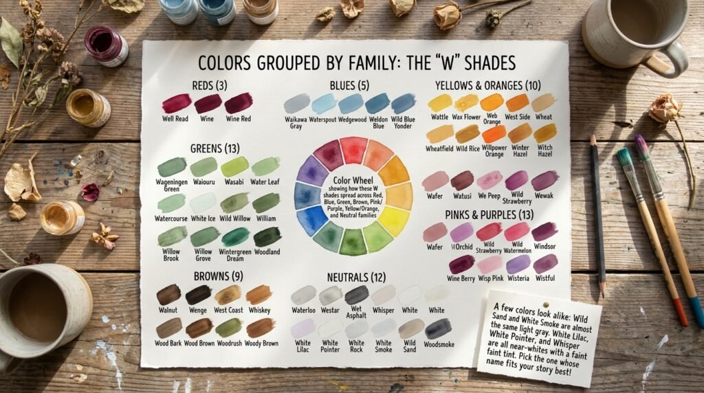
| Family | Color Names |
| Reds (3) | Well Read, Wine, Wine Red |
| Blues (5) | Waikawa Gray, Waterspout, Wedgewood, Weldon Blue, Wild Blue Yonder |
| Greens (13) | Wageningen Green, Waiouru, Warm Black, Wasabi, Water Leaf, Watercourse, White Ice, Wild Willow, William, Willow Brook, Willow Grove, Wintergreen Dream, Woodland |
| Browns (9) | Walnut, Wenge, West Coast, Whiskey, Windsor Tan, Wood Bark, Wood Brown, Woodrush, Woody Brown |
| Neutrals (12) | Waterloo, Westar, Wet Asphalt, Whisper, White, White Lilac, White Linen, White Pointer, White Rock, White Smoke, Wild Sand, Woodsmoke |
| Pinks and Purples (13) | Wafer, Watusi, We Peep, Wewak, Wild Orchid, Wild Strawberry, Wild Watermelon, Windsor, Wine Berry, Wine Dregs, Wisp Pink, Wisteria, Wistful |
| Yellows and Oranges (10) | Wattle, Wax Flower, Web Orange, West Side, Wheat, Wheatfield, Wild Rice, Willpower Orange, Winter Hazel, Witch Haze |
A few colors look alike. Wild Sand and White Smoke are almost the same light gray. White Lilac, White Pointer, and Whisper are all near-whites with a faint tint. Pick the one whose name fits your story best.
How to Read Hex, RGB, and CMYK Codes
You have seen three codes under every color. Here is what each one means. We will use Wisteria as the example.
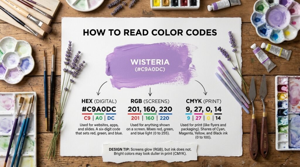
Hex is a six-digit code that starts with #. The first two digits set red. The next two set green. The last two set blue. Wisteria is #C9A0DC. Use Hex for websites, apps, and slides.
RGB uses three numbers from 0 to 255. They show how much red, green, and blue light to mix. Wisteria is 201, 160, 220. Use RGB for anything shown on a screen.
CMYK uses four numbers from 0 to 100. They show the share of cyan, magenta, yellow, and black ink. Wisteria is 9, 27, 0, 14. Use CMYK for print jobs like flyers and packaging.
One more point. Screens glow, but ink does not. So bright colors, like Wild Strawberry, may look duller in print. Now let’s put these codes to work.
How to Use These Colors
Colors work best when you use them with a plan. Here are simple tips for four fields.
Graphic Design
Pick one strong color and two quiet ones. Try Wet Asphalt (#34495E) as the base. Add a pop of Willpower Orange (#FD5800). Keep the rest light. Clean space makes bold colors shine.
Web Design
Choose a calm color for large areas. Use a bright one for buttons and links. White (#FFFFFF) makes a clean background. Wedgwood (#4E7F9E) works well for buttons. Wet Asphalt (#34495E) suits body text. Always check text contrast before you publish.
Interior Design
Soft, warm colors make a room feel cozy. White Linen (#F8F0E8) is great for walls. Walnut (#773F1A) suits wood pieces. Add Willow Grove (#65745D) for plants and accents.
Fashion
Deep tones feel rich. Light tones feel fresh. Wine (#722F37) looks sharp on a coat. Wisteria (#C9A0DC) lifts a simple top. Weldon Blue (#7C98AB) works well for accessories.
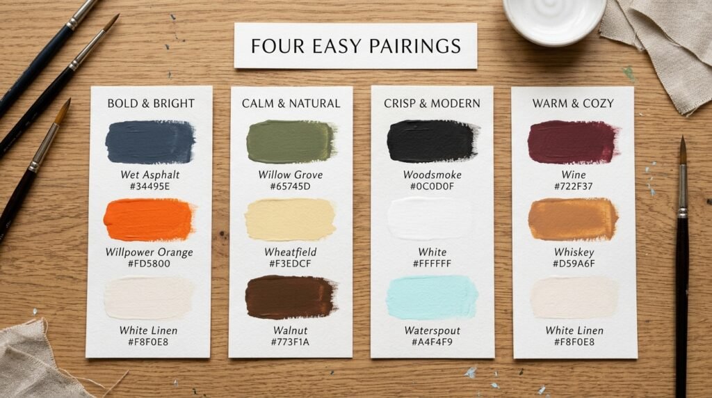
Four Easy Pairings
- Bold and bright: Wet Asphalt (#34495E) + Willpower Orange (#FD5800) + White Linen (#F8F0E8)
- Calm and natural: Willow Grove (#65745D) + Wheatfield (#F3EDCF) + Walnut (#773F1A)
- Crisp and modern: Woodsmoke (#0C0D0F) + White (#FFFFFF) + Waterspout (#A4F4F9)
- Warm and cozy: Wine (#722F37) + Whiskey (#D59A6F) + White Linen (#F8F0E8)
Conclusion
The letter W offers a wide range. You can find soft whites, warm woods, deep wines, and bright oranges. All 65 colors that start with W come with codes you can use now.
Save your favorites. Test them on screen and in print. Then build a palette that feels like you.
Ready for more? [Try our color tool] or [explore related colors].
FAQs
What are some colors that start with W?
Popular picks include White, Wheat, Wine, and Wisteria. You will also find Walnut and Wasabi. This guide lists 65 in all.
What is the darkest color that starts with W?
Woodsmoke (#0C0D0F) is the darkest. It is a near-black with a faint cool tint. Wood Bark (#261105) is a very dark brown.
What is the lightest color that starts with W?
White (#FFFFFF) is the lightest. It is pure and clean. White Pointer (#FEF8FF) and Wisp Pink (#FEF4F8) are near-whites with a soft tint.
What are some blue colors that start with W?
Try Wedgwood (#4E7F9E), Weldon Blue (#7C98AB), and Wild Blue Yonder (#A2ADD0). Waikawa Gray (#5A6E9C) is a muted slate blue. Waterspout (#A4F4F9) is pale and bright.
What are some purple colors that start with W?
Wisteria (#C9A0DC) is soft and light. Windsor (#3C0878) is deep and royal. Wild Orchid (#D470A2) leans toward pink.
Which W colors are best for earthy designs?
Walnut (#773F1A), Wenge (#645452), and Wood Brown (#C19A6B) feel warm and woody. Woodland (#4D5328) adds an olive touch. Wheat (#F5DEB3) adds a soft, golden base.
What W colors work well for websites?
White (#FFFFFF) makes a clean background. Wedgwood (#4E7F9E) is great for buttons and links. Wet Asphalt (#34495E) suits body text.