What Color Does Pink and Blue Make? Discover 9 Amazing Shades of Purple
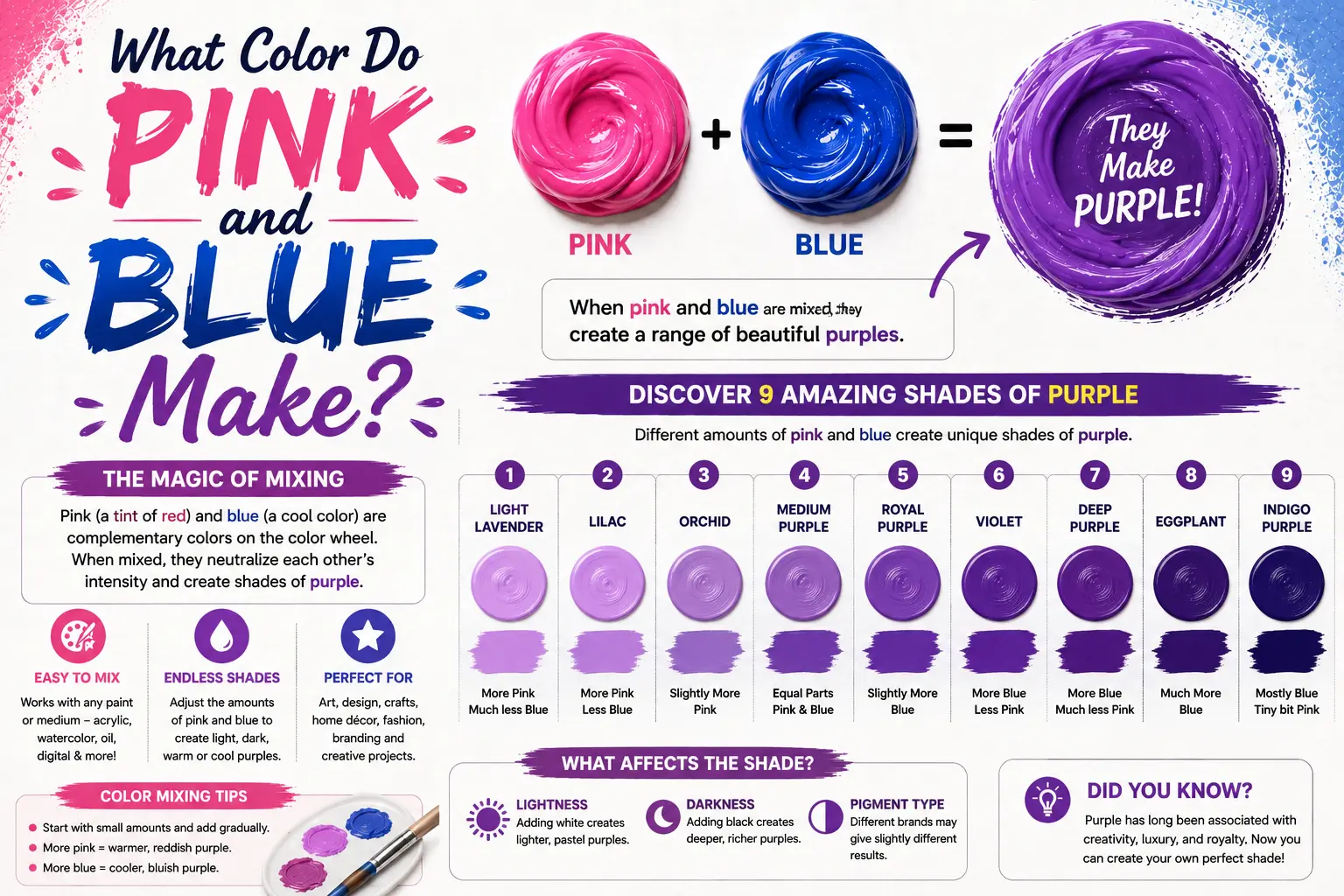
If you’ve ever wondered “pink and blue make what color,” you’re not alone. The straightforward answer is that mixing pink and blue creates purple. But if you have ever picked up a paintbrush or adjusted digital color sliders, you know that the exact result isn’t always a standard violet. Depending on your ratios, you can produce everything from soft lavender to deep plum.
Understanding how to control these mixes requires a quick look at pigment undertones and values. In this guide, you’ll discover how different shades interact, why lighting changes what you see, and how to craft 9 distinct purple variations for your creative projects.
Main Takeaway: Tinted Red (Pink) + Primary Color (Blue) = Secondary Purple Shade (depending on light value, temperature, and mixing ratio).
The Quick Answer: Pink and Blue Make Purple
The simple reason pink and blue combine into purple comes down to basic primary colors. Pink is fundamentally a lightened, desaturated red, and red mixed with blue always yields purple.
When you blend the two, the white pigment built into the pink softens the intensity of the blue. Instead of getting a dark, heavy violet like you would with pure red, you end up with lighter, brighter purple tones.
Here’s a good example. If you take a drop of sky blue and mix it with a dollop of bubblegum pink, you immediately get a cheerful, bright violet.
Beginner Tip: Because blue is naturally a stronger pigment than pink, it can overpower your mix quickly. Always start with your pink as the base and slowly add small amounts of blue until you reach your target shade.
Now let’s look at why this happens on a physical level.
Why Pink + Blue Makes These Colors (Mixing Science)
To see why this combination produces such vibrant tones, we have to examine pigment behavior. Pink carries red light waves mixed with white reflective particles. Blue absorbs yellow and red light waves while reflecting cool blue light.
When these two meet, the red in the pink and the blue in the paint combine to form a purple wavelength. The white already present in the pink lightens the value, preventing the mix from collapsing into a dark, muddy tone.
![[Red Pigment + White Filler] (Pink) + [Pure Blue Pigment] ===> Lighter, Radiant Violet](https://paintlogics.com/wp-content/uploads/2026/07/Artist-palette-with-dollops-of-bright-pink-and-cobalt-blue-paint-blending-into-a-rich-purple.jpg)
Imagine you’re painting a sunset sky. Mixing blue directly into red often creates a dark, heavy horizon line, but using pink instead creates a soft, glowing twilight transition.
That’s where many beginners get confused—they expect pure purple, but the built-in white shifts the entire output. Now compare that with what happens when you adjust the specific types of pink and blue you use.
Lavender, Lilac, Orchid & Periwinkle – How They’re Made from Pink + Blue
Changing your base ingredients completely alters your final hue. By altering values and undertones, you can create a full spectrum of stunning purple shades.
![[High Blue + Light Pink] ──► Cool Periwinkle
[High Pink + Light Blue] ──► Warm Lilac
[Equal Mix + Pure White] ──► Soft Lavender](https://paintlogics.com/wp-content/uploads/2026/07/Paint-swatches-showing-delicate-lavender-soft-lilac-and-cool-periwinkle-color-samples.jpg)
Lavender
Lavender is a pale, cool-toned purple with a soothing, airy feel. This happens because the mix leans slightly toward blue while keeping a high concentration of white. Combine equal parts soft baby pink and light sky blue, then add an extra touch of white paint to soften the hue. Interior designers often use this gentle shade for relaxing bedroom walls.
Lilac
Lilac is a light, warm purple with a subtle floral quality. The reason it feels warm is that it contains a higher proportion of red-toned pink than blue. Mix two parts soft rose pink with one part light blue. This creates a cozy, romantic color that works wonderfully in spring floral paintings.
Periwinkle
Periwinkle sits right on the border between blue and purple. This shade occurs because a cool blue dominates the mixture while taking on just enough pink to shift away from pure blue. Combine two parts sky blue with one part delicate pastel pink. It’s a staple color for stationery designs and winter landscape highlights.
What color does hot pink and blue make?
Hot pink mixed with blue creates a high-energy, vivid royal purple or electric violet. This happens because hot pink contains dense, saturated magenta pigments without much chalky white filler. Mix bright magenta with vibrant cobalt blue to produce an intense jewel tone. Graphic designers frequently use this punchy shade for bold modern branding.
Pro Tip: If your hot pink mix looks too dark, add a tiny pinprick of pure white paint to reveal the brilliant purple undertone hiding inside the dark mix.
What if I mix baby pink and navy blue?
Mixing baby pink with navy blue produces a muted, dusty slate purple. The reason for this subdued look is the dark gray quality of navy blue clashing with the light white in baby pink. Combine a deep navy with a soft pastel pink to get a sophisticated, smoky tone. This shade is highly popular in modern bridal palettes and autumn apparel.
Plum – Deep and Moody from Dark Blue + Reddish Pink
Plum is a rich, luxurious purple with a noticeable red undertone. This depth comes from pairing a dark, concentrated blue with a warm, berry-toned pink. Mix dark Ultramarine blue with a deep raspberry pink to achieve a shade resembling ripe fruit. Fine artists often use plum to paint rich velvet fabrics and deep shadow areas in still life compositions.
Dusty Purple – Soft and Muted
Dusty purple is a toned-down, earthy neutral that feels grounded and vintage. This effect happens when your blue or pink contains a tiny hint of yellow or gray. Take a muted rose pink and blend it with a subdued slate blue. The resulting gray-purple works perfectly as a background shade that won’t distract from brighter foreground elements.
Thistle – Delicate and Powdery with Extra White
Thistle is an extremely pale, powdery shade of purple that carries just a whisper of color. This tone relies on a heavy base of white paint lightly tinted by the pink and blue mix. Mix a tiny drop of pale pink and a microscopic dot of light blue into a large dollop of titanium white. It offers a soft, elegant touch for watercolor backgrounds and ceramic glazes.
Electric Violet – Striking and Neon
Electric violet is a sharp, glowing color that almost appears to radiate light. The reason it looks so intense is the use of synthetic pigments like Quinacridone Magenta (hot pink) and Phthalo Blue. Combine these two high-chroma pigments in equal parts to generate an astonishingly bright violet. Illustrators use this shade to draw neon lights and futuristic sci-fi scenes.
Color Swatch Chart – What Color Does Pink and Blue Make?
To help you choose the right blend for your next project, review this quick mixing reference guide.
| Starting Pink | Starting Blue | Mixing Ratio | Resulting Purple Shade |
| Baby Pink | Sky Blue | 50% Pink / 50% Blue | Classic Lavender |
| Rose Pink | Sky Blue | 65% Pink / 35% Blue | Soft Lilac |
| Pastel Pink | Light Blue | 35% Pink / 65% Blue | Cool Periwinkle |
| Hot Pink | Cobalt Blue | 50% Pink / 50% Blue | Electric Violet |
| Baby Pink | Navy Blue | 40% Pink / 60% Blue | Slate / Dusty Purple |
| Raspberry Pink | Ultramarine Blue | 60% Pink / 40% Blue | Deep Plum |
| Blush Pink | Light Blue + Extra White | 20% Pink / 10% Blue / 70% White | Powdery Thistle |
Tips for Mixing These in Paint
Getting a clean, attractive purple requires careful palette management. If you mix your paints carelessly, you can easily turn a bright violet into a dull gray.
The secret to keeping your purples clean lies in checking pigment labels. You want to select pinks and blues that are free from yellow undertones.
- Choose the Right Blue: Use cool blues like Phthalo Blue or Cobalt Blue rather than warm, greenish blues.
- Check the Pink: Magenta-based pinks yield the cleanest, most vibrant purples.
- Mix Gradually: Add blue to pink in tiny increments to prevent darkening the shade too quickly.
[Magenta Pink] + [Phthalo Blue] ===> Clean, Radiant Violet
[Yellow-Pink] + [Cerulean Blue] ===> Muddy Gray-Purple
Another thing worth knowing is how surrounding light sources affect what your eyes perceive on the canvas.
How Lighting Changes the Color You See
The lighting in your studio or home changes how light waves reflect off your mixed purple paint.
This happens because warm indoor light bulbs emit yellow wavelengths, while natural daylight leans toward blue. Under warm incandescent lighting, your mixed periwinkle will look slightly more muted and neutral. Under cool LED or morning daylight, that same swatch will appear much cooler and closer to blue.
Here’s a good example. Place a painted lavender card next to a window, then view it at night under a warm lamp. You will notice the warm yellow light counteracts the cool blue tones, making the swatch look grayer.
How Medium Affects the Outcome
The medium you choose changes how pigments combine and dry on your surface.
Acrylics, oils, watercolors, and digital tools handle color transparency differently.
![ACRYLICS / OILS (Opaque) WATERCOLOR (Transparent)
[Physical Pigment Blend] [Layered Transparent Washes]
│ │
▼ ▼
Opaque Uniform Color Glowing Layered Depth](https://paintlogics.com/wp-content/uploads/2026/07/Watercolor-painting-demonstration-showing-blue-and-pink-glazes-creating-transparent-violet-layers.jpg)
- Acrylics and Oils: These physical pigments mix directly on your palette. Acrylics tend to dry slightly darker than they appear when wet, so mix your pink and blue a shade lighter than your target color.
- Watercolors: Instead of heavy palette mixing, you can paint a thin wash of transparent pink, let it dry, and glaze a transparent blue wash over it. Light reflects through both layers, creating a luminous purple.
- Digital Art (RGB): On a digital screen, pink (high Red + high Blue) and blue (pure Blue light) combine additively. Adjusting your opacity yields bright, glowing purples without any chalkiness.
How Much Pink or Blue You Use Matters
The exact balance of your mixture determines whether your purple feels warm, cool, or neutral.
A pink-dominant mix pulls the color toward the warm side of the color wheel, creating friendly, approachable tones like orchid and lilac. A blue-dominant mix pushes it toward the cool side, creating calm tones like slate and periwinkle.
What if you use equal parts of both? You get a balanced, true violet that sits comfortably right in the middle of the spectrum.
Color Psychology of Pink + Blue Mixtures
Colors evoke strong emotional responses, and purples created from pink and blue carry a unique balance of energies.
Pink represents warmth, playfulness, and comfort, while blue symbolizes calm, stability, and trust. When combined, these colors unite active and passive traits into a single harmonious tone.
Interior designers frequently use lavender and lilac in bedrooms and wellness spas because these shades lower visual stress while maintaining a welcoming atmosphere.
Where to Use Pink + Blue Mixes in Art & Design
Knowing how to craft these purples opens up countless practical applications across creative industries.
In fine art, mixing pink and blue yields natural shadow tones for white clothing, snow landscapes, and flower petals. Pure black paint makes shadows look flat and artificial, but a sheer glaze of periwinkle or lavender creates depth and realism.
In wedding and event design, pairing soft pinks with slate blues creates a balanced aesthetic that appeals to diverse tastes.
Color Identity: How Pink + Blue Purple Represents Inclusivity
Beyond traditional art theory, the blend of pink and blue carries strong social significance. Historically, blue and pink were used to represent strict gender binaries, but combining them into purple creates a visual symbol of fluidity, balance, and inclusivity.
This blend is prominently featured in various pride flags, most notably the Bisexual Pride Flag, where pink and blue overlap in the center to form a vibrant purple stripe representing attraction across the spectrum.
Understanding this identity aspect helps designers create thoughtful, inclusive visual branding that resonates with modern audiences.
Common Mistakes When Mixing Pink + Blue
Even experienced artists occasionally mess up a color mix. Here are the most common pitfalls and how to avoid them:
- Using a Yellow-Based Pink: Warm pinks containing yellow (like salmon or coral) introduce a third primary color into your mix, instantly turning your purple into a muddy brown.
- Adding Too Much Blue at Once: Deep blues easily overpower pale pinks. Always feed blue into your pink base drop by drop.
- Ignoring Drying Shifts: Acrylic paints tend to darken as the water evaporates. Test your mixture on a scrap piece of paper and let it dry completely before committing to a large canvas area.
Now let’s wrap things up with a clear summary of everything you’ve learned.
Conclusion: what color does pink and blue make
When asking “what color does pink and blue make,” the answer is a versatile family of purples. By adjusting your ratios and watching out for unwanted yellow undertones, you can effortlessly craft everything from soft thistle to deep plum. Take these mixing principles to your palette or canvas, experiment with different values, and enjoy adding custom purple shades to your work.
You May Also Like
- What Color Do Red and Pink Make? Mixing Guide
- What Color Do Pink and Purple Make? Best Results
- What Do Purple and Yellow Make When mixed? Mixing Guide
FAQs
Does pink and blue always make purple?
Yes, in physical paint mixing, pink and blue will always create a shade of purple because pink is a tint of red. However, if your pink or blue contains yellow undertones, your purple may look dull or brownish.
Why does my pink and blue mix look gray or muddy?
Your mix looks gray or muddy because yellow was introduced to the palette. If you use a warm pink (like coral) or a greenish-blue (like turquoise), you are effectively mixing red, blue, and yellow together, which naturally neutralizes color brightness.
Can I make dark purple from pink and blue?
Yes. To make a dark purple, use a saturated, deep pink (like magenta) paired with a dark blue (like navy or Ultramarine). Avoid pale baby pinks, as the white filler inside them will lighten the mix into a pastel.
Can you mix pink and blue in watercolor?
Yes. You can mix them directly on your palette, or layer a transparent blue wash over a dried pink wash using a glazing technique to produce a glowing purple effect.
What color do pink and blue make in RGB (digital art)?
In digital RGB color space, pink is made of Red and Blue light, while blue is pure Blue light. Combining them creates a bright, highly saturated magenta-purple or light violet, depending on opacity settings.
Will pink + blue always make purple?
Yes, as long as you are working with subtractive pigments or additive light. The specific hue—whether lavender, periwinkle, or plum—will depend entirely on the proportions and values used.
Does pink and blue always make purple in acrylic paint?
Yes, pink and blue always yield purple in acrylic paint. Just remember that acrylics tend to dry slightly darker than they appear on the wet palette, so keep your initial mix a bit lighter than your desired final result.