What Color Do Orange and Yellow Make When Mixed?
If you’ve ever wondered “orange and yellow make what color,” you’re not alone. It’s a classic question that pops up whether you are trying to paint a glowing, realistic sunset, decorate a cozy living room, or simply design a high-converting website banner.
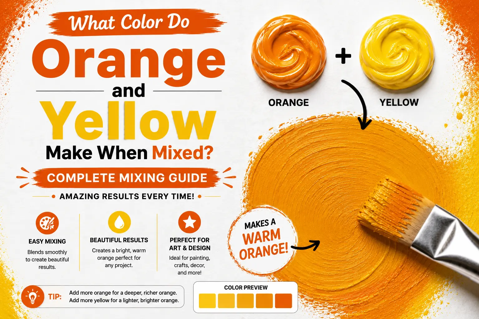
The direct answer is straightforward: mixing orange and yellow together creates yellow-orange, which is a warm, vibrant tertiary color often referred to as amber or golden orange.
However, the final result isn’t always exactly the same. The specific shade you get depends on the physical characteristics of your paint, the starting temperature of your yellow, and the exact mixing ratios you use. Understanding these subtle shifts gives you complete control over this high-energy color family. In this guide, you’ll learn how these two warm colors interact, how to mix them like a pro, and how to use this radiant hue to elevate your designs.
Main Takeaway:
Warm Yellow + Bright Orange = Yellow-Orange / Amber (varying from a light sunny shade to a rich golden glow depending on your mixing proportions).
Quick Answer: How to Create Amber from Paint?
To create a rich, true amber shade, you need to combine yellow and orange in a specific balance that mimics the warm glow of natural tree resin.
Why does this happen? The reason is simple: yellow is a highly reflective primary color, while orange is a dense secondary color containing red. If you use equal parts, the orange will easily overpower the delicate yellow pigment, leaving you with a dark, heavy hue.
To get a bright, luminous amber, you should start with a base of pure yellow paint and slowly fold in small touches of orange. A 2:1 ratio of yellow to orange is usually the sweet spot for a classic, glowing amber.
Is It Yellow-Orange, Amber, or Light Orange?
That’s where many beginners get confused. Are these three terms describing the exact same thing, or are they completely different colors?
The differences come down to context and subtle shifts in value.
- Yellow-orange is the strict, scientific name used in formal color theory.
- Amber is a rich, natural shade of yellow-orange that leans slightly warmer, often with a hint of gold or brown.
- Light orange is typically a pastel tint made by adding white paint to a pure orange base.
This happens because the human eye categorizes color based on natural associations. When you see a pure, equal blend of yellow and orange, your brain naturally registers the warmth of sun-drenched environments.
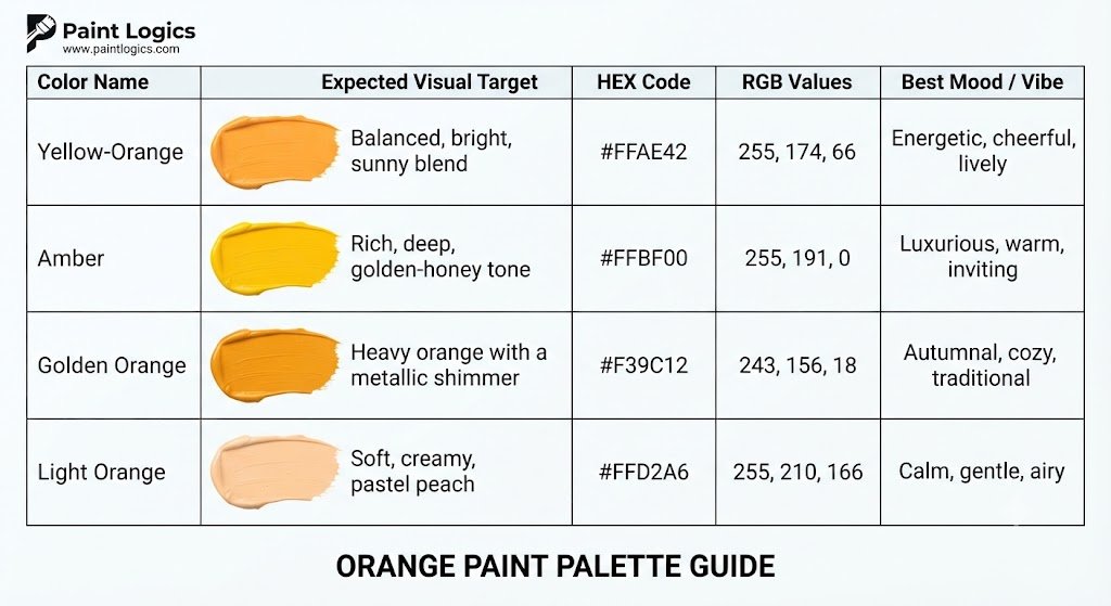
Here is a quick look at how these common shades differ in practice:
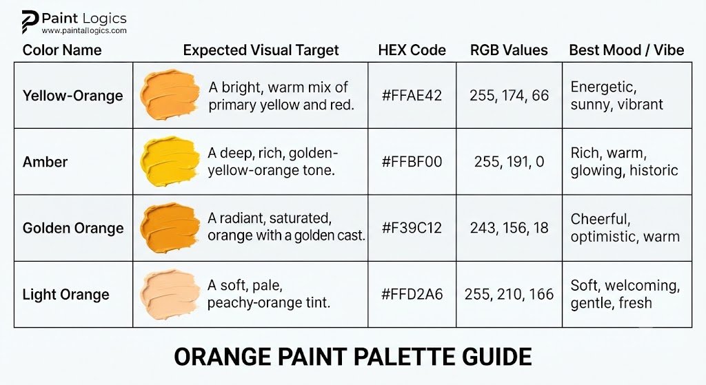
| Color Name | Expected Visual Target | HEX Code | RGB Values | Best Mood / Vibe |
| Yellow-Orange | Balanced, bright, sunny blend | #FFAE42 | 255, 174, 66 | Energetic, cheerful, lively |
| Amber | Rich, deep, golden-honey tone | #FFBF00 | 255, 191, 0 | Luxurious, warm, inviting |
| Golden Orange | Heavy orange with a metallic shimmer | #F39C12 | 243, 156, 18 | Autumnal, cozy, traditional |
| Light Orange | Soft, creamy, pastel peach | #FFD2A6 | 255, 210, 166 | Calm, gentle, airy |
How the Proportions Affect the Final What Color Do Orange and Yellow Make
Adjusting your mixing proportions entirely changes the weight, value, and overall mood of your final blend.
Why does this happen? Yellow pigments are naturally weaker and more transparent than red-based orange pigments. If you add too much orange too quickly, the red undertones will dominate the mixture immediately, drowning out the bright, sunny yellow qualities.
Here’s how different mixing formulas behave on your palette:
- More Yellow (3:1 Ratio): This creates a bright, pale yellow-orange that mimics morning sunlight. It is incredibly high-energy and clean.
- Equal Parts (1:1 Ratio): This gives you a balanced, deep yellow-orange. It is highly saturated and vibrant.
- More Orange (1:3 Ratio): This yields a dense, heavy golden orange that borders on a soft copper or dark sunset hue.
You Might Also Like:
Mixing Yellow and Orange in Paint (Step-by-Step Tutorial)
If you are working with physical mediums like acrylics, oils, or watercolors, achieving a clean mix requires a deliberate process to avoid muddying your colors.
1.Select your pigments:1 min.
Choose a clean, warm yellow (such as Cadmium Yellow Medium) and a pure orange (such as Cadmium Orange). Ensure your palette is completely clean of blue or green contaminants.
2.Squeeze out your paint bases:30 seconds.
Place a large dollop of yellow paint on your palette. Next to it, place a much smaller dollop of orange—about one-third the size of the yellow.
3.Fold the orange into the yellow:1-2 min.
Using a palette knife, scoop up a tiny speck of the orange paint. Slowly drag it into your pool of yellow and blend thoroughly. Do not dump all the orange in at once!
4.Test and adjust:1 min.
Brush a sample onto a piece of white paper. If it looks too bright and light, add a tiny pinpoint more orange. If it looks too dark, scrape some aside and blend in fresh yellow.
Color Theory Breakdown: How Yellow and Orange Create Amber
To understand why these colors look so beautiful together, we need to take a quick step back into basic color science.
Primary, Secondary, and Tertiary Colors: A Quick Review
The standard color wheel is built in structured tiers.
This happens because of how pigments reflect light wavelengths. Primary colors (Red, Yellow, Blue) cannot be made by mixing other colors. Secondary colors (Orange, Green, Violet) are made by mixing two primaries together.
Why Yellow + Orange Creates a Tertiary Color
A tertiary color is created when you mix a primary color with an adjacent secondary color.
The reason is simple: when you mix yellow (a primary) and orange (a secondary made of yellow and red), you are essentially creating a three-part blend that is heavily weighted toward yellow. This results in a hybrid color that sits perfectly between its parents on the wheel.
Pro Tip: Because tertiary colors contain a heavy dose of a primary, they naturally retain a clean, highly luminous quality that is difficult to dull down unless you accidentally introduce a cool opposite color.
Where Yellow-Orange Sits on the RYB Color Wheel
In the traditional RYB (Red-Yellow-Blue) color wheel used by painters, yellow-orange occupies a highly strategic position.
It sits snugly between yellow and orange, acting as a visual bridge. This location makes it an incredibly useful transition color for creating smooth gradients.
Imagine you’re painting a sunset. If you paint a stripe of bright yellow directly next to a stripe of dark orange, the boundary will look harsh and unnatural. Blending a transitional layer of yellow-orange right at the border creates a soft, realistic atmosphere that mimics the natural behavior of light in the sky.
Yellow-Orange in Real Life
This radiant color family isn’t just for art canvases; it is widely utilized across various professional fields to evoke specific feelings.
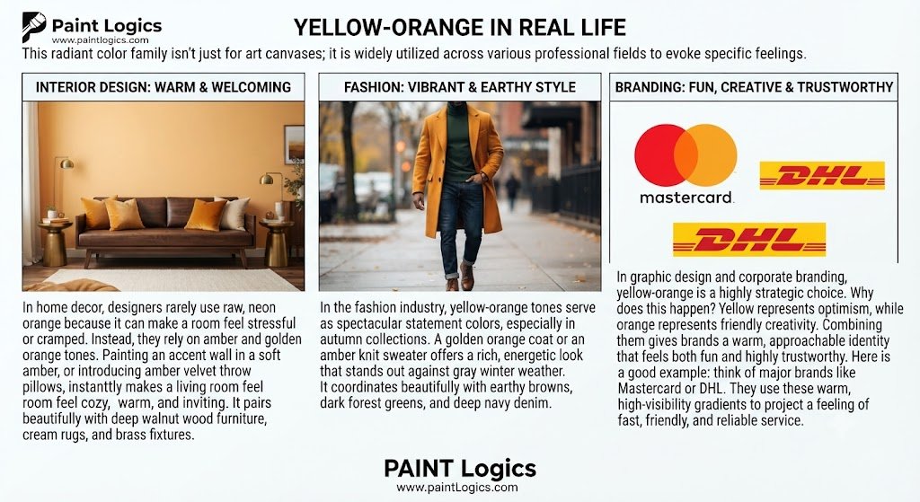
Interior Design: Warm & Welcoming
In home decor, designers rarely use raw, neon orange because it can make a room feel stressful or cramped.
Instead, they rely on amber and golden orange tones. Painting an accent wall in a soft amber, or introducing amber velvet throw pillows, instantly makes a living room feel cozy, warm, and inviting. It pairs beautifully with deep walnut wood furniture, cream rugs, and brass fixtures.
Fashion: Vibrant & Earthy Style
In the fashion industry, yellow-orange tones serve as spectacular statement colors, especially in autumn collections.
A golden orange coat or an amber knit sweater offers a rich, energetic look that stands out against gray winter weather. It coordinates beautifully with earthy browns, dark forest greens, and deep navy denim.
Branding: Fun, Creative & Trustworthy
In graphic design and corporate branding, yellow-orange is a highly strategic choice.
Why does this happen? Yellow represents optimism, while orange represents friendly creativity. Combining them gives brands a warm, approachable identity that feels both fun and highly trustworthy.
Here is a good example: think of major brands like Mastercard or DHL. They use these warm, high-visibility gradients to project a feeling of fast, friendly, and reliable service.
You Might Also Like:
Symbolism and Psychology of Amber Color
Colors have a profound subconscious impact on our moods, and amber is one of the most comforting colors on the spectrum.
Emotional and Psychological Effects
Because amber is the color of glowing fire embers and warm sunlight, it triggers feelings of safety, warmth, and physical comfort.
The reason is simple: humans are hardwired to associate these warm wavelengths with light, harvest, and shelter. Unlike bright red, which can trigger feelings of danger or high blood pressure, amber relaxes the nervous system while keeping the mind gently stimulated.
Color Therapy and Mood Associations of Amber Color
In color therapy (chromotherapy), amber is used to revitalize depleted energy.
This happens because it acts as a gentle stimulant. It is often used to combat feelings of seasonal sadness or lethargy during dark winter months. Decorating your workspace with amber accents or using warm, amber-toned LED lighting can boost focus, inspire creative thinking, and keep your spirits lifted throughout the day.
Spiritual Meaning and Auras of Yellow and Orange Color
In various spiritual traditions, yellow and orange are deeply tied to personal power and creative flow.
- The Sacral Chakra (Orange): Represents emotional balance, physical pleasure, and artistic creativity.
- The Solar Plexus Chakra (Yellow): Represents personal power, self-esteem, and willpower.
When these colors mix to form a glowing golden-orange aura, it is said to symbolize an individual who is highly creative, emotionally grounded, and radiating self-confidence.
Amber Color Palette Ideas and Inspiration
If you want to use this gorgeous color in your next design project, here are three highly cohesive color palettes to get you started:
1. Golden Hour Glow
This palette captures the warm, peaceful feeling of a late summer evening.
- Amber (#FFBF00)
- Warm Sand (#E5D3B3)
- Terracotta (#C26D4C)
- Charcoal Grey (#2F3E46)
2. Rustic Autumn
A cozy, traditional color scheme perfect for home decor and seasonal packaging.
- Golden Orange (#F39C12)
- Olive Green (#556B2F)
- Deep Mahogany (#4A2E2B)
- Cream (#FFFDD0)
3. Citrus Bright
A high-energy, refreshing palette ideal for modern branding and summer apparel.
- Yellow-Orange (#FFAE42)
- Key Lime (#A3C1AD)
- Grapefruit Pink (#FF8C94)
- Clean White (#FFFFFF)
Yellow + Orange Digital Mix Examples (with Hex Codes)
When designing for digital screens, colors are mixed using the RGB light model rather than physical paint pigments.
On a screen, yellow-orange is created by running the red channel at maximum power while running the green channel at a moderate level.
If you are coding a website, using an amber gradient (#FFBF00 to #FFAE42) for your main call-to-action buttons is a brilliant way to draw the user’s eye naturally without looking harsh.
Conclusion: What Happens When You Mix Yellow and Orange?
At the end of the day, mixing yellow and orange is one of the most rewarding experiments you can run on your palette.
You’ll always end up with a gorgeous, high-energy warm tone—whether that’s a light, sunny yellow-orange, a deep metallic golden orange, or a rich, glowing amber.
Just remember the golden rule of paint: yellow is the weaker pigment. Always start with your yellow paint first and slowly fold in your orange to keep your mix clean, luminous, and completely under your control.
You Might Also Like:
FAQs
What is the official name for yellow and orange mixed?
The official scientific name for this mixture is yellow-orange. It is classified as a tertiary color on the standard color wheel.
Is yellow-orange the same as amber or gold?
Not exactly. While they belong to the same color family, amber leans slightly warmer and deeper (like honey), while gold often has metallic undertones or a slightly green-brown tint.
Can I make orange if I only have yellow?
No, you cannot make pure orange with only yellow. Orange is a secondary color, meaning you must mix yellow with a primary red to create it.
What does orange and yellow make in light vs paint?
In both light (RGB) and paint (RYB), mixing orange and yellow results in a warm yellow-orange or amber. However, digital light will always look much brighter and more luminous than physical paint pigments.
What colors go well with yellow-orange?
Yellow-orange pairs beautifully with its complementary opposite, blue-violet, as well as natural earth tones like olive green, rich mahogany brown, warm cream, and charcoal slate gray.
What is the hex code for yellow-orange?
The classic hex code for a balanced yellow-orange is #FFAE42.
Do yellow and orange make brown?
No. Yellow and orange will only make a warm, sunny yellow-orange. To make brown, you need to introduce a cool complementary color, like blue, into your warm mix.
Do yellow and orange make gold?
They can! If you mix a warm yellow with a tiny touch of orange and a microscopic pinpoint of raw umber (brown), you will get a beautiful, classic gold paint tone.