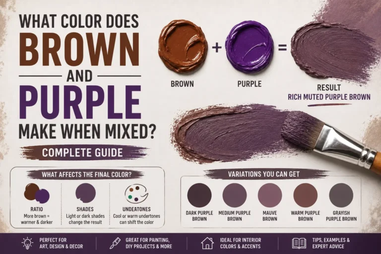
What Colors Make Gray (Grey)? 10 Easiest Ways
If you’ve ever wondered “what colors make gray,” you’re not alone. It’s one of the most common hurdles you’ll face on a fresh canvas, during a living room remodel, or while designing a clean website interface.
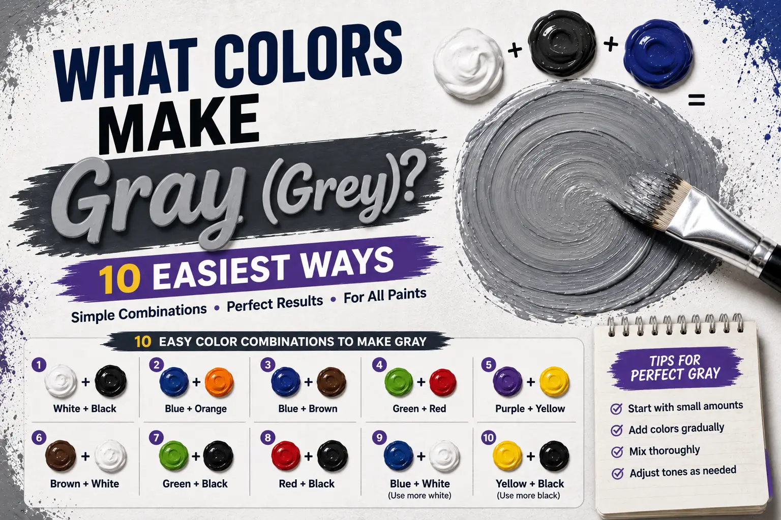
The direct answer is simple: to make a basic gray, you mix black and white together, but you can also mix complementary color pairs or combine all three primary colors.
However, the final result isn’t always identical every single time you blend a batch. The exact gray you get depends heavily on the temperature of your starting paints, whether you mix with a pure black pigment, or if you build your gray dynamically from primary hues. Understanding these variations gives you complete control over this incredibly versatile neutral. In this guide, you’ll learn the exact color theory behind this balance, how different pigment combinations behave, and how to mix a flawless, professional gray.
Main Takeaway:
Titanium White + Carbon Black = Neutral Gray (while Primary Red + Yellow + Blue = Chromatic Gray, depending on your color temperature and pigment ratios).
What Two Colors Make Gray?
To mix a basic, standard gray in the physical world, you only need to combine black and white on your palette. This combination is the easiest starting point for any creative project.
Why does this happen? The reason is simple: black paint absorbs all light wavelengths, while white paint reflects all of them back to your eye. When you physically blend them, you are diluting the absolute light absorption of the black pigment with the high light reflection of the white.
Imagine you’re painting a concrete sidewalk. If you squeeze out a large puddle of titanium white and slowly sweep a tiny dot of lamp black into the center, the bright white shifts instantly. It transitions away from a stark, blinding tone and settles into a calm, balanced silver gray.
Color Mixing Tool — Mix Colors Online | Free Color Mixer
Before you squeeze physical paint from your tubes, testing ratios digitally can save you a lot of wasted pigment. Online color mixing tools let you drag virtual sliders of red, yellow, blue, black, and white to see how they interact.
This happens because virtual mixers simulate pigment behavior mathematically on your screen. You can try adjusting the balance of white and black to see exactly how fast a dark pigment overrides a light one. It acts as a perfect playground for learning how a tiny drop of pigment can shift your values.
Here’s a good example: if you set a digital mixer to equal parts white and black, you get a clean mid-tone gray. If you then slide a tiny fraction of blue into the digital cup, you’ll immediately see the screen cool down to a slate tone.
Understanding the Two Types of Gray
When you start mixing your own paints, you’ll quickly realize that not all grays are created equal. Grays generally fall into two distinct camps: achromatic and chromatic.
Why does this happen? The reason is simple: achromatic grays are made purely from black and white, containing no colored pigments at all. Chromatic grays, on the other hand, are mixed using actual colors like red, blue, yellow, or complementary pairs.
Imagine you are painting a misty landscape. If you use an achromatic gray, the distant hills can look flat, cold, and a bit synthetic. But if you mix a chromatic gray using cobalt blue and burnt sienna, the hills will look alive, deep, and beautifully integrated with the natural atmosphere of your painting.
Warm vs. Cool Grays
The temperature of your gray determines the overall mood and energy it brings to your artwork or living space.
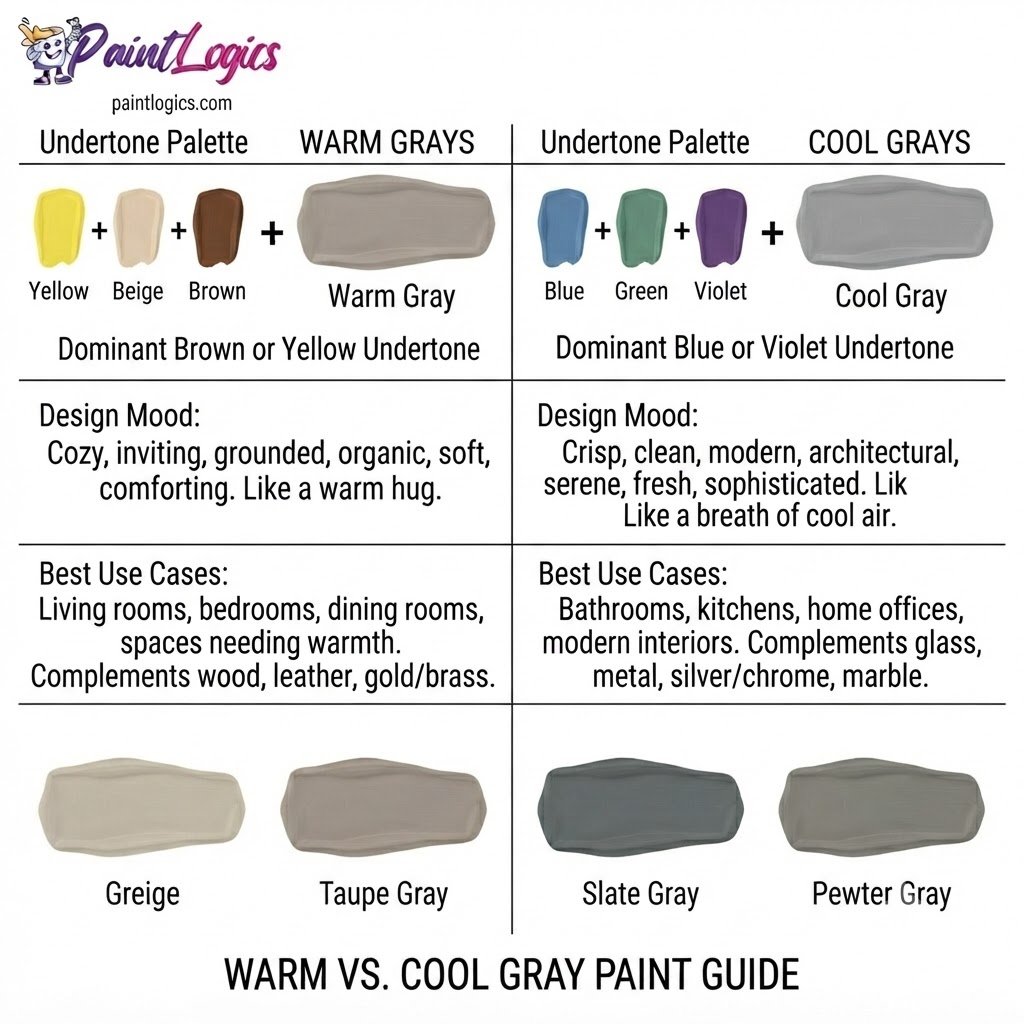
This happens because of the underlying color pigments radiating through the mix. A warm gray has subtle yellow, orange, or red undertones that make it feel cozy and inviting. A cool gray leans heavily toward blue, green, or violet undertones, giving it a sleek, modern, and clinical feel.
Now look at how these differences behave in practice:
| Gray Type | Undertone Color | Best Use Case | Mood / Vibe |
| Warm Gray | Yellow, Red, or Brown | Living room walls, animal fur, sunlit stone | Cozy, soft, earthy |
| Cool Gray | Blue, Green, or Violet | Modern kitchens, stormy skies, metal reflections | Sleek, industrial, calm |
How to Make Grey: Black + White vs. Complementary Colors
Both methods will give you a gray, but they look entirely different on a canvas. Choosing between them depends on the style of your project.
Method 1 – Black and White Make Grey
This is the most direct road to a gray tone, often called an achromatic or neutral mix.
How to Mix a Neutral Grey
Start with a generous dollop of pure white paint on your palette. Use your palette knife to grab a microscopic tip of black paint and blend it slowly into the white. Always add the dark color to the light color, or you’ll end up wasting a massive amount of white paint trying to lighten a dark pool.
Adjusting Temperature
Because carbon black and lamp black actually have cool, bluish undertones, mixing them with white will yield a slightly cool gray. If you want a perfectly neutral gray, you’ll need to nudge the mixture with a tiny pinpoint of raw umber or warm yellow to balance out that cool blue bias.
When to Use
Use this simple method when you need clean, predictable, and flat tones. It’s fantastic for painting commercial products, modern graphic designs, or graphic underpaintings where you don’t want any complex color undertones shining through.
Method 2 – Complementary Colors = Chromatic Grey
This technique relies on mixing two colors that sit directly opposite each other on the color wheel to neutralize each other.
Common Complementary Mixes
The most popular complementary pairings for a chromatic gray are:
- Blue + Orange (e.g., Ultramarine Blue and Cadmium Orange)
- Red + Green (e.g., Alizarin Crimson and Phthalo Green)
- Yellow + Purple (e.g., Cadmium Yellow and Dioxazine Violet)
Step-by-Step
To start, pick your complementary pair and place equal-sized dollops on your palette. Slowly drag small amounts of each color together in the center of your mixing area. Keep adjusting the balance until neither parent color is dominant, resulting in a deep, rich, near-black neutral. Then, slowly fold in white to reveal the glorious gray beneath.
Pro Results
The resulting gray will look incredibly rich, deep, and vibrantly alive because it contains active color pigments that reflect light in a multi-faceted way. It brings a visual depth that a flat black-and-white mix simply cannot replicate.
Troubleshooting
If your mix looks too green, you have too much yellow/green pigment in the pool. To fix this, fold in a microscopic touch of the opposite color on the wheel, which is red or orange, to neutralize the green bias.
You Might Also Like:
- Red and Orange Make What Color? Complete Mixing Guide
- Purple and Black Make What Color? Dark Purple Mixing Guide
Which Method Should You Choose?
Now let’s compare both approaches side-by-side to help you decide which is best for your current creative task.
| Feature / Quality | Black + White Method | Complementary Method |
| Visual Depth | Flat, simple, direct | Deep, atmospheric, vibrant |
| Color Temperature | Harder to control (usually cools down) | Extremely easy to shift warm or cool |
| Muddying Risk | Very low | Moderate if ratios are unbalanced |
| Best For | Clean graphic design, flat fills, modern walls | Fine art landscape painting, complex shadows |
What Colors Make Gray from Primary Colors + Warm and Cool Variations
If you don’t have black paint or pre-mixed secondary colors on hand, you can build a highly professional gray using nothing but your three primary colors.
Method 3 – Primary Colors (Red + Yellow + Blue)
Mixing all three primaries together is the ultimate test of color theory on your palette.
How to Mix a Primary Grey
Begin by mixing equal parts red and yellow to create a clean orange. Once you have your orange, slowly introduce your primary blue pigment. Because blue and orange are complementary opposites, they will instantly neutralize each other, collapsing the mix into a beautiful, complex dark brown or charcoal gray. Add white to reveal the hidden value.
Quick Adjustments
If your primary mix looks like a dark brown, it means your red and yellow pigments are dominating. To correct this, add a tiny touch of blue to cool it back down. If the mix looks like a cold slate, warm it up with a pinpoint of red.
Warm vs. Cool Greys Explained
The secret to mastering temperature lies in understanding how your eye perceives cool and warm pigments when they are heavily diluted with white.
The reason is simple: cool grays mimic the colors we see in deep shadows, deep water, and overcast winter mornings. They make objects feel like they are receding back into space. Warm grays mimic the colors of sun-drenched stones, desert sands, and animal fur, making elements feel closer, cozier, and more tangible.
Another thing worth knowing is that a cool gray works beautifully to push elements into the background of a painting, while a warm gray highlight can pull a feature forward into the light.
Analogous Greys (Soft Tonal Harmony)
Analogous grays are mixed by combining colors that sit directly next to each other on the color wheel along with their neutralizing complements.
For example, you can blend blue, blue-violet, and a touch of orange to create a soft, shifting sequence of harmonious grays. Because these colors share similar wavelengths, the transitions between them look incredibly smooth, soothing, and natural. Interior designers often use this trick to pick wall, trim, and ceiling colors that sit in perfect, quiet harmony.
Quick Temperature Reference
To make mixing on the fly easy, use this quick pigment cheat sheet for adjusting your grays:
- To Cool a Gray Down: Add a pinpoint of Ultramarine Blue, Cobalt Blue, or Phthalo Green.
- To Warm a Gray Up: Add a pinpoint of Burnt Sienna, Cadmium Red, or Yellow Ochre.
- To Neutralize a Green Bias: Add a tiny touch of Alizarin Crimson or Magenta.
- To Neutralize an Orange Bias: Add a tiny touch of Cerulean Blue.
Grey in Color Models: RYB, RGB, and CMYK
Understanding how gray is built across different color spaces ensures your colors translate accurately from screen to paper.
The RYB Color Model (Traditional Paint Mixing)
As we’ve explored, traditional physical paint mixing relies on subtractive color. Adding physical pigments together filters out light wavelengths. When you mix red, yellow, and blue paint, they absorb almost the entire visible spectrum, leaving you with a deep, desaturated neutral gray or brown.
The RGB Model (Digital Screens)
Digital monitors project colored light directly into your eyes using additive mixing.
When to Use
A digital neutral gray is created by running the Red, Green, and Blue sub-pixels at the exact same intensity value. For example, setting your RGB values to 128, 128, 128 creates a perfectly balanced medium gray on your screen. Use this system when designing web layouts, editing digital photography, or painting on a tablet.
The CMYK Model (Printing and Ink)
Printing presses use Cyan, Magenta, Yellow, and Black (Key) inks. Because paper is subtractive, you can print gray by using a tint of pure black ink (such as a 40% screen of K). However, commercial printers often mix small percentages of Cyan, Magenta, and Yellow alongside the Black ink to create a rich, deep gray that doesn’t look washed out on the page.
Comparing RYB vs. RGB vs. CMYK
| Color Space | Basic Building Blocks | How Gray is Made | Main Medium |
| RYB | Red, Yellow, Blue | Mixing physical paint pigments | Canvas, walls, physical crafts |
| RGB | Red, Green, Blue | Equal intensity of light beams | Screens, phones, digital art |
| CMYK | Cyan, Magenta, Yellow, Black | Halftone ink dots on paper | Books, brochures, posters |
How to Convert Between Systems
If you are designing a logo that will live on a website but also get printed on business cards, you must convert your colors carefully. Most design programs allow you to input a hex code (like #808080 for gray) and automatically calculate the corresponding CMYK ink values (0% C, 0% M, 0% Y, 50% K) to ensure your physical print matches your digital screen.
Why These Systems Matter
If you don’t calibrate your color systems, a beautiful, warm slate gray designed on your laptop can easily print out as a muddy, greenish-brown on paper. Keeping your color spaces aligned saves you time, money, and frustration.
Common Mistakes, Practical Uses, and FAQs About Mixing Grey
Even professional artists hit a few speed bumps when balancing these delicate neutrals. Here is how to keep your grays clean and deliberate.
Common Mistakes When Mixing Grey
1. Grey Looks Brown or Muddy
This happens because your complementary mix contains a bit too much red or yellow pigment. To fix it, slowly feed in a tiny pinpoint of blue paint to cool the mixture down and pull it back into the neutral gray zone.
2. Grey Dries Too Dark
Acrylic paint always dries a shade or two darker than it looks when wet on your palette.
Pro Tip: Always mix your wet gray paint a fraction of a shade lighter than your target color. When it cures, it will dry down to the exact value you wanted.
3. Flat, Lifeless Grey
If you only mix pure black and white, your gray can look clinical and lifeless under dynamic lighting. To cure this, add a tiny drop of raw sienna or ultramarine blue to give the gray a subtle, organic pulse.
4. Over-Mixing
If you blend your paint on the canvas for too long, you will destroy the subtle micro-streaks of color that give paint its beautiful depth. Blend your colors on your palette first, then apply them to your surface in clean, confident strokes.
5. Using Low-Quality White
Cheap white paint often has poor hiding power and low pigment density, which means your black paint will easily overwhelm it. Invest in a high-quality artist’s grade Titanium White to ensure your gray mixtures stay bright and clean.
How Artists and Designers Use Grey
This incredibly versatile neutral behaves as a silent anchor across all creative fields.
In Painting
Artists use gray to define values, control saturation, and paint realistic shadows. By painting an underdrawing entirely in gray values (a technique called grisaille), painters can lock in their light and shadow shapes before layering brilliant color glazes over the top.
In Interior Design
Interior designers use gray as a sophisticated canvas that lets other architectural elements shine. A warm gray wall acts as a perfect, quiet backdrop for bright modern art, rich hardwood floors, and metallic gold or brass fixtures.
In Digital Design
In app development and graphic design, gray is used to build clean hierarchies. Using a soft gray for background blocks and dark charcoal gray for body text prevents eye strain and makes the interface feel modern, clean, and highly professional.
In Photography and Printing
Photographers use a standard “18% gray card” to calibrate their camera’s exposure and white balance under tricky lighting conditions. By capturing a test shot of the gray card, they can calibrate their editing software to render natural, lifelike colors in post-production.
Practical Mixing Chart: Shades and Adjustments
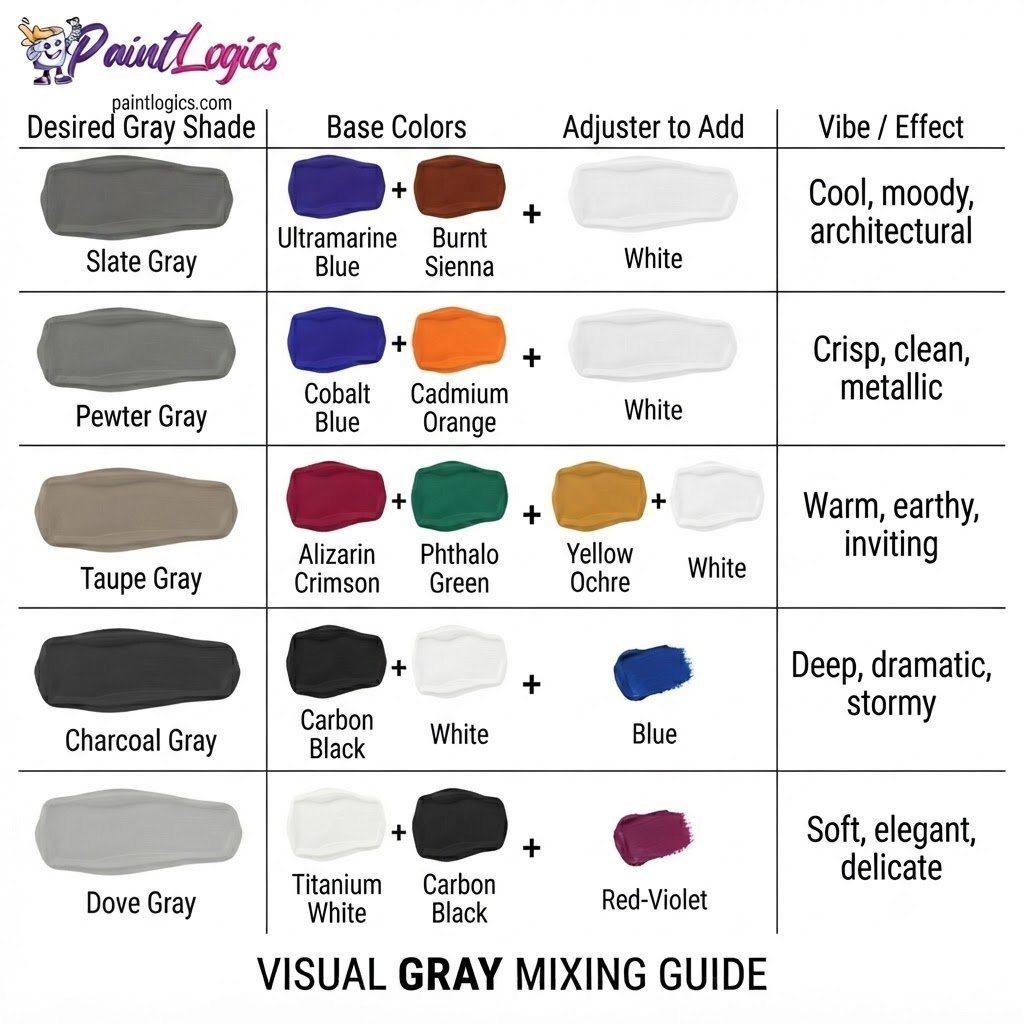
Use this quick-reference chart to build the exact shade of gray your project demands:
| Desired Gray Shade | Base Colors | Adjuster to Add | Vibe / Effect |
| Slate Gray | Ultramarine Blue + Burnt Sienna | White | Cool, moody, architectural |
| Pewter Gray | Cobalt Blue + Cadmium Orange | White | Crisp, clean, metallic |
| Taupe Gray | Alizarin Crimson + Phthalo Green | Yellow Ochre + White | Warm, earthy, inviting |
| Charcoal Gray | Carbon Black + White | Tiny drop of Blue | Deep, dramatic, stormy |
| Dove Gray | Titanium White + Carbon Black | Tiny drop of Red-Violet | Soft, elegant, delicate |
Conclusion – The Art of Creating Grey
To bring it all home, what colors make gray comes down to white and black, complementary color pairs, or a balanced blend of your three primary colors. Because gray is a natural light dampener, mastering its creation gives you the keys to controlling the value, temperature, and mood of your entire project.
The entire secret to mixing a flawless gray lies in starting with your white paint as your main base, introducing your dark colors in tiny, controlled steps, and paying close attention to your pigment undertones. Whether you are painting a misty mountain horizon, choosing a wall color for a home renovation, or designing a clean brand layout, utilizing this quiet neutral family adds instant depth, balance, and modern sophistication to your work.
FAQs
What two colors make grey?
The easiest two colors to mix are simply black and white. However, you can also mix complementary pairs like blue and orange, red and green, or yellow and purple to make a rich gray.
Can I make grey without black?
Yes, absolutely! In fact, many artists prefer to mix gray without black by using complementary color pairs (like blue and orange) or combining all three primary colors. This creates a more vibrant, “chromatic” gray.
Can I make grey without white?
Yes, you can. In transparent mediums like watercolor, you can create a beautiful light gray by diluting a tiny touch of black paint or a neutralized complementary mix with lots of clean water, letting the white paper act as your white light.
Do blue and green make grey?
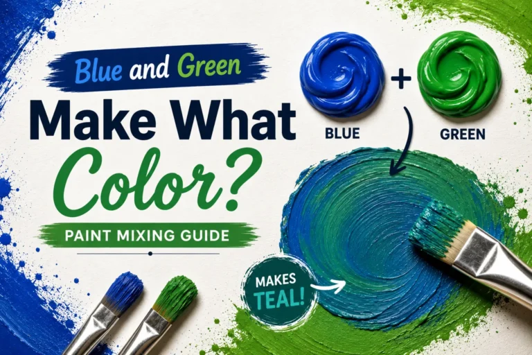
No, blue and green mixed together will make a cool teal, turquoise, or aquamarine. Because they are analogous colors sitting next to each other on the wheel, they cannot neutralize each other to make gray.
Why does my grey look greenish?
This happens because your starting mixture has a slight yellow and blue pigment surplus. To neutralize this green bias, add a tiny pinpoint of red or red-violet (the complement of green) to balance the mix.
How do I make warm vs. cool grey?
To make a warm gray, add a tiny touch of a warm color like yellow, red, or burnt sienna to your mix. To make a cool gray, add a pinpoint of a cool color like blue or green.
What is the RGB code for neutral grey?
A perfectly neutral medium gray is represented in digital design by the RGB code 128, 128, 128 (or the hex code #808080).
How can I make dark charcoal grey paint?
Start with a base of black paint, then fold in small amounts of white until you reach a dark slate value. Add a tiny drop of blue or purple to give the charcoal a rich, sophisticated depth.
Can I mix grey food coloring?
Yes, you can. If you don’t have black food coloring, you can combine equal drops of red, blue, and yellow food coloring into your white icing or batter to create a beautiful, organic gray.