Blue and Black Make What Color? Easy Mixing Guide with Real Examples
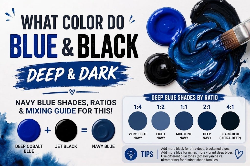
If you’ve ever wondered, “blue and black make what color,” you’re not alone. It’s a question that pops up all the time whether you’re mixing acrylic paints, styling an outfit, or designing a digital graphic.
The direct answer is simple: blue and black make dark blue.
However, the final result isn’t always identical. The exact shade you get depends entirely on the type of blue you start with and the amount of black you introduce. You could end up with a rich navy blue, a dramatic midnight blue, or a muted slate color. Understanding how these two pigments interact will completely change how you use them in your creative projects.
Main Takeaway:
Primary Blue + Black Pigment = Dark Blue (depending on the blue’s undertone and the mixing ratio).
Quick Answer: What Color Do Blue and Black Make?
When you mix blue and black together, you create a deeper tone of the original blue. In the art world, adding black to any color is called creating a “shade.” Because black absorbs light, it reduces the brightness of the blue without changing its actual position on the color wheel.
Why does this matter? If you add a tiny drop of black to a bright cobalt blue, it instantly transforms into a deep navy blue or midnight blue.
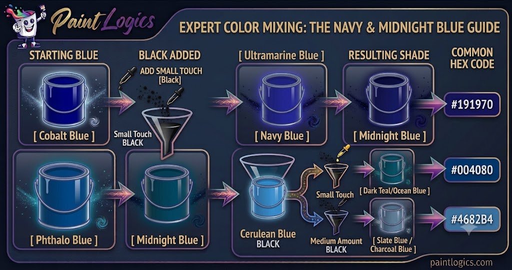
If you keep adding black, the blue will continue to darken until it looks like a blue black mixture that is barely distinguishable from pure black. The transition happens quickly, so a little bit of dark pigment goes a long way. Let’s look at how this breaks down visually:
| Starting Blue | Black Added | Resulting Shade | Common Hex Code |
| Cobalt Blue | Small Touch | Navy Blue | #000080 |
| Ultramarine Blue | Medium Amount | Midnight Blue | #191970 |
| Phthalo Blue | Small Touch | Dark Teal/Ocean Blue | #004080 |
| Cerulean Blue | Medium Amount | Slate Blue / Charcoal Blue | #4682B4 |
Now that you see the quick results, let’s look at why this happens from a scientific standpoint.
The Science Behind Mixing Blue and Black
Color looks different depending on whether you’re holding a paintbrush or staring at a computer screen. This happens because physical mediums and digital screens handle light in opposite ways.
Subtractive Color Mixing (Paint & Pigments)
When working with physical paints, inks, or dyes, you’re using subtractive color mixing. Physical pigments reflect certain wavelengths of light and absorb others. Blue paint looks blue because it reflects blue light into your eyes while absorbing red and yellow wavelengths.
When you introduce black paint, it absorbs almost all visible light. This leaves very little light to reflect back to you, which is why the blue quickly loses its vibrancy and turns into a deep, heavy dark blue.
Additive Color Mixing (Digital / Light)
Digital screens use additive color mixing, where colored lights combine to create shades. On a monitor, your primary colors are Red, Green, and Blue (RGB). Black isn’t a pigment here—it’s simply the complete absence of light.
If you want to make a dark blue on a computer, you don’t actually “add” black light. Instead, you turn down the intensity of the blue light. For example, pure digital blue has an RGB value of (0, 0, 255). To make it a midnight tone, you lower that blue value down to something like (0, 0, 100).
Common Shades Created When Mixing Blue and Black
Varying your proportions or changing your base blue yields distinct, beautiful shades. Here are the most common colors you can create.
1. Navy Blue
Navy blue is a classic, deep dark blue that got its name from the uniforms worn by the British Royal Navy. It’s a highly saturated dark tone that still clearly reads as blue rather than black.
This color happens because a rich, true blue is mixed with just a touch of black. Think of a traditional business suit or a crisp nautical theme.
Quick Tip: If you want a classic navy, use a balanced primary blue like French Ultramarine and add black in tiny, incremental amounts.
2. Charcoal Blue
Charcoal blue is a smoky, muted shade that sits comfortably between dark gray and blue. It doesn’t have the high saturation of navy, making it much softer on the eyes.
This shade occurs when your base blue has a slightly warm or neutral undertone, or when a tiny bit of gray enters the mix. Imagine a stormy sky or a slate rooftop. Interior designers frequently use this shade on accent walls to bring coziness to a living room without overwhelming the space.
3. Midnight Blue
Midnight blue is so dark that it frequently passes for black in low-light environments. It’s a mysterious, elegant shade with a subtle cool undertone.
This happens because the proportion of black to blue is quite high. Artists often use this mix when painting night landscapes or deep ocean waters. It provides more depth and realism than using plain black straight out of a paint tube.
4. Slate Blue
Slate blue leans heavily into the gray spectrum, offering a cool, industrial feel. It’s less intense than navy but deeper than standard sky gray.
This tone comes forward when you mix a lighter blue, like cerulean, with black. The naturally lighter value of the blue prevents the black from turning it entirely dark, resulting in a dusty, stony appearance.
5. Storm Blue
Storm blue mimics the chaotic, deep tones of rough ocean waves under an overcast sky. It has a very faint green or teal undertone hiding beneath the dark surface.
This unique look comes from mixing a green-leaning blue, like Phthalo blue, with black. It’s a highly favored color in modern landscape illustrations because it feels organic and moody.
6. Blackened Indigo
Blackened indigo is a velvety, ultra-dark shade that carries strong hints of deep purple or violet. It feels incredibly rich and luxurious.
This color occurs when you use an indigo or violet-blue base and darken it with black. Fashion designers love this shade for evening wear because it catches the light beautifully, revealing hints of purple as you move.
What Happens When You Mix Blue and Black with Other Colors?
Once you have your blue black mixture, you can introduce a third color to completely shift the mood. This is how professional artists build complex, custom palettes.
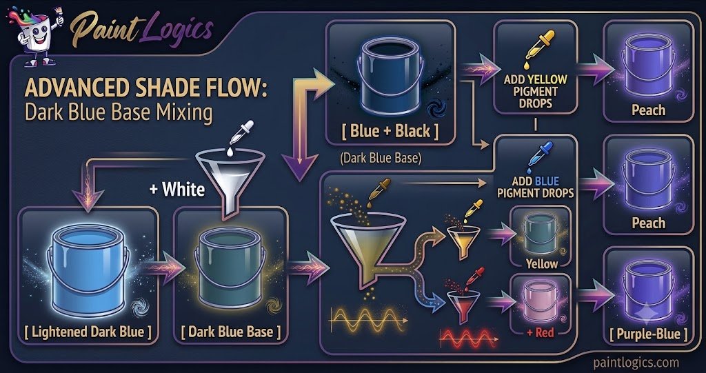
1. Blue + Black + White = Lightened Dark Blue
Adding white to your dark blue mixture softens the color significantly. Instead of making it brighter, white turns the dark shade into a dusty, cool gray-blue tint.
The white cancels out the heavy darkness of the black while preserving the cool tones of the blue. You’ll see this color used heavily in Scandinavian interior design to create calm, airy spaces.
2. Blue + Black + Yellow = Olive Blue
When you toss yellow into a blue and black mix, things get interesting. Yellow and blue naturally make green, but the presence of black keeps that green incredibly dark and earthy.
The result is a complex olive blue or deep army green with a cool edge. Think of moss growing in a dark forest or camouflage gear.
3. Blue + Black + Red = Purple-Blue
Red and blue make purple, so adding red to a dark blue mix creates a deep plum, eggplant, or dark violet shade.
The black ensures the purple stays grounded and sophisticated rather than bright like a grape soda. Costume designers use this combination to create rich, royal garments that look stunning under stage lights.
4. Blue + Black + Green = Teal
Mixing a bit of green into your blue-black base creates a rich, deep teal or dark hunter green.
The green pulls the cool blue toward an organic, oceanic feel, while the black provides excellent coverage and weight. It’s an excellent choice for painting deep foliage or tropical waters at dusk.
5. Blue + Black + Gray = Slate Blue
If your dark blue feels a bit too stark, adding standard gray will tone down the intensity without drastically changing how dark or light the color is.
This creates a highly stable slate blue that works perfectly for background elements in graphic design because it doesn’t distract from text or foreground images.
6. Blue + Black + Brown = Deep Brownish Blue
Adding brown to your mix creates an incredibly rich, near-black tone with immense warmth.
That’s where many beginners get confused. They assume brown and blue will make mud. Instead, the brown cuts the coldness of the blue, creating a highly natural shadow color that looks much more realistic than pure black paint.
Using Blue and Black in Design
Blue and black aren’t just for mixing on a palette. They also form a classic, sophisticated color combination used across multiple industries.
Fashion
For a long time, an old style rule said you should never wear blue and black together. Thankfully, that rule is completely dead.
Today, pairing a sharp black blazer with dark navy trousers is considered the height of modern elegance. The key to making this work is contrast. If the blue is too close to black, it looks like an accident. Using a distinct navy or midnight blue ensures the outfit looks intentional and deliberate.
Interior Design
Interior designers use blue and black to establish mood and luxury. A deep navy wall paired with matte black light fixtures and hardware creates a stunning, high-contrast look. This combination feels incredibly grounded and calm, making it a popular choice for bedrooms, home libraries, and cozy home offices.
Branding & Packaging
Look around and you’ll see this combination everywhere in corporate tech and luxury packaging. Blue represents trust, stability, and reliability, while black signals authority, luxury, and power. Together, they tell consumers that a brand is both highly professional and premium.
Tips for Mixing Blue and Black in Paint or Digital Art
If you’re ready to start mixing your own colors, keep these practical tips in mind to get the best results.
- Start Small: Always add black to your blue, never the other way around. Black is an incredibly dominant pigment. A tiny drop can overpower a large puddle of blue paint instantly.
- Adjust with White or Black: If your mix gets too dark, don’t try to save it by dumping in cups of blue paint. Instead, use a tiny speck of white to pull the color back into view.
- Test Under Different Lighting Conditions: A dark blue paint might look completely blue under bright studio lights, but it could look pitch black in a dimly lit hallway. Always check your dried sample where it will live.
- Use High-Quality Materials: Cheap paints often contain filler pigments that turn muddy when mixed. High-quality paints with single-pigment listings give you much crisper, cleaner shades.
Real-Life Examples of Blue and Black in Design, Art & Fashion
Seeing how this pair functions in the wild can give you instant inspiration for your next project.
Fashion
Think of premium dark-wash denim paired with a classic black leather jacket. The slight texture of the blue denim contrasts beautifully against the smooth black leather, creating an effortless, stylish everyday look.
Interior Design
Imagine a modern kitchen featuring deep navy blue cabinets, white quartz countertops, and matte black handles and faucets. The black hardware ties the room together, making the navy cabinets feel sophisticated rather than overly colorful.
Art & Illustration
Consider classic paintings of night scenes, like Vincent van Gogh’s Starry Night. He rarely used straight black for the night sky. Instead, he layered deep blues, indigos, and black tones together to give the cosmos a sense of endless depth and motion.
Common Mistakes to Avoid When Mixing Blue and Black
Mixing these two colors seems simple, but it’s incredibly easy to make a mess of your palette if you aren’t careful.
1. Using Too Much Black
This is the most frequent blunder. Because black is so strong, squeezing equal parts blue and black onto a palette will leave you with a color that just looks like dirty black.
How to avoid it: Treat black like a powerful spice. Add it with the very tip of your brush or palette knife until you reach your desired depth.
2. Not Testing the Mix
Acrylic and oil paints often look slightly different when they dry compared to when they’re wet. Acrylics, in particular, tend to dry darker.
How to avoid it: Paint a small swatch on a scrap piece of paper and let it dry completely before painting your main project.
3. Forgetting Undertones
Not all blue paints are created equal. Phthalo blue has a green undertone, while Ultramarine blue has a red undertone. If you ignore these biases, your final dark blue might look greener or purpler than you intended.
How to avoid it: Check your paint tube labels or look at the color in a thin smear against white paper to see its true undertone before mixing.
4. Ignoring Proportions
If you don’t keep track of how much paint you’re mixing, you’ll never be able to recreate that perfect shade of navy if you run out halfway through your painting.
How to avoid it: Use parts or ratios to measure your paint drops, especially if you’re working on a large canvas or a home accent wall.
Conclusion
To wrap things up, blue and black make dark blue. Depending on your choices, that dark blue can manifest as an elegant navy, a mysterious midnight blue, or a soft charcoal blue.
The secret to mastering this color match lies entirely in your ratios. Treat black as a dominant force, add it slowly, and pay close attention to the natural undertones of your base blue. Whether you are redecorating a room, putting together an outfit, or blending paints on a canvas, utilizing this moody pair adds instant sophistication and depth to your work.
Read More Guide’s
#1 What Color Does Red and White Make When Mixed? Complete Guide
#2 Red and Blue Make What Color? The Ultimate Color Mixing Guide
FAQs
What color do blue and black make when mixed?
They make a deep dark blue. The exact shade varies based on your mixing proportions, turning into hues like navy blue, midnight blue, or slate blue.
Can blue and black make other colors?
On their own, they will only produce dark variations of blue. However, if you introduce a third color like yellow, red, or white, you can create entirely new hues like olive green, deep purple, or smoky gray-blue.
How do I make blue and black mix more vibrant?
Black naturally tones down vibrancy. To keep the mix as lively as possible, use a highly saturated, pure blue pigment like Cobalt or Phthalo blue, and use the smallest amount of black possible.
Does blue and black result in a dark color?
Yes. Black absorbs light, meaning any color mixed with it will immediately drop in value and become significantly darker.
Can I lighten the blue and black mix?
Absolutely. You can add a small touch of white paint to turn the dark mixture into a muted, sophisticated gray-blue tone.
What happens when I mix blue, black, and white?
You create a cool, toned-down shade often referred to as slate blue or steel blue. The white breaks up the heavy darkness while keeping the cool blue tones intact.
Can I create a more vibrant blue with blue and black?
No. Adding black will always decrease the brightness and vibrancy of blue. If you want a brighter blue, you should add a lighter blue or a touch of pure white instead.
Is midnight blue the same as navy?
Not quite. Navy blue is a rich dark blue that clearly shows its blue characteristics. Midnight blue is significantly darker, often looking almost black under low light.
Is blue and black used in interior design?
Yes, it’s a very popular modern combination. Using navy blue walls with black fixtures creates a cozy, upscale look that works wonderfully in bedrooms and home offices.
What is the difference between navy and charcoal blue?
Navy blue is highly saturated and retains a strong blue appearance. Charcoal blue is heavily muted with gray undertones, making it softer and closer to a dark storm cloud.
How do I create teal with blue and black?
Start with a blue paint that already has a green undertone, such as Phthalo Blue. When you add a tiny touch of black, it darkens into a beautiful, deep ocean teal.
Can I use blue and black for casual wear?
Yes, you can. A classic example is a clean black t-shirt paired with dark-wash blue jeans. It’s a simple, timeless look that works perfectly for everyday casual outings.