Black and Yellow Make What Color? Easy Color Mixing Guide
If you’ve ever wondered “black and yellow make what color,” you’re not alone. It’s one of those classic art-room mysteries that feels completely counterintuitive the first time you squeeze the tubes onto your palette. Most people assume that adding black to a color simply darkens it, meaning yellow should turn into a deep golden tan or a dark, moody brown.
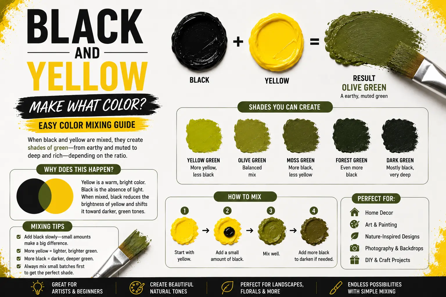
The direct answer is simple: when mixed in physical paint, black and yellow combine to make olive green or a dark, earthy greenish yellow.
However, the final result isn’t always identical across different creative workspaces. The exact shade you get depends on the quality of your pigments, the specific undertones of your yellow, and whether you are working with physical liquids or digital computer pixels. Understanding why this happens—and how to control it—will completely change how you approach color theory in your projects. In this comprehensive guide, you’ll learn the hidden science behind this mix, how to adjust your ratios for the perfect tone, and how to avoid the muddy pitfalls that ruin many color palettes.
Main Takeaway:
Primary Yellow + Pure Black = Olive Green / Muted Greenish Yellow (depending on the mixing ratio and the underlying undertone of the black pigment).
Quick Answer: What Color Does Black and Yellow Make?
When you blend black and yellow together in a physical medium like acrylic or oil paint, you create an unmistakable olive green or a deep, desaturated greenish yellow. Instead of scaling downward into a pure shadow version of yellow, the color introduces a completely new hue identity.
Why does this happen? The reason is simple: yellow is the lightest and most sensitive color on the spectrum, meaning even a microscopic trace of dark pigment will alter its wavelength reflection. Because most commercial black paints carry cool, blue-biased raw materials, adding black to yellow is structurally very similar to adding a touch of dark blue to yellow.
Imagine you’re mixing a batch of mustard-toned paint for a vintage-style illustration. If you drop a large puddle of carbon black directly into a bright lemon yellow, the color shifts instantly, skipping past gold and landing directly into a swampy, industrial green. The transition is highly visible, making it an incredibly useful shortcut for artists who want to create natural foliar tones without buying extra tubes of green.
Why Do Black and Yellow Make Olive Green?
The shift toward green catches many beginners off guard because we are taught that black is a neutral color that only alters value, not hue. However, in the practical world of pigments, pure, completely neutral black is incredibly rare.
Subtractive Mixing in Paint
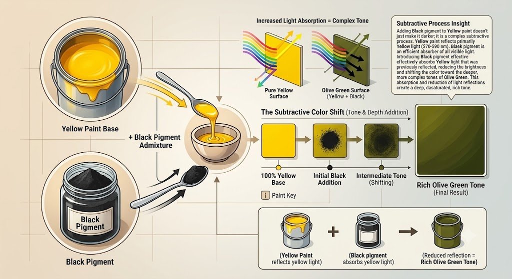
When you look at a tube of physical paint, you are dealing with subtractive mixing. This means the chemicals inside the paint soak up specific light waves and reflect the remaining colors back to your eyes. Yellow paint looks yellow because it reflects high-energy red and green light waves while swallowing up blue light waves completely.
When you introduce black paint, you aren’t just lowering the light value. Most manufactured black paints, such as Ivory Black or Carbon Black, naturally contain subtle blue or cool charcoal undertones. When these cool, blue-leaning black particles mix with the green wavelengths that yellow paint naturally reflects, the red wavelengths get choked out, leaving a dominant, muted olive tone behind.
Understanding Yellow and Black Individually
To truly understand how this mixture behaves, it helps to isolate the two characters involved in the process. Each pigment carries unique physical properties that dictate how they fight for dominance on the palette.
Yellow is the ultimate high-luminosity primary color. Because its value sits so close to pure white light, it possesses very little tinting strength, which means it is easily overwhelmed by any color darker than itself. Think of a bright sunflower or a neon highlighter; its high energy makes it incredibly transparent and delicate when mixed.
Black, on the other hand, is the ultimate light-absorber. Pigments like Lamp Black or Mars Black are incredibly dense, opaque, and heavy. They carry immense tinting strength, meaning a single droplet can instantly colonize a massive pool of lighter paint. When these two polar opposites meet, the heavy black easily crushes the yellow’s brightness, pulling its high-energy reflection down into a quiet, shadow-like state.
Common Shades Created When Mixing Black and Yellow
Varying your proportions or changing the type of yellow you use yields distinct, beautiful results that fit different design aesthetics. Here are the most common colors you can create with this mixture.
Mustard
Mustard is a warm, rich, slightly dirty yellow that carries a distinctly vintage, mid-century vibe. It looks comforting, deep, and heavily grounded.
This color happens because you use a warm, red-leaning yellow like Cadmium Yellow Deep and mix it with a highly microscopic dot of black paint. Think of traditional ballpark mustard or retro velvet armchairs from the 1970s.
Greenish Yellow
Greenish yellow is an intense, acid-toned shade that looks energetic, sharp, and highly industrial. It sits right on the knife-edge between a clean citrus and a dark moss.
This shade occurs when you take a cold, blue-leaning yellow, like Lemon Yellow or Zinc Yellow, and stir in a tiny sliver of black. Imagine the color of unripened fruit skins or high-visibility safety clothing.
Olive Green
Olive green is a classic, dark, organic shade that feels deeply connected to nature, military aesthetics, and quiet interior spaces. It looks completely desaturated and mature.
This tone comes forward when you mix equal or near-equal amounts of a standard primary yellow with a cool, charcoal-leaning black. Think of Mediterranean olives, military utility jackets, or deep forest shadows.
How Ratios Affect the Result
Because black paint holds a massive advantage in tinting strength, the exact ratio you use will alter your final color dramatically. Keeping track of your portions is the only way to replicate your favorite shades.
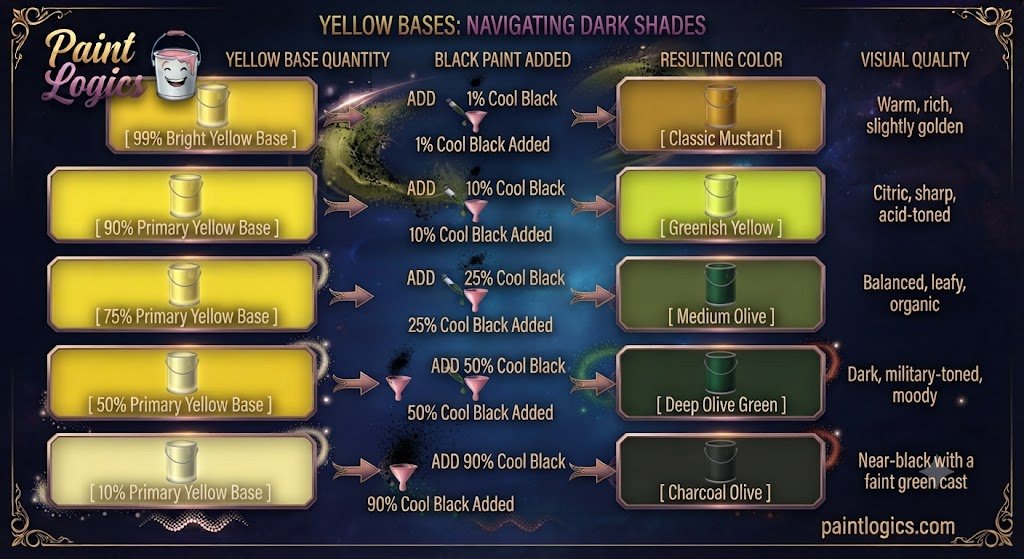
The reason is simple. A tiny shift in the amount of black pigment will rapidly swallow the yellow’s reflectivity. To visualize how this transition scales across different mixing combinations, look at this pigment breakdown table:
| Yellow Base Quantity | Black Paint Added | Resulting Color | Visual Quality |
| 99% Bright Yellow | 1% Cool Black | Classic Mustard | Warm, rich, slightly golden |
| 90% Primary Yellow | 10% Cool Black | Greenish Yellow | Citric, sharp, acid-toned |
| 75% Primary Yellow | 25% Cool Black | Medium Olive | Balanced, leafy, organic |
| 50% Primary Yellow | 50% Cool Black | Deep Olive Green | Dark, military-toned, moody |
| 10% Primary Yellow | 90% Cool Black | Charcoal Olive | Near-black with a faint green cast |
The Science Behind the Unexpected Result
The secret behind why yellow shifts into green rather than brown lies within the structure of the traditional color wheel. When you look at the spectrum, green sits directly between yellow and blue.
This happens because when you lower the light reflection of yellow using a cool modifier, you are effectively shifting its position on the wheel toward its nearest cool neighbor. Because black paint absorbs the red wavelengths faster than it absorbs the green ones, the remaining light that manages to bounce off the canvas is heavily skewed toward a cool, low-intensity green frequency. That is why your eyes read the mixture as a natural olive rather than a warm, chocolate brown.
What Happens in Digital vs. Physical Mediums?
This is where many graphic designers and traditional painters get completely confused. Colors behave completely differently depending on whether you are working with wet fluids or light emissions.
Physical Paint (Subtractive)
As we explored above, physical paint relies on subtractive color mixing. Every pigment you add absorbs more light, bringing the mix closer to darkness. When you blend yellow and black paint on a real wooden palette, you are physically blocking wavelengths, forcing the remaining light to reflect as a beautiful, rich olive green.
Digital (Additive / RGB)
Digital displays rely on additive color mixing, where red, green, and blue (RGB) light channels build colors out of darkness. On a screen, pure black isn’t a pigment particle—it is simply the total absence of light emission.
So what’s the difference? If you are working in a digital painting app and try to mix “black light” into yellow light, you are simply turning down the power grid of your pixels. For example, if pure yellow is RGB (255, 255, 0), cutting its power down equally results in RGB (128, 128, 0). On a screen, this looks like a dark, muddy gold or bronze, completely missing the distinct “greenish” undertone you get with real acrylic paint.
Black and Yellow in Paint: How Different Color Models Explain the Mix
Different creative fields use distinct color frameworks to organize and explain how these two colors interact. Here is how the three main systems interpret the blend.
RYB Color Model (Paint – Subtractive Mixing)
The traditional Red-Yellow-Blue model is the foundation for fine art painters. In this model, black is treated as a shade-generator. Fine artists use this system to build organic shadow tones for landscapes, recognizing that mixing black into a warm yellow field is the fastest way to paint realistic, shaded foliage without making the greenery look artificial or flat.
CMYK Color Model (Printing – Subtractive Mixing)
The Cyan-Magenta-Yellow-Key (Black) system governs commercial printing presses and desktop inkjets. When a printer wants to generate a deep olive tone on paper, it doesn’t actually mix black and yellow ink together in a cup. Instead, it layers tiny, microscopic dots of Yellow ink alongside Key (black) and Cyan (blue) ink dots, allowing the human eye to blend the colors subtractively from a distance.
RGB Color Model (Digital – Additive Mixing)
The Red-Green-Blue model runs the digital world of phones, monitors, and television screens. In this light-based framework, white is the presence of all light, and black is the complete shutoff of energy. To display a color that mimics physical olive green on a website, a programmer must manually boost the green light channel slightly ahead of the red channel to trick your eye into seeing that signature greenish shift.
What Happens When You Mix Black + Yellow with Other Colors
Once you have established your baseline black and yellow mix, dropping in a third color component can alter the temperature and mood instantly.
Now let’s look at this multi-color mixing matrix:
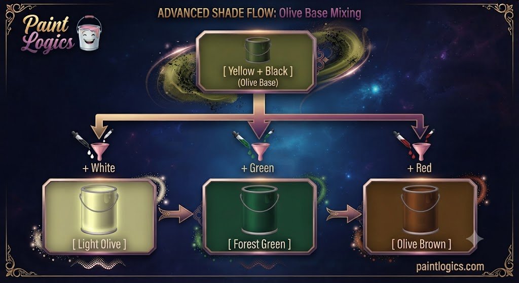
Black + Yellow + White → Light Olive / Pale Green
Introducing white paint to your olive base instantly lifts the value, transforming the heavy, swampy tone into a soft, sophisticated light olive or chalky sage green.
This happens because the highly reflective white particles dilute the dominance of the black pigment without destroying the green hue. Think of sage leaves or antique French country cabinetry.
Black + Yellow + Green → Forest or Deep Olive Green
Dropping an explicit green pigment into your active black and yellow mix pushes the color away from a yellow-dominant olive and firmly into a deep forest green.
The extra green emphasizes the cool side of the mix, while the black keeps the color from looking cartoonish or overly bright. Artists frequently use this combination to paint pine trees under a dark, stormy sky.
Black + Yellow + Brown → Earthy Olive Brown
Tossing a warm brown, like Burnt Sienna, into your mixture anchors the color into a complex, rustic earthy olive brown.
The brown introduces red components that actively fight against the blue undertones of the black, creating a highly natural neutral. Imagine the color of mossy tree bark or weathered leather work boots.
Black + Yellow + Blue → Deep Muted Green
If you add a splash of pure blue to your black and yellow palette, you will rapidly accelerate the green shift, dropping the mix into a heavy, dark muted green.
The blue reinforces the hidden undertones of the black paint, causing the yellow to surrender its color identity completely. This is an excellent choice for painting deep ocean water or midnight shadows.
Black + Yellow + Red → Olive Brown / Muted Yellow‑Orange
Introducing red into the mix acts as a warm counter-weight, shifting your olive base into a rich olive brown or muted yellow-orange.
The red cancels out the cool, green-leaning frequencies of the black, turning the mix toward an autumnal palette. Think of dried oak leaves, roasted coffee beans, or terracotta clay pots drying in the sun.
Tips for Mixing Black and Yellow Successfully
To avoid ruining your paint supplies and ensure your mixtures remain clean and intentional, follow these practical workflow tips:
1. Start with Small Amounts of Black
This is the single most important rule for any artist handling bright colors. Black paint is an absolute bully on the palette, and its massive tinting strength will instantly swallow up a lighter color.
Always establish your yellow paint as your main base pile first, then pull a microscopic sliver of black paint over using a palette knife. Blend it in slowly, bit by bit, until you watch the color gently ease into your target green.
2. Use High‑Quality Pigments for Predictable Results
Cheap student-grade paints are packed with chalky chemical fillers and blended multi-pigment blacks that quickly turn muddy when mixed.
Investing in professional-grade paint ensures that your black is crafted from clean, single-source carbon or iron oxides. This purity guarantees that when it mixes with yellow, you get a clean, luminous greenish yellow rather than a flat, dead gray.
3. Lighten with White for Softer Shades
If your olive mix looks too dark or intense, do not try to fix it by dumping cups of yellow paint back into the pile.
Instead, introduce a tiny dot of titanium white. The white will act as a lifting agent, spreading the pigments apart and revealing the hidden pale green undertones that are locked inside the dark mixture.
4. Test Small Swatches First
Acrylic and oil paints shift their character dramatically as they cure on a surface. Acrylic paint, in particular, always dries a full shade darker than it looks when it is wet and glistening on your palette.
Paint a quick, postage-stamp-sized test swatch on a piece of scrap cardboard or paper. Let it dry completely under your room’s actual light source before applying the mix to your main project canvas.
5. Consider Lighting Conditions
Yellow-based mixtures are incredibly sensitive to metamerism, which means they completely change their appearance depending on the ambient light bulbs in your room.
An olive green swatch that looks beautifully earthy under warm indoor lamps can look like a cold, industrial slate gray when taken out into harsh, blue-tinted daylight. Always evaluate your dried color blends in the exact environment where the final piece will be displayed.
Understanding Why the Hue Shifts Toward Green
Many color theorists point to this specific mixture to explain why human vision is so unique. Our eyes are biologically tuned to be incredibly sensitive to the green portion of the light spectrum.
This happens because our evolutionary ancestors relied on detecting subtle changes in foliage to find food and spot hidden predators. When you add a cool black pigment to a bright yellow base, you are lowering its light reflection right into the exact zone where our eyes are most sensitive to shifting wave variations. Your brain instantly latches onto those cool undertones, causing you to register a distinct green hue long before you notice the darkening effect of the black pigment.
Real‑World Examples of Black + Yellow Color Mixes
You can find this classic color combination hidden across nature, historical art collections, and modern manufacturing design layouts.
Painting Landscapes & Nature Scenes
Landscape painters almost never use pure green paint straight out of a factory tube to paint fields or forests because it looks too artificial and bright. Instead, they constantly mix black and yellow together to generate their shadow tones. This mixture perfectly mimics the way real sunlight filters through a canopy of green leaves, creating deep, believable shadows that give a landscape three-dimensional depth.
Camouflage & Military Tones
The global defense industry relies heavily on the specific olive tones generated by mixing black and yellow earth pigments. Because these shades absorb light efficiently and mirror the natural degradation of dead organic matter, they are incredibly effective at breaking up human outlines in desert, forest, and jungle terrains.
Home Décor & Interior Paint
Interior designers treat olive green and darkened mustard as spectacular “neutral-adjacent” colors for modern living spaces. Painting a kitchen accent wall in a rich olive shade provides a grounding, organic energy that pairs beautifully with natural oak woodwork, matte black hardware, and crisp white stone countertops.
Fashion & Textile Design
In the fashion world, autumn clothing lines rely heavily on these muted mixes. Think of a cozy olive green utility jacket or a heavy mustard-colored knit scarf. These tones are universally loved in textile design because they feel sophisticated, resist showing dirt, and harmonize beautifully with standard blue denim and brown leather boots.
Common Mistakes When Mixing Black and Yellow
Even experienced designers can run into trouble when blending these two highly contrasting color families. Here is what to watch out for:
1. Using Different Shades of Black or Yellow
Not all black and yellow paints are identical. If you swap out a warm, orange-leaning yellow for a cool, green-leaning yellow mid-way through a project, your color consistency will completely shatter.
How to avoid it: Always check the explicit pigment code index printed on the back of your paint tubes (such as PY3 for Lemon Yellow or PBk7 for Carbon Black) to ensure you are using matching raw materials across your entire canvas.
2. Adding Too Much Black Too Fast
Dumping a large amount of black paint directly into a yellow base is the fastest way to turn your entire batch of paint into a useless, dark gray soup.
How to avoid it: Treat black paint like a highly concentrated spice when cooking. Add it using the tip of a toothpick or a tiny brush corner, working it into the yellow in slow, controlled increments.
3. Ignoring Lighting Conditions
Mixing your paint colors under a cheap, warm yellow desk lamp will mask the green shift completely, causing you to add far too much black pigment.
How to avoid it: Always paint near a natural window or install a color-corrected, neutral daylight bulb (around 5000K) over your mixing desk to see the true hue shifts as they happen.
4. Skipping Test Swatches
Applying a freshly mixed wet color directly to your final canvas without testing it is an enormous gamble that frequently leads to messy, mismatched patches.
How to avoid it: Keep a dedicated piece of scrap paper right next to your mixing board solely for drying and checking your color values before making your final brush strokes.
Tips for Mixing Black and Yellow Successfully (Alternative Strategies)
If you want to branch out and create even more variations of this iconic color space, try altering your structural blending sequence:
1. Start With Yellow as the Base
Always remember that it takes a massive amount of light paint to fix a dark mistake, but it only takes a tiny speck of dark paint to alter a light base. By always anchoring your workspace with yellow first, you protect your color control and save a tremendous amount of paint from being wasted.
2. Adjust With White for Lighter Greens
If your goal is to paint a soft, misty morning field, don’t try to build that color by mixing yellow and black alone. Build your dark olive base first, then steadily introduce small pools of pure white paint to pull the color into a beautiful, pastel-toned sage or light khaki green.
3. Add Other Colors for Variation
Do not view your black and yellow mix as a dead end. Treat your resulting olive tone as a rich foundation. If it looks too cold, drop in a speck of red; if it looks too flat, stir in a touch of raw ultramarine blue to unlock a brilliant world of organic color depth.
Conclusion
To wrap things up, black and yellow make olive green or a deep, desaturated greenish yellow. While your intuition might tell you that adding black should simply darken a color, the unique light-absorbing qualities of physical pigments pull yellow straight across the color wheel into a quiet, organic green family.
The entire secret to mastering this color pairing lies in starting with your bright yellow base, adding your dark black pigment in microscopic increments, and respecting the hidden cool undertones of your materials. Whether you are illustrating a natural forest scene, designing a modern website layout, or choosing a bold new paint color for your home interior, utilizing this unexpected mixture adds instant depth, sophistication, and a beautiful natural touch to your creative work.
Read More Guide’s
#1 What Color Do Blue and Gray Make? Complete Mixing Chart & Shades
#2 What Color Does Yellow and Gray Make When Mixed? Complete Guide
FAQs
What color do black and yellow make when mixed?
In physical paint, they combine to make an olive green or a dark mustard tone. The exact shade is dictated entirely by your mixing proportions and pigment types.
Why does black and yellow make green?
Most commercial black paints carry subtle blue or cool charcoal undertones. When mixed with yellow, those hidden blue frequencies react with the yellow light waves to generate a green hue.
Can you mix black and yellow digitally?
Digitally, you will get a dark gold or olive-bronze color instead of a true greenish paint-style olive. This happens because digital screens use additive light mixing rather than physical light-absorbing pigments.
Does paint brand affect the outcome?
Yes, immensely. Cheap student-grade paints contain cheap chemical fillers that turn gray and muddy, whereas high-end artist brands use pure pigments that yield a highly vibrant, crisp olive green.
Why isn’t the result a brown?
To make brown, a color mixture requires a strong red component. Unless you are using a warm, orange-leaning yellow, the cool undertones of black paint will always pull the yellow toward the green side of the spectrum.
What color does black + yellow + white make?
This trio combines to make a soft sage green or a beautiful light olive gray. The white paint lifts the darkness, bringing out the delicate green undertones.
Can black and yellow make any other colors?
By tweaking your ratios and adding minor warmth, you can slide across a spectrum that includes bright mustard, vibrant chartreuse-olive, deep military khaki, and dark charcoal green.
Is olive green considered a tertiary color?
Yes, in traditional art design, olive is typically categorized as a tertiary color because it is built by blending a primary color (yellow) with a desaturated secondary color framework.
How do lighting conditions affect the result?
Yellow-based tones are highly reactive to light. Under warm indoor light bulbs, your mix will appear more like a warm mustard, while cool, natural daylight will emphasize the crisp green tones.
Can adding more yellow make the olive greener?
Adding more yellow will brighten the mix and shift it toward a vibrant greenish yellow or chartreuse. If you want it to look like a deeper grass green, you should introduce an explicit drop of pure blue paint.
Is olive green good for interior design?
It is an exceptional choice. Olive acts as a grounding, nature-inspired neutral that brings a soothing, organic energy to bedrooms, kitchens, and modern living spaces.
Does black always darken colors?
While black always lowers a color’s light value (making it darker), it also alters the hue of sensitive colors like yellow, shifting their position across the color spectrum.