Colors That Start With P: 27 Names, Hex Codes & RGB Values
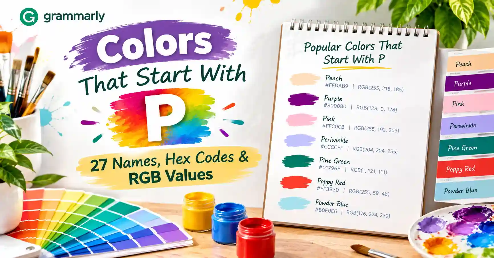
If you’ve ever described a color as “peach,” “plum,” or “periwinkle,” you’ve already used some of the best-known colors that start with P. This guide lists 27 real names, and every one has a code you can trust. Each entry includes the name, Hex, RGB, and CMYK values.
Eleven of these names come from the official web color standard. The rest come from fruit, gemstones, metals, and old pigments. Together they cover soft pastels, vivid brights, and deep, dark blues.
The CMYK numbers are approximate screen-to-print conversions. Use them as a starting point, then check a printed proof.
Quick Jump Guide
These color names that start with P fall into seven families: yellows and creams, oranges and peaches, pinks and reds, purples, blues and teals, greens, and neutrals. Blues and teals lead the list with eight entries. Many names start with “Pale,” which signals a light, soft version of a base color.
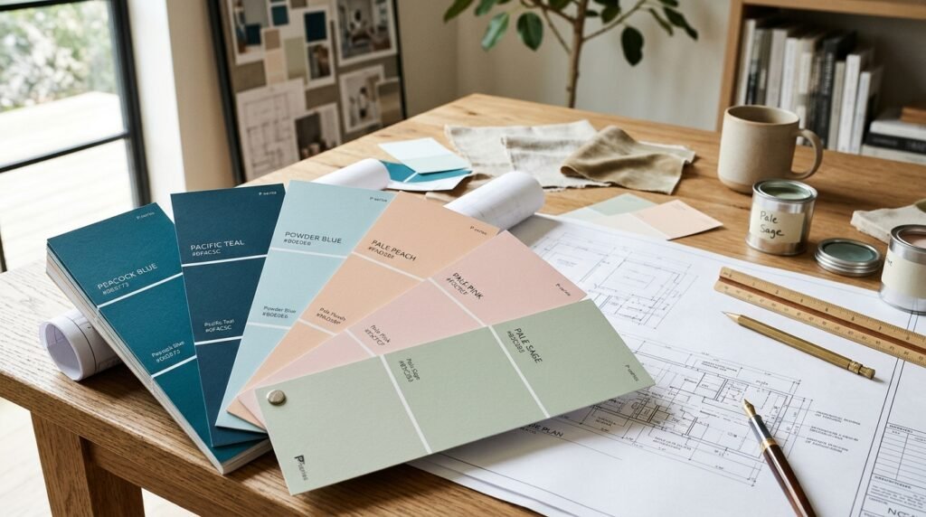
Quick Tip: Purple has two versions. The CSS keyword purple is #800080, a deep, muted shade. The older X11 purple is #A020F0, which is much brighter. Check which one your tool uses before you copy the code.
The Full List of Colors That Start With P
Pale Goldenrod
Soft and creamy, this pale yellow has a faint khaki tint. It looks calmer and more muted than a true yellow.
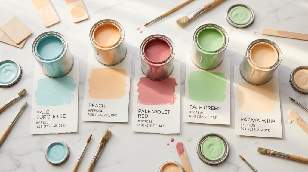
Hex: #EEE8AA | RGB: 238, 232, 170 | CMYK: 0, 3, 29, 7
Pale Green
Light and fresh, this pastel green leans toward mint. It looks softer than Pistachio and far lighter than Pear.
Hex: #98FB98 | RGB: 152, 251, 152 | CMYK: 39, 0, 39, 2
Pale Turquoise
Icy and cool, this very light aqua feels clean and airy. It’s a touch greener than Powder Blue.
Hex: #AFEEEE | RGB: 175, 238, 238 | CMYK: 26, 0, 0, 7
Pale Violet Red
Dusty and warm, this is a medium pink-rose with a soft mauve lean. It feels deeper than Pink but gentler than Puce.
Hex: #DB7093 | RGB: 219, 112, 147 | CMYK: 0, 49, 33, 14
Papaya Whip
Creamy and light, this near-white peach has a soft, buttery glow. It’s paler and creamier than Peach Puff.
Hex: #FFEFD5 | RGB: 255, 239, 213 | CMYK: 0, 6, 16, 0
Peach
Pale and sunny, this soft yellow-peach is named after the fruit’s flesh. It looks lighter and more yellow than Peach (Crayola).
Hex: #FFE5B4 | RGB: 255, 229, 180 | CMYK: 0, 10, 29, 0
Peach (Crayola)
Warm and rosy, this peach leans toward orange-pink. It reads richer and more cheerful than the plain Peach above.
Hex: #FFCBA4 | RGB: 255, 203, 164 | CMYK: 0, 20, 36, 0
Peach Puff
Soft and pinkish, this pale peach sits between Papaya Whip and Peach (Crayola). It feels gentle and slightly blushed.
Hex: #FFDAB9 | RGB: 255, 218, 185 | CMYK: 0, 15, 27, 0
Pear
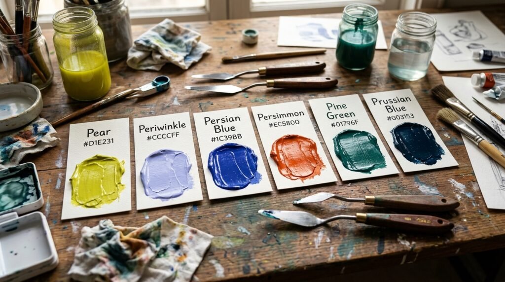
Zesty and bright, this yellow-green looks like a ripe pear’s skin. It’s sharper and more yellow than Pistachio.
Hex: #D1E231 | RGB: 209, 226, 49 | CMYK: 8, 0, 78, 11
Periwinkle
Light and dreamy, this lavender-blue is named after the small flower. It looks cooler and bluer than Plum.
Hex: #CCCCFF | RGB: 204, 204, 255 | CMYK: 20, 20, 0, 0
Periwinkle (Crayola)
Dusty and calm, this gray–blue is much quieter than the standard Periwinkle. It leans closer to Pewter Blue.
Hex: #C3CDE6 | RGB: 195, 205, 230 | CMYK: 15, 11, 0, 10
Persian Blue
Deep and bold, this rich blue carries a faint violet tint. It looks more vivid than Prussian Blue and far darker than Periwinkle.
Hex: #1C39BB | RGB: 28, 57, 187 | CMYK: 85, 70, 0, 27
Persian Green
Rich and cool, this deep teal-green feels lush and jewel-like. It’s brighter and more saturated than Pine Green.
Hex: #00A693 | RGB: 0, 166, 147 | CMYK: 100, 0, 11, 35
Persimmon
Vivid and fiery, this burnt orange has a red edge. It takes its name from the fruit, and it’s deeper than Pumpkin.
Hex: #EC5800 | RGB: 236, 88, 0 | CMYK: 0, 63, 100, 7
Peru
Warm and earthy, this golden tan-brown leans toward orange. It looks sandier and lighter than Persimmon.
Hex: #CD853F | RGB: 205, 133, 63 | CMYK: 0, 35, 69, 20
Pewter Blue
Muted and cool, this gray-blue looks like polished metal. It’s named after the alloy pewter, and it’s greener than Periwinkle (Crayola).
Hex: #8BA8B7 | RGB: 139, 168, 183 | CMYK: 24, 8, 0, 28
Pine Green
Deep and shadowy, this dark teal looks like a forest at dusk. It’s named after pine trees, and it runs bluer than a typical forest green.
Hex: #01796F | RGB: 1, 121, 111 | CMYK: 99, 0, 8, 53
Pink
Soft and warm, this light pink has a gentle rosy glow. It’s paler and sweeter than Pale Violet Red.
Hex: #FFC0CB | RGB: 255, 192, 203 | CMYK: 0, 25, 20, 0
Pistachio
Fresh and mild, this yellow-green is named after the nut’s kernel. It looks softer and calmer than Pear.
Hex: #93C572 | RGB: 147, 197, 114 | CMYK: 25, 0, 42, 23
Platinum
Pale and cool, this silvery gray feels clean and refined. It’s named after the precious metal, and it’s the only true neutral in the list.
Hex: #E5E4E2 | RGB: 229, 228, 226 | CMYK: 0, 0, 1, 10
Plum
Soft and orchid-like, this light purple has a pink lean. It’s named after the fruit, though it looks much lighter than a ripe plum.
Hex: #DDA0DD | RGB: 221, 160, 221 | CMYK: 0, 28, 0, 13
Powder Blue
Gentle and airy, this pale blue has a slight gray softness. It looks calmer than Pale Turquoise.
Hex: #B0E0E6 | RGB: 176, 224, 230 | CMYK: 23, 3, 0, 10
Prussian Blue
Very deep and inky, this dark blue-teal sits close to black. It’s named after the first modern synthetic pigment, and it’s the darkest color in the list.
Hex: #003153 | RGB: 0, 49, 83 | CMYK: 100, 41, 0, 67
Psychedelic Purple
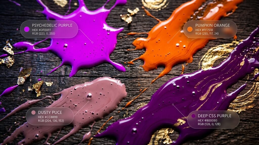
Electric and intense, this magenta-violet practically glows on screen. It matches the code of Phlox, and it looks far louder than Purple.
Hex: #DF00FF | RGB: 223, 0, 255 | CMYK: 13, 100, 0, 0
Puce
Dusty and muted, this pink-brown has a mauve undertone. The name comes from the French word for flea, and it feels softer than Pale Violet Red.
Hex: #CC8899 | RGB: 204, 136, 153 | CMYK: 0, 33, 25, 20
Pumpkin
Bold and warm, this bright orange is named after the autumn squash. It looks sunnier than Persimmon and much stronger than Peach.
Hex: #FF7518 | RGB: 255, 117, 24 | CMYK: 0, 54, 91, 0
Purple
Deep and balanced, this is the CSS purple, a dark violet with a slight magenta lean. It’s calmer and more muted than Psychedelic Purple.
Hex: #800080 | RGB: 128, 0, 128 | CMYK: 0, 100, 0, 50
Colors That Start With P, Grouped by Family
This table sorts every entry into seven broad families. Use it when you know the mood you want but not the exact name yet.

| Family | Colors |
| Yellows & Creams | Pale Goldenrod, Papaya Whip |
| Oranges & Peaches | Peach, Peach (Crayola), Peach Puff, Persimmon, Peru, Pumpkin |
| Pinks & Reds | Pale Violet Red, Pink, Puce |
| Purples | Periwinkle, Plum, Psychedelic Purple, Purple |
| Blues & Teals | Pale Turquoise, Periwinkle (Crayola), Persian Blue, Persian Green, Pewter Blue, Pine Green, Powder Blue, Prussian Blue |
| Greens | Pale Green, Pear, Pistachio |
| Neutrals | Platinum |
The table holds 27 colors. Blues and teals are the biggest family with eight entries, and oranges and peaches follow with six. Neutrals have just one, which makes Platinum easy to spot.
How to Read Hex, RGB, and CMYK Codes
Hex, RGB, and CMYK describe the same color in three ways. Each fits a different job.

Hex is a six-digit code, like #003153. It’s the standard for websites and design apps. Paste it into CSS or Figma, and you’re done.
RGB splits a color into red, green, and blue light. Each value runs from 0 to 255. Use it when a tool shows sliders instead of a code box.
CMYK describes ink, not light. It stands for cyan, magenta, yellow, and black (K). Printers ask for it. The rule is simple: screens use Hex or RGB, and print uses CMYK.
How to Use These Colors
Graphic design. Pair Prussian Blue (#003153) with Peach (#FFE5B4) for a warm, classic poster. The deep blue anchors the page, and the soft peach adds light.

Web design. Use Prussian Blue (#003153) for text and Pumpkin (#FF7518) for buttons. The dark base keeps reading easy, and the orange pulls the eye to each action.
Interior design. Try Powder Blue (#B0E0E6) walls with Platinum (#E5E4E2) trim. Both colors are cool and soft, so the room feels calm and open.
Fashion. Combine Puce (#CC8899) with Pine Green (#01796F) for a rich, moody look. Or match Plum (#DDA0DD) with Pistachio (#93C572) for a fresh spring outfit.
Conclusion
Colors that start with P cover a wide range, from airy pastels to deep, inky blues. You get juicy fruits, cool metals, vivid oranges, and dusty pinks. All 27 names here have verified codes you can trust. Explore our color tool to test these shades together before you lock in a palette.
FAQs
What are some colors that start with P?
The best-known are Pink, Purple, Peach, Plum, and Periwinkle. Prussian Blue and Persimmon add deeper, bolder options.
What is the darkest color that starts with P?
Prussian Blue (#003153) is the darkest, with a CMYK black value of 67. Pine Green (#01796F) comes next at 53.
What is the brightest color that starts with P?
Psychedelic Purple (#DF00FF) is the most intense, since it sits at full magenta and full blue. Pumpkin (#FF7518) and Persimmon (#EC5800) are the brightest oranges.
What is the difference between Peach and Peach (Crayola)?
Peach (#FFE5B4) is pale and leans yellow. Peach (Crayola) (#FFCBA4) is warmer and leans toward orange-pink.
What does “Pale” mean in color names?
In the web color standard, “Pale” marks a lighter, softer version of a base color. Pale Green (#98FB98), for example, is a light pastel take on green.
Which P color works well for a calm space?
Powder Blue (#B0E0E6) and Platinum (#E5E4E2) are both soft and quiet. Pistachio (#93C572) adds a gentle, natural accent.
Why do some sites show different codes for Pine Green?
Traditional names have no single official code, so each site picks its own shade. We use the most widely cited value, #01796F, a deep teal. Always confirm the code before you print.