Pink and Green Make What Color? Complete Mixing Guide
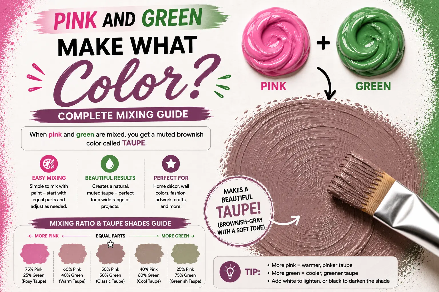
If you’ve ever wondered “pink and green make what color,” you’re not alone. The quick answer is that mixing pink and green generally creates a muted brown or a soft, neutral gray. But if you have ever experimented with different tubes of paint, you know that the final result isn’t always that predictable. Sometimes you get a beautiful dusty rose-gray, and other times you get a muddy sludge.
Getting the exact shade you want requires understanding how these two tones interact on a pigment level. In this guide, you’ll learn how different values shift your results, how light sources alter the color, and how to use this combination to elevate your artwork or home decor.
Main Takeaway: Tinted Red (Pink) + Secondary Color (Green) = Neutral Tone (depending on the specific undertones of your starting shades).
Why Do Pink and Green Make Brown or Gray?
To understand why these colors combine the way they do, we have to look at basic color theory. Pink is essentially a lightened version of red, which is a primary color. Green is a secondary color made by mixing blue and yellow.
When you mix pink and green, you are actually mixing all three primary colors together: red, blue, and yellow. This happens because the red in the pink clashes with the blue and yellow inside the green. When all three primaries meet, they cancel each other out and absorb the vast majority of light waves.
Here’s a good example. If you take a bright magenta pink and mix it with an equal amount of grass green, the brightness vanishes instantly. Instead of a new bright color, you get a balanced, muted brown.
Beginner Tip: Because pink is already diluted with white, it is much easier to overpower than a pure primary red. Always add your green incrementally so you don’t instantly turn your pink into mud.
Now let’s look at how changing your specific starting hues changes everything.
How Different Shades of Pink and Green Affect the Result
You don’t have to settle for a boring, flat brown when combining these two colors. By changing the specific types of pink and green you start with, you can create a beautiful range of sophisticated neutrals.
The reason for this variation is the hidden undertone within each specific paint tube. Some greens carry more blue, while some pinks carry a heavy dose of yellow or purple.
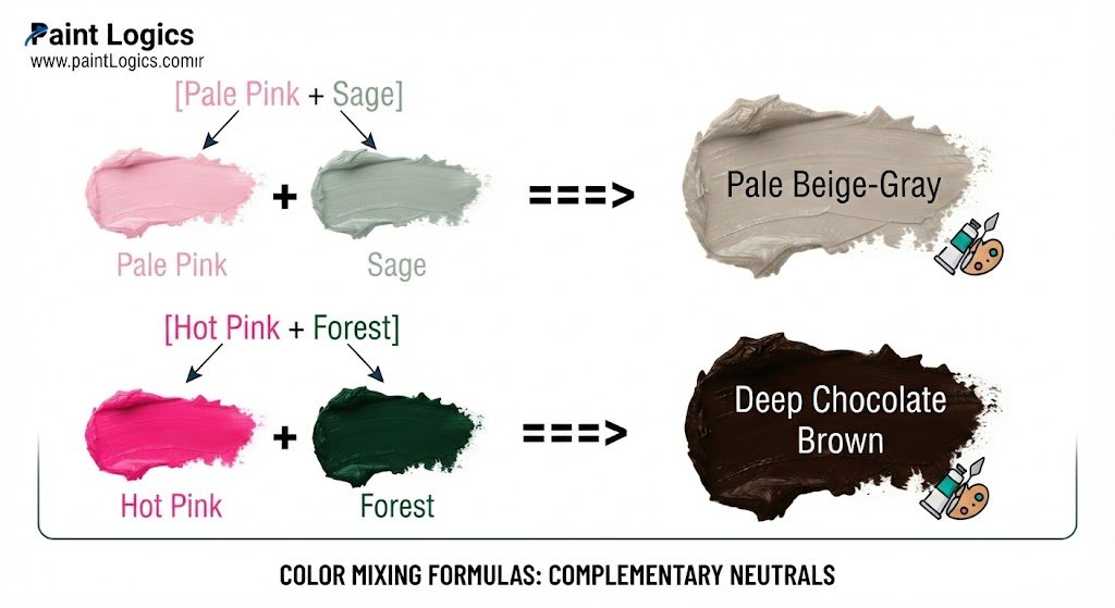
To see this in action, set out a few different variations on your palette. You’ll quickly see that subtle changes in your base tones yield completely different results.
Pale Beige-Gray
A pale beige-gray is a soft, quiet neutral that works beautifully for painting stone or textiles. This happens because both starting pigments are heavily diluted with white before they ever meet. Mix a delicate baby pink with a soft sage green. The result is a clean, modern gray with a slight warm undertone that interior designers love.
Deep Brown
A deep brown provides a rich, dark shadow tone without the flat look of pure black paint. This tone comes from using saturated, highly pigmented starting colors that lack white filler. Combine a vibrant neon hot pink with a dark forest green. You’ll get a rich, dark chocolate brown that adds excellent depth to landscape paintings.
Dusty Mauve
Dusty mauve is a gorgeous, vintage purple-gray shade. This happens because the pink base carries a hidden blue undertone, leaning toward violet. Mix a cool, berry-toned pink with a tiny touch of mint green. The green naturally pulls down the brightness, leaving you with a sophisticated, smoky mauve.
Warm Brown-Gray
A warm brown-gray feels organic, earthy, and sun-baked. The reason for this warmth is a heavy presence of yellow in both base colors. Mix a coral pink (which contains yellow-orange) with a warm olive green. This combination yields a rich taupe that works perfectly for painting natural wood textures or autumn leaves.
Grayish Khaki
Grayish khaki is a timeless, utility neutral that leans slightly toward a green-brown hue. This effect comes from letting a strong, dominant green control a very soft pink. Take a classic army or hunter green and add a tiny splash of pale blush pink. The pink softens the aggressive green, turning it into an approachable, elegant khaki.
Paint vs. Light: Does It Change the Mixed Color?
The physical rules of mixing pigments on a canvas do not apply when you are working on a computer screen or under theater spotlights.
This happens because paint relies on subtractive color mixing, while screens rely on additive color mixing. When painting, pigments absorb light, turning your pink and green into a muted brown or gray.
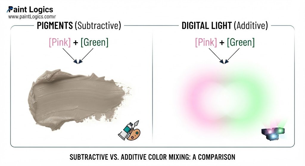
Think of a phone screen or a digital art canvas. Digital pink is made of high red and blue light, while digital green is pure green light. When you overlay them digitally, you are combining red, green, and blue light at high intensities. Instead of a dark gray, you end up with a very bright, pale yellow-white or a light pastel cream.
Examples of Pink and Green Mixes in Art and Design
Great artists and designers rarely view a neutral color as a mistake. They deliberately mix pink and green to achieve specific, high-end visual effects.
Portrait painters frequently use this combination to mix realistic human skin tones. The human face contains subtle shifts of red, blue, and yellow light under the skin. By mixing a soft pink with a tiny touch of green, artists can paint the natural transition shadows around a model’s cheeks and jawline without making the skin look dirty.
Another thing worth knowing is how this pairing works in textile design. Fashion designers often use a pink and green mix to create understated, earthy patterns.
Can You Make Green from Pink? (And Vice Versa?)
If you find yourself with a palette full of pink paint but completely out of green, you might wonder if you can convert one into the other.
The short answer is no, you cannot make green out of pink. The reason is simple: green requires blue and yellow pigments. Pink contains red and white, meaning it completely lacks the necessary chemical properties to reflect green light.
Can you extract Green from Pink? ──► [No Blue/Yellow Pigments Present]
Can you extract Pink from Green? ──► [No Red Pigments Present]
The same rule applies in reverse. You cannot make pink out of green because green contains no red pigment. If you try to force the mix by adding yellow or blue to pink, you will only move further toward purple, orange, or the gray-brown tones we discussed earlier.
Pink and Green Color Mixing Chart (Paint Examples)
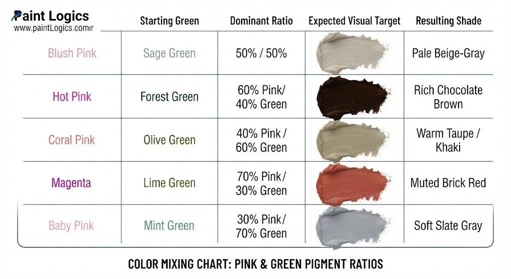
To help you visualize your next project, look over this quick reference chart detailing how specific pigment combinations interact.
| Starting Pink | Starting Green | Dominant Ratio | Resulting Shade |
| Blush Pink | Sage Green | 50% / 50% | Pale Beige-Gray |
| Hot Pink | Forest Green | 60% Pink / 40% Green | Rich Chocolate Brown |
| Coral Pink | Olive Green | 40% Pink / 60% Green | Warm Taupe / Khaki |
| Magenta | Lime Green | 70% Pink / 30% Green | Muted Brick Red |
| Baby Pink | Mint Green | 30% Pink / 70% Green | Soft Slate Gray |
That’s where many beginners get confused—they expect every single mixture to look like standard dirt. Now compare that chart with your own paint tubes to predict your next custom neutral.
Conclusion: Why Mixing Pink and Green Is More Useful Than You Think
Mastering the relationship between pink and green gives you complete control over the mood of your color palette. Instead of relying on pre-made grays out of a plastic tube, you can craft organic neutrals that feel integrated into your design.
When someone asks “pink and green make what color,” you can confidently explain that they create a beautiful array of grays and browns. The secret lies entirely in the specific undertones and values you choose to combine. Put this knowledge to work on your next canvas or design layout, and enjoy the subtle depth these custom neutrals bring to your workspace.
You May Also Like
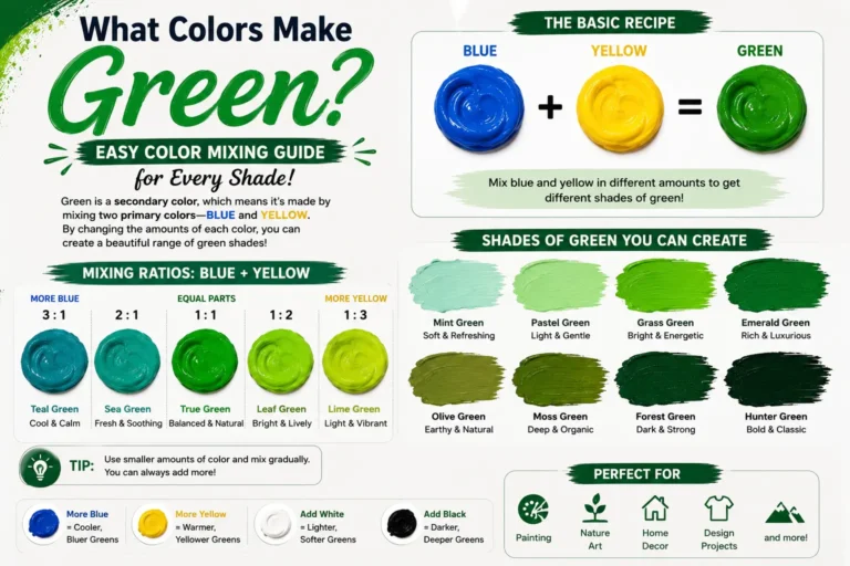
- What Colors Make Green? Easy Color Mixing Guide for Every Shade
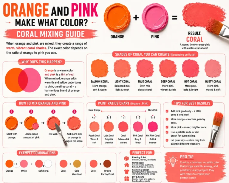
- What Color Do Pink and Purple Make? Best Results
- What Do Purple and Yellow Make When mixed? Mixing Guide
FAQs
Q: What color does pink and green make when mixed?
When mixed together, pink and green make a neutral tone, typically ranging from a muted brown to a soft gray. The exact outcome depends entirely on how bright or dark your starting paint colors are.
Q: Why do pink and green make brown or gray?
They make brown or gray because combining them means you are mixing all three primary colors (red, blue, and yellow) at the same time. This combination cancels out the brightness of the individual pigments, creating a neutralized shade.
Q: Can you make pink from green?
No, you cannot make pink from green. Pink requires red and white pigments, neither of which are present inside a pure green mixture of blue and yellow.
Q: Can you make green from pink?
No. Pink lacks the blue and yellow light-reflecting properties needed to build green. Mixing other colors into pink will not generate a clean green base.
Q: Do different pinks and greens change the result?
Yes, dramatically. A cool pink mixed with a mint green will create a soft gray or mauve, while a warm coral pink mixed with olive green will produce a rich, earthy brown.
Q: What happens if I mix pink and green in digital art?
In digital art, mixing pink and green light creates a bright, pastel cream or a light yellow-white. This happens because screens use the additive color model, where combining light waves increases brightness.
Q: Is mixing pink and green useful in painting?
Yes, it is incredibly useful. Artists mix them to create realistic skin tones, natural shadows on clothing, and sophisticated, organic background grays that look more alive than black-and-white paint mixes.
Q: What if I add white to a pink and green mix?
Adding white to the mix will instantly turn your brown or gray into a beautiful pastel tint, such as a soft pewter gray or a delicate sandy beige.
Q: Do pink and green look good together even if I don’t mix them?
Yes, they look fantastic together. Because red and green are complementary colors, placing pink (a light red) next to green creates a vibrant, high-contrast visual pairing that is highly popular in modern fashion and interior design.