Orange and Green Make What Color? Complete Mixing Guide
If you’ve ever wondered “orange and green make what color,” you’re not alone. It’s a classic color mixing puzzle that often catches people off guard, whether you are an artist trying to capture the subtle tones of a forest floor, a designer building an earthy palette, or a crafter working with clay.
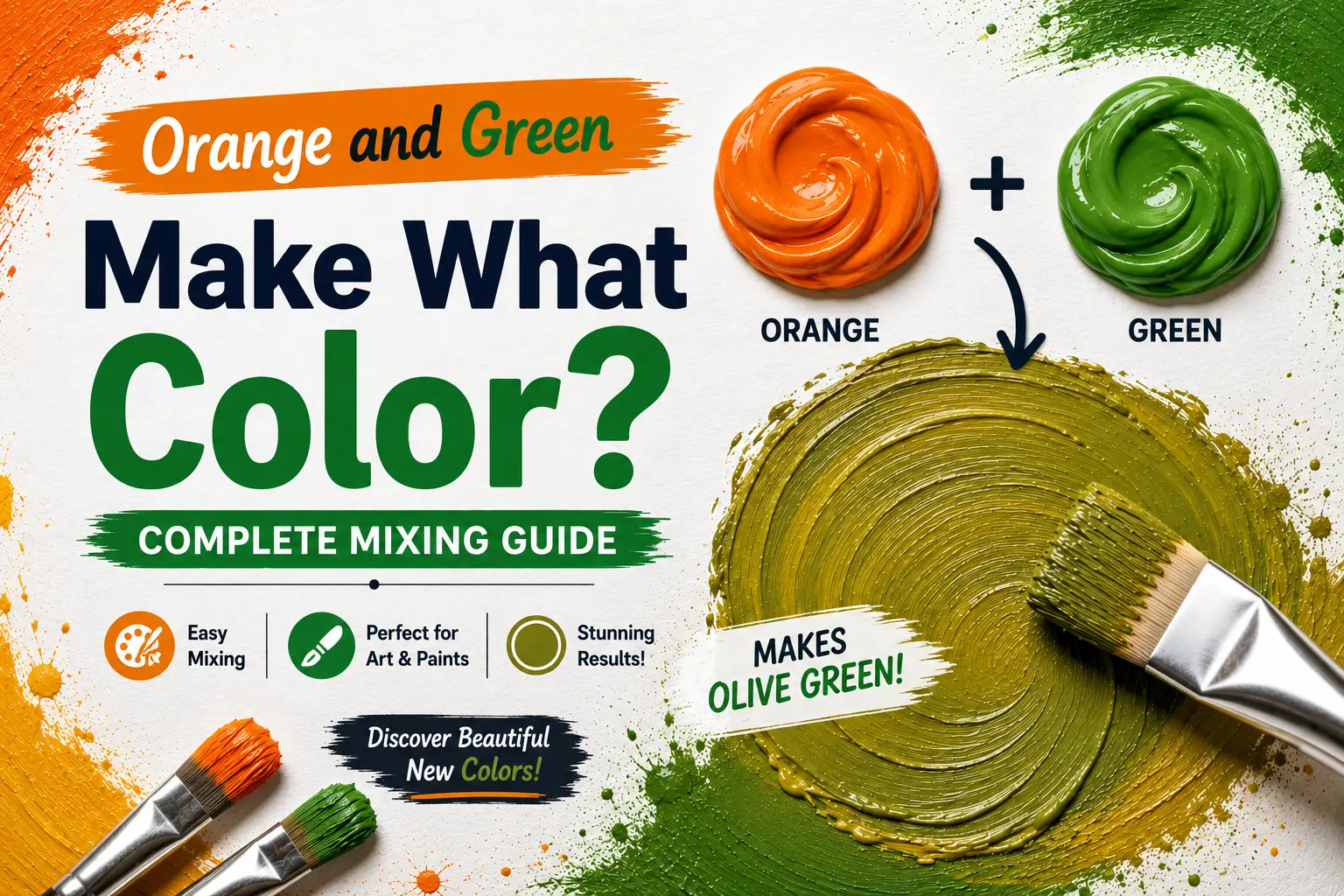
The direct answer is simple: when mixed together in physical paint, orange and green combine to make an earthy, natural color like olive, khaki, or warm brown.
However, the final result isn’t always identical every time you mix them. The exact color you get depends heavily on whether your green leans toward blue or yellow, how vibrant your orange pigment is, and the physical medium you are using. Understanding how these two secondary colors interact gives you total control over a highly versatile family of organic neutrals. In this guide, you’ll learn the exact color theory mechanics behind this blend, how different paint pigments behave when crossed, and how to utilize these rich tones across various creative mediums.
Main Takeaway:
Secondary Orange + Secondary Green = Olive / Khaki / Brown (varying in depth and warmth depending on your starting pigment ratios and undertones).
Quick Answer: What Color Does Orange and Green Make When Mixed?
When you combine orange and green on your palette, they naturally merge to produce a series of beautiful, muted earth tones like olive, brown, and khaki. Instead of clashing, these two secondary colors temper one another to create a soft, highly organic neutral.
Why does this happen? The reason is simple: orange is made from red and yellow, while green is made from blue and yellow. When you mix orange and green together, you are physically combining all three primary colors (red, yellow, and blue) in the same pool. Because yellow is present in both parent colors, the mixture retains a warm, golden-green undertone rather than turning into a flat gray.
Imagine you’re painting a landscape in autumn. If you take a standard grass green and slowly swirl in a dollop of pumpkin orange, the bright, vibrant green softens instantly. It transitions away from a summer lawn look and turns into a deep, mossy olive that looks instantly natural and atmospheric.
Why Do Orange and Green Make This Color?
To get a grip on this mixture, you have to look at how light wavelengths interact when these pigments collide on your palette. Both colors contain a massive amount of yellow light reflection, but they also bring competing primary elements to the mix.
This happens because the blue inside your green pigment and the red inside your orange pigment are complementary opposites on the color wheel. When they meet, they work to neutralize one another, absorbing light and dampening the overall saturation. However, because both colors are built heavily on a yellow base, the yellow survives the neutralization process, casting the final mix into a warm, earthy brown or khaki green.
Here’s a good example: if you mix a warm, yellow-dominant orange with a cool, blue-green, the red and blue pigments cancel each other’s high vibrancy out. The resulting color is a beautiful, stony khaki. Artists use this behavior to paint realistic tree bark, dried leaves, and shadow zones in natural sunlight.
What Happens When You Mix Different Shades of Orange and Green?
The specific tubes of paint you pull from your art kit dictate the ultimate outcome of your mixture. Subtle pigment variations change the energy of your mix completely.
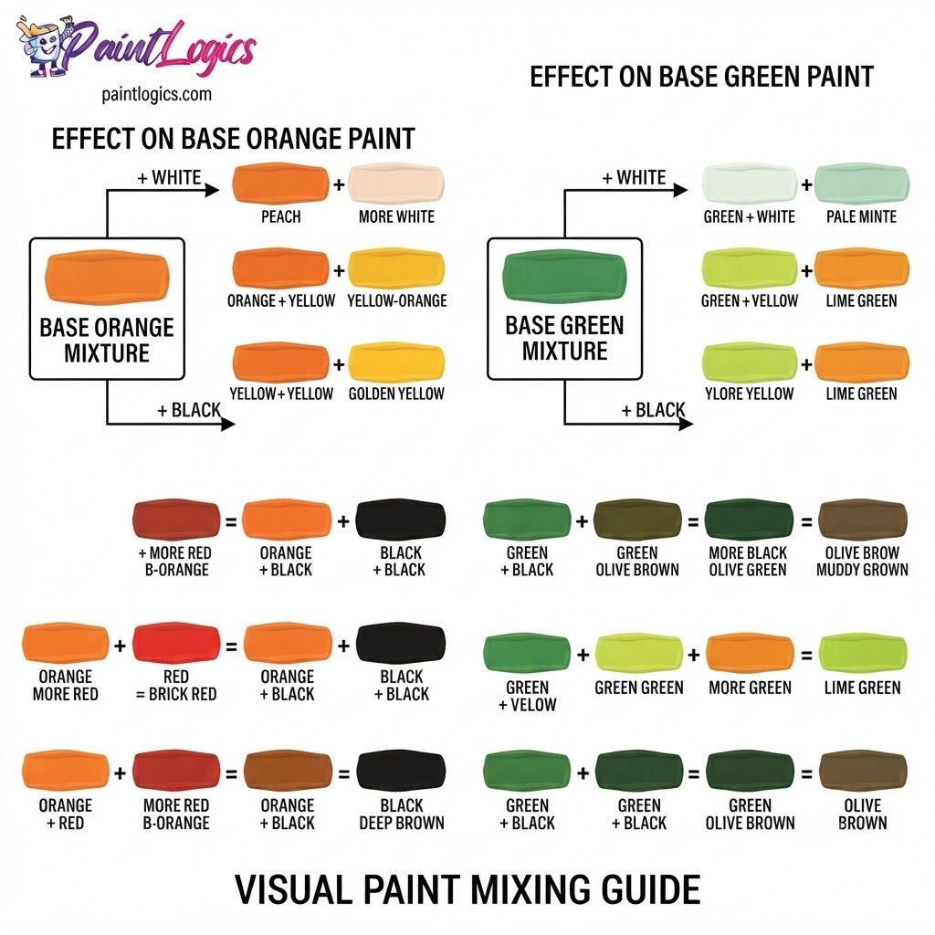
Now let’s look at how different starting variations interact on the mixing tray:
| Orange Pigment | Green Pigment | Resulting Color | Visual Quality |
| Cadmium Orange (Bright, Yellowish) | Phthalo Green (Cool, Blue-Green) | Earthy Khaki | Stonelike, balanced, neutral |
| Burnt Orange (Deep, Reddish) | Sap Green (Warm, Yellow-Green) | Rich Olive Green | Warm, leafy, moss-like |
| Neon Orange | Bright Kelly Green | Warm Amber Brown | Organic, golden-brown, rich |
| Tangerine Orange | Forest Green (Dark) | Deep Army Green | Muted, dark, military-style |
Common Mistake: Mixing a highly transparent, red-heavy orange with a very dark, blue-heavy green. The dominant red and blue pigments will overwhelm the yellow, turning your clean olive into a muddy, dark charcoal-brown. Matching your yellow balance is key.
Orange and Green in Paint: RYB (Red, Yellow, Blue) Color Model
In the traditional RYB color model used by painters, orange and green are both secondary colors. When you combine them, you are creating what is known as a quaternary color, or a complex neutral blend built from all three primary bases.
This happens because physical paint relies on subtractive color mixing. Every pigment particle you add to the wet mix acts as a tiny physical filter that absorbs specific light waves. Because orange absorbs cool blue light and green absorbs warm red light, combining them filters out most of the high-vibrancy spectrum, leaving a warm, low-saturation brown or olive paint layer behind.
Imagine you are using heavy-body acrylics to paint a forest path. By blending a touch of secondary green directly into your orange on the canvas, you create a seamless, dusty transition that perfectly mimics the organic forest floor under direct canopy light.
Orange and Green in Digital Media: RGB vs. CMYK
Understanding your medium is the only way to avoid frustrating surprises when moving your artwork from a computer screen to a physical printout.
RGB Model (Additive Mixing):
Digital displays operate on the additive RGB model, where colors are created by projecting light directly into your eyes. Think of a computer screen: a rich yellow-green is made by running the green sub-pixels at a very high power while running the red sub-pixels at a medium level. When you mix orange and green light on a screen, the display actually becomes brighter and warmer, yielding a glowing lime-yellow or bright amber rather than a dull olive paint pastel.
CMYK Model (Subtractive Mixing):
The CMYK system governs commercial printing presses and home inkjets. Because printing ink is highly transparent, laying down rich earth tones requires layering specific percentages of Cyan, Magenta, Yellow, and Black inks on white paper. If the printer is not calibrated correctly, the cyan can easily overpower the yellow, turning your warm khaki illustration into a cool, flat green on the page.
How the Ratio of Orange to Green Affects the Final Color
Adjusting the balance of your mixture allows you to control the exact visual temperature and mood of your final shade.
Let’s look at how shifting the proportions of your pigments changes what you see:
- More Orange than Green (e.g., 75% Orange, 25% Green): This formula drives the mix straight into a warm, golden brown or rich rust. The green works to cool down the orange, taking away its bright citrus edge and leaving behind an earthy, terracotta-like shade.
- Equal Parts (50% Orange, 50% Green): This creates a balanced, true medium khaki. It sits perfectly on the fence between warm brown and cool green, feeling highly natural and understated.
- More Green than Orange (e.g., 25% Orange, 75% Green): This yields a beautiful, rich olive or moss green. The orange acts as a tempering agent, taking the cold, synthetic edge off the green and making it feel much more organic and leaf-like.
Pro Tip: Always add your dark green paint in tiny, controlled increments into your orange base. Green pigments often have a very high tinting strength and can easily overpower a light orange if you dump too much in at once.
Artistic Uses of Orange and Green Together
This organic color pairing is highly prized across various creative fields because it creates a sense of comfort, nature, and rustic luxury.
In Art:
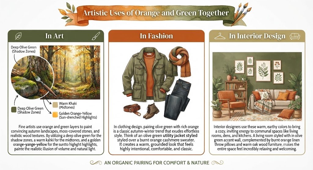
Fine artists use orange and green layers to paint convincing autumn landscapes, moss-covered stones, and realistic wood textures. By utilizing a deep olive green for the shadow zones, a warm khaki for the midtones, and a golden orange-yellow for the sun-drenched highlights, painters create the realistic illusion of volume and natural light.
In Fashion:
In clothing design, pairing olive green with rich orange is a classic autumn-winter trend that exudes effortless style. Think of an olive green utility jacket styled over a burnt orange cashmere sweater. It creates a warm, grounded look that feels highly intentional, comfortable, and classic.
In Interior Design:
Interior designers use these warm, earthy colors to bring a cozy, inviting energy to communal spaces like living rooms, dens, and kitchens. A living room styled with an olive green accent wall, complemented by burnt orange linen throw pillows and warm oak wood furniture, makes the entire space feel incredibly relaxing and welcoming.
How to Adjust the Mix: Add White, Black, or Yellow
You can easily steer the mood of your orange and green mixture by using small amounts of specific color adjusters.
That’s where many beginners get confused; you don’t need to throw away a dull paint pile. Just follow these simple adjustment rules:
- White: Adding a splash of white paint lifts the value instantly, turning your rich olive into a soft, sage-like pastel green or dusty cream-khaki.
- Black: Introduce a pinpoint edge of black to swallow up the light reflection. This transforms your khaki mix into a deep, moody forest shadow or dark bronze.
- Yellow: Folding in a drop of primary yellow pulls the mixture back toward the bright side of the color wheel, turning your earthy brown into a vibrant, golden moss green.
Mixing Orange and Green with Other Colors
Once you have your base orange and green mixture sitting on your palette, dropping in a third color component allows you to cross over into completely different color families.
Here’s how a third variable shifts the entire balance of your earthy mix:
- Orange + Green + Yellow: The yellow supercharges the warmth of the entire system, driving your olive straight into a brilliant, sun-baked chartreuse or bright golden-green.
- Orange + Green + Blue: Adding blue shifts the balance back toward a cool palette, transforming your earthy green into a deep, smoky spruce or dark forest teal.
- Orange + Green + Red: Red drives the mixture straight back to its warm, fiery roots, transforming your soft khaki into a rich, rustic terracotta or dark autumn rust.
- Orange + Green + White: The white spreads the dense pigment molecules apart, smoothing the intense olive into a soft, dusty sage or warm sandstone pastel.
- Orange + Green + Brown: Brown acts as a dark, warm anchor. Mixing it with your orange and green creates a beautiful, deep bronze-espresso color that looks highly organic and luxurious.
Orange and Green Color Mixing Chart (Visual)
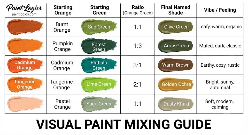
To help you visualize your mixing experiments, here is a quick-reference guide to the most common orange and green combinations:
| Starting Orange | Starting Green | Ratio (Orange to Green) | Final Named Shade | Vibe / Feeling |
| Burnt Orange | Sap Green | 1:1 | Olive Green | Leafy, warm, organic |
| Pumpkin Orange | Forest Green | 1:3 | Army Green | Muted, dark, classic |
| Cadmium Orange | Phthalo Green | 3:1 | Warm Brown | Earthy, cozy, rustic |
| Tangerine Orange | Lime Green | 2:1 | Golden Ochre | Bright, sunny, autumnal |
| Pastel Orange | Sage Green | 1:1 | Dusty Khaki | Soft, modern, calming |
Common Issues and How to Fix Them When Mixing Orange and Green
Even experienced creators can hit a few speed bumps when balancing these two complex secondary colors.
- The mix looks too muddy: This happens because your green contains a heavy blue base and your orange contains a heavy red base, canceling each other out completely. To fix this, fold in a tiny drop of primary yellow or a splash of white to restore the warm, luminous undertone.
- The green completely ate the orange: Green has an incredibly high tinting strength. If your mix turned instantly green, drag a small amount of the mix to a clean side of your palette and slowly feed in more orange paint until the color balances out.
- The final color looks gray and lifeless: You likely used desaturated or muted starting colors. To inject life back into your mix, add a tiny pinpoint of vibrant primary yellow or orange to boost the light reflection.
Conclusion
To bring it all home, orange and green make olive, khaki, or brown. Because these two secondary colors sit opposite their respective primary complements across the color wheel, blending them triggers a natural desaturation process that strips away their bright citrus and grass-like intensity, leaving behind a highly sophisticated, organic neutral.
The entire secret to mastering this beautiful blend lies in starting with your lighter orange paint as your main base, introducing your green pigment in small, controlled steps, and keeping your yellow levels high. Whether you are illustrating an autumn landscape, styling a classic wardrobe, or picking an inviting paint scheme for your home, utilizing this earthy family adds instant warmth, depth, and natural balance to your creative projects.
You Might Also Like:
- Red and Orange Make What Color? Complete Mixing Guide
- Orange and Pink Make What Color? Coral Mixing Guide
FAQs – Orange and Green Color Mixing
What color does green and orange make when mixed?
They combine to form a beautiful, natural range of warm neutrals known as olive green, khaki, or warm brown.
Can I make bright colors from orange and green?
No. Because they contain complementary elements (red and blue), they naturally desaturate each other, meaning they will always produce soft, low-saturation earth tones.
What happens when I add white to orange and green?
Adding white paint lifts the overall value and diffuses the dense pigments, softening a dark olive green into a beautiful, dusty sage or light sandstone pastel.
Can I use orange and green to create a vibrant tone?
Generally, no. Their physical mixture is chemically bound to produce muted neutrals. However, placing pure orange and green right next to each other on a canvas creates a highly vibrant, energetic contrast.
What colors are good to combine with orange and green in design?
They pair beautifully with warm metallic gold accents, clean cream tones, soft sand, and natural wood finishes.
How can I use orange and green together in design?
Use olive green as your calm, grounding base color (such as on a sofa or wall) and use burnt orange as a high-contrast accent pop (such as on throw pillows or artwork) to keep the space feeling energetic and warm.
What happens when I mix orange, green, and yellow?
The yellow supercharges the warm light reflection of the system, pulling your earthy olive green into a bright, golden chartreuse or mossy yellow-green.
Why does orange and green make brown?
The reason is simple: orange is made of red and yellow, and green is made of blue and yellow. Combining them mixes all three primary colors together, which naturally filters out pure light and leaves a dark, rich brown base.
How do I adjust the ratio of orange and green for different effects?
Leaning heavier on your green paint will yield a leafy, cool olive, while mixing in a larger portion of orange will slide the final color into a warm, golden wood-brown.
Can I make bright orange or bright green using orange and green?
No. Once they are mixed, the complementary neutralization cannot be undone. You must use fresh, pure paint straight from your tubes to achieve bright, saturated oranges or greens.
What happens if I mix orange and green with purple?
Since you are adding purple (which is blue and red) to an already complex mix, the pigments will absorb nearly all light wavelengths, turning your earth tone into a very dark, neutral charcoal or near-black.
Is there a way to prevent the mix from turning muddy when combining orange and green?
Yes. To keep the mix looking clean and organic rather than muddy, ensure you use a yellow-heavy orange and a yellow-heavy green. This floods the mixture with warm, reflective yellow pigments that prevent it from turning a flat gray.