Red and Yellow Make What Color? Easy Color Mixing Guide
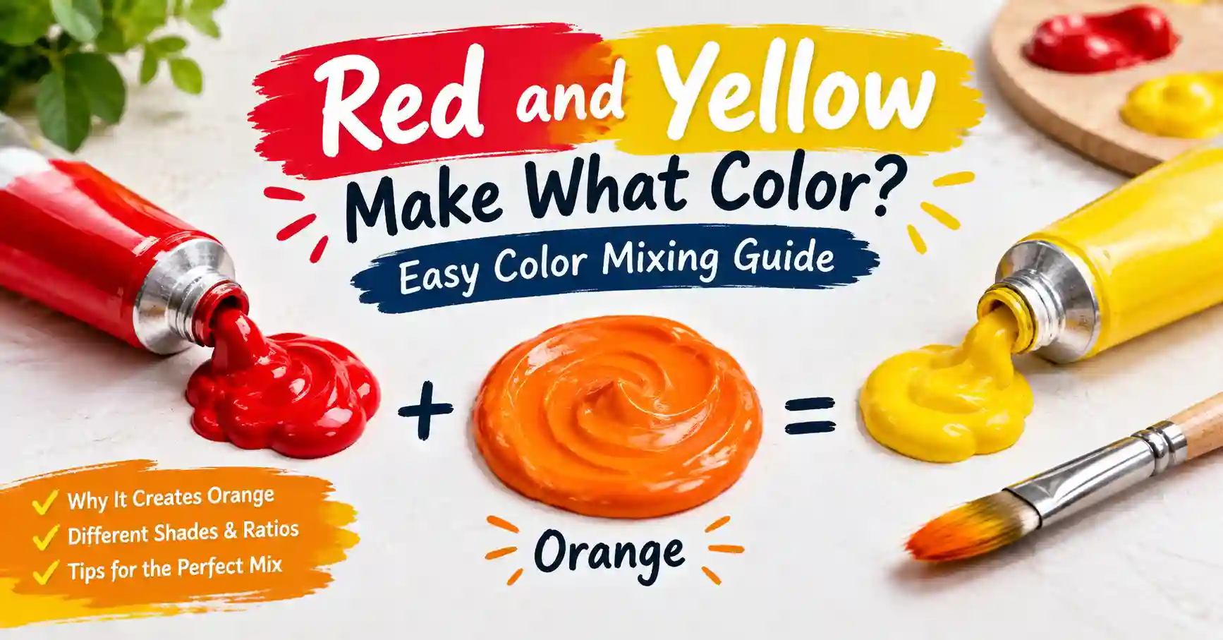
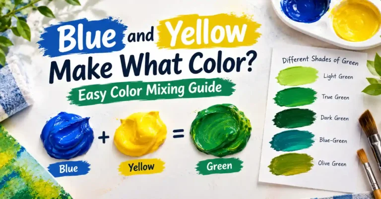
Red and Yellow Make What Color? You squeeze a blob of red and a blob of yellow onto your palette. You stir. What happens? In short, red and yellow make what color? The answer is orange.
Main takeaway: Red + Yellow = Orange. In paint, mix them in about a 1:1 ratio for classic orange. Use more yellow for a sunny orange. Use more red for a deep red-orange.
That is the short answer. But there is more to learn. The exact shade depends on your pigments, your ratio, and even whether you mix paint or light. This guide covers all of it in simple steps.
Understanding Red and Yellow as Colors
Before you mix, it helps to know your two colors. Red and yellow each have their own personality. Knowing it helps you predict the result.
Red: A Warm Primary Color
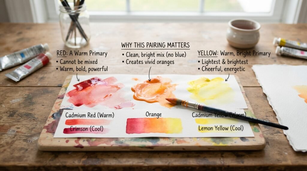
Red is a primary color. You cannot make it by mixing other paints. It is warm, bold, and strong.
Red is also a powerful pigment. A small amount can change a mix fast. Some reds lean warm, like cadmium red. Others lean cool, like crimson.
Yellow: A Warm, Bright Primary Color
Yellow is also a primary color. It is the lightest and brightest color on the wheel. It is warm, cheerful, and full of energy.
Some yellows lean warm, like cadmium yellow. Others lean cool, like lemon yellow. Cool yellows lean slightly green.
Why This Pairing Matters
Red and yellow sit next to each other on the color wheel. Both are warm. Neither one carries much blue, so the mix stays clean and bright.
That is why this pair gives such a vivid result. It is also the starting point for nearly every orange you will ever need.
Red and Yellow Make What Color in Paint?
Here is the direct answer for paint. Red and yellow make orange. This works because paint uses subtractive color mixing, which we explain later.
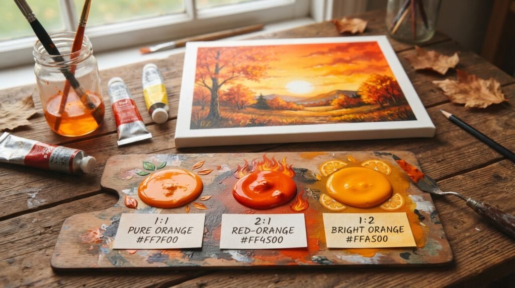
The exact shade depends on the ratio. Here are three examples to try.
Example 1: 1 Part Red + 1 Part Yellow
This is the classic mix. You get a balanced, true orange.
- Result: Pure Orange
- Hex code: #FF7F00
- Best use: Autumn scenes, sunsets, and bold accents
Example 2: 2 Parts Red + 1 Part Yellow
Extra red pushes the mix toward the red side. You get a deep, fiery orange.
- Result: Red-Orange
- Hex code: #FF4500
- Best use: Flames, warm shadows, and dramatic backgrounds
Example 3: 1 Part Red + 2 Parts Yellow
Extra yellow lifts the mix toward the sunny side. You get a bright, glowing orange.
- Result: Bright Orange
- Hex code: #FFA500
- Best use: Citrus fruit, summer designs, and cheerful logos
So, what color do red and yellow make when you change the ratio? Always some shade of orange. The ratio simply decides how warm or sunny it looks.
Full Mixing Chart: Red and Yellow Pigment Combinations
Different brands and pigments give different oranges. This chart shows 11 popular combinations. The hex codes are close digital matches. Real paint will vary a little by brand and batch.
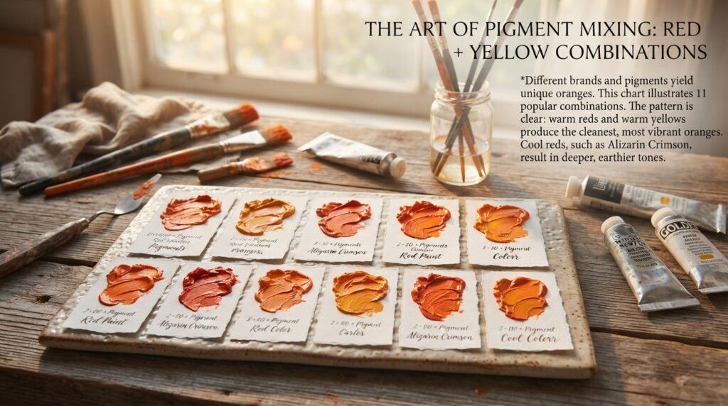
| # | Pigment Combination | Ratio (Red : Yellow) | Resulting Color | Hex Code |
| 1 | Winsor & Newton Cadmium Red + Cadmium Yellow | 1:1 | Pure Orange | #FF7F00 |
| 2 | Liquitex Cadmium Red Medium Hue + Cadmium Yellow Medium Hue | 1:1 | Bright Orange | #FF8C00 |
| 3 | Golden Pyrrole Red + Hansa Yellow Medium | 1:1 | Pumpkin | #FF7518 |
| 4 | Winsor & Newton Winsor Red + Winsor Yellow | 1:1 | Tangerine | #F28500 |
| 5 | Daniel Smith Quinacridone Rose + Hansa Yellow | 1:1 | Coral | #FF7F50 |
| 6 | Winsor & Newton Alizarin Crimson + Lemon Yellow | 1:1 | Burnt Orange | #CC5500 |
| 7 | Cadmium Red + Yellow Ochre | 1:1 | Terracotta | #E2725B |
| 8 | Cadmium Red + Lemon Yellow | 1:2 | Marigold | #EAA221 |
| 9 | Liquitex Basics Primary Red + Primary Yellow | 1:1 | Carrot Orange | #ED9121 |
| 10 | Cadmium Red + Cadmium Yellow | 3:1 | Red-Orange | #FF4500 |
| 11 | Cadmium Red + Cadmium Yellow | 1:3 | Amber | #FFBF00 |
The pattern is clear. Warm reds and warm yellows give the cleanest orange. Cool reds, like alizarin crimson, give deeper and duller tones.
What Color Does Red and Yellow Light Make?
Paint and light follow different rules. If you mix colored light, you get a different kind of result.
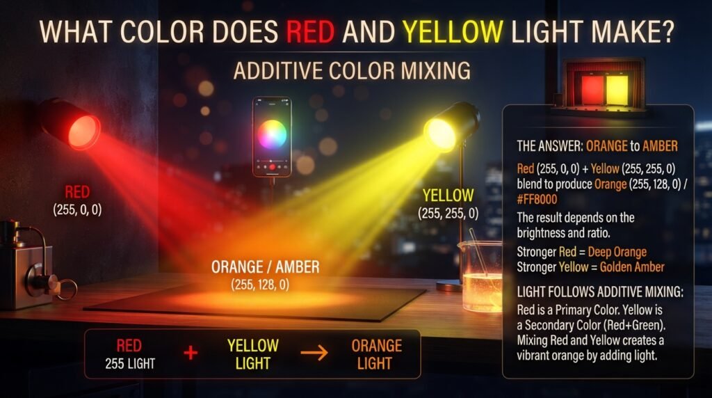
Many people ask, red and yellow make what color when mixed as light? The answer is still in the orange family. But it depends on how bright each light is.
How Additive Mixing Works
Screens, LEDs, and stage lights use additive color mixing. You start with darkness. Each light you add makes the result brighter.
The base colors in light are red, green, and blue (RGB). Yellow light is really red light plus green light. So when you add red light to yellow light, you add even more red.
The Light-Mixing Answer
Red light and yellow light make orange to amber. With a stronger red, you get a deep orange. With a stronger yellow, you get a golden amber.
On a screen, a simple 50/50 blend of pure red (255, 0, 0) and pure yellow (255, 255, 0) gives (255, 128, 0). That is the hex code #FF8000, a clean orange.
Where Light Mixing Is Used
- Screens and phones: Pixels blend red and green light to make orange.
- LED lighting: Smart bulbs mix colored LEDs for warm tones.
- Theater and stage lights: Red and yellow gels create sunset and firelight effects.
Subtractive vs. Additive Color Mixing
Here is a side-by-side comparison. It shows why paint and light behave so differently.
| Feature | Subtractive (Paint) | Additive (Light) |
| Base colors | Red, yellow, blue | Red, green, blue |
| Starting point | White surface | Black screen |
| How it works | Pigments absorb light | Lights add together |
| Adding more color | Gets darker | Gets brighter |
| Mixing all colors | Muddy brown or black | White |
| Red + Yellow result | Orange | Orange to amber |
| Used in | Painting, printing, dyeing | Screens, LEDs, stage lights |
How Ratio Affects the Final Color
Ratio is the biggest control you have. A tiny change can shift your orange a lot. This small table shows what to expect.

| Ratio (Red : Yellow) | Resulting Color | Hex Code | Best Use |
| 4:1 | Scarlet-Orange | #FF2400 | Bold accents, warning signs |
| 2:1 | Red-Orange | #FF4500 | Flames, warm shadows |
| 1:1 | Pure Orange | #FF7F00 | General painting, logos |
| 1:2 | Bright Orange | #FFA500 | Citrus, summer designs |
| 1:4 | Saffron | #F4C430 | Golden light, warm highlights |
Here is a simple rule. Red and yellow make what color when ratios change? A different orange each time. More red means deeper. More yellow means lighter.
Start with the stronger color in small amounts. Red is usually stronger, so add it slowly.
Why Your Mix Looks Muddy and How to Fix It
Sometimes your orange comes out dull or brown. Do not panic. This is a common problem with simple fixes.

Hidden Undertones
Why It Happens
Cool reds and cool yellows hide traces of blue or green. These are the opposite of orange. They cancel the brightness and make the mix gray or brown.
How to Fix It
Switch to a warm red and a warm yellow. Cadmium red and cadmium yellow are good starting points.
Overmixing
Why It Happens
Too much stirring can blend in more of the base paint than you want. Some paints also turn flat when mixed too long.
How to Fix It
Stir just until the streaks disappear. Then stop. Use a clean palette knife for a smooth blend.
Cheap Paint
Why It Happens
Student-grade paints often have less pigment and more filler. Fillers make colors look weak or chalky.
How to Fix It
Switch to artist-grade paint for your main colors. You do not need a full set. Even two good tubes make a big difference.
Dirty Brushes and Palettes
Why It Happens
A trace of blue or green on your brush can ruin an orange fast. Blue is orange’s complement, so it dulls the mix.
How to Fix It
Wash your tools between every mix. Use a clean area of the palette for each new color.
💡 Beginner Tip: Start with your yellow and add red in tiny amounts. Red is the stronger pigment, so it can take over quickly. You can always add more red later, but you cannot take it out.
Best Pigments to Mix for Clean Results
The right pigments make all the difference. Here are the best pairs for a clean, vivid orange.
| Pigment Pair | Result | Notes |
| Cadmium Red + Cadmium Yellow | Vivid, pure orange | The classic clean pair; both are warm |
| Pyrrole Red + Hansa Yellow Medium | Bright, glowing orange | Modern pigments with strong tinting power |
| Winsor Red + Winsor Yellow | Clear, bright orange | A good, budget-friendly artist option |
| Quinacridone Rose + Hansa Yellow | Soft coral-orange | Cool red gives a pinker, gentler tone |
| Cadmium Red + Yellow Ochre | Warm, earthy terracotta | Great for natural, muted palettes |
Mixing Tips for Cleaner Results
- Pick warm over cool. Warm pigments carry less hidden blue.
- Use a palette knife. It mixes cleanly and does not trap color in bristles.
- Mix on a white palette. You will see the true color.
- Keep your mix simple. Two pigments are better than three.
Mixing orange is like making lemonade with a splash of cherry juice. A little goes a long way, and too much changes everything.
Real-Life Examples of Red and Yellow Mixed
Orange appears everywhere in art and design. Here are three places where this simple mix does big work.
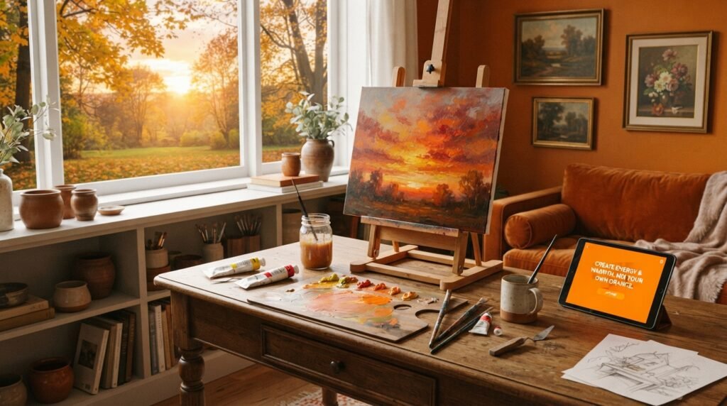
Traditional Art
Painters use red and yellow to build sunsets, autumn leaves, and glowing firelight. Many artists also mix their own oranges instead of buying tubes. It gives them more control over warmth and brightness.
Interior Design
Orange walls feel warm and welcoming. A burnt orange sofa adds a cozy touch. Soft peach shades work well in bedrooms and nurseries.
Digital Media
Designers use orange in apps, websites, and logos. It signals energy, creativity, and friendliness. Hex codes like #FF7F00 and #FFA500 are popular choices for buttons and call-to-action banners.
What Happens When You Add White, Yellow, or Black
Once you have orange, you can modify it. Each addition changes the color in a clear way.
| Modifier | Effect | Resulting Color | Hex Code |
| Add white | Lighter, softer, more pastel | Peach | #FFCBA4 |
| Add more yellow | Sunnier and more golden | Amber | #FFBF00 |
| Add more red | Deeper and more fiery | Red-Orange | #FF4500 |
| Add a tiny touch of blue | Duller, earthier, browner | Rust | #B7410E |
| Add a tiny touch of black | Darker, but can look muddy | Burnt Umber | #8A3324 |
A quick warning about black. It can make orange look dirty. For richer dark oranges, try adding a bit more red or a drop of blue instead.
Paint vs. Digital Media
Paint and screens both make orange, but they do it in different ways. Here is a simple recap with real examples.
Paint: Subtractive Mixing
Paint works by absorbing light. A red pigment absorbs most colors except red. A yellow pigment absorbs most colors except yellow. Mixed together, they leave mostly orange to bounce back to your eye.
For example, a tube of cadmium red mixed with cadmium yellow gives you a real, physical orange. You can feel it, brush it, and see it change as it dries.
Digital: Additive Mixing
Screens work by emitting light. Pixels glow in red, green, and blue. To make orange, a screen turns on full red and about half green.
For example, the hex code #FF8000 tells your screen to use red at 255, green at 128, and blue at 0.
Which One Should You Use?
Use paint for physical art, walls, and crafts. Use RGB or hex values for websites, apps, and digital art. Both give orange, but each needs its own approach.
Image caption: A split image with a red-and-yellow paint mix on the left and the same orange on a glowing digital screen on the right.
Tips for Artists
A few simple habits will help you mix better oranges every time.
Know Your Warm and Cool Pigments
Warm pigments give bright, clean oranges. Cool pigments give softer or duller ones. Label your tubes as warm or cool to make choices faster.
Test on a White Palette
White shows the true color. Mix a small amount, brush it on white paper, and compare. This avoids surprises later.
Mix Small Batches, Then Scale Up
Start with a small test batch. Once you like the color, make more. Keep notes on your ratios so you can repeat it.
Try Layering
Layering is another way to make orange. Paint a thin yellow layer. Let it dry. Then glaze red over it. This is called optical mixing, and it gives a glowing, luminous effect.
Dry-Test Before You Commit
Acrylic paint often dries darker than it looks wet. Always test a dry swatch before painting your main piece.
Orange in Fashion and Interior Design
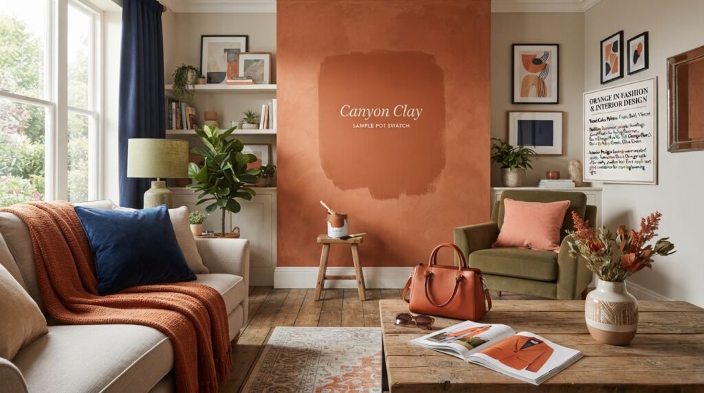
Orange is a trend color that keeps coming back. It feels fresh, bold, and full of life.
Orange in Fashion
Designers use orange for statement jackets, handbags, and accessories. Soft coral and peach tones suit spring and summer. Burnt orange and rust tones are popular in fall.
Orange pairs well with navy, cream, and olive green. That makes it easy to wear in many ways.
Orange in Interior Design
Orange works as an accent in almost any room. A single orange cushion or print can warm up a neutral space. Terracotta and burnt orange walls add an earthy, modern feel.
If you are not sure about a full wall, start small. Try a sample pot of a ready-mixed orange before you commit to a whole room. Paint a large swatch and watch it in morning and evening light.
Where Orange Sits on the Color Wheel
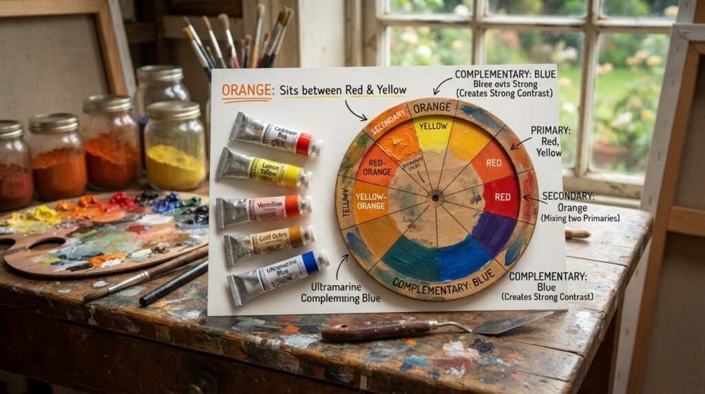
Orange is a secondary color. It sits between red and yellow on the traditional color wheel. Knowing its neighbors helps you mix and pair colors with confidence.
Primary, Secondary, or Tertiary?
Red and yellow are primary colors. Mixing two primaries makes a secondary color, and that is orange. It is not a tertiary color.
The two tertiary colors beside orange are red-orange and yellow-orange. These come from mixing orange with a neighboring primary.
Complementary Color
The complementary color of orange is blue. It sits directly across from orange on the wheel. Together, they create strong contrast and make each other pop.
Analogous Colors
Analogous colors sit next to orange. These are red, red-orange, yellow-orange, and yellow. They blend smoothly and make warm, harmonious palettes.
Conclusion
So, red and yellow make what color? Orange. In paint, mix them in about a 1:1 ratio. In light, they give an orange-to-amber glow.
Remember the key points. Warm reds and warm yellows give the cleanest results. Add white to lighten, more yellow to brighten, and more red to deepen. Keep your tools clean, and watch out for cool undertones and too much black.
Do not worry about perfect results on the first try. Mix small batches, test on scrap paper, and note what works. With a little practice, you will mix any orange you need. Now grab your red and yellow, and see what you can create.
FAQs
Red and yellow make what color?
Red and yellow make orange. In paint, a 1:1 ratio gives a classic orange. Changing the ratio gives deeper or lighter shades.
What color do red and yellow make when mixed as light?
Red light and yellow light make an orange to amber glow. A 50/50 digital blend gives the hex code #FF8000. The exact shade depends on how bright each light is.
What happens when you mix red and yellow paint in different amounts?
More red gives a deep red-orange. More yellow gives a sunny, golden orange. A 1:1 ratio gives a balanced, classic orange.
Why does my red and yellow mix look brown?
Your red or yellow probably leans cool, which hides blue or green in the mix. A dirty brush can also add unwanted color. Use warm pigments and clean tools to keep it bright.
How do I make light orange from red and yellow?
First, mix red and yellow into orange. Then add white a little at a time. Stop when you reach the shade you want, like peach or apricot.
How do I make dark orange?
Add a little more red to your orange mix. You can also add a tiny touch of blue for a richer, earthier tone. Go slowly, because dark colors take over fast.
What is the hex code for orange?
The standard hex code for orange is #FFA500, with RGB values of 255, 165, 0. The classic color-wheel orange is #FF7F00. A pure red and yellow digital blend gives #FF8000.