Blue and Orange Make What Color? Complementary Mixing Guide
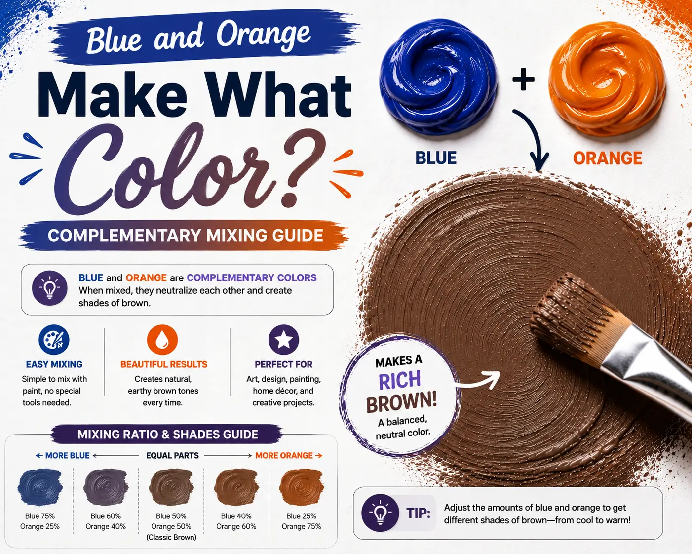
If you’ve ever wondered “blue and orange make what color,” you’re not alone. It’s one of the most common questions for artists, designers, and home decorators alike.
The direct answer is simple: mixing blue and orange together creates brown, which can range from a rich chocolate tone to a muted gray-brown.
However, the final result isn’t always the same dull shade. The exact tone you get depends heavily on the temperature of your colors, your mixing proportions, and the specific pigments you use. Understanding these variables gives you complete control over this incredibly useful color family.
Main Takeaway:
Primary Blue + Secondary Orange = Brown or Muted Gray-Brown (varying from warm ochre to cool slate depending on the color bias and mixing ratios).
What Color Does Blue and Orange Make in Paint?
When you mix blue and orange paint, you are working with physical pigments. This process is called subtractive color mixing. Because blue and orange are complementary colors, they cancel each other out when blended.
This happens because the mix combines all three primary colors. Remember, orange is made by mixing red and yellow. When you add blue to the mix, you have all three primaries competing for light absorption.
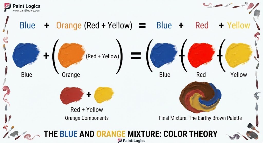
Because physical pigments absorb light rather than emit it, combining all three primaries results in a dark, earthy neutral color.
Let’s look at the specific variations you can create on your palette.
Burnt Sienna
Burnt sienna is a rich, warm, reddish-brown. This happens because the mixture is dominated by a warm orange pigment with just a touch of blue to take away the bright glare.
To make this shade, start with a big dollop of Cadmium Orange and slowly fold in a tiny speck of Ultramarine Blue. The blue cools down the fiery orange, turning it into a deep, rustic clay color.
Artists often use burnt sienna to paint brick walls, autumn leaves, or warm shadows on skin.
Muddy Gray-Brown
A muddy gray-brown is a highly neutral, balanced shade that doesn’t lean too warm or too cool. This happens when you mix equal parts of a standard blue and a standard orange.
To mix this, combine equal amounts of Cobalt Blue and a basic Medium Orange. The two pigments fight to a draw, canceling out each other’s vivid tones completely.
This shade is incredibly useful for painting natural soil, tree bark, or building realistic shadow bases.
Blue-Tinted Brown
A blue-tinted brown is a cool, dark brown that looks almost like a deep twilight shadow. It has a mysterious, cold feeling compared to standard warm browns.
This happens because the blue pigment dominates the mixture, absorbing most of the warm light. To achieve this, mix three parts Phthalo Blue with one part orange paint.
Landscape painters use this cool tone to capture the deep shadows found under pine trees or the dark crevices of wet mountain rocks.
Rust Brown
Rust brown is a vibrant, earthy orange-brown that mimics oxidized iron. It feels warm, energetic, and highly organic.
This happens because the warm red tones inside the orange are allowed to shine, while the blue simply stabilizes the color from looking too neon. Mix a high-pigment Orange with a touch of Cerulean Blue.
Interior designers often use rust brown as an accent color for leather couches, pottery, or accent rugs to bring warmth to a modern space.
Ashy Taupe
Ashy taupe is a soft, light grayish-brown with cool undertones. It looks modern, clean, and highly sophisticated.
This happens because a cool blue pigment is combined with a soft orange, and then lightened to reveal the subtle undertones. Mix a pale blue like Cerulean with a soft orange, then add a touch of white paint.
This shade is a favorite for modern living room walls because it provides a calming, neutral backdrop that changes beautifully with the daylight.
Now let’s see what happens when we tweak the ratios even further.
What Happens When Orange is mixed with Blue to create Different Shades?
Adjusting the ratios on your palette opens up an entire spectrum of beautiful, earthy tones. You aren’t stuck with just one flat brown.
Why does this happen? The pigments compete for dominance. If you use a high-tinting blue, it will quickly overpower a transparent orange, shifting the mixture toward a cool tone.
Here’s a breakdown of how different mixing formulas behave on your palette.
Burnt Sienna
This classic warm shade is created by keeping the mixture heavily weighted on the orange side. Use a 3:1 ratio of Orange to Blue. The orange provides the fiery warmth, while the blue adds a stabilizing, grounding weight.
Smoky Gray-Brown
A smoky gray-brown is a quiet, soft neutral that looks like wet river rocks. Mix 2 parts Blue with 1 part Orange. The slight excess of blue cools the mixture down, creating a beautiful smoky tone that works perfectly for moody skies.
Blue-Tinted Brown
This is a very cool, deep brown that sits on the edge of charcoal. Mix 4 parts Blue with 1 part Orange. It’s an excellent choice for painting stormy seas or deep forest shadows.
Rust Brown
To get a bright, fiery rust, mix 4 parts Orange with 1 part Blue. The tiny drop of blue takes away the artificial “cartoonish” look of pure orange, making it look like real metal or natural clay.
Olive Brown
Yes, you can make a greenish-brown using blue and orange! This happens because some blues contain strong yellow undertones (like Phthalo Blue). Mix 2 parts Phthalo Blue with 1 part warm Orange to get a rich, swampy olive brown.
Dusty Rose
Dusty rose is a soft, muted pink-brown. This happens when you use a very warm, reddish-orange and mix it with a light sky blue, then add white. It is highly popular in modern floral paintings and bohemian home decor.
Slate Gray
Slate gray is a cold, dark gray with strong blue undertones. Mix 3 parts Cobalt Blue with 1 part Orange, then add a tiny touch of white. This mimics the color of wet concrete or dark winter clouds.
Terracotta Beige
Terracotta beige is a light, warm, sandy color. Mix 3 parts Orange with 1 part Blue, then fold in a generous amount of white paint. It feels warm, inviting, and looks like Mediterranean plaster walls.
Clay Mauve
Clay mauve is a dusty, purple-gray neutral. This happens when you mix a cool, reddish-blue (like Ultramarine) with a reddish-orange, then add white. The red undertones in both colors combine to create a beautiful, muted violet shade.
Stormy Taupe
Stormy taupe is a dark, moody gray-brown with purple undertones. Mix equal parts Ultramarine Blue and a deep Red-Orange. It is perfect for painting the dramatic clouds of an approaching summer storm.
What Shades Can You Make by Mixing Blue and Orange Pigments?
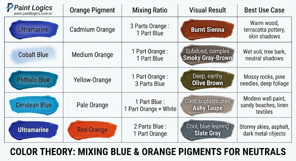
Let’s look at a quick visual guide to see how these mixtures compare side-by-side:
| Blue Pigment | Orange Pigment | Mixing Ratio | Visual Result | Best Use Case |
| Ultramarine | Cadmium Orange | 3 Parts Orange : 1 Part Blue | Burnt Sienna | Warm wood, terracotta pottery, skin shadows |
| Cobalt Blue | Medium Orange | 1 Part Orange : 1 Part Blue | Smoky Gray-Brown | Wet soil, tree bark, neutral shadows |
| Phthalo Blue | Yellow-Orange | 1 Part Orange : 3 Parts Blue | Olive Brown | Mossy rocks, pine needles, deep foliage |
| Cerulean Blue | Pale Orange | 1 Part Blue : 1 Part Orange + White | Ashy Taupe | Modern wall paint, sandy beaches, linen textiles |
| Ultramarine | Red-Orange | 2 Parts Blue : 1 Part Orange | Slate Gray | Stormy skies, asphalt, dark metal objects |
Pro Tip: Always mix your dark colors into your light colors. Because blue pigment is much stronger than orange, adding blue to orange in tiny drops prevents you from accidentally wasting paint.
Now, let’s step away from physical paint and look at how this works on digital screens.
What Color Does Blue and Orange Result in Light (RGB)?
If you are working on a computer screen, phone, or projector, color behaves completely differently. This is called additive color mixing.
Instead of absorbing light, screens emit light. The primary colors of light are Red, Green, and Blue (RGB). In this system, orange is not a primary color—it is actually made by combining red light with a small amount of green light.
So what happens when you mix blue light with orange light?
When you mix red, green, and blue light together at equal intensities, they combine to make white light. Because orange is just a variation of red and green, mixing blue and orange light results in a pale, desaturated off-white or light gray.
Let’s look at the specific variations you can create with light.
Light Cyan
If you mix a strong, bright blue light with a very pale, weak orange light, the blue dominates. However, the green component inside the orange light shifts the blue toward a soft, glowing light cyan.
Lavender / Violet Tint
If you mix a deep blue light with a reddish-orange light, the red wavelengths combine with the blue to create a beautiful lavender or violet tint. This is often used in stage lighting to create a dreamy, nocturnal atmosphere.
Off-White
When the intensities of the blue and orange light are perfectly balanced, they cancel each other out completely. This results in a clean, neutral off-white or a light gray light.
What Colors Can Blue and Orange Light Make?
Here is a quick look at how digital light mixtures compare:
| Blue Light Intensity | Orange Light Intensity | Resulting Light Color | Common Use Case |
| High (100%) | Low (25%) | Light Cyan | Neon sci-fi interfaces, digital screens |
| Medium (50%) | High (100%) | Warm Amber-White | Cozy indoor lighting, sunset effects |
| Balanced (50%) | Balanced (50%) | Neutral Off-White | Studio photography lighting, white balance |
Now let’s look at why these two colors behave so differently from standard mixing rules.
Why Blue and Orange Don’t Mix Like Basic Primary Colors
That’s where many beginners get confused. They expect blue and orange to behave like blue and yellow (which make green).
The reason is simple: orange is already a secondary color. When you mix a primary color (blue) with its complementary secondary color (orange), you are actually mixing all three primary colors together.
Because they sit on opposite sides of the color wheel, they have nothing in common. They are designed to oppose and neutralize each other. Instead of creating a brighter color, they pull each other down into a quiet, desaturated state.
Digital Mixing Guide: Hex, RGB, and CMYK Values
If you are a graphic designer or digital artist, you need exact numbers to work with. Here is the technical breakdown of the blue and orange spectrum.
| Color Name | Hex Code | RGB Values | CMYK Values (Print) |
| Pure Blue | #0000FF | (0, 0, 255) | (100%, 100%, 0%, 0%) |
| Pure Orange | #FFA500 | (255, 165, 0) | (0%, 35%, 100%, 0%) |
| Mixed Brown (Paint Equivalent) | #7F627F | (127, 98, 127) | (0%, 23%, 0%, 50%) |
| Burnt Sienna | #E97451 | (233, 116, 81) | (0%, 50%, 65%, 9%) |
| Slate Gray | #708090 | (112, 128, 144) | (22%, 11%, 0%, 44%) |
Why Blue and Orange Are Complementary Colors
To understand why these two colors look so incredible together, we have to look at the color wheel.
Complementary colors are pairs of colors that, when combined, cancel each other out. But when placed side-by-side, they create the strongest contrast possible.
Here’s what that looks like:
- High Visual Vibrancy: Place a bright orange circle on a blue background, and the orange will appear to vibrate or pop off the screen.
- Warm vs. Cool: Blue is the coldest color on the wheel, while orange is one of the warmest. This creates a perfect temperature balance.
- Natural Harmony: Because they are opposites, your eyes naturally love seeing them together. It feels balanced and satisfying.
Let’s look at how adding white or black can completely transform this mix.
How Additives Like White or Black Change the Orange and Blue Mix
Once you have mixed your blue and orange to create brown, you can easily shift the value (how light or dark it is) using white or black paint.
Why does this happen? White increases the reflection of light, revealing the subtle undertones of the mix. Black absorbs more light, pulling the mixture toward a deep shadow.
- Adding White (Tints): Adding white to your blue-orange brown creates beautiful, sandy beige, soft taupe, or light khaki tones. This is perfect for painting sandy beaches or linen clothing.
- Adding Black (Shades): Adding a touch of black turns your brown into a deep, rich espresso or near-black shade. This is excellent for creating heavy, structural shadows without making your painting look dirty.
Common Mistake: Don’t add too much black too quickly. It can easily overpower the warm orange undertones, turning your beautiful brown into a cold, lifeless charcoal.
Artist Tips to Avoid Making Mud
One of the biggest frustrations for beginner artists is accidentally creating “mud” when they wanted a clean, vibrant color.
What causes muddy colors? It happens when you mix colors without understanding their color bias (whether a color leans warm or cool).
Here is how you can keep your mixtures clean and intentional:
- Tip 1: Use Pure Pigments: Always check the label on your paint tubes. Look for single-pigment paints rather than pre-mixed hues. Pre-mixed paints contain multiple pigments that make muddy mixtures much faster.
- Tip 2: Keep a Color Chart: Paint a small grid showing what happens when you mix different ratios of your specific blue and orange paints. Keep this next to your easel for quick reference.
- Tip 3: Clean Your Brushes: Even a tiny trace of yellow or green on your brush can ruin a clean blue-orange mix. Keep your water jar clean!
Real-Life Uses of Blue and Orange Color Mixes
You see the magic of the blue and orange mix every single day, even if you don’t realize it.
In Hollywood filmmaking, color graders use a technique called “Orange and Teal.” They make the shadows cool and blue while keeping skin tones warm and orange. This creates a highly cinematic, dramatic look that keeps your eyes glued to the screen.
In sports branding, teams like the New York Knicks, Denver Broncos, and Chicago Bears use blue and orange side-by-side because the high contrast looks energetic, bold, and highly professional.
Color Psychology: Emotional Impact of the Mix Blue and Orange
When you combine these two colors, you are blending two completely opposite emotional states.
Blue represents calm, trust, stability, and peace. It lowers our heart rate and makes us feel secure. Orange, on the other hand, represents energy, excitement, warmth, and playfulness.
When you use them together, they create a sense of balanced energy. It feels exciting yet stable, warm yet refreshed. This makes it a highly popular color palette for modern businesses and activewear brands.
Conclusion
So, to answer the big question once again: blue and orange make brown when mixed as paint, and they make a neutral off-white when mixed as light.
By mastering this complementary pair, you can create everything from warm burnt sienna to cool slate grays. The key is to experiment with your ratios, keep your paintbrushes clean, and pay attention to whether you are working with physical pigments or digital pixels.
The next time you sit down to paint a sunset, design a logo, or decorate a room, don’t be afraid of this dynamic duo. Embrace the contrast, control the neutral tones, and let your creativity shine!
You May Also Read
- Red And Green Make What Color? Color Mixing Guide
- What Colors Make White? Paint vs Light Color Mixing Explained
FAQs
Does blue and orange always make brown in paint?
Yes, in physical paint, mixing blue and orange will always result in some variation of brown, gray, or taupe. Because they are complementary colors, they neutralize each other’s vividness, pulling the mixture into a quiet, earthy state.
What color does blue and orange make digitally (RGB)?
Digitally, blue and orange light mix to make a desaturated off-white or light gray. This happens because mixing complementary light wavelengths stimulates all the color receptors in your eyes simultaneously, creating white light.
Can I get green from blue and orange?
No, you cannot make a clean, vibrant green from blue and orange. However, if you use a blue with strong yellow undertones (like Phthalo Blue) and mix it with a yellowish-orange, you can get a muted, earthy olive brown.
How do I make a cleaner brown instead of mud?
To make a clean, rich brown, use single-pigment paints (like Ultramarine Blue and Cadmium Orange). Avoid using cheap paints that contain pre-mixed pigments, as these will quickly turn gray and lifeless on your palette.
What is the most useful blue-orange combo for painting skin tones?
The most popular combo for skin tones is mixing Cobalt Blue with Cadmium Orange, then adding white. This creates a beautiful, natural base that can be easily adjusted with tiny touches of red or yellow to match any skin tone perfectly.