Blue and Green Make What Color? Paint Mixing Guide
If you’ve ever wondered “blue and green make what color,” you’re not alone. It is one of the most exciting experiments on an artist’s palette, as these two cool tones combine to create some of the most vibrant, refreshing colors in nature.
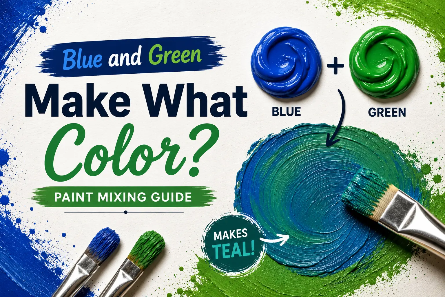
The direct answer is simple: when you mix blue and green together, they create a stunning family of intermediate shades known as cyan, turquoise, and teal.
However, the final result isn’t always identical every time you sweep your brush through them. The exact color you get depends heavily on the specific undertones of your base paint, the medium you are working with, and the precise mixing proportions. Understanding how these cool-toned neighbors interact gives you total control over oceanic landscapes and rich digital palettes alike. In this guide, you’ll learn the exact color science behind this blend, step-by-step physical mixing methods, and how to master these refreshing shades in your creative projects.
Main Takeaway:
Primary Blue + Secondary Green = Cyan / Teal / Turquoise (varying in depth and tone based on mixing ratios and underlying pigment biases).
What Happens When You Mix Blue and Green?
When you combine blue and green on a palette, they naturally merge to produce a series of bright, oceanic colors. Because they sit right next to each other, they don’t fight or neutralize one another; instead, they blend to create smooth, harmonious intermediate transitions.
Blue + Green in Different Mediums
The way these two colors combine shifts when you switch your materials. In physical mediums like heavy-body acrylics or fluid watercolors, the mixed pigments physically filter out specific warm light wavelengths, pulling the blend into rich, dense teal or turquoise. In digital spaces, mixing blue and green light uses an additive approach, creating an incredibly bright, neon-like cyan that feels electric.
Why the Mixing Ratio Matters
The balance of your mixture controls the overall personality and temperature of your final shade. Skewing the recipe toward blue yields an icy, deep turquoise that mimics deep ocean water. On the flip side, adding more green pushes the blend toward a tropical mint or seafoam tone that feels bright and organic.
Understanding Blue and Green in Color Theory
To truly master this mix, it helps to understand how these colors relate to one another on a standard color layout.
Primary and Secondary Colors in RYB
In the traditional RYB (Red, Yellow, Blue) model used by physical painters, blue is a foundational primary color, while green is a secondary color created by combining blue with yellow. Therefore, when you mix blue and green, you are technically adding more blue to a pre-existing yellow-blue blend.
What Are Tertiary Colors Like Teal and Cyan?
A tertiary color is created by mixing equal parts of a primary color with its closest secondary neighbor. This places our blue-green mixture squarely in the tertiary family, yielding distinct tones like teal, turquoise, and cyan.
Why Medium Matters: Pigment vs. Light vs. Digital
Physical pigments subtract light, meaning they absorb wavelengths and become darker as you add more colors together. Digital monitors project light using the RGB model, where combining pure blue light and green light actually creates a brighter, more brilliant cyan.
Role of the Color Wheel
On a standard color wheel, blue and green are analogous colors, meaning they sit side-by-side. Because they share a massive cool-toned foundation, blending them never results in a clashing or ugly color; they naturally complement each other’s visual temperature.
How to Mix Blue and Green Paint (Step-by-Step)
Mixing these shades by hand is highly rewarding if you use a systematic approach to prevent waste.
Tools and Materials You’ll Need:
- Premium blue paint (like Ultramarine or Phthalo Blue)
- Clean green paint (like Phthalo Green or Viridian)
- A flat plastic or glass mixing palette
- A flexible palette knife (safer and cleaner than a brush for mixing)
- Scrap paper to swatch your test mixes
Step-by-Step Instructions:
1.Squeeze out your base pigments:Prerequisite.
Place a nickel-sized dollop of green paint and a separate dollop of blue paint on opposite sides of your mixing tray to keep them clean.
2.Pull your green base:Step 1.
Use your palette knife to drag a small portion of green paint into the center of your mixing zone to serve as your starting foundation.
3.Introduce the blue in increments:Step 2.
Take a tiny, matchstick-sized dot of blue paint and fold it into the green base, working it thoroughly with flat strokes.
4.Adjust and swatch:Step 3.
Keep adding microscopic drops of blue until the blend hits your desired turquoise tone, then swatch it on white paper to check its true value.
Mixing Blue and Green in Paint
When working with fine art paints, the specific style of paint you use alters how the pigments interact on your canvas.
What You Get: Teal, Turquoise, and Seafoam Color with Acrylic, Watercolor, or Oil
Acrylics dry slightly darker, meaning your mixed teal will appear deeper once dry than when wet. Watercolors rely on transparent layers, allowing the white paper beneath to shine through your turquoise mix for a luminous, tropical effect. Oils blend slowly over days, giving you ample time to create soft gradients between your greens and blues.
How to Mix Teal, Cyan, or Aqua on a Palette
To mix a classic, rich teal, blend deep Phthalo Blue with a standard medium green and a tiny pinprick of black. For a bright, clear cyan or aqua, select a light Cerulean Blue, mix it with a yellowish green, and add a heavy splash of titanium white.
Why Do Blue and Green Sometimes Make a Muddy Color?
Why does this happen? The culprit is almost always hidden red pigment inside your tubes. If you use a warm blue like Ultramarine, it contains a subtle red undertone; because red is the complementary opposite of green, that tiny bit of red will quietly neutralize the mix, creating a dull, muddy slate color.
Mixing Specific Blue-Green Shades (Teal, Turquoise, Cyan)
To create specific target shades, you have to follow precise pigment combinations.
Here is a quick breakdown of how to guide your paint mixtures toward iconic coastal colors:
- Teal: Mix 2 parts deep blue with 1 part dark green, then add a tiny touch of black or burnt umber to deepen the shade.
- Turquoise: Combine equal parts of a bright, green-leaning blue (like Phthalo Blue) with a true green, then fold in a splash of white to reveal the bright undertone.
- Cyan: Mix a light, sky-blue pigment with a tiny hint of yellow-green, backed by a generous amount of white paint to match the digital hue.
Mixing Blue and Green in Light
When you move off the canvas and step behind a digital screen, the laws of physics change completely.
Additive Mixing in the RGB Model
The RGB model relies on additive color mixing, where projecting colored light beams together builds toward pure white light. When a monitor projects pure green light and pure blue light onto the exact same spot on a display panel, their wavelengths combine to create cyan, which is a brilliant, glowing primary light value.
Cyan in RGB vs. CMYK
This is where many digital artists get tripped up. In the digital RGB display world, cyan is incredibly bright and neon. However, when you convert that design to CMYK for commercial printing inks, the physical printer cannot reproduce that digital glow, transforming your electric cyan into a slightly flatter, more matte blue-green on paper.
Exploring Shades Between Blue and Green
The space between blue and green holds a vast array of unique color values that are highly popular in design work.
Cyan vs. Teal vs. Turquoise: What’s the Difference?
So what’s the difference? Cyan is a bright, light tone that sits perfectly balanced between blue and green light. Turquoise carries a heavier green undertone and is boosted by white, mimicking the natural gemstone. Teal is a much darker, desaturated version of blue-green that carries a highly professional, quiet mood.
Gradient Chart (HEX and Ratio Table) Blue-Green Shade Chart
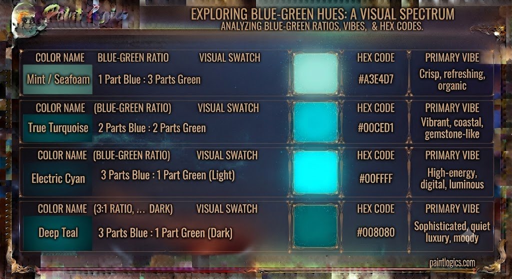
To see how these shades transition based on their mix ratios and digital values, take a look at this reference chart:
| Color Name | Blue to Green Ratio | Hex Code | Primary Vibe |
| Mint / Seafoam | 1 Part Blue : 3 Parts Green | #A3E4D7 | Crisp, refreshing, organic |
| True Turquoise | 2 Parts Blue : 2 Parts Green | #00CED1 | Vibrant, coastal, gemstone-like |
| Electric Cyan | 3 Parts Blue : 1 Part Green (Light) | #00FFFF | High-energy, digital, luminous |
| Deep Teal | 3 Parts Blue : 1 Part Green (Dark) | #008080 | Sophisticated, quiet luxury, moody |
What Happens When You Add White, Black, or Gray?
Altering the value of your base blue-green mixture allows you to adapt it to any design theme or illustrative lighting condition.
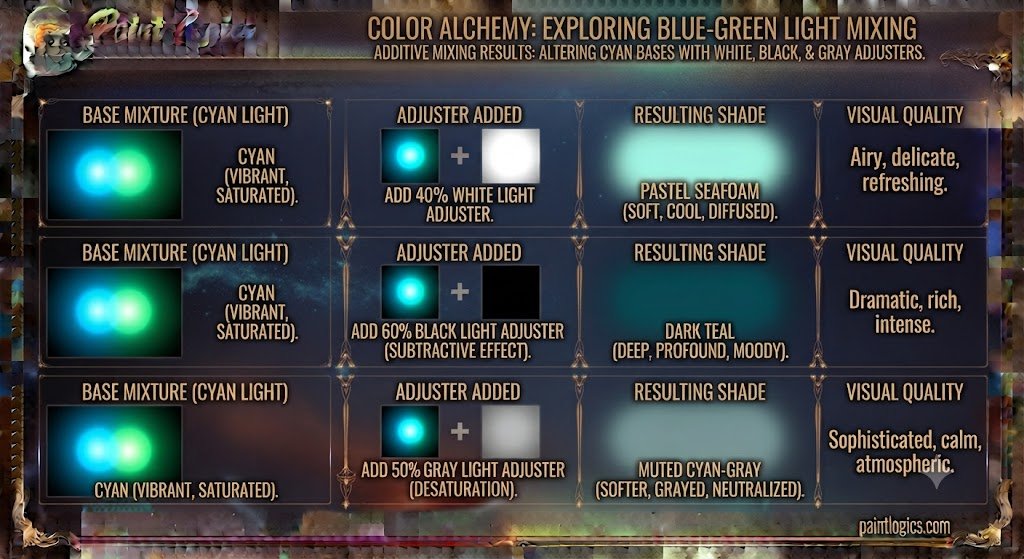
Another thing worth knowing is how basic neutral adjusters shift your custom mix:
- Adding White: This expands the pigment mix to create soft pastels like robin’s egg blue, mint green, or light seafoam.
- Adding Black: This swallows the light reflection, instantly dropping your bright turquoise down into a moody, sophisticated deep ocean tone or midnight teal.
- Adding Gray: This tones down the vibrant saturation, turning a loud tropical color into a smoky, dusty blue-green that looks highly modern and understated.
Emotions and Symbolism of Blue-Green Shades
Blue-green shades carry a unique psychological weight because they combine the calming properties of blue with the life-giving properties of green.
What Blue-Green Represents:
- Tranquility and Peace: These tones mimic the appearance of clear tropical waters, instantly lowering heart rates and evoking vacation-like relaxation.
- Growth and Vitality: Because of the green component, these mixes represent natural energy, renewal, and fresh starts.
- Sophistication: Darker variations like teal feel incredibly rich, conveying a sense of deep wisdom, luxury, and professional balance.
Blue-Green in Art & Design
This color group is highly versatile and frequently serves as a core focal anchor across multiple industries.
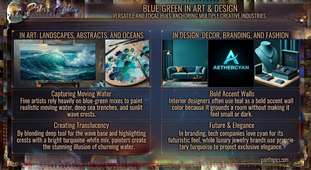
In Art: Landscapes, Abstracts, and Oceans
Fine artists rely heavily on blue-green mixes to paint realistic moving water, deep sea trenches, and sunlit wave crests. By blending a deep teal for the base of a wave and highlighting the crest with a bright turquoise-white mix, painters create the stunning illusion of translucent, churning water.
In Design: Decor, Branding, and Fashion
Interior designers often use teal as a bold accent wall color because it grounds a room without making it feel small or dark. In branding, tech companies love cyan because it feels futuristic, while luxury jewelry brands use proprietary turquoise shades to project exclusive, high-end elegance.
Creating Digital Blue-Green Shades
If you are a web designer or digital illustrator, dialing in the perfect blue-green requires a firm grasp of hexadecimal color values.
Best RGB and HEX Codes
For a quick, foolproof design setup, use these industry-standard hex values:
- Electric Cyan: HEX #00FFFF | RGB (0, 255, 255)
- Classic Turquoise: HEX #40E0D0 | RGB (64, 224, 208)
- Deep Teal: HEX #008080 | RGB (0, 128, 128)
How to Make Custom Blue-Green
In software like Photoshop or Illustrator, open your color picker and slide the hue bar directly to the border between blue and green (around 180 degrees). To make it feel more custom and high-end, slide your picker slightly away from the pure edge and pull it toward the gray or black quadrants to add maturity to the hue.
Color Palette Ideas That Pair Well with Teal or Cyan
Think of a pristine coral reef. Teal pairs beautifully with warm peach, dusty terracotta, and soft cream tones, as the rich warmth of these shades provides a stunning, high-contrast frame for the cool blue-green center.
What Colors Go Well With Blue-Green?
Building a cohesive palette around your newly mixed blue-green tones is easy when you follow classic color harmony rules.
Complementary Colors
The absolute complementary opposite of blue-green on a professional color wheel is red-orange. Pairing a deep teal with an earthy terracotta or burnt coral creates a vibrant, high-contrast dynamic that feels balanced and warm.
Analogous Colors
For a calming, low-contrast look, pair your blue-green with its immediate neighbors: pure blue, soft green, and deep indigo. This creates a cohesive, oceanic palette that is incredibly easy on the eyes.
Triadic and Tetradic Palettes
A triadic palette matches blue-green with rich purple and warm yellow-orange, creating a playful, artistic energy. A tetradic setup utilizes a four-corner approach, balancing blue-green and blue with their exact opposites, red-orange and orange, for a highly structured look.
Conclusion
To bring it all home, blue and green make what color, teal, or turquoise. Because these two cool colors sit right next to each other on the color wheel as analogous partners, they blend together effortlessly to create refreshing, organic shades that capture the exact essence of natural oceans and bright digital spaces alike.
The secret to mastering this beautiful blend lies in managing your color medium, keeping an eye out for hidden red undertones that cause accidental muddiness, and adjusting your ratios incrementally. Whether you are mixing heavy-body acrylics for a coastal landscape, coding a modern website layout, or picking a bold new jacket for your wardrobe, utilizing the blue-green family adds instant energy, freshness, and professional balance to your work.
You Might Also Like:
- Red and Orange Make What Color? Complete Mixing Guide
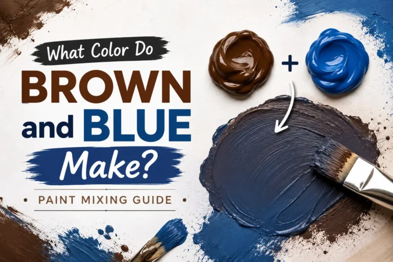
- What Color Do Brown and Blue Make? Paint Mixing Guide
FAQs
Does blue and green make turquoise or cyan?
Yes, they make both! The exact name depends on your medium and ratio. Equal parts of paint mixed with a touch of white yield gemstone turquoise, while blending pure blue and green light digitally produces bright cyan.
Why does my blue-green mix look muddy or gray?
This happens because your starting blue paint likely has a hidden red undertone (like Ultramarine Blue). Red is the complement of green, so that tiny touch of red acts as a third primary wheel component, neutralizing your vibrant mix into a dull gray.
Is blue-green a warm or cool color?
It is firmly a cool color. Both blue and green sit on the icy, calming side of the color spectrum, making their mixture highly refreshing and cool to look at.
Can I make seafoam or mint by mixing blue and green?
Yes. To get these soft shades, start with a large base of titanium white paint, add a medium green, and fold in a tiny pinpoint of blue until it softens into a pastel seafoam.
Is blue-green a secondary or tertiary color?
It is a tertiary color. It is mixed by combining a primary color (blue) with an adjacent secondary color (green).
Can I use food coloring to mix blue and green in baking or crafts?
Yes, absolutely! Liquid food coloring mixes beautifully. Just add two drops of green to a single drop of blue in your frosting or water to hit a gorgeous tropical teal.
Can I mix blue and green to get emerald or jade green?
Not quite. Emerald and jade are highly green-dominant shades. To achieve them, you need to start with a pure green base and add a tiny touch of dark yellow or a micro-drop of blue to deepen it, rather than blending them equally.
What is the best ratio to mix blue and green for teal?
The best starting ratio for a deep, rich teal is 3 parts blue to 1 part green, adjusted with a tiny speck of black or dark brown to give it that trademark sophisticated depth.
How do I mix blue-green colors in watercolor?
Start with a wet puddle of Phthalo Green on your mixing tray and slowly stroke in wet Cobalt or Phthalo Blue. Let the water spread the pigments naturally on your paper for a beautiful, transparent aquatic gradient.
Can I mix blue and green with colored pencils or markers?
Yes. With colored pencils, lightly layer your green base down first, then gently cross-hatch your blue pencil directly over the top to blend the wax layers visually.
Can I make turquoise without green paint?
Yes, you can! Since green is made of blue and yellow, you can simply mix a large pool of bright blue paint with a tiny, controlled drop of primary yellow to create a stunning turquoise from scratch