Red and Orange Make What Color? Complete Mixing Guide
If you’ve ever wondered “red and orange make what color,” you’re not alone. It is one of the most common questions for artists looking to capture the perfect fiery glow of a crackling fireplace, designers building a high-energy brand, or home decorators wanting a warm, welcoming entryway.
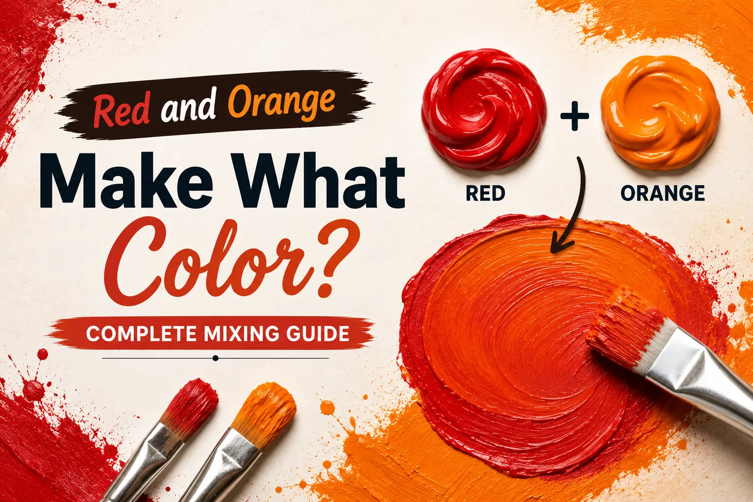
The direct answer is simple: when mixed together in physical paint, red and orange combine to make a vibrant, high-energy tertiary color known as red-orange, scarlet, or vermilion.
However, the final result isn’t always identical every single time you sweep them together. The exact shade you get depends heavily on the specific undertones of your red base, whether you are using a yellow-dominant or red-dominant orange, and the precise mixing proportions. Understanding how these two high-intensity warm colors interact gives you complete control over your warm-toned palettes. In this guide, you’ll learn the exact color theory behind this blend, how different paint pigments behave when crossed, and how to utilize these radiant tones across various mediums.
Main Takeaway:
Primary Red + Secondary Orange = Red-Orange / Scarlet (varying in intensity and warmth depending on the mixing ratios and pigment undertones).
Quick Answer: What Do Red and Orange Make When Mixed?
When you combine red and orange together on your palette, you produce a brilliant tertiary shade called red-orange. Because both parents sit side-by-side on the warm half of the color wheel, they merge smoothly to create a transition color that retains the high visual energy of both pigments.
Why does this happen? The reason is simple: orange is a secondary color created by mixing yellow and red. Adding more red to an existing orange simply shifts the chemical and visual balance further toward the red end of the spectrum, intensifying the hue without introducing any neutralizing colors.
Imagine you’re painting a dramatic desert sunset. If you take a standard pool of medium orange and slowly stir in a dollop of pure crimson red, the orange darkens and deepens instantly. It transitions away from a simple citrus color and turns into a blazing, rich scarlet that radiates heat off the canvas.
Why Do Red and Orange Make This Color?
To get a grip on this mixture, you have to look at how light wavelengths interact when these pigments collide. Both colors share a massive structural overlap because they are built from red light waves.
This happens because neither paint contains any blue or green wavelengths, which are the traditional cool pigments that neutralize warm colors. Since there are no competing cool wavelengths to cause a muddy gray downshift, the red and yellow light waves reflect back to your eyes in perfect, high-intensity harmony.
Here’s a good example: if you mix a cool Alizarin Crimson with a bright Cadmium Orange, the tiny hint of blue inside the cool red slightly tempers the orange’s yellow energy. This yields a highly sophisticated, deep vermilion rather than a flat, chalky peach. Artists use this behavior to create smooth transitions in fire, autumn leaves, and glowing embers.
What Happens When You Mix Different Shades of Red and Orange?
The specific tubes of paint you pull from your studio box dictate the ultimate outcome of your mixture. Subtle pigment shifts change the energy of your mix completely.
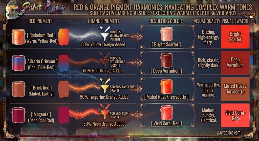
Now let’s look at how different starting variations interact on the mixing tray:
| Red Pigment | Orange Pigment | Resulting Color | Visual Quality |
| Cadmium Red (Warm, Yellow-Red) | Yellow-Orange (Amber) | Bright Scarlet | Blazing, high-energy, fiery |
| Alizarin Crimson (Cool, Blue-Red) | Red-Orange (Burnt) | Deep Vermilion | Rich, classic, slightly dark |
| Brick Red (Muted, Earthy) | Tangerine Orange | Muted Rust / Terracotta | Warm, earthy, highly organic |
| Magenta (Deep Cool Red) | Neon Orange | Vivid Coral-Red | Modern, punchy, electrical |
Common Mistake: Mixing a cool, purple-leaning red with a highly muted, brown-leaning orange. The conflicting undertones will muddy the clean fiery look, leaving you with a dull rust instead of a vibrant scarlet. Matching your temperature goals is key.
Red and Orange in Paint: RYB (Red, Yellow, Blue) Color Model
In the traditional RYB color model used by painters, red is a primary color and orange is a secondary color. When you combine them, you are physically mixing a primary with its neighboring secondary, which mathematically yields a tertiary color.
This happens because physical paint relies on subtractive color mixing. Every pigment particle you add to the wet mix acts as a tiny physical filter that absorbs specific light waves. Because red and orange both let warm yellow and red light pass through while absorbing cool blues, the resulting red-orange paint layer stays incredibly bright and clean.
Imagine you are using heavy-body acrylics to paint autumn foliage. By blending Cadmium Red Medium directly into Cadmium Orange on your canvas, you create a seamless, glowing transition that mimics the natural color shifts of maple leaves under direct sunlight.
Red and Orange in Digital Media: RGB vs. CMYK
Understanding your medium is the only way to avoid frustrating surprises when moving your artwork from a computer screen to physical print.
RGB Model (Additive Mixing):
Digital displays operate on the additive RGB model, where colors are created by projecting light directly into your eyes. Think of a phone screen: red-orange is made by running the red sub-pixels at absolute full power while running the green sub-pixels at roughly half power. When you mix red light and orange light on screen, the display actually becomes brighter and more luminous because you are adding physical light energy to the system.
CMYK Model (Subtractive Mixing):
The CMYK system governs commercial printing presses and home inkjets. Because printing ink is highly transparent, laying down red and orange requires layering specific percentages of Magenta and Yellow inks on white paper. If the printer is not calibrated correctly, the yellow can easily overpower the magenta, turning your brilliant vermilion book cover into a flat, orange-heavy coral.
How the Ratio of Red to Orange Affects the Final Color
Adjusting the balance of your mixture allows you to control the exact visual weight and temperature of your tertiary tone.
Let’s look at how shifting the proportions of your pigments changes what you see:
- More Red than Orange (e.g., 75% Red, 25% Orange): This formula drives the mix straight into a classic scarlet. The orange works to warm up the red, taking away any cool pink undertones and leaving behind a brilliant, rich tomato red.
- Equal Parts (50% Red, 50% Orange): This creates a balanced, true red-orange. It sits perfectly on the fence between both parent colors, feeling highly energetic and balanced.
- More Orange than Red (e.g., 25% Red, 75% Orange): This yields a deep, reddish mandarin or tangerine color. The red acts as an anchor, giving the light orange a dramatic boost in saturation and structural weight.
Pro Tip: Always add your dark red paint in tiny, controlled increments into your orange base. Red has a very high tinting strength and can easily overpower a light orange if you dump too much in at once.
Artistic Uses of Red and Orange Together
This analogous color pairing is highly prized across various creative fields because it creates a sense of heat, passion, and natural beauty.

In Art:
Fine artists use red and orange layers to paint convincing fires, suns, and dramatic light sources. By utilizing a deep vermilion for the core shadow of a flame, a bright red-orange for the body, and pure yellow for the highlights, painters create the realistic illusion of flickering heat and light.
In Fashion:
In clothing design, pairing red and orange together is a classic, high-contrast trend that exudes absolute confidence. Think of a bright scarlet trench coat styled over an orange silk slip dress. It creates a bold, warm statement that feels highly intentional, modern, and sun-kissed.
In Interior Design:
Interior designers use these warm tones to bring a cozy, inviting energy to active spaces like kitchens, dining rooms, and entryways. A dining room styled with a muted terracotta wall, complemented by burnt orange linen chairs and warm wood accents, makes the entire space feel incredibly social and warm.
How to Adjust the Mix: Add White, Black, or Yellow
You can easily steer the mood of your red-orange mixture by using small amounts of specific color adjusters.
That’s where many beginners get confused; you don’t need to throw away a muddy paint pile. Just follow these simple adjustment rules:
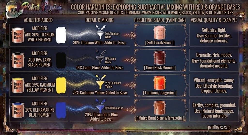
- White: Adding a splash of white paint lifts the value instantly, turning your fiery red-orange into a soft, tropical coral or warm peach-pink.
- Black: Introduce a pinpoint edge of black to swallow up the light reflection. This transforms your bright scarlet into a deep, moody brick red or rich mahogany shadow.
- Yellow: Folding in a drop of primary yellow pulls the mixture back toward the yellow side of the color wheel, turning a deep red-orange into a bright, golden amber.
Mixing Red and Orange with Other Colors
Once you have your base red-orange mixture sitting on your palette, dropping in a third color component allows you to cross over into completely different color families.
Here’s how a third variable shifts the entire balance of your warm mix:
Red + Orange + Yellow
The yellow supercharges the warmth of the entire system, driving your red-orange straight into a brilliant, sun-baked apricot or bright tropical gold.
Red + Orange + Blue
Because blue is the complementary opposite of orange, adding it triggers a massive neutralization process. This three-part mixture results in a highly sophisticated, smoky brown or deep, muted plum gray.
Red + Orange + White
The white spreads the dense pigment molecules apart, smoothing the intense flame into a beautiful, creamy peach or soft coral pastel.
Red + Orange + Black
Adding black absorbs the bright warm light waves, pulling the brilliant scarlet down into a moody, sophisticated terracotta or dark chocolate-rust shade.
Red + Orange + Green
Green contains blue and yellow. The blue component fights the red while the yellow boosts the orange, resulting in a unique, organic olive-brown or dark khaki color.
Red + Orange + Purple
Purple introduces cool blue-red light waves to the mix. This combination delivers a highly complex, exotic burnt magenta or rich burgundy that looks incredibly luxurious.
Red + Orange + Gray
The gray absorbs the pure saturation of the warm tones, transforming your bright red-orange into a dusty, sophisticated clay or muted rose-rust neutral.
Red + Orange + Pink
Pink brings a mix of red and white to the party. Adding it to red-orange creates a beautiful, luminous flamingo pink or warm coral-rose shade.
Red + Orange + Tan
Tan is a light, warm neutral. Mixing it with red-orange creates a soft, earthy terracotta-cream or warm sand color that looks highly rustic and inviting.
Conclusion
To wrap things up, red and orange make what color, vermilion, or scarlet. Because these two hot colors sit right next to each other on the color wheel and share a massive red foundation, blending them together simply creates a smooth, harmonious transition that radiates warmth, energy, and professional depth.
The entire secret to mastering this fiery blend lies in starting with your lighter orange paint as your main base, introducing your dark red pigment in small, controlled steps, and respecting your color temperatures. Whether you are illustrating a scenic desert sky, styling a confident runway look, or picking a warm accent color for your home, utilizing this vibrant mixture adds instant passion, balance, and organic luxury to your creative projects.
Love To Read More Orange and Pink Make What Color? Coral Mixing Guide
FAQs – Red and Orange Color Mixing
What color do red and orange make when mixed?
They combine to form a vibrant, high-energy tertiary color known as red-orange, scarlet, or vermilion.
Can I create a vibrant red-orange color from red and orange?
Yes, absolutely! By mixing a warm, yellow-leaning Cadmium Red into a bright, pure orange, you will create a highly saturated, fiery red-orange.
How does adding white affect the red and orange mix?
Adding white lifts the value and diffuses the intense pigments, softening the bright scarlet into a beautiful coral or warm peach pastel.
How can I make the color darker?
The most efficient way is to drop in a microscopic touch of black paint or a bit of raw umber, which lowers the reflectivity and turns the mix into a deep brick red.
Can I make a bright, golden color with red and orange?
Not on their own, as they are too red-dominant. However, if you add a generous amount of primary yellow to the mix, it will transition into a beautiful, warm golden amber.
What’s the difference between vermilion and scarlet?
So what’s the difference? Vermilion is a highly traditional, slightly deeper red-orange pigment that carries historical mineral depth, whereas scarlet is a slightly brighter, high-vibrancy orange-red that sits closer to pure red.
What do I get if I mix red, orange, and blue?
Because blue and orange are complements, the blue cancels out the orange’s brightness, leaving you with a highly sophisticated, smoky plum-brown or dark slate neutral.
How do I make a more vibrant, fiery orange?
Start with a pure primary yellow base and pull in tiny, controlled drops of warm red paint until it flashes into a brilliant, clean orange.
Can I use red and orange in interior design?
Yes. They are spectacular for creating warm, cozy, and highly social spaces like dining rooms, kitchens, or entryways when balanced with neutral creams and natural wood tones.
How do red and orange mix in digital design?
On a digital screen using the RGB light model, they project a highly luminous, bright warm-orange light rather than a creamy paint pastel.
Can I create a deep, rich orange with red and yellow?
Yes. By starting with a large pool of yellow paint and gradually blending in a small touch of warm red, you will manufacture a beautiful, deep secondary orange from scratch.
What’s the best way to use red and orange together in fashion?
High-contrast color-blocking—such as pairing a bold scarlet tailored blazer over an energetic orange slip dress—is an excellent way to create a modern, confident statement.