What Color Do Red and Pink Make? Mixing Guide
If you’ve ever wondered “red and pink make what color,” you’re not alone. It is a highly common question among artists refreshing their palettes, graphic designers looking for a bold statement, and homeowners selecting a vibrant accent for an interior space.
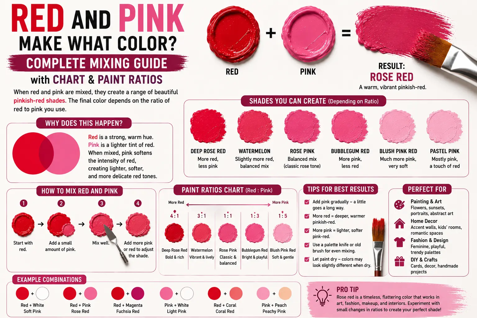
The direct answer is simple: when mixed together in physical paint, red and pink combine to make a deeper, richer pink or a vibrant red-pink hybrid, such as raspberry, rose, or magenta.
However, the final result isn’t always identical every time you sweep your brush through them. The exact shade you get depends heavily on whether your red has warm or cool undertones, the opacity of your starting pink, and the exact proportions of each color in your mix. Understanding how these closely related tones interact allows you to dial in beautiful, balanced gradients without making your palette look muddy or washed out. In this guide, you’ll learn the exact color mechanics of this blend, how to modify the results with other pigments, and how to use these hues effectively across different design mediums.
Main Takeaway:
Base Red + Starting Pink = Rich Magenta / Raspberry (varying based on the base undertones and the exact mixing proportions).
Quick Answer: What Do Red and Pink Make When Mixed?
When you mix red and pink together on a palette, you create a deeper, highly saturated pink or a slightly lightened, intense red. Because pink is structurally just a tint of red (red mixed with white), combining them doesn’t create an entirely new color family; instead, it shifts the value and intensity of the red pigment.
Why does this happen? The white pigment already locked inside the pink acts as a light-scattering agent when it meets the pure red. Instead of creating a muddy mess, the two colors blend smoothly because they share the exact same underlying warm light wavelengths, producing a highly luminous mid-tone.
Imagine you’re painting a vibrant floral piece and need a shadow color for a soft peony petal. If you take a dollop of true medium pink and fold in a stroke of classic red, the pale shade deepens instantly. It shifts away from a soft pastel and turns into a striking, juicy raspberry tone that catches the eye.
Why Do Red and Pink Make This Color?
To truly master your palette, you need to look at how these pigments interact chemically and visually. Pink is created when white paint breaks apart the dense, light-absorbing power of red molecules. When you reintroduce pure red back into that mix, you are simply increasing the concentration of red pigment relative to the white base.
This happens because the extra red particles swallow up more green and blue light waves, which reduces the light-scattering effect of the white. As a result, the mixture gains a massive boost in visual depth while retaining the smooth, creamy consistency of a tinted paint layer.
Here’s a good example: if you mix a cool Alizarin Crimson red with a soft bubblegum pink, the cool blue undertones inside the crimson combine with the white to create a brilliant, clear rose tone. Artists often use this exact behavior to transition from deep, shadowy areas of a canvas into bright, high-contrast highlights without losing color harmony.
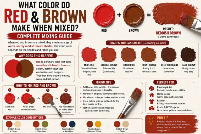
Read More: What Color Do Red and Brown Make When Mixed? Complete Mixing Guide
How Does the Ratio Affect the Final Shade?
The balance between your two starting colors completely dictates the weight and mood of the final blend.
So what’s the difference? If your mix is dominant in red, the white inside the pink will barely soften the edges, turning the pigment into a bright cherry or watermelon red. On the flip side, leaning heavily on the pink side yields a deep, punchy hot pink that feels modern and highly energetic.
What Happens When You Mix Different Shades of Red and Pink?
The specific tubes of paint you pull from your supply box carry distinct chemical personalities that will completely alter your mixing results.
Explaining the Results:
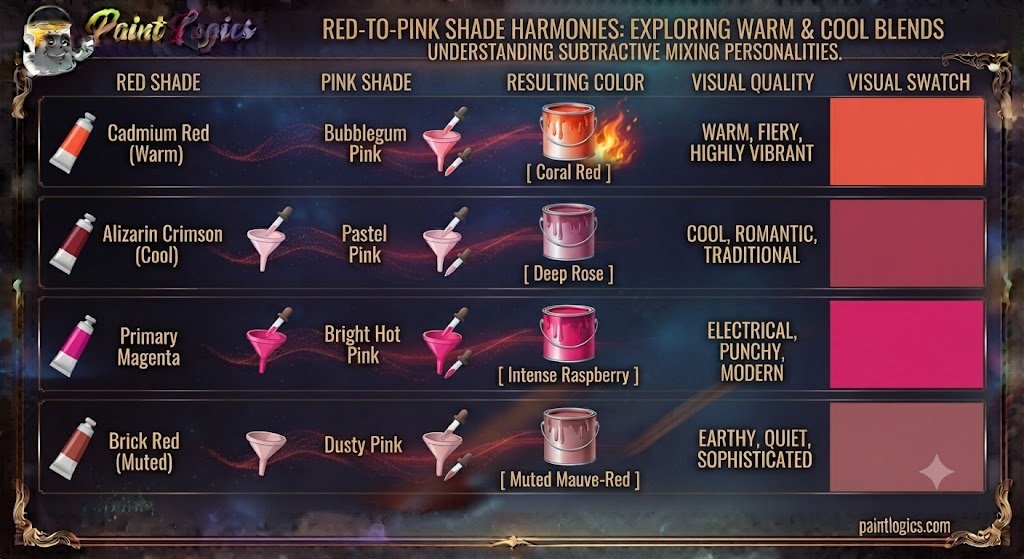
To help you visualize how these different combinations behave when blended in equal portions, take a look at this comparison chart:
| Red Shade | Pink Shade | Resulting Color | Visual Quality |
| Cadmium Red (Warm) | Bubblegum Pink | Coral Red | Warm, fiery, highly vibrant |
| Alizarin Crimson (Cool) | Pastel Pink | Deep Rose | Cool, romantic, traditional |
| Primary Magenta | Bright Hot Pink | Intense Raspberry | Electrical, punchy, modern |
| Brick Red (Muted) | Dusty Pink | Muted Mauve-Red | Earthy, quiet, sophisticated |
Common Mistake: Many beginners grab a warm tomato red and mix it with a cool, blue-toned pink, expecting a clean violet. Instead, the conflicting yellow and blue undertones muddy the water, resulting in a dull, brick-like coral. Matching your color temperatures is the secret to keeping your mixes clean.
Color Theory and Models for Red and Pink Mixing
Color mixing changes completely depending on whether you are working with physical liquids, digital screen pixels, or commercial printing inks.
RYB (Red, Yellow, Blue) – Subtractive Color Mixing
The traditional RYB model is what you use when working with physical paints on a canvas. In this subtractive system, adding red to pink increases the amount of red light absorbed by the paint film. The resulting color is always darker and more intense than the starting pink because you are physically removing light reflection from the surface.
RGB (Red, Green, Blue) – Additive Color Mixing
Digital screens operate on the additive color model, where colors are created by projecting light directly into your eyes. Think of a phone screen: pink is made by running the red sub-pixels at full power alongside lower green and blue levels. If you add more digital red light to this mix, the green and blue components are overwhelmed, causing the screen to jump directly into a brilliant, fiery red.
CMYK (Cyan, Magenta, Yellow, Black) – Subtractive Color Mixing
The CMYK system governs commercial printing presses and standard home inkjets. In this setup, pink is achieved by printing a sparse pattern of magenta dots on white paper, allowing the paper to shine through. Flooding that same area with solid red ink completely covers those gaps, yielding a deep, saturated berry tone that looks rich on glossy paper packaging.
How the Ratio of Red to Pink Affects the Final Color
Adjusting your mixing proportions allows you to smoothly travel across an incredibly wide spectrum of values and intensities.
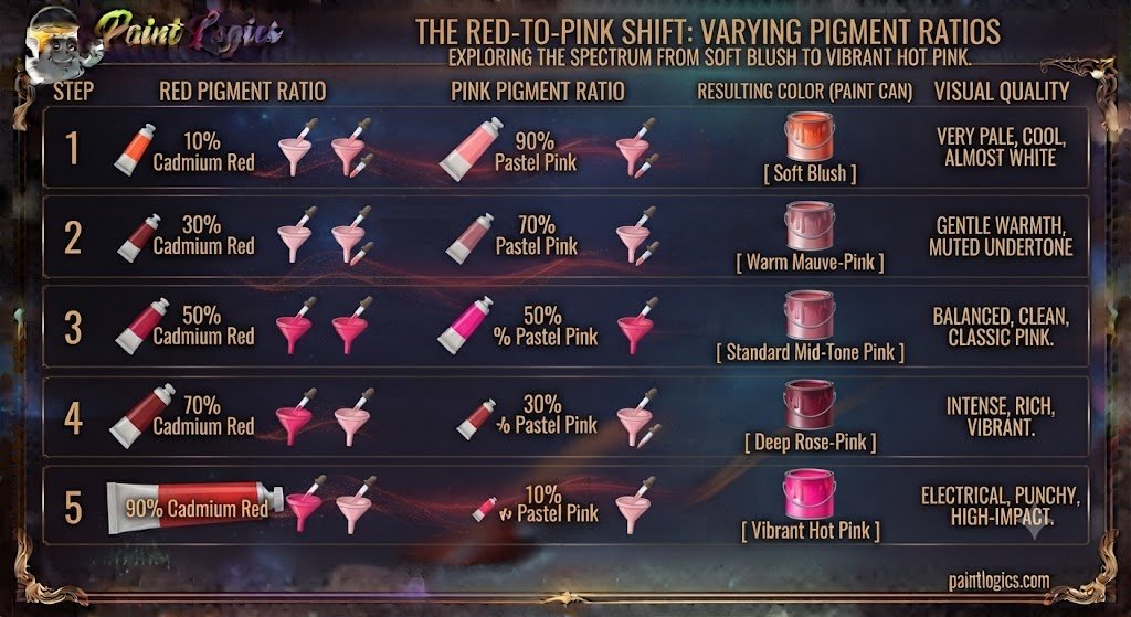
Explanation of the Results:
Let’s break down exactly how modifying the weight of your pigments shifts your results on the mixing tray:
- More Red than Pink (e.g., 80% Red, 20% Pink): This creates a slightly softened, luminous crimson or strawberry red. The small touch of pink cuts the harshness of the pure red, making it look incredibly rich and velvety.
- Equal Parts (50% Red, 50% Pink): This combination lands you squarely in a beautiful, classic rose or medium raspberry shade. It balances the depth of the red with the playful brightness of the pink perfectly.
- More Pink than Red (20% Red, 80% Pink): This formula supercharges your pink, driving it straight into a brilliant, high-impact hot pink. The red acts as an anchor, giving the pale pink a dramatic boost in saturation.
Another thing worth knowing is that it’s always safer to add your dark red into your light pink base. Dark pigments can overwhelm a light color in seconds, wasting a lot of material if you have to correct it later.
Mixing Red and Pink with Other Colors
Once you have your base red and pink mixture sitting on your palette, dropping in a third color component allows you to steer the hue into entirely different color spaces.
Red + Pink + Yellow
Adding a splash of bright yellow introduces warm, high-energy wavelengths to the mix. The yellow pulls the pinkish undertones forward, transforming the blend into a stunning, sun-kissed coral or rich peach-orange. Think of a tropical sunset or fresh grapefruits.
Red + Pink + Blue
Tossing a clean blue pigment into the pool drops the color temperature instantly. The blue combines with the red foundations to create a beautiful, rich plum or a deep orchid purple. Pro Tip: Use a cool blue like Ultramarine to keep this purple looking incredibly clean and vibrant.
Red + Pink + White
Introducing extra white paint spreads the dense pigment molecules apart even further. This neutralizes the aggressive red tones, smoothing the entire mixture into a soft, romantic pastel pink or a delicate cotton-candy shade. It is an exceptional choice for soft backgrounds.
Red + Pink + Black
Adding a tiny pinprick of pure black paint swallows up the ambient light reflection, stripping away the sweet, playful nature of the pink. This moves the color directly into a deep maroon, dark wine, or sophisticated burgundy shade that carries great visual weight.
Red + Pink + Purple
When you blend purple into your red and pink mix, you are reinforcing the cool, blue side of the spectrum. This combination delivers a majestic, deep magenta or intense fuchsia tone that looks highly regal. Imagine expensive velvet drapery or exotic orchids.
Artistic Uses of Red and Pink Together
This closely related, analogous color pairing is highly prized across various creative fields because it creates a sense of vibrant harmony without visual clashing.

In Art:
Fine artists use red and pink layers to generate believable three-dimensional volume in their subjects. By using deep red for the shadows, a medium raspberry for the mid-tones, and a soft pastel pink for where the light hits directly, painters can make a rose petal or a silk dress look incredibly realistic and tangible.
In Fashion:
In the fashion world, color-blocking red and pink is a classic, high-contrast trend that exudes confidence and modern energy. Think of a bright red tailored blazer paired over a hot pink silk blouse. It creates a bold, fashion-forward statement that feels playful yet completely intentional and sophisticated.
In Interior Design:
Interior designers often use this pairing to bring warmth and romance into a residential space. A bedroom styled with a deep rose-colored accent wall, accented by soft blush pink throw pillows and blankets, creates a layered, monochromatic look. The varying values keep the room from feeling flat while making the space feel incredibly cozy and inviting.
Conclusion
To wrap things up, red and pink make a deeper pink, raspberry, or rose color. Because pink is simply a lighter tint of the red family, combining them boosts the saturation and depth of your mixture, creating a beautifully rich, warm tone instead of a muddy mess.
The secret to mastering this vibrant combination is simple: pay close attention to your color ratios, match your undertones to prevent unwanted muddiness, and always add your red paint in small, controlled steps into your pink base. Whether you are painting a dramatic canvas, styling an eye-catching outfit, or designing a bold room layout, utilizing this harmonious blend adds instant energy, warmth, and professional depth to your creative projects.
Read More: Brown and Pink Make What Color? Mixing Guide with Swatches
FAQs – Red and Pink Color Mixing
What color do red and pink make when mixed?
They combine to form a richer, more saturated pink or a slightly softened red, yielding beautiful shades like raspberry, deep rose, or magenta.
Can I create a vibrant pink with red and pink?
Yes, absolutely! Mixing a bright primary red into a generous base of light pink will supercharge the mixture, turning it into a high-impact hot pink.
How does adding white affect red and pink?
White lifts the value and expands the light scattering, softening your deep raspberry mix into a gentle pastel pink or light blush tone.
What colors can I mix with red and pink to create a softer shade?
Adding a touch of pure white or a tiny drop of a warm cream paint will instantly tone down the intensity, creating a soft, romantic hue.
How do I make red and pink darker?
The most efficient way is to drop in a tiny pinpoint of black paint or a touch of raw umber, which lowers the reflectivity and turns the mix into a deep burgundy.
Can I create purple with red and pink?
Not on their own, because neither color contains blue wavelengths. However, if you stir a clean blue paint into your red and pink mix, it will transition into a rich purple.
What’s the best use of red and pink in fashion?
High-contrast color-blocking—such as pairing a bold crimson skirt with an energetic fuchsia top—is an excellent way to create a modern, confident statement look.
How can I make a pastel version of red and pink?
Start with a large pool of pure white paint on your mixing tray, then pull in a very tiny smudge of your red and pink mixture until it turns into a soft cotton-candy shade.
What happens when I mix red, pink, and purple?
They blend harmoniously into an incredibly deep, rich magenta or vivid fuchsia tone because they all share closely related warm and cool undertones.
Can red and pink make a soft color for a nursery?
Yes. If you lean heavily on the pink side and dilute it with plenty of white paint, you will get a beautiful, calming blush or dusty rose that is perfect for a nursery.
Can I create coral from red and pink?
Yes, but you will need to add an extra component. Stirring a small splash of primary yellow into your red and pink mix will inject the warmth needed to turn it into a beautiful coral.
Is it possible to make maroon from red and pink?
Yes. To transform your bright red and pink mix into a moody maroon, you simply need to introduce a small amount of black or dark brown paint to pull the value down.