Green and White Make What Color? Light Green Mixing Guide
If you’ve ever wondered “green and white make what color,” you’re not alone. It is an incredibly common experiment on the studio palette, whether you’re trying to recreate a soft spring leaf, mix up a subtle hue for a bedroom accent wall, or design a clean look for a modern brand.
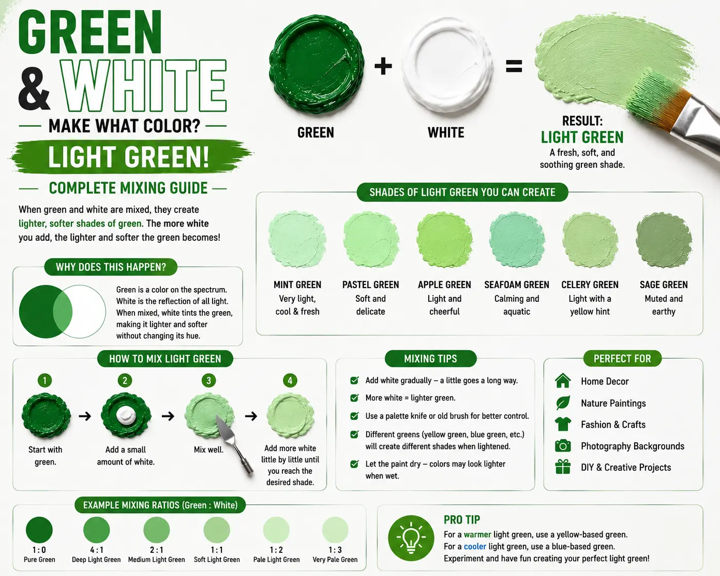
The direct answer is simple: when mixed together in physical paint, green and white combine to make a lighter tint of green, such as mint, pastel green, or a soft sage.
However, the final result isn’t always identical every time you mix them. The exact shade you get depends heavily on the starting green’s temperature, the specific type of white pigment you use, and the blending ratios you choose. Understanding how these two tones interact allows you to build refreshing, professional color schemes with absolute control. In this guide, you’ll learn exactly how to manipulate these tones, mix highly sought-after shades, and avoid the chalky mistakes that ruin many palettes.
Main Takeaway:
Base Green + Opaque White = Lighter Green Tint (varying from bright mint to dusty sage depending on the source undertones and mixing proportions).
What Happens When You Mix Green and White?
When you combine green and white in a physical medium like acrylic or oil paint, you create a lighter, less intense version of your original green, structurally known as a tint. Instead of changing the core hue itself, the white particles open up the color, making it look softer and highly reflective.
Why does this happen? The reason is simple: white pigment does not contain any chromatic color information, meaning it cannot shift green toward yellow or blue on the color wheel. Instead, it acts as a light scattering agent that bounces ambient light waves back to your eyes, lowering the color’s saturation.
Imagine you’re painting a landscape and need a highlight color for a sunlit meadow. If you start with a dollop of a deep forest green and fold in a clean titanium white, the heavy darkness breaks apart instantly. It shifts away from a deep shade and turns into a beautiful, airy pastel green that breathes life into your canvas.
General Results of Mixing Green and White:
By adjusting your ratios, you can hit a wide spectrum of light values. The overall trend always results in a highly soothing, readable tone that feels much less aggressive than a pure, saturated primary or secondary color.
Mixing Light Green and White: What Color Does This Make?
Combining a green that is already bright with white paint yields a highly luminous, energetic tint that looks clean and refreshing.
This happens because the starting light green already reflects a high level of yellow or white light waves. When you introduce pure white to this base, you push its reflectivity to its absolute limit, stripping away its remaining weight.
Resulting Color:
The mixture transitions straight into a bright mint or an ice-green shade. Imagine the color of refreshing peppermint ice cream, retro mid-century kitchen appliances, or standard surgical scrubs.
Mixing Dark Green and White: What Color Does This Make?
When you take a heavy, deep forest green and introduce white, the darkness gives way to a highly sophisticated, complex mid-tone.
Why does this happen? Dark greens usually carry dense blue or black undertones that absorb light heavily. The white paint effectively uncovers these hidden elements, softening the tone without washing it out completely.
Resulting Color:
The outcome is a gorgeous, dusty sage or a classic seafoam green. Think of dried eucalyptus leaves, high-end linen upholstery, or the muted green found on traditional military utility jackets.
The Influence of Different Green Tones on the Mixture
The specific tube of green paint you choose from your art supply box completely dictates the personality of your lighter tint. Subtle pigment differences alter the end product completely.
Yellow-Green and White:
Yellow-green is an incredibly warm, high-energy hue that looks like fresh spring growth. When white hits it, it turns into a soft pistachio or lime-cream color.
The reason is simple: the white paint preserves the high-wavelength yellow light while taming its aggressive brightness. Imagine soft neon highlighters or a classic key lime pie.
Blue-Green and White:
Blue-green paint carries a cool, deep oceanic undertone. Mixing this base with white unlocks a beautiful, refreshing turquoise or dark mint pastel.
This happens because the white spreads the dense teal particles apart, allowing the clean blue waves to shine through clearly. Think of tropical beach water or vintage porcelain teacups.
Olive Green and White:
Olive green is a muted earth tone packed with brown and yellow undertones. Adding white shifts it into a beautiful, organic khaki or light clay neutral.
This combination works beautifully because the white desaturates the heavy mud tones, transforming a swampy shade into a quiet, premium neutral. Imagine elegant linen trousers or modern Scandinavian interior design.
How to Mix Green and White for Specific Shades
Hitting a precise target color requires a careful workflow, as white paint can quickly overpower or dull your mixtures if handled poorly.
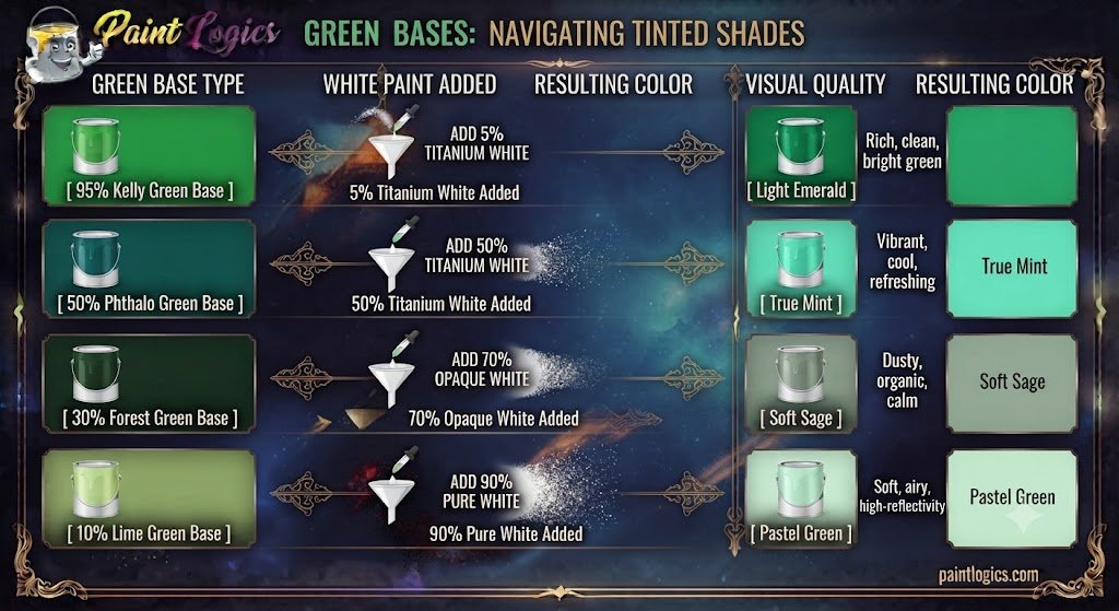
Now let’s look at a quick mixing comparison chart to see how varying proportions affect your final paint color:
| Green Base Type | White Paint Added | Resulting Color | Visual Quality |
| 95% Kelly Green | 5% Titanium White | Light Emerald | Rich, clean, bright green |
| 50% Phthalo Green | 50% Titanium White | True Mint | Vibrant, cool, refreshing |
| 30% Forest Green | 70% Opaque White | Soft Sage | Dusty, organic, calm |
| 10% Lime Green | 90% Pure White | Pastel Green | Soft, airy, high-reflectivity |
Adjusting for Lighter Green:
If your mixture looks too dark or heavy, you need to lift its value carefully. The best way to do this is to add more white paint, but do it in tiny, separate increments rather than dumping a massive pile into your main mix.
Adjusting for Darker Green:
That’s where many beginners get confused. If your mix becomes too chalky or pale, simply adding more dark green paint back into the pool can waste a lot of material. Instead, adding a pinprick of the original source pigment or a tiny drop of raw umber will restore depth without ruining the hue.
Mixing Green, White, and Other Colors: What Color Do They Make?
Once you have your base green and white tint ready, dropping in a third color component allows you to cross over into completely different color families.
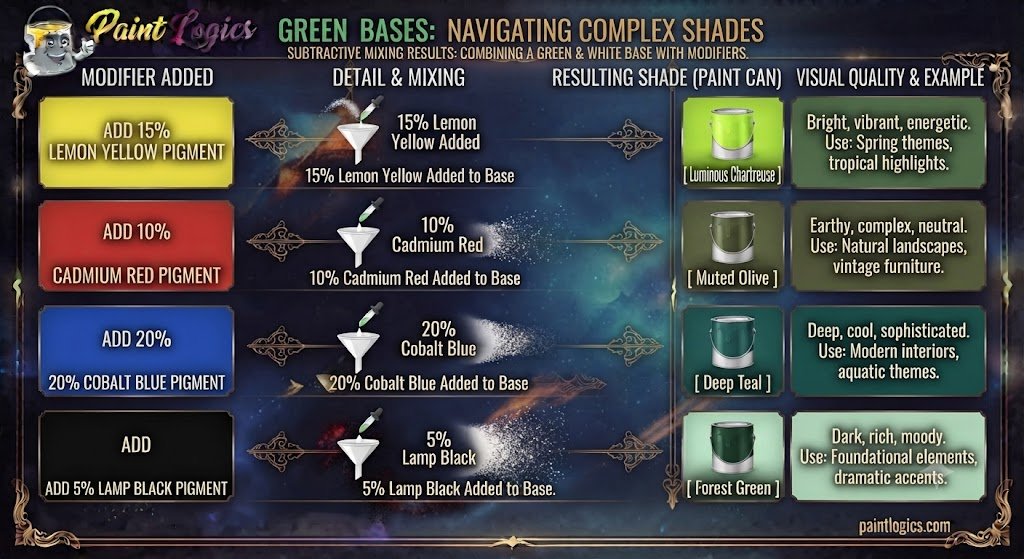
Here is what happens when you introduce a third color variable into your active mixture:
Green, White, and Yellow
Adding a splash of bright yellow into your mixture transforms a flat pastel into a sun-kissed grass green or soft chartreuse. The yellow injects immediate warmth and high energy. Think of new spring buds or tennis balls.
Green, White, and Red
Because red is the direct complement to green on the color wheel, adding it cancels out the green’s identity. This three-part mixture results in a highly sophisticated, muddy slate gray or a dusty taupe neutral.
Green, White, and Blue
Tossing a clean blue pigment into the pool pulls your tint straight into a beautiful seafoam or cool teal pastel. The blue drops the color temperature significantly, making it feel deeply serene and airy.
Green, White, and Purple
Purple brings a mixture of red and blue wavelengths into the mix, which creates a highly complex, smoky lavender-green or a muted heather shade. This is an exceptional shadow color for fine art painters.
Green, White, and Orange
Orange infuses both yellow warmth and a touch of red contrast into the tint. This combination creates a beautiful, desaturated olive-tan or warm olive khaki that looks highly rustic.
Green, White, and Pink
Pink is simply a mixture of red and white. Introducing it to your green and white base neutralizes the vibrancy, creating a very delicate, dusty rose-earth tone that mimics natural stone minerals.
Green, White, and Black
Adding a microscopic grain of pure black paint to your green and white mix takes away the chalky pastel shine, transforming the color into a highly practical, modern gunmetal green or slate tone.
Practical Applications of Green and White in Design

This clean, natural combination is heavily utilized across multiple creative fields because it evokes an immediate sense of freshness and calm.
Interior Design
Interior designers treat soft green tints like sage and mint as the ultimate secret weapon for spaces meant for relaxation. Painting a bathroom or bedroom wall in a soft sage green paired with crisp white trim creates an instant spa-like environment. The white trim reflects daylight, making the room feel open and clean, while the green provides a soothing link to nature.
Fashion
In the apparel industry, pastel greens and white form the foundation of classic spring and summer wardrobes. Think of a crisp white linen shirt paired with soft mint trousers, or a sage green summer dress accented with white leather sandals. This color scheme looks universally flattering, looks clean under direct sunlight, and feels incredibly breezy.
Art
Fine artists use green and white mixtures to build realistic depth in foliage and landscapes. Instead of using pure green out of the tube, layering soft green highlights over deep shadows creates a highly convincing illusion of sunlight filtering through a forest canopy.
Color Psychology: What Does Green and White Represent?
Colors carry a massive subconscious weight that impacts how people feel when they step into a room or interact with a brand logo.
Green Color Psychology
Green is heavily associated with growth, health, renewal, and stability. Because human eyes are biologically tuned to detect a massive variety of green shades in nature, it is a color that promotes physical relaxation and lowers stress levels.
White Color Psychology
White represents absolute purity, clarity, simplicity, and cleanliness. It provides a visual clean slate that clears away mental clutter and makes any design layout feel spacious and organized.
Combined Meaning
When you combine them, you get a psychological profile that screams wellness, balance, and organic luxury. It feels completely approachable, making it a highly successful choice for medical centers, organic skincare packaging, and wellness retreats.
How to Adjust the Mix: Add Other Colors
If your standard green and white mixture feels a bit too flat or boring, you can easily shift its mood by using specific color adjusters.
Another thing worth knowing is that a tiny adjustment goes a long way when working with light tints:
- Add Yellow: If your mint green looks too cold or sterile, folding in a drop of primary yellow will immediately warm it up, turning it into a delicious pistachio shade.
- Add Black: To take away the bright “baby nursery” feel of a pastel green, introduce a pinpoint edge of black paint. This grounds the color, turning it into a sophisticated slate.
- Add Blue: If you want a crisp, icy look that mimics cold water, stir in a touch of ultramarine blue to steer the mixture toward a rich turquoise pastel.
Best Color Combinations with Green and White
To make your lighter green tones pop with professional energy, try pairing them alongside these proven companion colors:
Green and White with Gray
This creates a highly modern, minimalist aesthetic. The gray cools down the green, making it look incredibly sleek and architectural.
Green and White with Yellow
This combination delivers a joyful, high-energy punch. It feels highly welcoming, making it perfect for cheerful kitchen spaces or children’s branding.
Green and White with Brown
This is the ultimate organic, forest-inspired palette. The brown anchor pulls the light green back down to earth, feeling incredibly rich and authentic.
Green and White with Blue
This pairing mimics the soothing colors of a coastal beach. It offers a deeply tranquil, cohesive look because green and blue are naturally harmonious neighbors.
Green and White with Pink
This delivers an elegant, high-end botanical look. The contrast between soft pink floral tones and organic green creates a beautiful visual balance.
Green and White with Black
This provides a sharp, high-contrast, contemporary feel. The black anchors the space, preventing the soft green from looking too pale or weak.
Conclusion
To wrap things up, green and white make mint, pastel green, or sage. Because white paint functions as a light-reflecting engine rather than a color shifter, adding it to a green base simply opens up the pigment particles, lowering their intensity and creating a refreshing, peaceful tint.
The secret to mastering this clean combination is simple: always start with a clean white paint base if you want to make a very light pastel, introduce your green pigment in tiny, controlled steps, and pay close attention to whether your base green carries warm yellow or cool blue undertones. Whether you are painting a misty outdoor meadow, styling a refreshing summer outfit, or picking a calming wall color for your next home project, utilizing this natural blend adds instant freshness, balance, and organic beauty to your creative work.
Read More: Brown and Yellow Make What Color? Color Mixing & Uses
FAQs – Green and White Color Mixing
What happens when you mix green and white?
They combine to create a lighter tint of the original green, reducing its saturation and making it look softer and much more reflective under light.
What color does green and white make when mixed?
Depending on your starting green and proportions, they create beautiful shades like mint, pastel green, or a soft sage.
Can mixing green and white create a mint color?
Yes, absolutely! If you start with a clean, slightly cool green (like Phthalo Green) and blend it into a generous base of white paint, you get a perfect mint green.
What color do I get if I mix yellow-green and white?
You will create a highly warm, cheerful tint that looks identical to pistachio cream or a soft lime pastel.
How do I mix dark green and white for a lighter shade?
Start with your white paint pile first, then pull a tiny corner of your dark forest green into it using a palette knife until it softens into a rich, dusty sage tone.
What is the result of mixing green, white, and yellow?
The yellow injects immediate warmth, shifting your light pastel green into a vibrant, sunlit chartreuse or bright clover-cream color.
Does adding white to green make it lighter?
Yes, it lifts the value and reflectivity significantly by spreading the color pigments apart, creating what color theory defines as a tint.
What color does green, white, and red make?
Because red and green are complementary opposites, adding all three together cancels out the colors, leaving you with a highly sophisticated slate gray or dusty earth neutral.
What is a good combination with green and white in fashion?
Pairing a sage green wool sweater with crisp white linen pants and soft brown leather boots creates a gorgeous, high-end look that feels completely timeless.
Can I mix green and white with black for a darker shade?
Yes. Adding a tiny prick of black to your green and white base strips away the sweet pastel look, turning it into a smoky, mature gunmetal green.
What other colors go well with green and white in interior design?
They harmonize beautifully with natural wood browns, warm metallic brass fixtures, and soft charcoal grays to create a clean, modern sanctuary look.
How do I make a mint green with white and green?
Take a large pool of titanium white, add a small dot of bright kelly or phthalo green, and mix thoroughly. If it looks too warm, add a microscopic touch of blue to snap it into a true, icy mint.