How to Choose the Right Paint Color for Any Room: A Step-by-Step Guide

Almost everyone has stood in front of a wall of paint swatches feeling more confused than when they started. Hundreds of near-identical chips, names that tell you nothing, and the nagging fear of committing to four walls of the wrong color. The good news: choosing a paint color is a process, not a talent. Follow these steps in order and you will narrow a thousand options down to one you can trust — and you will know how to test it properly before a single wall is painted.
Step 1: Start With the Room, Not the Color Chart
Before looking at any swatches, answer four questions about the room itself. How big is it? Small rooms can carry deep colors beautifully, but a dark color in a small room with little light will feel smaller still. Which way do the windows face? North-facing rooms get cool, bluish light that makes colors look grayer and colder; south-facing rooms get warm light that flatters almost everything. What is the room for? Calm colors support rest and work; energetic colors suit social spaces. And what is staying? Flooring, sofas, curtains, and artwork that are not changing are fixed points your color must live with — bring a photo or a cushion cover when you shop, not just a memory.
Step 2: Find the Undertone
Undertone is the hidden color beneath the obvious one, and it is the number-one reason a “safe gray” turns blue or purple on the wall. Every neutral has one: grays can lean blue, green, or violet; whites can lean warm yellow or cool blue; beiges can lean pink or gold. To spot undertone, compare swatches against a sheet of pure white printer paper — the lean becomes obvious immediately. Then make sure the undertones of your paint, flooring, and fixed furniture agree, or consciously contrast. Most “this color is just wrong” disasters are undertone clashes, not bad colors.
Step 3: Build a Palette, Not a Single Color
Rooms look designed when colors follow a rough proportion: about 60% a dominant color (usually the walls), 30% a secondary color (large furniture, curtains, bedding), and 10% an accent (cushions, art, a painted door or piece of furniture). Use the color wheel to choose the relationship: analogous colors for a calm, layered room; a complementary accent for energy; or a monochromatic range of one hue in different depths for the easiest sophisticated result. Our color theory guide for beginners explains these harmonies in plain language.
Step 4: Respect the Light — Then Test In It
Paint color is not a property of the paint; it is a property of the light bouncing off it. The same color can look fresh in morning daylight and muddy under warm evening bulbs. This is why testing is not optional:
- Buy sample pots of your top two or three colors — never decide from a printed chip alone.
- Paint large samples, at least 30 × 30 cm (about a square foot), on two different walls, or on card you can move around the room.
- Apply two coats and let them dry fully; paint darkens as it dries.
- Look at the samples morning, afternoon, and evening, in daylight and under your actual lamps, for at least a full day.
- Check the samples next to the floor, the largest piece of furniture, and the trim color.
The color that survives all of those viewings is your color. The one that wins only at noon in the shop’s lighting is not.
Step 5: Choose the Finish at the Same Time
Sheen changes how a color reads — glossier finishes make it look deeper. Test and choose color and finish together. As a starting point: matte or eggshell for living rooms and bedrooms, satin for kitchens, bathrooms, and children’s rooms, and semi-gloss for trim and doors. Our paint finishes guide explains the trade-offs room by room.
Special Cases Worth Knowing
Small and dark rooms
Light colors help, but “light” matters less than “clear”. A clean, slightly saturated pale color feels brighter than a dull near-white that turns gray in low light. Painting the ceiling the same color, or one step lighter, removes the visual lid and makes the room feel taller.
Open-plan spaces
Use one main wall color throughout, then differentiate zones with rugs, furniture, and one accent wall or painted feature per zone. Chopping an open space into unrelated colors almost always looks restless.
Rentals and resale
If you may move or sell soon, choose warm, soft neutrals with gentle undertones and save strong colors for accents you can take with you or repaint in an afternoon.
Five Mistakes That Cause Repaints
- Choosing from a tiny chip under shop lighting only.
- Ignoring undertone and clashing with the floor or fixed furniture.
- Painting the sample on one small patch and judging it wet.
- Picking a color that is the same depth as everything else in the room, so nothing has contrast.
- Forgetting the fifth wall — a ceiling in the wrong white can make the wall color look dirty.
Frequently Asked Questions
How many sample colors should I test?
Two or three is the sweet spot. One gives you nothing to compare; six restarts the confusion you were trying to escape.
Should trim always be white?
No. White trim is classic and safe, but trim painted the same color as the walls (in a higher sheen) looks modern and makes rooms feel larger, and dark trim can frame pale walls beautifully.
What if I still cannot decide between two colors?
Choose the one that looked best in evening light. Most people spend their waking home hours under artificial light, and it is the harsher judge.
The Bottom Line
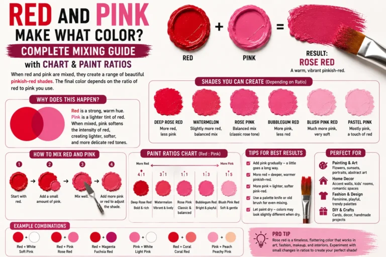
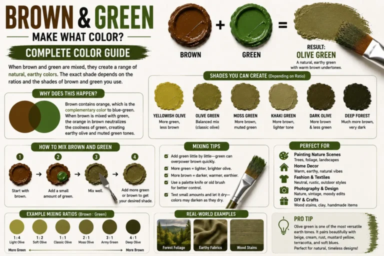
Start with the room and its fixed elements, identify undertones, build a 60-30-10 palette using the color wheel, then test large dried samples in real light for a full day. Do that, and the “risky” decision becomes the most reliable one in the whole project. If you are also mixing a custom color rather than buying one, our color mixing chart will help you hit the shade your samples promised.