Pink and Black Make What Color? Complete Paint Mixing Guide
Ever stared at your palette, brush in hand, wondering what color pink and black make when mixed? You’re not alone. It’s one of those classic “artist’s dilemmas” that can lead to either a beautiful discovery or a muddy mess if you aren’t careful.
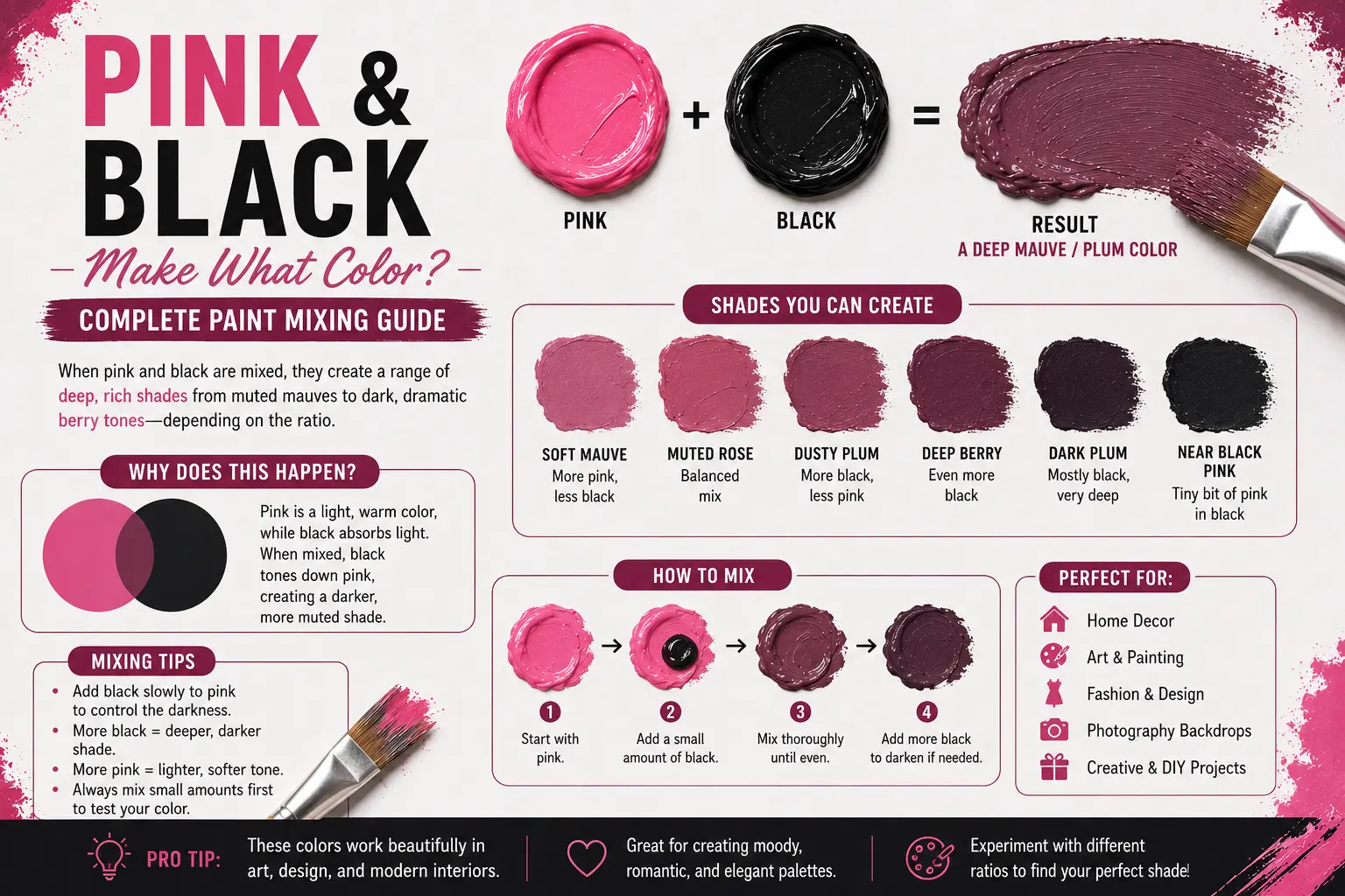
When you mix pink and black, you typically get muted, dusky tones like mauve, deep rose, or soft brownish-gray. It’s rarely a simple “new color” because pink is technically a tint (red plus white), and adding black deepens that tint into a shade. The final result depends entirely on the intensity of your pink and how much black you sneak into the mix.
In this guide, we’re going to walk through the science of these mixtures, how to control your shades, and how to avoid making mud on your canvas.
Quick Answer: What Color Does Pink and Black Make?
At its core, mixing pink and black results in a darkened version of your starting pink. Because pink contains white, adding black doesn’t just create a dark pink; it creates a “shade” that moves toward the gray or brown spectrum.
You’ll often end up with:
- Mauve: If your pink had cool, blue-ish undertones.
- Deep Rose: If your pink was closer to a warm, red-leaning magenta.
- Taupe or Gray-Brown: If you add too much black, neutralizing the vibrancy entirely.
Why Pink and Black Make These Shades
Color theory can feel abstract, but it’s quite logical once you see the mechanics. Pink is essentially a “high-value” color—it’s light and bright. Black, on the other hand, is a “low-value” color that absorbs almost all light.
What Black Does to Color in Paint
When you introduce black to a light color like pink, you are systematically lowering the value. You aren’t just changing the hue; you are changing the saturation and the brightness simultaneously.
Think of it like turning down the volume on a stereo. The sound (the color) is still there, but it becomes deeper and more subdued. If your pink has a strong yellow undertone, the black will react with that yellow to push the mix toward a muted brown. If the pink is cool and blue-based, the black pushes it toward a sophisticated, smoky purple or mauve.
All Possible Shades From Mixing Pink and Black
The variety of outcomes is surprisingly wide. You aren’t limited to just one “dark pink” color.
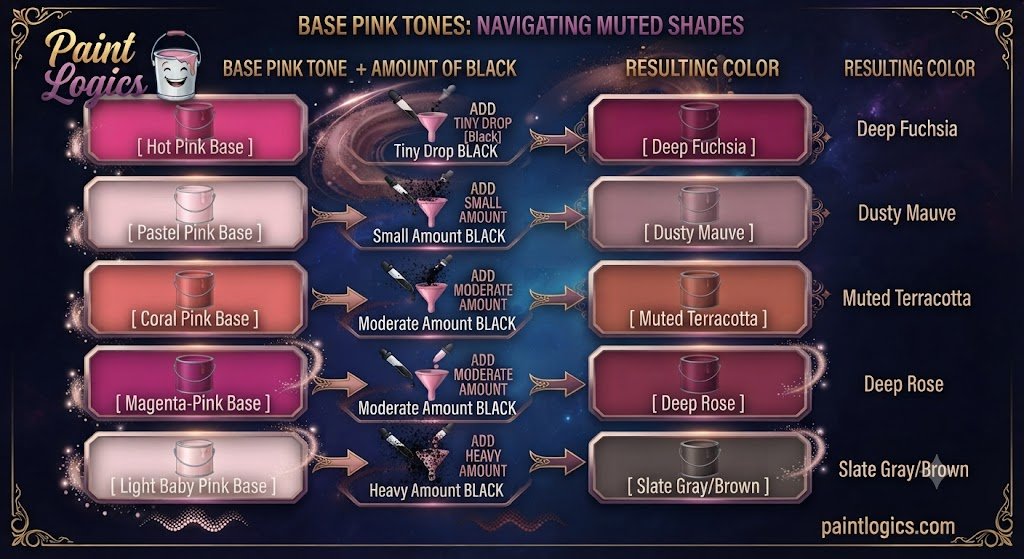
| Base Pink Tone | + Amount of Black | Resulting Color |
| Hot Pink | Tiny Drop | Deep Fuchsia |
| Pastel Pink | Small Amount | Dusty Mauve |
| Coral Pink | Moderate Amount | Muted Terracotta |
| Magenta-Pink | Moderate Amount | Deep Rose |
| Light Baby Pink | Heavy Amount | Slate Gray/Brown |
How Different Pink Variations Affect the Result
Not all pinks are created equal. A “Barbie” pink is chemically different from a “Salmon” pink.
If you start with a cool-toned pink (think bubblegum or fuchsia), the black will interact with the blue undertones. This creates elegant, moody shades like plum or soft mauve. On the flip side, if you start with a warm-toned pink (like coral or strawberry), the black works against those red-orange undertones. This often results in earthy, clay-like, or brownish-rose colors.
Pro Tip: Always swatch your base pink on a piece of paper next to the black paint before you mix them. It helps you see the undertones clearly before you commit to the blend.
Pink And Black in Different Color Models
Understanding how colors behave depends on the “medium” you’re working in. Mixing paint is very different from designing for a website.
1. Subtractive Mixing (Paint & Pigments)
In physical painting, you are subtracting light. Pigments reflect specific wavelengths, and when you mix them, they absorb more light. This is why adding black to pink makes it darker and duller.
2. Digital Mixing (RGB Additive Model)
On a computer screen, things work differently. You aren’t mixing physical pigments; you’re mixing light. If you take a bright pink (High Red + High Blue) and add “Black” (which is the absence of light), you are effectively just darkening the pixel’s output.
3. CMYK & Printing
In printing, you’re using ink. This is a subtractive process similar to painting. If you’re designing a brochure and want a specific dusty pink, you’ll often find that printers use a mix of Magenta, Yellow, and a touch of Key (Black) to hit that perfect muted tone.
What Happens When You Add Other Colors to Pink and Black
Sometimes, pink and black aren’t enough. Adding a third color can “anchor” the mix and prevent it from turning into a muddy gray.
- Pink + Black + White: This creates the classic dusty rose or pale mauve. The white brings back some of the brightness that the black took away.
- Pink + Black + Red: This leans into rich burgundy pink. It’s perfect for shadows in portrait painting.
- Pink + Black + Purple: You’ll get deep plum or berry shades. This is a very luxurious, high-end color combination.
- Pink + Black + Blue: This creates a muted violet or smoky purple.
- Pink + Black + Yellow: This creates a muted peach or brownish tone. Be careful here; this is the quickest way to accidentally create “mud.”
Tips for Mixing Black and Pink Successfully
1. Add Black Slowly
This is the golden rule of painting. You can always add more black, but you can never take it out. Start with a tiny speck of black on your brush and blend it into a larger pile of pink.
2. Test on a Palette First
Never mix directly on your main piece. Keep a scrap piece of canvas or a palette nearby to test the ratio. It’s better to waste a tiny bit of paint than to ruin your entire project.
3. Know Your Pigments
Check the tube! Is your black “Ivory Black” (which has a slightly warm, brownish undertone) or “Mars Black” (which is very opaque and neutral)? Ivory black will produce a warmer, earthier rose, while Mars black will produce a colder, flatter tone.
Real-World Uses of Pink + Black Shades
These colors aren’t just for abstract art. They are highly functional in design.

- Interior & Home Design: Dusty rose combined with charcoal black is a staple in modern, cozy interiors. It feels sophisticated without being overly sweet.
- Fashion & Clothing: Deep rose and mauve are popular in “capsule wardrobes.” They pair beautifully with black leather or denim.
- Graphic & Digital Design: Using muted pinks against black backgrounds creates a high-contrast, edgy aesthetic often used in luxury branding.
Common Mistakes When Mixing Pink and Black
The biggest mistake? Adding too much black too quickly. It’s tempting to want a darker shade immediately, but black is an aggressive pigment. Most beginners end up with a color that’s far too dark or “dead” because they didn’t take the time to blend in small increments. Another common error is forgetting that paint often dries darker than it appears when wet.
Conclusion
Mixing pink and black doesn’t have to be a guessing game. While it’s tempting to think you’ll get a simple “darker version” of your pink, you’re actually opening the door to a world of sophisticated mauves, deep roses, and earthy tones.
Remember: start small, watch your undertones, and don’t be afraid to add a touch of white if things start looking a bit too murky. Whether you’re painting a sunset or designing a logo, treat black as a garnish, not the main ingredient.
Read More Guide’s
#1 What Color Does Brown and Purple Make When Mixed? Complete Guide
#2 Purple and Black Make What Color? Dark Purple Mixing Guide
FAQs
What color do pink and black make when mixed?
They create muted, dusky shades like mauve, deep rose, or brownish-gray, depending on the ratio.
Do pink and black make purple?
Not exactly. If your pink has a strong blue undertone, you might get a cool-toned mauve that looks purple, but it’s technically a muted shade.
Can pink and black make gray?
Yes. If you add enough black to a light or pale pink, it will eventually desaturate the pink so much that it becomes a dark, warm gray.
How do I lighten a too-dark pink + black mix?
Add a little bit of white. This will re-introduce brightness and help you achieve that “dusty” pastel look.
Does digital mixing of pink and black differ from paint?
Yes. Digital mixing uses light (RGB), while paint uses pigment (subtractive). Digital mixing is cleaner, while paint mixing is susceptible to the physical properties of the pigments.
Can pink and black be used in home décor?
Absolutely. It’s a very popular color scheme for creating a moody, sophisticated, and modern atmosphere.
What happens when you mix pink, black, and white?
You get beautiful, soft, dusty rose or muted mauve tones. It’s much easier to control the outcome this way.
Is dusty rose the same as deep rose?
No. Dusty rose usually implies a lighter, more muted, and slightly desaturated shade. Deep rose is usually more vibrant and darker.
Can I mix pink and black hair dyes?
In theory, yes, but proceed with caution. Hair dyes are transparent pigments, and applying a dark mix over light hair can result in unpredictable, patchy results. Always perform a strand test.
What color season suits muted pinks?
Muted pinks and mauves are typically perfect for the “Soft Summer” or “Soft Autumn” color palettes.
Are muted pinks trendy in fashion?
Yes, they are timeless. They appear in almost every seasonal collection because they are easier to wear than bright, neon pinks.
Can pink and black create burgundy?
You can get a very dark, muted burgundy, but it’s usually better to add a touch of red or purple to the mix to get that true, rich burgundy depth.