What Color Do Red, Green & Blue Make? RGB Explained Simply
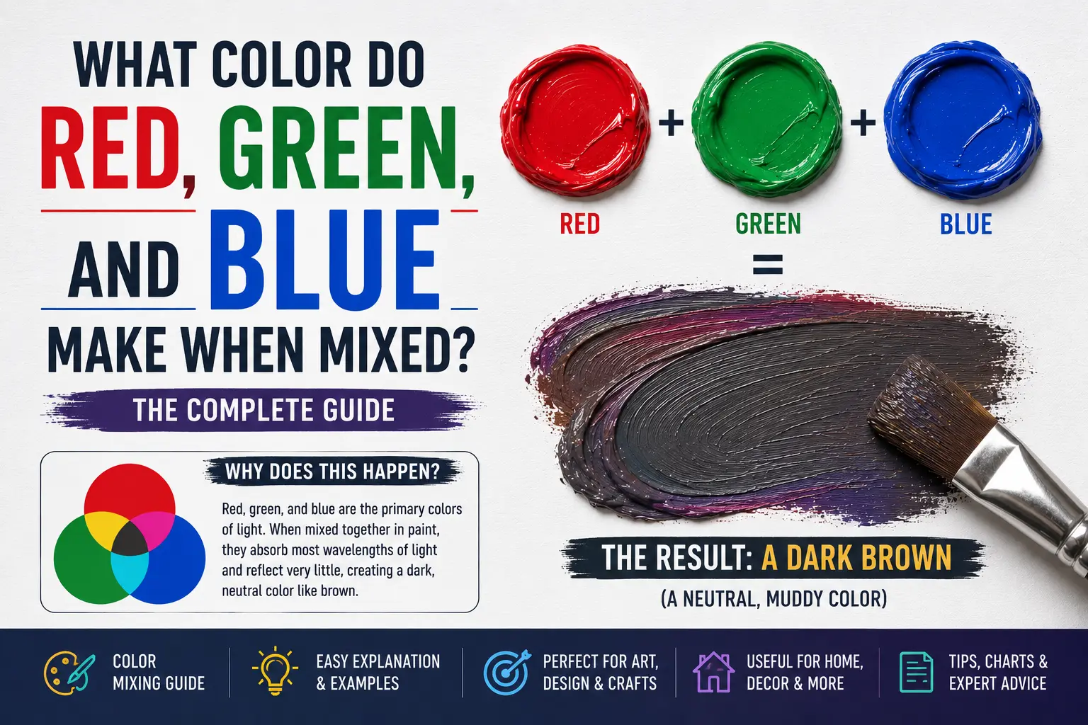
If you’ve ever wondered Red Green and Blue make what color,’ you’re not alone. It’s a trick question that trips up almost everyone because the answer changes completely depending on whether you are holding a physical paintbrush or looking at a digital device.
The direct answer is simple: when mixed as light, red, green, and blue combine to make pure white light.
However, the final result isn’t always that straightforward. If you were to mix these three exact shades using physical acrylic paints or inks, you wouldn’t get white at all—you’d end up with a dark, muddy dark brown or near-black. Understanding how these colors interact depends entirely on the medium you are working in.
Main Takeaway:
Red Light + Green Light + Blue Light = White Light (depending on the mixing medium and the equal intensity of each beam).
Quick Answer: What Color Do Red, Green, and Blue Make?
When you mix red, green, and blue light waves together at maximum brightness, they produce white light. This specific three-color foundation forms the backbone of the digital world, commonly known as the RGB color model.
Why does this happen? Light mixing is an additive process. Instead of soaking up colors like physical paint does, blending light beams overlappingly adds more energy and brightness to the viewable spectrum until it reaches full clarity.
Think of a phone screen or a theater stage light setup. If you blast a pure red spotlight, a vibrant green spotlight, and a deep blue spotlight onto the exact same spot on a wall, the intersection point glows brilliantly clear. The transition from individual colors to a unified bright illumination is the basis of modern display tech.
The Science Behind Mixing Red, Green, and Blue
To master this color trio, you have to split your understanding between light physics and physical liquid pigments. They operate on opposite spectrum rules.
Additive Color Mixing (Light / Digital)
Digital screens, projection systems, and stage lighting use additive mixing. In this system, you start with complete darkness (a black screen) and add colored wavelengths to build up visibility.
How does it work?
Your eyes contain specialized cone receptors that detect red, green, and blue frequencies. When all three frequencies strike your eye from the same source simultaneously, your brain processes the combined stimulation as clean white light. This is why a computer monitor can show a snowy landscape using only tiny red, green, and blue sub-pixels.
How Intensity Affects the Outcome
Varying the brightness of each individual beam changes the final hue instantly. If you keep red and green at full blast but shut off the blue entirely, your brain reads the result as bright yellow. The relative power of each channel dictates the color identity.
Creating Secondary and Tertiary Colors
By adjusting the baseline balances of your primary light sources, you build out the entire visible palette. Blending two primaries equally gives you a vivid secondary color, while adding a third channel in smaller doses creates complex tertiary transitions.
The reason is simple. Red and green light create yellow; red and blue light yield magenta; green and blue light produce cyan. By stepping outside equal values, you can smoothly transition into thousands of shades like orange, violet, and rose.
The Role of Intensity in Color Mixing
Intensity functions exactly like a volume knob for color values. When you lower the intensity of all three channels equally, the white light drops into a neutral gray.
Think of a phone screen dimming its brightness at night. The pixels don’t change their color recipes; they simply lower the energy emission, causing the bright white background to ease safely into a soft, readable gray scale.
Common Colors Created When Mixing Red, Green, and Blue
Varying the digital value sliders from 0 to 255 changes the output dramatically. Here are the most prominent colors created inside the RGB workspace.
1. White Light
White light is the ultimate culmination of the additive color system. It represents the highest energy state where all primary wavelengths are completely present.
This happens because the red, green, and blue color channels are all set to their absolute maximum value of 255. Imagine looking directly at a bright studio flashbulb or an empty browser window.
2. Cyan
Cyan is a brilliant, electric greenish-blue that mimics the look of clear tropical waters. It feels highly modern, synthetic, and digital.
This color occurs when you mix green and blue light at maximum intensity while turning off red completely. Think of futuristic neon signs or high-tech interface designs.
3. Magenta
Magenta is a vibrant, intense red-purple shade that carries an energetic, punchy personality. It doesn’t actually exist as a single wave in the natural light spectrum; your brain invents it when red and blue mix.
This tone comes forward when you blend full red and full blue light channels while leaving the green channel completely dead. Imagine concert stage lighting or flashy digital pop art.
4. Yellow
Yellow light is a sunny, radiant hue that feels warm, inviting, and cheerful.
So what’s the difference between digital yellow and paint yellow? In paint, yellow is a pure primary, but on your computer monitor, it is a secondary color built by stacking full red light and full green light together. Think of a glowing digital sunset or a caution graphic on a website layout.
5. Orange
Orange light is a warm, fiery tone that sits comfortably between red and yellow on the digital spectrum.
This shade occurs when you keep your red light channel at maximum power but scale your green channel back to roughly half power, leaving the blue channel at zero. Imagine the warm glow of a digital fireplace or neon holiday lighting.
6. Greenish Yellow
Greenish yellow is a sharp, acid-toned hue that carries a high-contrast, edgy look. It catches the human eye faster than almost any other combination.
This look happens because your green channel is set to full blast while the red channel runs at a medium-high level. Think of safety vests or tennis balls displayed on a television screen.
What Happens When You Mix Red, Green, and Blue with Other Colors?
Once you have your core red, green, and blue light channels running, introducing an extra color element shifts the display values instantly.
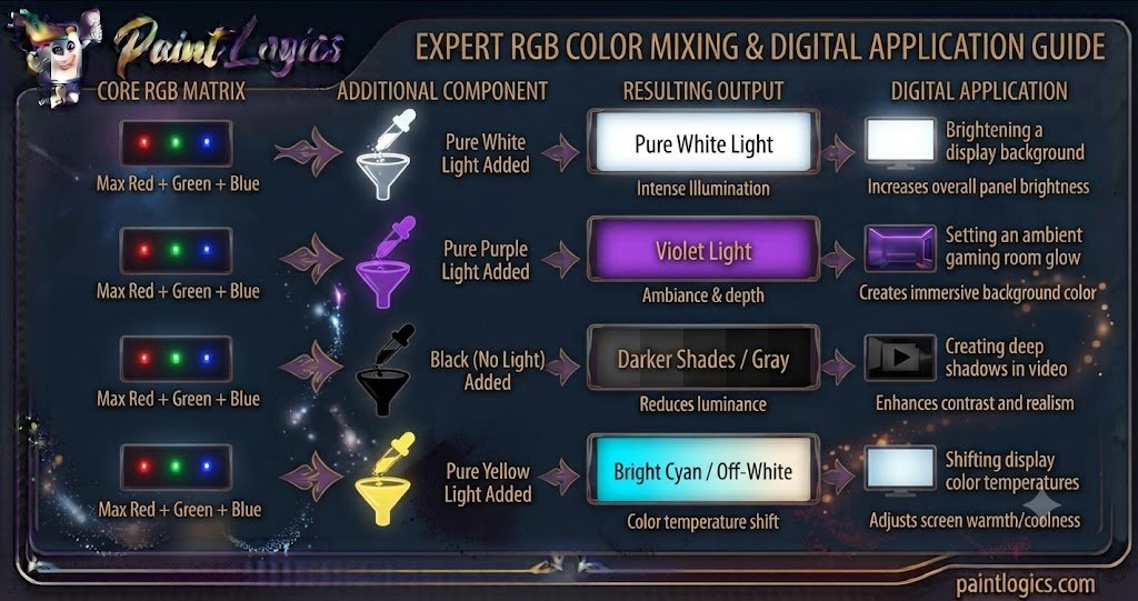
Now let’s look at this digital mixing chart:
| Core RGB Matrix | Additional Component | Resulting Output | Digital Application |
| Max Red + Green + Blue | Pure White Light | Pure White Light | Brightening a display background |
| Max Red + Green + Blue | Pure Purple Light | Violet Light | Setting an ambient gaming room glow |
| Max Red + Green + Blue | Black (No Light) | Darker Shades / Gray | Creating deep shadows in video |
| Max Red + Green + Blue | Pure Yellow Light | Bright Cyan / Off-White | Shifting display color temperatures |
1. Red + Green + Blue + White = White Light (If Balanced)
Adding more white light to a fully saturated RGB mix doesn’t change the color tone; it simply maxes out your screen’s illumination capacity.
The reason is simple. Because red, green, and blue are already creating white, adding more white is just amplifying the existing brightness level until the display hits its absolute output limit.
2. Red + Green + Blue + Purple = Violet Light
When you inject an extra stream of purple light into an active white RGB beam, the balanced neutrality shatters, shifting the environment into a cool violet light.
The extra blue and red wavelengths overwhelm the green light channel, causing the ambient light to take on a soft, neon purple appearance. Think of the modern color schemes used in esports streaming rooms.
3. Red + Green + Blue + Black = Darker Shades
In the additive light system, black isn’t a substance you mix in—it is simply the absence of light energy. Adding black means reducing the power flowing to your color channels.
This happens because lowering the output drops the color value without changing the recipe proportions. Your brilliant white light falls smoothly into a slate gray, and eventually goes completely black when the power hits zero.
4. Red + Green + Blue + Yellow = Bright Cyan
If you take a balanced white light beam and stack an extra layer of yellow light onto it, you pull the mix heavily toward a bright cyan or warm off-white, depending on individual channel balances.
The additional red and green waves from the yellow shift the balance, showing how digital artists lean on secondary colors to tweak the temperature of a white light source.
5. Red + Green + Blue + Orange = Warm Tones
Introducing an orange light source to your balanced primary beam pushes the overall atmosphere into cozy, inviting warm tones.
The red and green values step ahead of the blue channel, mimicking the natural golden hour lighting seen at sunset. Photographers use this mixing method to create flattering skin tones in virtual production studios.
6. Red + Green + Blue + Pink = Light Magenta
Dropping pink light into your active RGB mix yields a beautifully soft, luminous light magenta or pastel rose tint.
The red and white properties buried inside the pink boost the red channel while softening the cold green and blue influences, creating an upscale lifestyle aesthetic often used in modern fashion tech branding.
Using Red, Green, and Blue in Design
The principles of RGB light mixing guide how we display visual media across multiple industries, from runway lights to digital storefront layouts.
Fashion
While clothing relies on subtractive dyes, fashion designers use additive mixing when setting up runway shows or high-end retail display cases.
Bold & Vibrant Fashion
Using high-intensity RGB spotlights on neutral garments makes fabric textures shift color on the fly. A white silk dress can flash from electric cyan to deep magenta with a simple flip of a light board switch.
Earthy Tones for Casual Fashion
By dimming the RGB spotlights and balancing the channels unevenly, lighting designers create warm, muted amber colors that make earthy autumn clothes look richer and more inviting to shoppers.
Interior Design
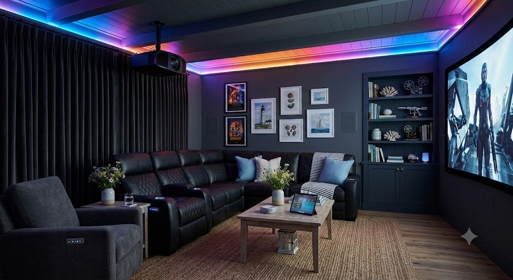
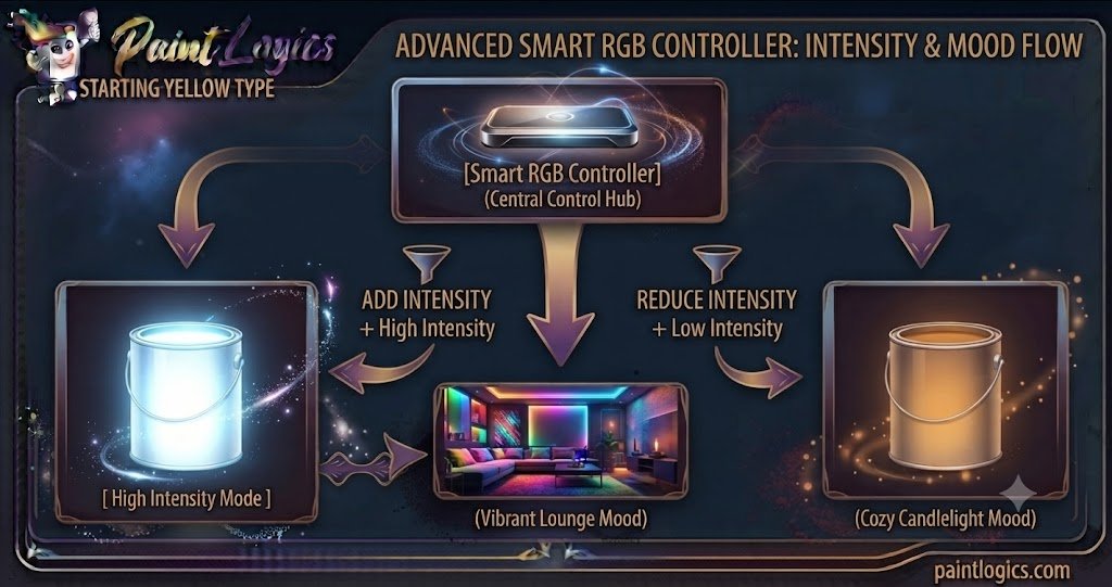
Modern interior designers use smart RGB architectural lighting to rewrite the mood of a physical space instantly.
Bright & Bold Designs
A minimalist white living room can transform into a high-energy lounge space by flooding the walls with saturated red, green, and blue LED light tracks. It allows home owners to change their interior styling without touching a paintbrush.
Muted Earthy Spaces
By pulling down the RGB values toward the lower double-digits, smart home systems create quiet, amber-tinted environments that feel like soft candlelight, perfect for unwinding at the end of the day.
Branding & Packaging
How a brand handles color determines how consumers perceive its value and identity across digital and physical spaces.
Tech and Digital Branding
Software platforms and tech giants rely heavily on bright RGB secondary mixes like cyan and yellow. These colors scream for attention on mobile screens and project a sense of modern, fast-paced innovation.
Eco-Conscious Packaging
When transitioning from screen to paper print layouts, brands must translate their RGB web designs into CMYK inks. Eco-friendly brands use muted, earthy versions of these mixes to highlight sustainability and natural origins on their cardboard boxes.
Tips for Mixing Red, Green, and Blue in Digital Art or Design
If you are working inside programs like Photoshop, Illustrator, or Procreate, mastering your color channels keeps your illustrations crisp and professional.
- Start with Equal Proportions: When you want a perfect neutral background, set your R, G, and B values to the exact same number. Equal values guarantee a clean white, gray, or black without any accidental green or pink color casts.
- Adjusting Intensity for the Desired Color: Treat your values like percentages. If you want a warm skin tone highlight, keep your red value high, drop your green slightly lower, and keep your blue channel near the bottom of the scale.
- Using RGB Sliders in Software: Don’t just guess on the color wheel. Open up your software’s explicit RGB slider input boxes to learn exactly how adding digits to a channel shifts your document’s color profile.
- Create Gradients and Shadows: To paint realistic shadows on a digital screen, don’t just paste flat black paint over your art layer. Instead, lower the RGB values of your base color while slightly adding a cool blue tint to mimic natural atmospheric shading.
- Be Mindful of Over-Saturation: Blasting every channel to full saturation causes digital art to look cheap, amateurish, and exhausting to look at. Balance your bright neon accents with large areas of low-intensity, muted tones to give the viewer’s eyes a place to rest.
Common Mistakes to Avoid When Mixing Red, Green, and Blue
Digital color management is highly precise, and small missteps can ruin an entire design project.
1. Overuse of One Color
This is a classic rookie blunder. Pushing your red channel to maximum value across an entire web layout creates a harsh, aggressive look that causes immediate eye strain.
How to avoid it: Use your intense, single-channel primary colors sparingly as call-to-action buttons or focal highlights rather than background templates.
2. Not Testing the Mix
An RGB color profile that looks stunning on a bright tablet screen might look completely washed out or unreadable when projected onto a wall or printed out on paper.
How to avoid it: Always check your hex color codes across multiple target devices—like a phone, a laptop, and a monitor—before finalizing your design palette.
3. Ignoring Color Brightness
Forgetting that your screen’s illumination level interacts with your color values will cause your shadows to look muddy or your highlights to clip into flat white blocks.
How to avoid it: Keep your eye on your software’s histogram panel to ensure your values stay safely within printable and viewable limits.
4. Forgetting to Adjust the Alpha (Transparency)
If your digital brush strokes look blocky or unnatural when overlaying colors, you are likely forgetting to scale back your brush opacity or alpha channel layer.
How to avoid it: Drop your layer transparency down to small single-digit percentages when blending highlights to let the underlying color channels interact naturally.
Conclusion
To wrap things up, red, green, and blue make white light. When working inside the digital ecosystem, this primary trio functions as the ultimate builder for everything we see on our screens, transitioning into brilliant cyans, punchy magentas, or clean grays depending on individual brightness settings.
The whole secret to mastering this color space lies entirely in remembering that digital colors add brightness as they mix, which is the exact opposite of traditional wet paint palettes. Treat your RGB values like a precise control board to shape light, intensity, and temperature. Whether you are coding a new website layout, painting a digital concept canvas, or configuring smart home lighting, utilizing this powerful trio adds incredible life and professional polish to your creative output.
Read More Guide’s
#1 What Color Does Blue and White Make When Mixed? Complete Guide
#2 Red and Blue Make What Color? The Ultimate Color Mixing Guide
FAQs
What color do red, green, and blue make when mixed?
When mixed together as light waves (additive mixing), they combine to make pure white light. If you mix them using physical paint pigments (subtractive mixing), they create a dark brown or muddy black color.
Can I create other colors by mixing red, green, and blue?
Yes, absolutely. By adjusting the individual brightness levels of these three primary light colors, you can display over 16 million distinct color shades on a modern digital screen.
How do I create purple with red, green, and blue?
To create purple or violet light, turn your red and blue color channels up to a high level while dropping your green channel down to zero or a very low value.
Why do red, green, and blue make white light?
This happens because human eyes have specific light receptors tuned to detect these three precise wavelengths. When all three strike your eye at maximum power simultaneously, your brain interprets the combined signal as white.
How do I make a more vibrant color in RGB mixing?
To maximize vibrancy, keep your primary target channels at full power (255) while stripping away any opposing color channels that might dilute or neutralize the main tone.
How can I mix RGB for digital art?
Open the color palette menu in your digital painting program and use the numerical input fields or sliders to adjust the red, green, and blue mixes until you lock in your desired hue.
Can RGB be used for physical paints?
No, physical paints use the subtractive color model (traditionally RYB or CMYK). Trying to mix red, green, and blue paint tubes will result in a muddy dark brown because physical pigments absorb light instead of emitting it.
What happens if I use more yellow in the mix?
In an RGB light framework, adding yellow means you are increasing the brightness of both the red and green light channels simultaneously, which softens your blue channel and brightens the overall mix.
Can RGB be used for lighting design?
Yes, it is the standard format for modern entertainment spaces. RGB LED fixtures allow stage crews and decorators to change the structural color of a room instantly via digital programming boards.
How do RGB screens display colors?
They use millions of microscopic red, green, and blue light-emitting sub-pixels packed closely together. By changing how brightly each sub-pixel shines, the screen tricks your eye into seeing a seamless, full-color image.
How do I achieve a pure green in RGB mixing?
Set your green channel slider to its maximum limit of 255 while keeping both the red and blue sliders pinned flat at zero.
How does adding black affect RGB mixing?
In digital lighting, black is simply the absence of light. “Adding black” means dialing down the power values of your color channels, which darkens your vibrant hues into deep shadows or grays.