Color Theory for Beginners: A Complete Guide to the Color Wheel
Color theory sounds like something that belongs in an art school, but it is really just a practical map of how colors relate to each other — and it is the single most useful thing you can learn before mixing paint or choosing a wall color. Once you understand the color wheel, you stop guessing. You can predict what two paints will make, know which colors will calm a room down or make it feel alive, and fix a mix that has gone wrong. This guide explains color theory in plain language, step by step, with examples you can use straight away.
What Is Color Theory?
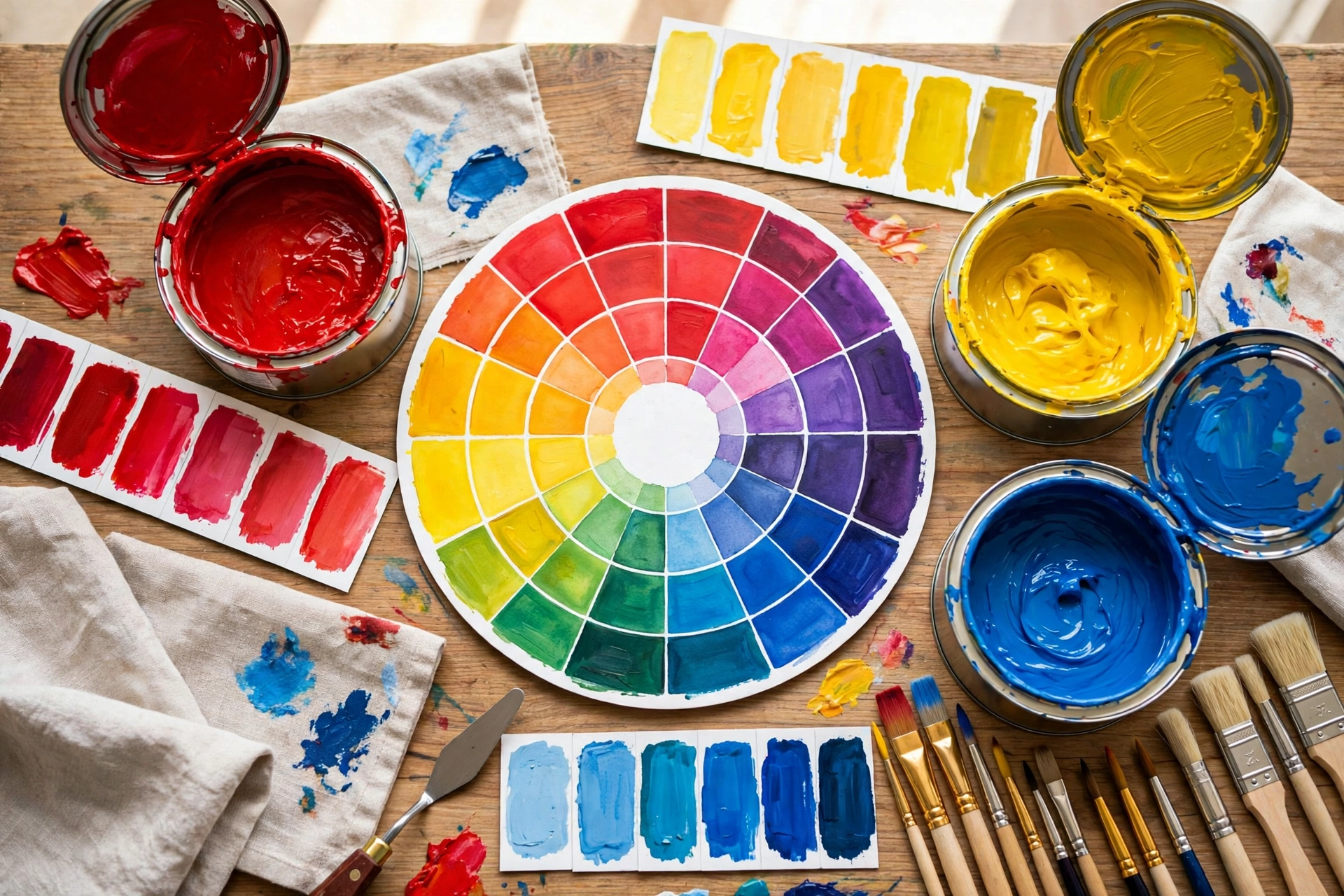
Color theory is the set of principles artists and designers use to understand how colors are made, how they combine, and how they affect each other and the viewer. It is built around the color wheel, a circle that arranges colors in the order they appear in the spectrum. Everything in color theory — mixing, matching, contrast, harmony — starts with where a color sits on that wheel and how far it is from the colors around it.
The Three Primary Colors
Red, yellow, and blue are the primary colors in traditional paint mixing. They are called primary because you cannot mix any combination of other paints to create them, yet mixed together in different pairs and proportions they produce almost every other color. This is why a beginner’s paint set really only needs these three, plus black and white, to mix a surprisingly wide range.
A practical warning: paint primaries are not perfect. Your red may lean slightly orange or slightly purple, and your blue may lean green. That hidden lean, called bias, is why two people following the same recipe can get slightly different results — and why testing on a sample board matters.
Secondary Colors: The First Mixes
Mix two primaries and you get a secondary color:
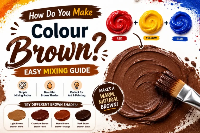
- Red + yellow = orange
- Yellow + blue = green
- Blue + red = purple (violet)
These three secondaries sit exactly halfway between their parent primaries on the wheel. If you want the full detail for any pair — ratios, undertones, and common problems — Paint Logics has a dedicated guide for each one, including what colors make orange and blue and yellow make what color.
Tertiary Colors: Filling the Gaps
Mix a primary with the secondary next to it and you get a tertiary color: yellow-orange, red-orange, red-purple, blue-purple, blue-green, and yellow-green. These in-between colors — amber, vermilion, magenta-leaning purple, violet, teal, and chartreuse — are where most of the colors people actually love to live with are found. Nature and interior design both favour tertiary and muted colors far more than pure primaries.
Hue, Value, and Saturation: Describing Any Color
Three words let you describe — and adjust — any color precisely:
Hue
The hue is the color’s identity: red, green, blue-purple, and so on. It is the position on the wheel. Changing hue means moving around the wheel by adding a neighbouring color.
Value
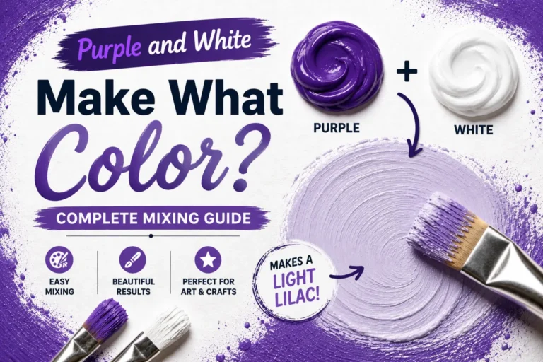
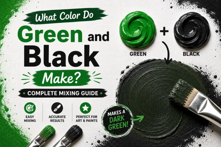
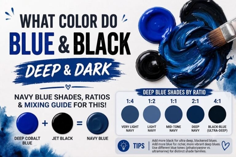
Value is how light or dark a color is. Add white and value rises (a tint); add black and value falls (a shade). Value is the property your eye notices first, which is why a light room feels bigger and a dark accent wall feels closer.
Saturation
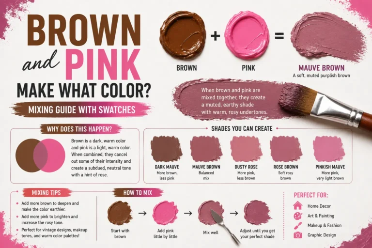
Saturation, also called intensity or chroma, is how vivid or dull a color is. A pure hue straight from the tube is fully saturated. Adding its opposite color on the wheel, or a touch of gray, lowers saturation and produces the muted, sophisticated tones used in most modern interiors.
Complementary Colors: Opposites That Work
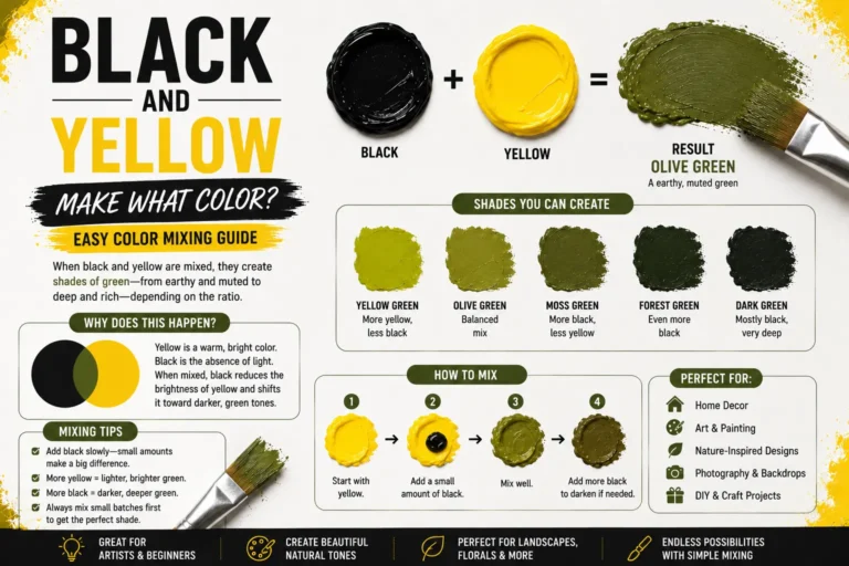
Colors directly opposite each other on the wheel are complementary pairs: red and green, blue and orange, yellow and purple. They do two opposite jobs. Placed side by side, they create maximum contrast and make each other look brighter — think of orange cushions on a blue sofa. Mixed together in paint, they cancel each other out and produce browns and grays. Both facts are powerful tools: one for decorating, one for mixing realistic neutrals.
Color Harmonies: Recipes for Combinations That Work
Analogous
Three colours that sit next to each other on the wheel, such as blue, blue-green, and green. Analogous schemes feel calm, natural, and unified — a safe choice for bedrooms and connected living spaces.
Triadic
Three colors evenly spaced around the wheel, such as red, yellow, and blue, or orange, green, and purple. Triadic schemes are balanced but lively, and work best when one color dominates and the other two act as accents.
Split-complementary
A base color plus the two colors either side of its opposite. This gives strong contrast with less tension than a direct complementary pair, and is one of the easiest schemes to use in a real room.
Monochromatic
One hue in many values and saturations — pale blue-gray walls, mid-blue upholstery, deep navy accents. Monochromatic schemes are almost impossible to get wrong and are ideal if you want a room to feel pulled together.
Warm and Cool Colors
The wheel splits into warm colors (reds, oranges, yellows) that feel energetic and advancing, and cool colors (greens, blues, purples) that feel calm and receding. Warm colors suit social rooms and north-facing spaces that need visual warmth; cool colors suit bedrooms, bathrooms, and sun-drenched rooms that need cooling down. Our separate guide to warm vs cool colors goes deeper into using temperature on walls.
Putting Color Theory to Work
Start any project with three decisions: pick your dominant hue on the wheel, choose a harmony recipe to find its partners, then set the values — mostly light, one or two mid tones, and a small amount of dark for grounding. When mixing paint, use the wheel to predict the result before you open a tin, and use a color’s complement to dull a mix that is too bright instead of reaching for black. Keep a note of ratios that worked; your own tested recipes are worth more than any chart, including our color mixing chart, which is designed as a starting point for exactly these experiments.
Frequently Asked Questions
Do I need to learn color theory to paint a room?
No — but a basic grasp of the wheel, value, and complementary colors will help you choose colors that work together and avoid the most common mistake, which is picking colors that are all the same value and saturation so nothing stands out.
Why did my mixed color turn out muddy?
Usually because the two paints were near-complementary and cancelled each other, or because too many pigments were mixed together. Mixing two paints keeps color cleaner than mixing three or four.
Are the primary colors the same for paint and for screens?
No. Paint uses red, yellow, and blue traditionally (and cyan, magenta, yellow in printing), while screens use red, green, and blue light. That is why a color can look different on your phone than in the tin — our guide to colors that start with A lists hex codes alongside paint guidance to help you translate between the two.
The Bottom Line
Color theory is a map, not a rulebook. Learn the wheel, the three primaries, how tints and shades work, and what complementary colors do, and you will be able to mix with intent, decorate with confidence, and troubleshoot any color that surprises you. The rest is practice — and every test patch teaches you something the wheel alone cannot.