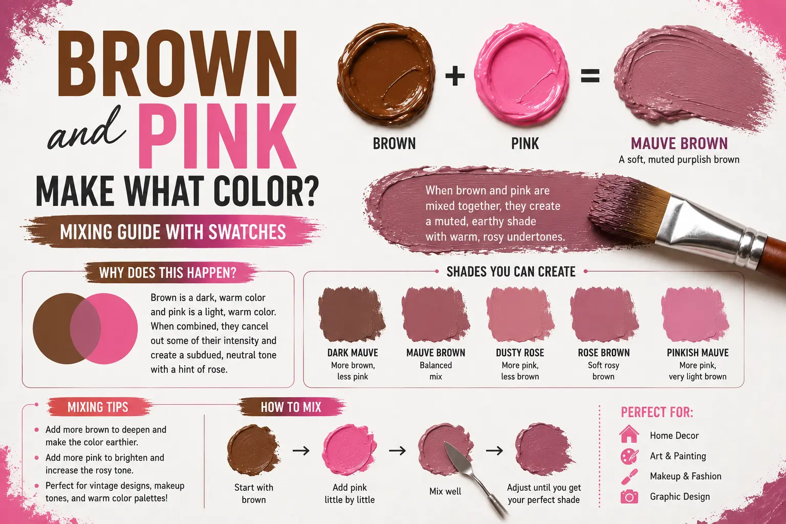
Brown and Pink Make What Color? Mixing Guide with Swatches
If you’ve ever wondered “brown and pink make what color,” you’re not alone. It’s an unusual combination that often pops up when you’re trying to achieve that perfect vintage aesthetic, but the result is almost always more sophisticated than you might expect.
The direct answer is simple: brown and pink make a muted, earthy rose or a soft, desaturated mauve.
However, the final result isn’t always identical. The exact shade you get depends entirely on the temperature of your brown—is it a cool, gray-leaning taupe or a warm, red-leaning umber?—and the intensity of your pink. Understanding how these pigments interact will completely change how you use them in your art, home decor, or even hair color projects.
Main Takeaway:
Earthy Brown + Bright Pink = Muted Mauve / Dusty Rose (depending on the mixing ratio and the base undertone of the brown).
Quick Answer: What Color Do Brown and Pink Make?
When you blend brown and pink, you’re essentially performing a “toning” exercise. Pink is simply a high-value red (red plus white), and brown is a complex mixture of all three primary colors. Adding that earthy brown to your pink acts as a natural desaturator, pulling the color away from a “bubblegum” look and into a more mature, organic realm.
Why does this happen? The pigments inside the brown neutralize the high-energy, candy-like vibration of the pink. Instead of a bright, artificial tint, you end up with a color that feels grounded and natural.
If you add just a splash of brown to a pale pink, you’ll get a soft blush brown or a romantic rosy beige. If you start with a dark, rich coffee brown and stir in a bit of pink, you’ll quickly reach a deep, elegant mauve brown. The shift is incredibly smooth, making it one of the easiest color families to calibrate.
The Science Behind Mixing Brown and Pink
Color behaves differently depending on whether you are working with physical pigments or pixels on a screen. This happens because physical paint and digital light handle light reflections in opposite ways.
Subtractive Color Mixing (Paint & Pigments)
When working with acrylics, house paints, or inks, you’re using subtractive color mixing. Physical pigments reflect certain light wavelengths into your eyes while absorbing others. A bright pink looks pink because it reflects red and white-light wavelengths while soaking up most of the green and blue.
When you introduce brown paint—which is a mix of red, yellow, and blue—you’re adding particles that absorb more light across the entire spectrum. This causes the bright pink to lose its piercing intensity, transforming it into a quiet, organic dusty rose or mauve.
Additive Color Mixing (Digital / Light)
Digital displays rely on additive color mixing, where red, green, and blue (RGB) light emissions build colors. On a monitor, pink is created by mixing high-intensity red with a bit of blue.
To create a mauve or blush brown digitally, you don’t add a “brown” light. Instead, you keep your red values high, bring your blue values up to shift it toward purple, and then dampen the whole thing by lowering the overall intensity and introducing small amounts of green light. For example, a perfect digital dusty rose is created by carefully balancing these three channels until the “glow” of the screen is softened.
Common Shades Created When Mixing Brown and Pink
Varying your proportions or changing your base brown yields distinct, beautiful results. Here are the most common colors you can create with this mixture.
1. Dusty Rose Brown
Dusty rose brown is a sophisticated, nostalgic color that looks like a faded floral print. It sits comfortably between a deep neutral and a soft pink.
This color happens because a cool, neutral brown is mixed with a medium-toned pink. Think of dried rose petals or vintage lace.
2. Blush Brown
Blush brown is an airy, light-filled tint that feels incredibly modern and chic. It retains enough pink identity to look feminine without being overly loud.
This shade occurs when you take a large amount of a very light, sandy brown and mix in a tiny splash of primary pink. Imagine the color of early morning light on limestone. Interior designers love this shade for living rooms because it feels warmer than gray but much more mature than standard pink.
3. Taupe-Rose
Taupe-rose is a unique, earthy shade that looks like a blend of stone gray and romantic pink. It carries a distinctive, urban feel.
This tone comes forward when you mix a gray-based brown (like Raw Umber) with a deeper, cooler pink. Think of granite rock with a sunset reflection. It’s a favorite among concept artists who want to create grounded, atmospheric backgrounds.
4. Mauve Brown
Mauve brown is a rich, moody shade that sits on the edge of the purple family. It is deeply relaxing and feels very expensive.
This color occurs when you use a dark chocolate brown and stir in enough pink to shift it into the plum spectrum. Think of weathered mahogany wood or a dark, moody sunset.
5. Warm Coral Brown
Warm coral brown is an energetic, slightly orange-leaning shade that feels incredibly cozy and vintage. It’s perfect if you want a brown that doesn’t feel too “cold.”
This tone happens when your base brown has a strong red/orange undertone and you mix in a warm, sunshine-leaning pink. Imagine antique brass or polished copper with a rose-gold tint.
6. Rosy Beige
Rosy beige is a clean, stony neutral that looks like raw linen fabric with a pink glow. It is incredibly subtle and soft on the eyes.
This happens because the proportion of brown is heavily skewed toward a light, warm tan. Imagine the color of fine clay or desert sand. Graphic designers often use this hue for website backgrounds because it feels warmer and more inviting than a sterile white.
How to Control the Outcome
When mixing brown and pink, small adjustments can alter your final color dramatically. Keeping track of your variables ensures you get the exact hue you need.
So what’s the difference between a clean blush and a muddy mess? The answer lies entirely in your brown’s hidden lineage.
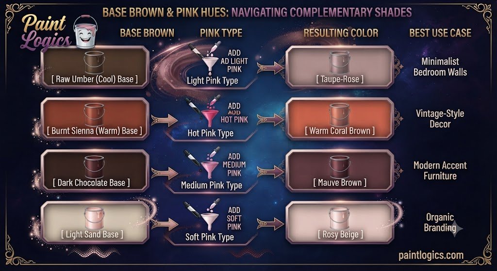
Grays mixed from cool blacks will pull your pink toward a “dusty” violet, while grays made from burnt umber and white will keep your pink beautifully warm and honey-like.
| Base Brown | Pink Type | Resulting Color | Best Use Case |
| Raw Umber (Cool) | Light Pink | Taupe-Rose | Minimalist Bedroom Walls |
| Burnt Sienna (Warm) | Hot Pink | Warm Coral Brown | Vintage-Style Decor |
| Dark Chocolate | Medium Pink | Mauve Brown | Modern Accent Furniture |
| Light Sand | Soft Pink | Rosy Beige | Organic Branding |
Brown and Pink in Paint: RYB, CMYK & Digital Color Models
Different creative industries use different color frameworks to mix these shades. Here is a breakdown of how it works across mediums.
RYB Color Model (Paint – Subtractive Mixing)
The traditional Red-Yellow-Blue model is what you used in art class. In this physical system, brown is a neutral modifier. Adding pink (a high-value red) to brown naturally warms it up and softens its intensity. This is perfect for fine art, like painting the subtle, fleshy shadows on a portrait.
CMYK Color Model (Print – Subtractive Mixing)
The Cyan-Magenta-Yellow-Key (Black) system is used by commercial printers. To print a mauve brown on paper, the printer dots magenta and yellow ink alongside a touch of cyan to “cool” the mixture. Because printer ink is translucent, these dots layer to create the illusion of a complex, mixed earth tone.
RGB Color Model (Digital – Additive Mixing)
The Red-Green-Blue model rules over your phone and computer screens. In the digital world, brown doesn’t actually exist as a “brown light.” It’s just a dark, desaturated orange. By mixing digital pink with this digital brown, you’re essentially telling the screen to illuminate the red and blue sub-pixels while dimming the green, resulting in a complex, screen-safe mauve.
What Happens When You Mix Brown and Pink with Other Colors?
Once you have your basic brown and pink mixture, introducing a third color can completely shift the mood. This is how pros build custom palettes.
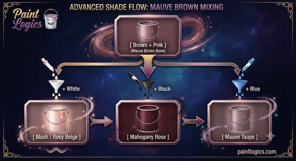
Brown + Pink + White = Blush or Rosy Beige
Adding white to your brown-pink mix lifts the value and creates a soft, chalky blush. Instead of looking like a bright candy pink, it stays incredibly soft and muted.
Brown + Pink + Black = Mahogany Rose
If your mix feels a bit too “light” or “sugary,” adding a drop of pure black will instantly drop its value into a heavy mahogany rose or deep mauve brown.
Brown + Pink + Red = Dusty Rosewood
Adding a dash of red to your mixture creates an incredibly complex dusty rosewood color. The extra red emphasizes the warmth, making the color feel much more “alive.”
Brown + Pink + Yellow = Coral Taupe
Mixing yellow into your brown-pink base creates a coral taupe. The yellow pulls the pink toward a sunset hue, while the brown keeps it grounded and neutral.
Brown + Pink + Blue = Mauve Taupe
When you drop blue into the mix, the color moves quickly into a dusty lavender or mauve taupe. The blue cancels out any orange tones, leaving you with a very cool, sophisticated, and earthy neutral.
Using Brown and Pink in Design
Brown and pink are a classic, high-contrast combination found everywhere from luxury fashion to boutique branding.
Fashion
In the style world, pairing brown and pink is a foolproof way to look effortlessly polished. Think of a chocolate brown wool coat worn over a soft, blush-pink sweater. The brown tones down the playfulness of the pink, creating a timeless look that feels mature and high-end.
Interior Design
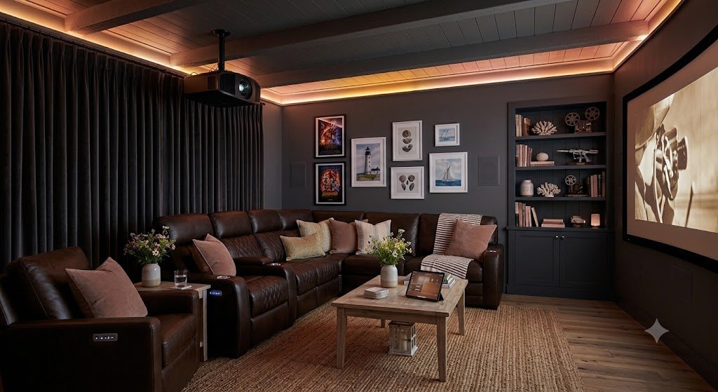
Interior designers treat brown and pink as a classic romantic combination that doesn’t feel “juvenile.”
Pro Tip: A living room with chocolate-colored leather chairs, soft blush throw pillows, and light wood floors feels perfectly balanced, cozy, and incredibly peaceful without being boring.
Branding & Packaging
Look around and you’ll see this combination in organic food packaging and boutique cosmetic shops. The pink represents friendliness and warmth, while brown signals reliability, stability, and sleek professionalism.
Tips for Mixing Brown and Pink in Paint or Digital Art
If you’re ready to start mixing, keep these practical tips in mind:
- Start Small: Always add your pink paint to your brown in small increments. Brown is a dominant earth pigment, and you can easily overwhelm it with too much pink.
- Test on a Palette: Acrylic and oil paints look different when wet. Acrylics always dry a full shade darker.
- Adjust with White/Black: If your mix looks too dark or muddy, don’t try to fix it by wasting more pink. Use a tiny speck of white to pull the color back into a readable tone.
- Consider Lighting: A blush swatch might look beautifully pink under warm bulbs but turn completely gray under harsh office fluorescents. Always test your paint in its final location.
- Use High-Quality Pigments: Cheap paints contain chalky fillers that turn muddy. Investing in artist-grade paints gives you much cleaner, more predictable results.
Real‑Life Examples of Brown and Pink in Design, Art & Fashion
Seeing how this pair functions in the real world can give you instant inspiration.
Fashion
Think of a classic winter look: a deep violet-pink scarf styled over a tailored camel or dark brown trench coat. The vibrant pink adds a splash of energy to the neutral brown.
Interior Design
Imagine a contemporary master bathroom featuring dark espresso cabinets, light gray marble tiles, and deep mauve bath towels. The pink towels prevent the stone from feeling too “cold” or institutional.
Branding
Many organic skincare brands use these tones to communicate that their product is both “natural” (brown) and “gentle” (pink).
Common Mistakes to Avoid When Mixing Brown and Pink
It’s incredibly easy to end up with a muddy mess if you aren’t paying attention.
1. Using Too Much Bright Pink
This is the most frequent blunder. Because pink is a high-chroma color, dropping a massive dollop into a pool of brown can cause it to vanish into a flat, muddy gray-brown.
2. Ignoring Undertones
Not all brown paints are built the same way. Raw umber has a cool, green undertone, while burnt sienna has a warm, red bias. If you mix a green-toned brown with pink, you might accidentally create an accidental grayish-mud tone instead of a rosy mauve.
3. Not Testing the Mix
Never paint an entire room or canvas right after mixing. Paint a small swatch, let it dry, and look at it in daylight.
4. Forgetting Lighting Effects
Lighting can completely change how a mauve brown looks. Incandescent indoor lights will make the pink stand out more, while cool morning sunlight will make the brown undertones take over.
Conclusion
To wrap things up, brown and pink make a muted, sophisticated rose or mauve. Depending on your mixing choices, that combination can transform into an elegant taupe-rose, a soft blush brown, or a rich mahogany rose.
The whole secret to mastering this color combo lies entirely in managing your proportions and understanding your base undertones. Treat brown as a grounding anchor, add your pink slowly, and always test your results. Whether you are building an outfit, painting a fresh accent wall, or blending acrylics, utilizing this organic pair adds instant maturity and sophistication to your work.
Love To Read More
#1 What Color Does Yellow and Gray Make When Mixed? Complete Guide
#2 Purple and Black Make What Color? Dark Purple Mixing Guide
FAQs
What color do brown and pink make when mixed?
They make a muted, earthy rose or mauve. Depending on the ratios, it can look like dusty rose, blush brown, or a deeper mauve brown.
Does brown and pink make what color in hair dye?
In hair color, this mix is often used to achieve a “rose brown” or “muted copper-pink.” It helps neutralize brassiness while adding a soft, trendy rose tint.
Can brown and pink make beige?
Yes! If you mix a very light, sandy brown with a tiny touch of pale pink, the result is a beautiful, warm rosy beige that is perfect for wall paint or neutral fashion.
What happens if I mix brown, pink, and white?
You create an incredibly soft, pastel blush. The white lifts the darkness of the brown while preserving the sophisticated, quiet character of the pink.
Is brown and pink used in interior design?
Yes, it is a classic combination. It is a fantastic way to add warmth to a room without making it feel too “childish” or overly bright.
Can I mix brown and pink digitally?
Absolutely. In digital programs, you create this by adjusting your red, green, and blue channels to favor the red spectrum while keeping the overall intensity low.
What shade is best for wedding design?
Dusty rose brown or mauve are incredibly popular for weddings. They feel romantic and soft but remain elegant and understated.
Does the undertone matter?
Yes, immensely. A cool-toned brown will result in a dusty, gray-purple mauve, while a warm-toned brown will result in a coral-leaning, sunset-style rose.
What color does brown + pink + yellow make?
You get a coral taupe. The yellow adds a sunny brightness that pushes the pink-brown mix into a warm, sunset-inspired territory.
Can brown and pink mix to a cool tone?
Yes. If you choose a brown with a strong blue or gray undertone and mix it with a cool, violet-leaning pink, you will get a very cool, moody taupe.
How do I achieve a deeper rosy brown?
Add a tiny bit of black or a very dark chocolate brown to your pink-brown mix. This deepens the value without losing the romantic rosy undertone.
Are brown and pink good for branding?
They are excellent for brands that want to communicate “organic luxury.” The brown promises reliability, and the pink promises a gentle, human-centric approach.