What Color Does Red and White Make When Mixed? Complete Guide
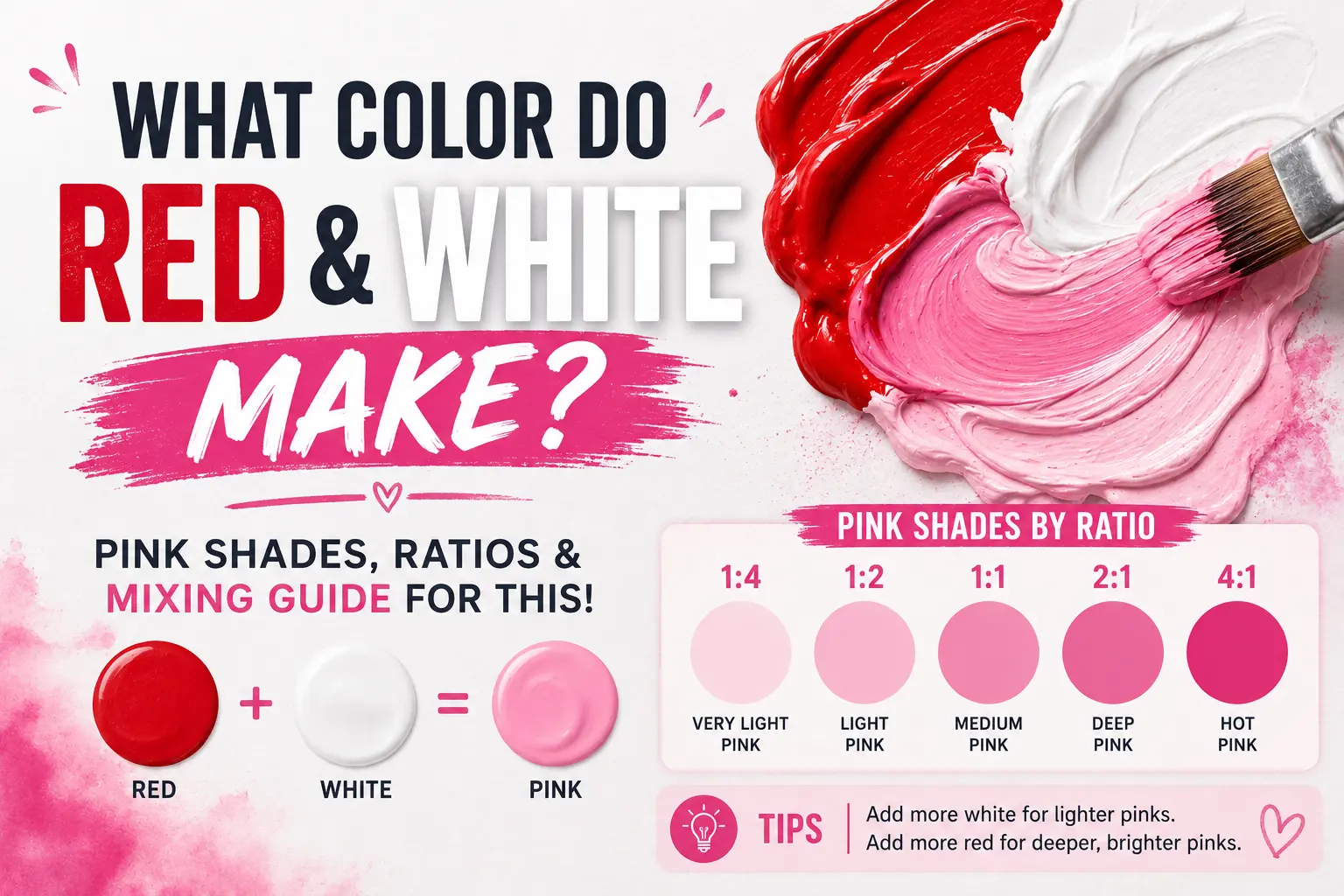
If you’ve ever wondered, “red and white make what color,” you’re not alone. The straightforward answer is pink. But as anyone who has ever picked up a paintbrush knows, creating the perfect shade is rarely that simple.
Why does a vibrant crimson sometimes turn into a muddy pastel instead of a clean, bright rose? The final result depends entirely on the specific pigments you choose, your mixing ratios, and even the medium you’re using. You will learn exactly how these two colors interact, how to mix different variations like blush and salmon, and how to avoid the common pitfalls that ruin color blends.
Main Takeaway:
Red + White = Pink (depending on the warm or cool undertones of your base red paint).
Quick Answer: What Color Do Red and White Make?
At its most basic level, mixing red and white paint creates the color pink. White acts as a tinting agent, which lifts the dark value of the red and increases its reflectance.
This happens because white paint doesn’t just lighten a color; it changes how light bounces off the pigment particles back to your eyes. When you add white to red, you’re scattering the light waves, reducing the intensity of the red hue. For example, if you add a tiny drop of white to a pool of deep red, you’ll instantly see a rich berry or rose tone begin to emerge.
Beginner Tip: Always add your darker color (red) into your lighter color (white) in small increments. It takes a massive amount of white paint to lighten a dark red, so starting with a white base saves a lot of paint.
Now let’s examine the actual science behind why this transformation happens.
The Science Behind Mixing Red and White
Color behaves differently depending on whether you are working with physical materials or digital screens. Understanding this distinction saves a lot of frustration when trying to recreate a specific shade.
Subtractive Color Mixing (Paint & Pigments)
In the physical world of acrylics, oils, and watercolors, we use subtractive color mixing. Pigments absorb certain wavelengths of light and reflect others back to our eyes.
Red paint appears red because it absorbs blue and green light while reflecting red light. When you introduce white paint, you aren’t adding a new color wavelength; instead, you are adding a highly reflective pigment that scatters all visible wavelengths. Think of a canvas where a thick layer of white titanium paint dilutes the concentrated red particles, turning a heavy scarlet into a softer, lighter pink.
Additive Color Mixing (Digital / Light)
Digital art and screens operate on an entirely different system known as additive color mixing. Here, colors are created by combining beams of colored light rather than physical pigments.
On a phone screen or monitor, red is a primary color of light ($R$), and white is the combination of all visible light wavelengths at full intensity ($R + G + B$). When you mix red light with white light, you are maxing out the red channels while boosting the green and blue channels. This creates a bright, luminous light pink that looks crisp on a display but cannot be replicated exactly using physical paint tubes.
Let’s look at the specific varieties of pink you can create on your palette.
Common Shades Created When Mixing Red and White
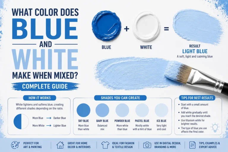
Changing the ratio of your red white paint mix allows you to create an incredible spectrum of tones. Here is a breakdown of the most common shades you can mix.
1. Light Pink
Light pink is a soft, delicate shade with a highly reflective quality. This color forms when you use a heavy hand with your white base and add just a touch of a neutral red. Artists often use this clean shade to capture the soft highlights on silk fabric or flower petals.
2. Pastel Pink
Pastel pink is incredibly close to light pink but carries a distinctly chalky, matte appearance. It requires a highly opaque white paint, like Titanium White, combined with a true primary red. This shade is a staple in nursery decor and spring-themed illustrations because of its calming effect.
3. Coral Pink
Coral pink is a warm, energetic shade that carries a strong hint of orange. To achieve this, you need to use a warm red paint that already leans toward yellow, like Cadmium Red. Imagine a tropical sunset; that vibrant, sunny glow comes from those warm, orange-leaning undertones.
4. Rose
Rose is a deeper, more romantic pink that mimics the natural look of a classic flower. This shade requires a cool red base, such as Alizarin Crimson or Quinacridone Magenta, mixed with a moderate amount of white. The cool blue undertones in these reds keep the mixture looking rich and slightly berry-toned.
5. Hot Pink
Hot pink is an intense, high-energy color that seems to pop off the surface. You cannot get a true, electric hot pink by simply mixing a standard primary red with white. Instead, you must start with a cool, vibrant magenta base and add a tiny amount of pure white to lift its brightness without dulling its intensity.
6. Salmon
Salmon is a unique pink that perfectly straddles the line between orange, pink, and gray. It requires a specific balance of a warm red, a touch of yellow, and a dominant white base. It mimics the natural, rich color of fresh seafood and coastal aesthetics.
7. Flamingo Pink
Flamingo pink is a bright, cheerful shade that leans slightly toward a cool, blue-toned pastel. This color happens when you mix a clean primary red with a generous amount of white, keeping the mix pure without adding any earthy tones. It is frequently seen in retro summer designs and pop art.
8. Peachy Pink
Peachy pink is a soft, welcoming hue that leans heavily into a pastel orange territory. It relies on a high ratio of white, a small splash of warm red, and a definite drop of yellow paint. Interior designers use this shade to create spaces that feel cozy, warm, and sun-kissed.
| Color Name | Red Ratio | White Ratio | Modifying Color | Hex Code |
| Light Pink | 10% | 90% | None | #FFB6C1 |
| Pastel Pink | 15% | 85% | None (Opaque) | #FFD1DC |
| Coral Pink | 20% | 75% | 5% Yellow | #F88379 |
| Rose | 35% | 65% | Trace Blue | #FF007F |
| Salmon | 25% | 65% | 10% Yellow | #FA8072 |
That brings us to a closer look at one of the most requested mixtures: salmon.
How to Make Salmon Color
Salmon is an incredibly popular shade in both home decor and fine art, but it can be notoriously tricky to nail down on your first try.
What Colors Make Salmon?
To mix a true salmon color, you need three basic components: a warm red paint, pure white paint, and a splash of warm yellow. The reason is simple. If you only use red and white, you will end up with a standard baby pink. Adding that hint of yellow pulls the mixture toward an organic, orange-toned territory.
Salmon Color Mixing Chart
- Base Blend: 3 parts White + 1 part Warm Red.
- The Adjuster: Add a half-part of Medium Yellow.
- The Muter (Optional): A pinprick of Ultramarine Blue to tone down excessive brightness.
Salmon Hex Codes
In digital spaces, salmon shades generally sit within these hex parameters:
- Light Salmon: #FFA07A
- Classic Salmon: #FA8072
- Dark Salmon: #E9967A
Warm vs. Cool Salmon
Can you make salmon feel cooler or warmer? Absolutely. A warm salmon uses more yellow or a red like Cadmium Red, making it look closer to a terracotta tile. A cool salmon minimizes the yellow and uses a touch more white, pulling it closer to a dusty blush pink.
Common Mistakes When Mixing Salmon
The biggest mistake beginners make is adding too much yellow too quickly. This accidentally turns your beautiful pink base into a bright orange or a muddy gold. Another issue is using a cool, blue-toned red, which creates a purplish mauve rather than a warm salmon.
Where Salmon Differs from Coral and Peach
So what’s the difference between these three similar shades? Peach contains significantly more yellow and white, making it look like a pale orange. Coral is much more vibrant, saturated, and heavy on the red-orange side. Salmon sits right in the middle, looking softer, more muted, and distinctly pinker than peach.
Now, what happens if we start experimenting with third colors in our red and white mix?
What Happens When You Mix Red and White with Other Colors?
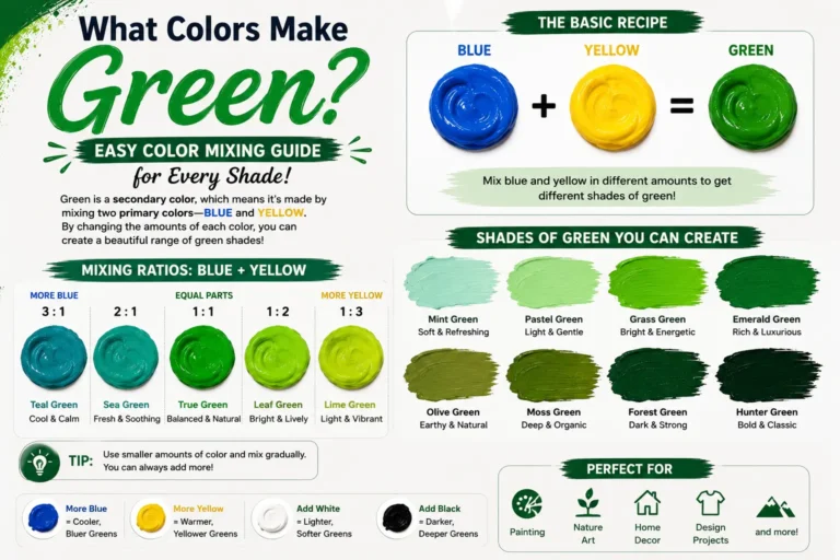
Once you have mastered the basic pink mixture, you can start introducing a third color to create entirely new color families.
1. Red + White + Blue = Pinkish Purple
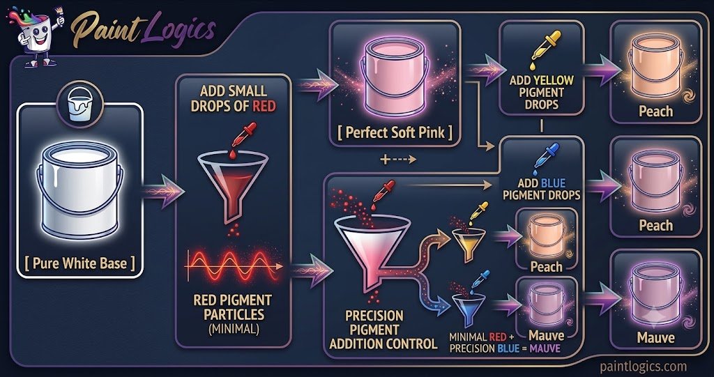
When you add a touch of blue to your red and white mix, you create a beautiful pinkish purple or orchid shade. This happens because the red and blue combine to form purple, while the white lifts the value into a soft pastel.
2. Red + White + Yellow = Peach
Introducing yellow to your red and white paint gives you a soft, creamy peach. The red and yellow create a subtle orange baseline, which the white paint instantly softens into a warm, inviting tone.
3. Red + White + Green = Light Brownish Pink
Adding a small dot of green to your pink mix will yield a light brownish pink, often called dusty rose. Because green is the complementary color to red, it cancels out the vibrancy of the red, creating a highly sophisticated, natural neutral.
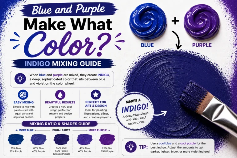
4. Red + White + Purple = Lavender Pink
Mixing purple into your red and white base creates a cool-toned lavender pink. This shade feels regal and cool, making it perfect for painting shadows on snow or creating a serene bedroom palette.
5. Red + White + Black = Deep Rose
If you add a tiny speck of black to your pink mix, you will get a deep, rich rose tone. The black darkens the value without completely muddying the hue, giving the pink an antique, vintage appearance.
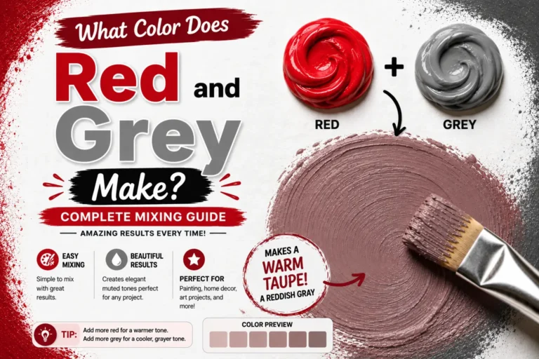
6. Red + White + Gray = Dusty Pink
Mixing gray into red and white creates a beautifully muted dusty pink. This shade drops the saturation significantly, creating an understated color that is incredibly popular in modern minimalist interior design.
Using Red and White in Design
The combination of red, white, and their resulting pink shades plays a massive role across various creative industries.
Fashion
In clothing design, mixing red and white creates contrast and balance. Think of a classic white button-down paired with a bold red blazer, or the softer route of a blush pink linen suit. Designers use these tones to evoke everything from high-power energy to soft, approachable elegance.
Interior Design
Interior designers usually avoid using pure primary red on all four walls because it can elevate heart rates and anxiety. Instead, they use white to soften the red into a subtle blush or sand tone for walls, saving the pure red for accent pieces like cushions, rugs, or artwork.
Branding & Packaging
In the world of corporate branding, red brings excitement and urgency (think Coca-Cola or Target), while white offers cleanliness and clarity. When brands shift toward pink, they are targeting a sense of playfulness, youth, or luxury cosmetics.
Tips for Mixing Red and White in Paint or Digital Art
To get predictable results every single time you sit down to create, keep these practical tips in mind.
Start Small
Always start with your white paint on the palette first, then pull small amounts of red into it. It is incredibly easy to make a white paint darker, but it takes an immense amount of white paint to fix a mix that started out too red.
Adjust with Other Colors
If your pink looks too much like bubblegum and you want something more natural, don’t keep adding white. Drop in a tiny speck of its complement (green) or a warm yellow to ground the color and give it some earthiness.
Test Under Different Lighting Conditions
Pro Tip: Paint dries darker than it looks when wet. Always paint a small test patch on a scrap piece of paper and let it dry completely under the lighting where it will be displayed before committing to your entire project.
Real-Life Examples of Red and White in Design, Art & Fashion
Seeing how these colors interact in the real world helps train your eye for your own projects.
Fashion
Consider the iconic pink aesthetic seen in spring runway collections. Designers often mix stark white fabrics with deep crimson silks to create a layered effect that naturally blends into shades of rose and blush as the garments move and catch the light.
Interior Design
Imagine walking into a coastal-themed living room. You will often see crisp white linen sofas accented with salmon-colored throw pillows and coral undertones in the woodwork. The white bounce-light keeps the warm pink tones from feeling heavy or outdated.
Art & Illustration
Fine artists painting realistic portraiture rarely use pink straight out of a tube for skin tones. Instead, they constantly mix Titanium White with small touches of Cadmium Red and Yellow Ochre to create the luminous, realistic translucent qualities of human skin.
Common Mistakes to Avoid When Mixing Red and White
Avoid these three frequent missteps to save yourself time and wasted supplies.
1. Using Too Much Red
It cannot be stressed enough: red pigments are incredibly dominant. Adding a large dollop of red directly to white will instantly overpower the white, leaving you with a massive pile of mid-tone red paint that you didn’t want.
2. Not Testing the Mix
Assuming your wet paint mix will look identical on a dry wall or canvas is a recipe for disappointment. Acrylics, in particular, tend to shift a shade or two darker as the binder dries from white to clear.
3. Ignoring Undertones
Never grab just “any” red tube. If you grab a red that leans toward orange and expect a cool violet-pink, you will end up disappointed. Always check whether your base red is warm or cool before you start mixing.
Conclusion
When you mix red and white, you get pink—but the journey doesn’t end there. By controlling your ratios and understanding whether your red base has warm or cool undertones, you can mix everything from a vibrant hot pink to a muted, sophisticated salmon. Keep your paint mixtures controlled by adding dark pigments into light bases slowly, always test your colors dry, and don’t be afraid to add hints of yellow or blue to customize your shade.
Read More: Red and Blue Make What Color? The Ultimate Color Mixing Guide
FAQs
What color do red and white make when mixed?
They make pink. The specific shade of pink will depend on the type of red pigment used and how much white is added to the mixture.
Can red and white make other colors?
No, on their own, they can only make shades within the pink family. To get colors like peach, mauve, or brown, you must introduce a third color like yellow, blue, or green.
How do I make a lighter pink?
Simply increase the amount of white paint in your mixture. Start with a base of pure white and fold in a pinprick of red paint at a time until you reach your desired lightness.
Does the shade of red matter?
Yes, it matters immensely. A warm red (like Cadmium Red) will produce a warm, peachy pink, while a cool red (like Alizarin Crimson) will produce a cool, berry-toned rose.
Can I make a deeper pink with red and white?
You can make a darker pink by using a higher ratio of a cool red pigment. If it still isn’t deep enough, add a microscopic touch of black or dark blue to deepen the value without destroying the pink hue.
Is pink used in interior design?
Yes, muted pinks like blush, dusty rose, and salmon are incredibly popular as neutrals in modern interior design because they bring warmth without overpowering a room.
What is the difference between light pink and pastel pink?
Light pink simply refers to a high-value pink, while pastel pink typically has a more opaque, chalky appearance due to a heavy concentration of white titanium dioxide pigment.
How do I create a peach color with red and white?
Mix your red and white to create a soft pink base, then add a small amount of warm yellow paint to pull the hue into a soft, warm peach territory.
Can I use pink for formal wear?
Absolutely. Darker, muted pinks like dusty rose or dusty mauve are excellent choices for formal suits, ties, and evening gowns, offering a sophisticated alternative to traditional navy or black.
What color do I get if I mix red, white, and yellow?
You will get a warm peach, apricot, or salmon color, depending on the exact ratios of red and yellow used in the white paint base.
Is pink a good color for branding?
Yes, pink works exceptionally well for brands that want to convey creativity, youthfulness, approachability, or luxury, especially in the cosmetics, confectionery, and modern tech spaces.
Can I mix red, white, and green to make brown?
Yes. Because green is the complement of red, mixing red and green creates a muted brown. Adding white to that mix will give you a light, earthy, brownish-pink neutral.